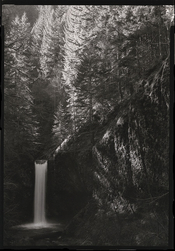
Enlarging without dodging.

For V.

D
For V.

  • 1
  • 0
  • 24
Mt Rundle

A
Mt Rundle

  • 7
  • 0
  • 58
Sonatas XII-35 (Homes)

A
Sonatas XII-35 (Homes)

  • 0
  • 1
  • 50
Ode to Cor

H
Ode to Cor

  • 2
  • 0
  • 80
Moon in Myrtle

D
Moon in Myrtle

  • 5
  • 0
  • 70

Recent Classifieds

Forum statistics

Threads
199,458
Messages
2,791,893
Members
99,913
Latest member
Shallom
Recent bookmarks
1

Mike Lopez

Member
Joined
Jan 30, 2005
Messages
653
Format
Multi Format
Haaa, that might have been more intriguing than the reality. (Cal Poly SLO).

I had a hunch this was the correct answer and just asked my wife if that is the name of the student paper there (she’s an alum), but you responded before I could say anything!
 

Bill Burk

Subscriber
Joined
Feb 9, 2010
Messages
9,355
Format
4x5 Format
Most photographers favor negatives that range from normal to contrasty or that range from normal to soft. The approach they will champion will be the one that works for their negatives.
Makes a lot of sense. Put me on the normal to high contrast negative team. I like to fall between negatives that will look good on grades 2 or 3 and I struggle when they’re underexposed and flat.
 

Bill Burk

Subscriber
Joined
Feb 9, 2010
Messages
9,355
Format
4x5 Format
I had a hunch this was the correct answer and just asked my wife if that is the name of the student paper there (she’s an alum), but you responded before I could say anything!

A bunch of old friends are getting together tonight to see Weird Al and they called to razz me for skipping out. (I saw him last week.)
 

Bill Burk

Subscriber
Joined
Feb 9, 2010
Messages
9,355
Format
4x5 Format
I signed up for one of Ansel's workshops for the summer of 1984. Alas, he passed away between registration and the workshop. John Sexton led the darkroom portion of the workshop, using Ansel's MOONRISE OVER HERNANDEZ as an example. It had to be burned, dodged, bleached and toned to create a print that satisfied Ansel.
Russ Young, F.R.P.S.

I saw (I’m sure it was a copy) that negative at Jim Alinder’s gallery about the time Mary’s f.64 book came out.

Glad John Sexton carried on with the workshop, but that must have been an awful heartbreaking experience.
 

Vaughn

Subscriber
Joined
Dec 13, 2006
Messages
10,158
Location
Humboldt Co.
Format
Large Format
I saw (I’m sure it was a copy) that negative at Jim Alinder’s gallery about the time Mary’s f.64 book came out.
...
Visiting the Adams house in Carmel in the late 80s on a Friends of Photography Workshop and sitting in the living room, we were shown the Moonrise negative...the the person showing it (too long to remember who) dropped it, almost -- much to the shock of all us participants. We all jumped...😬 We were never told, but later I assumed it was a copy neg.
 

awty

Subscriber
Joined
Jul 24, 2016
Messages
3,675
Location
Australia
Format
Multi Format
I wonder what print the horse was eyeing - a dodged one or a straight print? We should ask its opinion.

Vaughn - I don't think Australia is in Nevada, but you never know. There are plenty of big open spaces and strange creatures in Nevada too, and weird tribal celebrations where either dust storms or flashfloods seem mandatory.

He sold all rights for a carot.
 

koraks

Moderator
Moderator
Joined
Nov 29, 2018
Messages
23,835
Location
Europe
Format
Multi Format
he "highlights first" approach is true
A "shadows first" approach is best
Why would you formulate it like this, if ultimately, you arrive at this conclusion:

as we are all doing this for fun, it matters not one whit which method one employs or champions.
I'd add that even those who don't do it for fun (alone), they'd still obviously be entirely free to do as they please.
And whether it 'matters not one whit' - I don't know. I think it does, really. But we're evidently free to do as we please.

Of course, I understand that you're offering your insights based on your extensive professional experience as well as an objectively sensible line of reasoning, and that the approach you suggest should reliably yield prints that span the full density range of the paper while also showing differentiation in all (relevant) parts of the image. Which will probably be fine for many printers - but by far not all, and it's certainly not a matter of 'true' or 'best'. So why formulate it that way? It implies that there's a right and a wrong way to do it. Especially inexperienced printers who can benefit the most from solid advice are often confused by this. We see it all the time in the questions novice darkroom workers ask, which often feature an undertone of "I want to do it correctly."

I advocate distinguishing more explicitly between someone's requirements/criteria and how different approaches can realize (entirely or in part) those requirements. While it may seem/feel like a lot of work and require more words than a simple "here's how to do it," I think it really does help those who arrive at the scene and are trying to make sense of the seemingly conflicting information.

Personally, my approach is different from yours, and much more similar to that of @AndrewSandersonPhoto, where I moreover determine the contrast grade that will encompass part of the tonal range I want to print, but not all. The rest I fill in with burning and/or flashing. I do this because it allows me to optimize (within my visual criteria) contrast where I want it. I'm not advocating that this is somehow a 'correct' way of working, or universally recommended. It's one way of doing it, which I personally use much of the time, and at this particular stage in my printing 'career'.
 
Photrio.com contains affiliate links to products. We may receive a commission for purchases made through these links.
To read our full affiliate disclosure statement please click Here.

PHOTRIO PARTNERS EQUALLY FUNDING OUR COMMUNITY:


Ilford ADOX Freestyle Photographic Stearman Press Weldon Color Lab Blue Moon Camera & Machine
Top Bottom