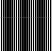
Downloadable 18% Gray Card

Roses

A
Roses

  • 6
  • 0
  • 102
Rebel

A
Rebel

  • 6
  • 4
  • 125
Watch That First Step

A
Watch That First Step

  • 2
  • 0
  • 83
Barn Curves

A
Barn Curves

  • 3
  • 1
  • 69
Columbus Architectural Detail

A
Columbus Architectural Detail

  • 5
  • 3
  • 81

Forum statistics

Threads
197,490
Messages
2,759,896
Members
99,517
Latest member
RichardWest
Recent bookmarks
1

Paul Verizzo

Member
Joined
Jan 20, 2008
Messages
1,643
Location
Round Rock, TX
Format
35mm
http://picasaweb.google.com/VerizzoPhotoEstate/18GrayCard

My comments:

This is a gray card created using pure RGB colors in Corel Photo-Paint. I got the settings by scanning a Delta card and then blurring and reblurring the heck out of it. Results? Each color was right around 100 on the RGB scale.

The spectral range for each color is very narrow on my card. Use it for white balance, too.

You can make a superior "card" over Delta and Kodak because it has even tonality instead of a lumpy and shiny surface. Put it on a good quality matte paper, or inkjet to fabric! If you use a 90% reflective paper, you now have the flip side of a Kodak Gray Card.

You will probably need to experiment with your printer settings of paper type and ink load. Make a small image for testing so that you don't waste ink, then when you have it right, print it at full size.

Don't forget, you just need to get the reflectivity very close, not perfect. There are many other variables of greater concern during exposure determination. I'll bet Delta cards aren't necessarily exactly 18% - but they work fine.
 

Ian Grant

Subscriber
Joined
Aug 2, 2004
Messages
23,249
Location
West Midland
Format
Multi Format
I carry an 18% Grey card with me at all times, it's simpler, cheaper, and free - It's called the back of my hand. Being serious this is an old trick that many photographers use.

The huge problem with making your own is the type of paper used makes a difference too, it should be matt, then there's knowing if the printer calibrated properly.

Ian
 

RobC

Member
Joined
Nov 5, 2007
Messages
3,880
Location
UK
Format
Multi Format
I've got something called a light meter. It's highly accurate. Far more accurate than a piece of grey card which needs to be at very specific angles in relation to the primary light source, subject and camera before it reflects what it claims to reflect.
 

Philippe-Georges

Subscriber
Joined
Apr 11, 2005
Messages
2,659
Location
Flanders Fields
Format
Medium Format
According to my DigitalColor-Meter.app (version 3.6.1) incorporated in my mac, the Grey you showed is : R = 39,2 % G = 39,2 % B = 39,2 % .
The Grey I have as a desktop background is R/G/B = 17,6 %.
The Grey in the APUG logo is R/G/B = 29,8 %.
So, which is the right one?

Philippe
 

Mike Kennedy

Member
Joined
Feb 5, 2005
Messages
1,594
Location
Eastern Cana
Format
Multi Format
I've heard about using the back of your hand.Do you meter and then decrease by 1 stop? Guess it would also depend on your skin tone.
 

Ian Grant

Subscriber
Joined
Aug 2, 2004
Messages
23,249
Location
West Midland
Format
Multi Format
The grey you need is the colour of the clouds on a dull drizzley day in Belgium :D

So take your MAC outside & compare . . . . more seriously it's better to acquire a proper card or borrow one and match it, if you really need one.

Mike, I usually use a Spotmeter, and measure highlughts and shadows, but grass or the back of my hand is usually Zone V, so I can use that. Often if the lights changing very little a I'll just use either for a quick check.

Ian
 
Last edited by a moderator:

Nick Zentena

Member
Joined
Nov 21, 2004
Messages
4,668
Location
Italia
Format
Multi Format
Following up on what Ian is saying.

If you're using a 35mm with a built in meter try holding it up to your eye and panning. See how the meter reacts. Let the meter teach you what to look for.
 

Steve Smith

Member
Joined
May 3, 2006
Messages
9,110
Location
Ryde, Isle o
Format
Medium Format
I've heard about using the back of your hand.Do you meter and then decrease by 1 stop?

That's what I do (sometimes). My Weston meter has a line up mark for just this purpose.


Steve.
 

Ian Grant

Subscriber
Joined
Aug 2, 2004
Messages
23,249
Location
West Midland
Format
Multi Format
FWIW just testing my Lunatic Pro meter using the diffuser at the ambient light source is giving the same exposure as taking a Zone V reading off the back of my hand, it's the same in bright sunlight too.

Ian
 

ooze

Member
Joined
Nov 22, 2004
Messages
428
Location
Istanbul/Düsseldorf
Format
Multi Format
Mike, I usually use a Spotmeter, and measure highlughts and shadows, but grass or the back of my hand is usually Zone V, so I can use that.
Ian

Is that with a sunburn or without?

I mean, after driving for a whole day in high summer the back of my hand easily goes down to ZoneIV if not darker :smile:

If I have no other good reference I usually measure off the palm of my hand and open up by ~1 stop. The palm tends to stay the same shade.
 

argus

Member
Joined
Dec 14, 2004
Messages
1,128
Format
Multi Format
The grey you need is the colour of the clouds on a dull drizzley day in Belgium :D
Ian

Even that is not a stable parameter.

Did you know that Belgians (both French and Dutch speaking) have about 43 different words to define the grey of the coulds? It's more than Eskimos have to nominate the whites of snow :wink:


G
 

Ed Sukach

Member
Joined
Nov 27, 2002
Messages
4,517
Location
Ipswich, Mas
Format
Medium Format
I've heard about using the back of your hand.Do you meter and then decrease by 1 stop? Guess it would also depend on your skin tone.
Depends upon whose hands we are considering. They are like snowflakes - no two exactly alike.
The amount of light reflected will depend on the characteristics of the light itself, as well. Compare the back of the hand in question to a gray card in different situations - and see how well they correlate.
 
OP
OP

Paul Verizzo

Member
Joined
Jan 20, 2008
Messages
1,643
Location
Round Rock, TX
Format
35mm
"Back of Hand?" and more

I presume you gents are referring to the palm of your hand. Backs of hands vary widely in reflectivity.

Yes, that's all my father ever used for a reference point. Set your light meter for a one stop slower film. An amazing fact of nature, no doubt. Doesn't matter what your race is or anything.

As to paper type and "calibration", that's why I said to run tests. Frankly, I can't imagine an 88, or 92, or even higher paper mattering. It's being covered pretty thoroughly with ink. Test against a known good card, change your saturation as needed.

I did this just for fun. I also thought it might be useful to have a "card" that folds.
 
OP
OP

Paul Verizzo

Member
Joined
Jan 20, 2008
Messages
1,643
Location
Round Rock, TX
Format
35mm
Mine, of course....

According to my DigitalColor-Meter.app (version 3.6.1) incorporated in my mac, the Grey you showed is : R = 39,2 % G = 39,2 % B = 39,2 % .
The Grey I have as a desktop background is R/G/B = 17,6 %.
The Grey in the APUG logo is R/G/B = 29,8 %.
So, which is the right one?

Philippe

Just kidding, but not entirely. I can't address the issues cuz I have no idea what your digital color meter is, although I think I can make a fair assumption. Nor am I familiar with rating a color as percentage of RGB. Sorry.

Certainly your desktop background and APUG logo don't hold themselves out as 18% gray, do they?

As I mentioned, I find the Delta card, the only one available here, lumpy in texture and rather shiny. I'm probably picking nits, but I can't believe that those characteristics are conducive to accurate readings. When I scanned it, those characteristics showed up strongly as darker and lighter areas.

After the scan I used the various blurring tools in Photo-Paint over and over until it was as uniform as I could get. I would save it and then reopen it for another treatment. I did this, I think, three times. There was a very slight, barely perceptible ringing on my LCD monitor similar to using 16 colors with an image. Again, barely perceptible, I had to move my head around to confirm what I was seeing. When I opend this in my Dimage Viewer program and hovered my cursor around the "image," the readings were within a point or two, plus or minus, of 100 on the 255 RGB scale. I thought that most interesting!

I went back to Photo-Paint and dialed in a fill of 100 for each color. And there it is.

Obviously Delta or Kodak or whomever makes an analog printing ink to meet specs. The colors are rather diffuse around their maximum values, sort of like a steep mountain. It's what I would expect from, er, an analog production. My chart is a sharp spike in each color. Does it matter? I'm sure that the answer is an empatic "No!"

If nothing else, there's a reference for your monitor.
 
OP
OP

Paul Verizzo

Member
Joined
Jan 20, 2008
Messages
1,643
Location
Round Rock, TX
Format
35mm
Mine, of course....

According to my DigitalColor-Meter.app (version 3.6.1) incorporated in my mac, the Grey you showed is : R = 39,2 % G = 39,2 % B = 39,2 % .
The Grey I have as a desktop background is R/G/B = 17,6 %.
The Grey in the APUG logo is R/G/B = 29,8 %.
So, which is the right one?

Philippe

Just kidding, but not entirely. I can't address the issues cuz I have no idea what your digital color meter is, although I think I can make a fair assumption. Nor am I familiar with rating a color as percentage of RGB. Sorry.

Certainly your desktop background and APUG logo don't hold themselves out as 18% gray, do they?

As I mentioned, I find the Delta card, the only one available here, lumpy in texture and rather shiny. I'm probably picking nits, but I can't believe that those characteristics are conducive to accurate readings. When I scanned it, those characteristics showed up strongly as darker and lighter areas.

After the scan I used the various blurring tools in Photo-Paint over and over until it was as uniform as I could get. I would save it and then reopen it for another treatment. I did this, I think, three times. There was a very slight, barely perceptible ringing on my LCD monitor similar to using 16 colors with an image. Again, barely perceptible, I had to move my head around to confirm what I was seeing. When I opend this in my Dimage Viewer program and hovered my cursor around the "image," the readings were within a point or two, plus or minus, of 100 on the 255 RGB scale. I thought that most interesting!

I went back to Photo-Paint and dialed in a fill of 100 for each color. And there it is.

Obviously Delta or Kodak or whomever makes an analog printing ink to meet specs. The colors are rather diffuse around their maximum values, sort of like a steep mountain. It's what I would expect from, er, an analog production. My chart is a sharp spike in each color. Does it matter? I'm sure that the answer is an empatic "No!"

If nothing else, there's a reference for your monitor.
 

Steve Smith

Member
Joined
May 3, 2006
Messages
9,110
Location
Ryde, Isle o
Format
Medium Format
Has anyone tried using a purely black and white pattern similar to the one attached?

If you have 18% of the area white and the rest black you should get 18% reflectance.

A suitably spaced halftone dot pattern should work too.


Steve.
 

Attachments

  • grey.jpg
    grey.jpg
    31.8 KB · Views: 547

RH Designs

Advertiser
Advertiser
Joined
Apr 9, 2003
Messages
651
Location
Yorkshire Da
Format
Multi Format
Has anyone tried using a purely black and white pattern similar to the one attached?

If you have 18% of the area white and the rest black you should get 18% reflectance.

A suitably spaced halftone dot pattern should work too.

The problem is - how black is the black and how white the white? This would work with perfect 0% and 100% black and white respectively, but not otherwise. The idea of a grey card is to appear as a mid grey, looking to the eye like half way between black and white. Trying to produce one using an inkjet printer throws up all sorts of issues of colour management, gamma, etc. which are not subjects for this forum and to be honest best avoided by all but the dedicated colour scientist. Anyone who's tried to match an inkjet print to the screen image without using a fully colour managed workflow will know what I mean! Using a glossy paper for a grey card makes matters worse because of reflections etc.

Best to use your hand or a commercially produced grey card. Better still, a spot meter.
 
OP
OP

Paul Verizzo

Member
Joined
Jan 20, 2008
Messages
1,643
Location
Round Rock, TX
Format
35mm
My original thinking was along those lines....

Has anyone tried using a purely black and white pattern similar to the one attached?

If you have 18% of the area white and the rest black you should get 18% reflectance.

A suitably spaced halftone dot pattern should work too.


Steve.

But I quickly realized what the poster below did.
 
OP
OP

Paul Verizzo

Member
Joined
Jan 20, 2008
Messages
1,643
Location
Round Rock, TX
Format
35mm
Anyone who's tried to match an inkjet print to the screen image without using a fully colour managed workflow will know what I mean! Using a glossy paper for a grey card makes matters worse because of reflections etc.

Best to use your hand or a commercially produced grey card. Better still, a spot meter.

I'm not sure why this is being made so difficult. You print with your best guess and paper settings. You test. If not on the money, you adjust. More saturation or less. Save those settings. You can also print to fiber. No need for color managed workflows or similar.

One could just as well take a piece of white paper, spray black paint on it in a mottled fashion, and at an appropriate distance, have an 18% reflectance. No color management or workflow!

I specifically stated that a) I could only get the Delta card locally (and the dealer was surprised to see that he had a set!) and, 2) the surface is lumpy and shiny, which I can't believe doesn't sometimes impact a reading. And 3), there you are for your monitor, regardless of anything else.
 

Steve Smith

Member
Joined
May 3, 2006
Messages
9,110
Location
Ryde, Isle o
Format
Medium Format
The problem is - how black is the black and how white the white? This would work with perfect 0% and 100% black and white respectively, but not otherwise.

I think you are right but I also think that a correctly proportioned white/black pattern would be easier to achieve than a 18% grey with an inkjet print.

But I wouldn't suggest that either was an ideal solution.

I think metering the palm of the hand and adding an extra stop (or using the C position on a Weston meter) is a good solution as you are not likely to forget to bring your hand!


Steve.
 

Don Wallace

Member
Joined
Jun 12, 2006
Messages
419
Location
Ottawa, Cana
Format
Large Format
Is that with a sunburn or without?

I mean, after driving for a whole day in high summer the back of my hand easily goes down to ZoneIV if not darker :smile:

If I have no other good reference I usually measure off the palm of my hand and open up by ~1 stop. The palm tends to stay the same shade.

I think what you are getting at is the idea of measuring parts of the body which do not see sunlight very much and thus remain at a constant value. Perhaps some of you have already guessed where this post is going. In the field, I usually wear very loose pants and carry a mirror.

Ok, just kidding. :D
 
OP
OP

Paul Verizzo

Member
Joined
Jan 20, 2008
Messages
1,643
Location
Round Rock, TX
Format
35mm
Man, just when I think I can tie my shoes!

To throw a spanner (wrench) in the works, I read an article that camera's are calibrated at 12% gray.

http://www.bythom.com/graycards.htm

Comments

From the above, "someone had shot a picture of a gray card, and then remarked that his meter must be off, since the histogram that the camera generated showed the peak of values to the left of center."

I noticed the same thing! I figgered it was just my Dimage program or some peculiarity that I didn't understand.

After reading that, I guess it only confirms that trying to expose to the .001 proper EV is a total waste of time. Second, run your own tests!

Sunny sixteen it is, after all this technology.
 
Photrio.com contains affiliate links to products. We may receive a commission for purchases made through these links.
To read our full affiliate disclosure statement please click Here.

PHOTRIO PARTNERS EQUALLY FUNDING OUR COMMUNITY:


Ilford ADOX Freestyle Photographic Stearman Press Weldon Color Lab Blue Moon Camera & Machine
Top Bottom