Hello- I just got a black and white darkroom and was experimenting with printing color negs on black and white paper and the results were surprisingly pleasing. I was wondering if there is anyone else out there doing this? What happens when black and white negs are printed on color paper? -Patrick
-
Welcome to Photrio!Registration is fast and free. Join today to unlock search, see fewer ads, and access all forum features.Click here to sign up
You are using an out of date browser. It may not display this or other websites correctly.
You should upgrade or use an alternative browser.
You should upgrade or use an alternative browser.
Does anyone else cross print?
-
A
- Thread starter Ektagraphic
- Start date


Recent Classifieds
-
For Sale 4 vintage 35mm metal film canisters: Ilford, Kodak, Ansco, Adox
- Started by Jon Shiu
-
Sold SOLD! RW Vacuum Fidelity Elite 4x5 (5 units) & 8x10 (4 units) Film Holders
- Started by B.S.Kumar
-
Sold Cable Release Adapters for Leica, Nikon, Yashica, Rollei
- Started by Jon Shiu
-
Sold Stoesser Pin Registration Punch
- Started by Roger Thoms
Forum statistics
mike c
Subscriber
I did not know it was possible with the color negs having the orange mask,Kodak use to make a BW paper that would work with color negs Panlure I think it was called.What type of BW paper are you using.
Mike
Mike
- Joined
- Jun 1, 2003
- Messages
- 1,823
Good Evening, Ektagraphic,
I've had somewhat acceptable results using MG paper, usually with a 4- or 5-grade filter. Mike is right about the old Panalure, which is apparently no longer available. That paper was very fast, but ordinarily gave decent results. I think it was, late in its production at least, available in a couple of different grades. My recollection is that Panalure didn't age particularly well, so any package(s) of it you might encounter now are probably suspect.
Konical.
OP
OP
I am using some paper I bought a local store that had been cut from rolls and they say it is Ilford. There is a water mark on the back that says black and white paper. It is a RC and VC paper. I did not print these with any filters. I will scan an example.
OP
OP
mike c
Subscriber
I'm alittle behind time's,VC paper would be more sensitive to color negs than the graded papers. I used panalure once on a color neg and it didn't work very well for me.
OP
OP
I am VERY new to this...what is a graded paper?
mike c
Subscriber
Ha,Haaa back when they only made papers that had only 1 grade per box so you had to buy 3 or 4 different boxes of paper for the different contrasts. they still make them but there not as cost effective as a box of VC paper.
Mike
Mike
Graded paper has fixed contrast. It comes in specific grades (e.g. 1, 2, 3 or 4) with grade 2 being "normal". You choose which grade to use according to the contrast inherent in the negative.
Graded paper is sensitive to (mainly) one colour of light. Variable contrast paper is sensitive (mainly) to two different colours of light (blue and green) and one adjusts the contrast of the print by varying the relative amounts of each colour.
It is the colour sensitivity of the Black and White paper that makes printing colour negatives somewhat hit or miss. The orange mask decreases contrast generally, and different negatives may be predominately of colours that the Black and White paper has little or no sensitivity to.
For example, a scene that is predominantly cyan will yield a negative that is predominantly red - and the paper is almost blind to red.
On the other hand, a scene that is predominantly yellow will yield a negative that is predominantly blue - and the paper's high contrast emulsion is blue sensitive.
Matt
mike c
Subscriber
Thank you Mat,you do a did a better job of explaining the difference.
It is the colour sensitivity of the Black and White paper that makes printing colour negatives somewhat hit or miss. The orange mask decreases contrast generally, and different negatives may be predominately of colours that the Black and White paper has little or no sensitivity to...
And let's not forget that VC papers' contrast changes whit the color of the light projected on them. Using color negatives means that some parts of the picture will effectively have different contrast grades from others.
- Joined
- Sep 10, 2002
- Messages
- 3,336
- Format
- 35mm
I have never seen an ILford paper with a logo on the back, so someone is pulling your leg. Nonethe less that is not important. You need to use a filter to boost the contrast, think above 3.5
the times will be long due to the orange mask of the film.
the times will be long due to the orange mask of the film.
- Joined
- Sep 8, 2002
- Messages
- 2,331
- Format
- Multi Format
biggest problem I encountered doing this some time ago is the tones did not match a normal B&W interpretation. Reds and especially peoples skin used to come out weird. I have also printed some B&W negs on colour paper and ended up with a 'toned' monochrome print.
There is still panchromatic paper produced - Wephota Equitone, which is sensitive to light of any colour and is designed specifically for work with colour negatives.
You should probably consider traditional B&W safelights unusable with this kind of paper.
You should probably consider traditional B&W safelights unusable with this kind of paper.
There is still panchromatic paper produced - Wephota Equitone, ...
IIRC, Wephota doesn't make any paper, they buy from other manufacturers and cut - pack themselves. Who did it for them then?
- Joined
- Jul 27, 2005
- Messages
- 1,110
- Format
- 35mm
I am VERY new to this...what is a graded paper?
Gooooooooooooooooooooooooooooooooogle!
The last time I printed a colour neg on B&W paper was about 10 years ago. I recall that exposure times were long and that I had no patience for it. Multigrade RC paper was what I used back then. The results were pretty decent. The orange cast acted like a contrast filter of sorts if I recall correctly.
Regards, Art.
Regards, Art.
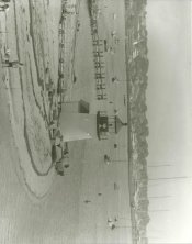
I just printed a color neg this weekend, and I would say results were just ok, not great. Printed on Ilford MGWT in Dektol, toned w/ KRST 1:20.

The reason I wanted to try it because I wasn't happy with the color cast I had on the original (which you can also see if you click on the link), but have very mixed feelings about digital conversions. Actually I have mixed feelings about the analog method as well...I feel like I should be trying to shoot color better or simply use b/w film rather than try to change what I've got. Anyway, I had to bump up the contrast quite a bit as it seemed flat without a filter, but 160S is a fairly subtle film and the added contrast just seems to defeat the purpose. I think I also printed too dark for the subsequent toning. But...well, there's my example.
The reason I wanted to try it because I wasn't happy with the color cast I had on the original (which you can also see if you click on the link), but have very mixed feelings about digital conversions. Actually I have mixed feelings about the analog method as well...I feel like I should be trying to shoot color better or simply use b/w film rather than try to change what I've got. Anyway, I had to bump up the contrast quite a bit as it seemed flat without a filter, but 160S is a fairly subtle film and the added contrast just seems to defeat the purpose. I think I also printed too dark for the subsequent toning. But...well, there's my example.
Last edited by a moderator:
And let's not forget that VC papers' contrast changes whit the color of the light projected on them. Using color negatives means that some parts of the picture will effectively have different contrast grades from others.
Using an "under the lens" filter would help solve some of that. Although depending on the color mix of the original negative image and the filter, some odd contrast issues can still happen. Anything that mixes as a red tone would likely print fairly light for example.
Using an "under the lens" filter would help solve some of that. Although depending on the color mix of the original negative image and the filter, some odd contrast issues can still happen. Anything that mixes as a red tone would likely print fairly light for example.
I don't think that would make any difference, under or over the lens. Let's say that you have a blue, a red and a yellow filter. Would it matter how you stack them? Would you get a different color if you changed the order?
| Photrio.com contains affiliate links to products. We may receive a commission for purchases made through these links. To read our full affiliate disclosure statement please click Here. |
PHOTRIO PARTNERS EQUALLY FUNDING OUR COMMUNITY:  |