I'm in the process of making my first batch of digital negatives on Inkpress Paper's transparency film. There isn't an ICC profile available for printing on an Epson SC P7000. I know I set the media to ultra premium luster and use PK ink. Other than that, any additional information is appreciated.
-
Welcome to Photrio!Registration is fast and free. Join today to unlock search, see fewer ads, and access all forum features.Click here to sign up
You are using an out of date browser. It may not display this or other websites correctly.
You should upgrade or use an alternative browser.
You should upgrade or use an alternative browser.
Digital Negative ICC Profile
-
H
- Thread starter BobDavid
- Start date


Recent Classifieds
-
For Sale Pentax SMC 135mm f3.5 lens
- Started by logan2z
-
For Sale Jobo Expert Drum 3006 4x5 or 5x7inch
- Started by mcnash
Forum statistics
You don't need an ICC profile - in fact, it doesn't really make a whole lot of sense to use one.
ICC profiles are used to ensure that the colors as printed by the printer match what is encoded in the digital data sent to the printer. The profile compensates for optical density variations due to the inks and paper used, but also non-linearities in the ink delivery system (i.e. the head itself).
When you're printing digital negatives, the calibration is done between the digital input data (your image, e.g. in Photoshop or in a dedicated print tool like QTR) and the final print as made with the target process (e.g. cyanotype etc.). Hence, to a large extent, what happens in the inkjet printing step doesn't really matter, as long as it's consistent (i.e. every time you print the same thing, it comes out the same).
You could (and indeed, can) make an ICC profile for the calibrated workflow if that happens to be a full-color workflow. This is what e.g. Calvin Grier does for his alt. process pigment prints (carbon, printmaker's friend and previously gum). But in that case, what you profile is not the inkjet printer and the inkjet negative, but the 'virtual printer' consisting of the entire chain comprising the inkjet printer, the digital negative and the finished & dried alt. process print.
So long story short: stop looking because there's no need or even a realistic need for this, and that's why it doesn't exist.
You don't need an ICC profile - in fact, it doesn't really make a whole lot of sense to use one.
ICC profiles are used to ensure that the colors as printed by the printer match what is encoded in the digital data sent to the printer. The profile compensates for optical density variations due to the inks and paper used, but also non-linearities in the ink delivery system (i.e. the head itself).
When you're printing digital negatives, the calibration is done between the digital input data (your image, e.g. in Photoshop or in a dedicated print tool like QTR) and the final print as made with the target process (e.g. cyanotype etc.). Hence, to a large extent, what happens in the inkjet printing step doesn't really matter, as long as it's consistent (i.e. every time you print the same thing, it comes out the same).
You could (and indeed, can) make an ICC profile for the calibrated workflow if that happens to be a full-color workflow. This is what e.g. Calvin Grier does for his alt. process pigment prints (carbon, printmaker's friend and previously gum). But in that case, what you profile is not the inkjet printer and the inkjet negative, but the 'virtual printer' consisting of the entire chain comprising the inkjet printer, the digital negative and the finished & dried alt. process print.
So long story short: stop looking because there's no need or even a realistic need for this, and that's why it doesn't exist.
Thank you.
djdister
Subscriber
The folks at Bostick & Sullivan have suggestions for Look Up Tables (LUTs) for making digital negatives, see this https://www.bostick-sullivan.com/digital-negatives-lut/
I'm in the process of making my first batch of digital negatives on Inkpress Paper's transparency film. There isn't an ICC profile available for printing on an Epson SC P7000. I know I set the media to ultra premium luster and use PK ink. Other than that, any additional information is appreciated.
You can use any icc profile as long as you use the same for the whole process, i.e. icc profile for making the actual negative should match the one used when creating the correction curve. I would use the Epson Ultra Premium Luster paper profile for P7000 since you are already using that media type.
:Niranjan.
I use the P7000 to make digital negatives, I as well use luster setting and PK inks.. As Korak's mentions above you
need to calibrate your negative using quadtone rip, and a I one spectrometer. I print using Print Tool and in the future
Greg and I are going to try to avoid Quad tone rip and print tool but do this all through PS.
Spoiler alert - if you are not digitally alert, and do not have really good computer skills I would suggest you have someone make the profile for you.
I use a friend in NY who does this for me, once it is made and you have it in print tool you will never need to do again. For example my first
profile was made by Ron Reeder who visited me a couple of times and I used his curve for 10 years. I recently felt that I needed to make a new curve and had Greg Brophy make it for us. I now use his curve, the difference is initially Ron did not put in blocking colours, but Greg has done so. My negatives are green/yellow.
Once you have this linerizatin for the film you are using with PK inks, I have found that I can use the same curve for , my gum negs, my silver negs, my cyanotype negs. Initially I had the curve made from Pt Pd output using 100 step wedge input and then Greg reads the output print and use Boutwells system for bringing the output numbers to match the input numbers. Then remotely he jumps on my computer and loads the profile.
As you can see though I understand what they are doing , I personally am like a deer in the headlights with this part of photography and I pass the roll on to others more patient than I. In reality I have saved money by not doing it myself, just Gregs fee and shipping costs of sending the prints to him.
gbroadbridge
Subscriber
It really depends on the end to end process.
Print it and see how it turns out
Print it and see how it turns out
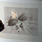
My first digital negative for vandyke brown. I used the Bostick & Sullivan curve. I'm thinking it's too thin. Any thoughts?
The proof is in the printing.
I expect that the shadows have insufficient differentiation for that printing process, but see how it goes.
How exactly did you apply the B&S curve?
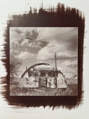
My first halfway decent vandyke brown. I had three negatives and this is the one that came out best. Still, it doesn't have as much sparkle as I'd like. I think I need to make denser negatives, but am wondering if I'm at the limit of what my Epson and the Inkjet Press transparency film can render. I looked at the Bostick & Sullivan curve and discarded it as it removed too much detail and flattened out the contrast. I found that letting the printer instead of Photoshop manage the print worked much better. I set the media for premium glossy and the rendering intent at saturation. I am wondering if the sodium thiosulfate solution might have been slightly weaker than it should have been.
Attachments
gbroadbridge
Subscriber
I went though a similar learning process about 12 months ago.
Burned through a couple of packets of HPR, other types of Paper, three different types of transparency film, two different printer drivers with many different printer settings before I was happy with the outcome.
So many variables and then a couple that are difficult to control like humidity.
Ticked off the bucket list at least..
You'll get there in the end
I went though a similar learning process about 12 months ago.
Burned through a couple of packets of HPR, other types of Paper, three different types of transparency film, two different printer drivers with many different printer settings before I was happy with the outcome.
So many variables and then a couple that are difficult to control like humidity.
Ticked off the bucket list at least..
You'll get there in the end
At least I don't need to worry about humidity, being that I live in Colorado, a few miles away from the Rockies. What transparency film are you using?
gbroadbridge
Subscriber
At least I don't need to worry about humidity, being that I live in Colorado, a few miles away from the Rockies. What transparency film are you using?
This worked really well - most other materials I tried gave insufficient density with my Canon printer.
Edit: I need to point out though, it was the combination of this film and a third party printer driver that did the trick for me. The Canon driver for my printer does not work with transparencies.
I just ordered Pictorico Pro Ultra Premium OHP Transparency Film (my printer is an Epson). I went back to the Bostick & Sullivan and dug a bit deeper. I downloaded their LUT/ICC profile combination. I'm hopeful that will yield a better result than what I tried earlier.
gbroadbridge
Subscriber
I just ordered Pictorico Pro Ultra Premium OHP Transparency Film (my printer is an Epson). I went back to the Bostick & Sullivan and dug a bit deeper. I downloaded their LUT/ICC profile combination. I'm hopeful that will yield a better result than what I tried earlier.
I would have tried Pictorico, but it's impossible to obtain here.
Looks pretty good to me!My first halfway decent vandyke brown.
Can you define what 'sparkle' means to you? What are you missing in this print?it doesn't have as much sparkle as I'd like.
The first thing to do is to determine the exposure time, through a blank piece of inkjet film, that will give the (desired) maximum density (dmax) of your printing process. If dmax is unsatisfactory and additional exposure doesn't make the dmax any higher, then work on the printing process first and forget about the whole inkjet stuff until you fix that. There's no sense in trying to linearize a printing process that's not consistently working.I think I need to make denser negatives
With 'printing process' I mean in this case the Van Dyke Brown output process, not the inkjet print.
Almost certainly not a problem. Epson pigment inks can easily build waaaaay more density than you need for this.but am wondering if I'm at the limit of what my Epson and the Inkjet Press transparency film can render.
I think you need to read a few texts on linearization. There's a couple of approaches and accompanying tools available. Easy Digital Negatives and Precision Digital Negatives are popular approaches. Hands-down the best text I've read on the subject is Calvin Grier's "Calibration for Alternative Photographic Processes".I looked at the Bostick & Sullivan curve and discarded it as it removed too much detail and flattened out the contrast. I found that letting the printer instead of Photoshop manage the print worked much better.
Epson pigment matte black ink builds more UV density than photo black. You will generally get the best results if you set the paper setting to 'Epson archival matte'.I set the media for premium glossy and the rendering intent at saturation.
Consider using QTR; it has a learning curve, but will give you virtually full control over how the printer uses the various ink channels. It's far, far more flexible than the Epson print dialog - although can get perfectly good results with just that, too.
See remark above; first nail the target process. You're now juggling a host of variables and the "guess & let's see" approach will throw you for a loop. That's not a possibility, it's guaranteed to happen. You can still get decent prints even if you poke around quasi-randomly, but most of the time, people who do this end up optimizing for one particular kind of image and then get stuck again later on, or they get lost in the woods again (and again and again) once a parameter changes somewhere.I am wondering if the sodium thiosulfate solution might have been slightly weaker than it should have been.
Pictorico and Fixxons are virtually identical, and both are only very marginally better than the cheap, generic screen printing inkjet film linked to by @gbroadbridge That film, btw, will work perfectly fine for what you're doing. The only meaningful difference between Pictorico and Fixxons on one side and the cheap screen printing stuff on the other, is that the former will accept a few percent more ink. However, for a process like Van Dyke that's irrelevant as the cheap film can take way more ink than you need.I just read that Fixxons is supposed to be as good and much cheaper.
I really recommend Calvin's eBook series. You don't even need to read or adopt all of it. Just give the first couple of chapters (the ones about monochrome) a read. Regardless of whether you end up using Calvin's tools or exact approach, he does a great job at explaining the basics in a robust as well as easily accessible manner. It's well worth the money.
I found this useful though might not be perfect for specific processes:
Mike Ware
Siderotype Workshop Notes - Preparation of Digital Negatives
Mike Ware
Siderotype Workshop Notes - Preparation of Digital Negatives
Print a 100 step-wedge, see if it renders well first or do a 21 step wedge, everything else is just time , material wasting. You need to match your output values to your input values, nothing short of this will give you exceptional , repeatable results.
gbroadbridge
Subscriber
Print a 100 step-wedge, see if it renders well first or do a 21 step wedge, everything else is just time , material wasting. You need to match your output values to your input values, nothing short of this will give you exceptional , repeatable results.
You still end up printing lots of tests trying to find a combination of paper, film, ink and printer to get the step wedge printing correctly.
Even more difficult without an experienced eye which only comes with practice.
| Photrio.com contains affiliate links to products. We may receive a commission for purchases made through these links. To read our full affiliate disclosure statement please click Here. |
PHOTRIO PARTNERS EQUALLY FUNDING OUR COMMUNITY:  |