


mooseontheloose
Moderator
I've just started experimenting with cyanotypes while my darkroom is a no-go and I have a few questions. I'm currently using the basic cyanotype kit from Bostick and Sullivan (A+B), my exposures on sunny days run between 30-60 minutes.
My biggest problem seems to be coating the paper. I have a glass rod but all attempts with it produce blotchy results. I get kind of cool "antique-y" look to it but the image is not clear at all and the colour is quite uneven. Coating (especially double coating) with a hake brush seems to produce a much better print -- it's more even overall. But...I have a problem with beading when using the brush -- the brush strokes on the edges look absolutely horrible. I suppose I could mask it off, but is there some trick or technique to get consistent nice-looking brush strokes without the beading?
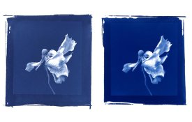
Finally, my last question is about the blue colour. What creates a nice deep, dark blue? My blues, although nice, don't have the deep blue richness that I've seen from other cyanotypes, whether it be through the postcard exchange or in books. I have a much paler blue. Is it the exposure time? The chemicals? The paper? Pre- or post-treatment to the paper? I have tried hydrogen pyroxide, bleaching, and toning techniques, and although I like the effects they produce, they don't do much to deepen the original blue colour that has been consistent with the cyanotypes I've done recently.
My biggest problem seems to be coating the paper. I have a glass rod but all attempts with it produce blotchy results. I get kind of cool "antique-y" look to it but the image is not clear at all and the colour is quite uneven. Coating (especially double coating) with a hake brush seems to produce a much better print -- it's more even overall. But...I have a problem with beading when using the brush -- the brush strokes on the edges look absolutely horrible. I suppose I could mask it off, but is there some trick or technique to get consistent nice-looking brush strokes without the beading?
Finally, my last question is about the blue colour. What creates a nice deep, dark blue? My blues, although nice, don't have the deep blue richness that I've seen from other cyanotypes, whether it be through the postcard exchange or in books. I have a much paler blue. Is it the exposure time? The chemicals? The paper? Pre- or post-treatment to the paper? I have tried hydrogen pyroxide, bleaching, and toning techniques, and although I like the effects they produce, they don't do much to deepen the original blue colour that has been consistent with the cyanotypes I've done recently.