• Welcome to Photrio!
    Registration is fast and free. Join today to unlock search, see fewer ads, and access all forum features.
    Click here to sign up

Critique (Yes I know there is a section on the gallery)

Do Not Come Here

A
Do Not Come Here

  • 1
  • 0
  • 8
Heavy

H
Heavy

  • 8
  • 5
  • 87

Recent Classifieds

Forum statistics

Threads
201,919
Messages
2,832,034
Members
101,016
Latest member
brodykatie
Recent bookmarks
5

LifeIn35mm

Subscriber
Allowing Ads
Joined
Apr 5, 2014
Messages
122
Location
Boulder, Co
Format
35mm
Hey! So I would love to hear everyones opinions on my shots. I know that there is a critique section in the gallery for subscribers like myself but I don't get good advice on there (plus non subscribing members can't give me advice). My first critique I posted received like 8 pages of advice (I don't expect that much but I hope for a page or two of good advice). Please be brutally honest and as harsh as you see fit. If you hate my photos and think that I am a waste of film and a camera please tell me so and what I'm doing wrong. I just started taking photos in January when my high school class started so I do need advice. I'm looking forward to receiving great advice from the awesome APUG community.

Here are the groups:

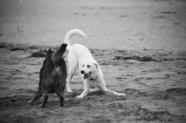
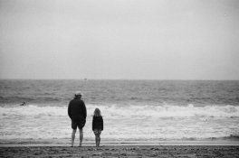
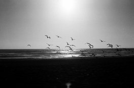
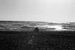
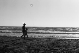
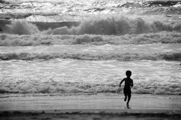
Beach: Images 1-2 4-7

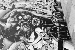
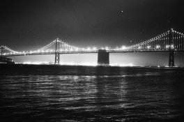
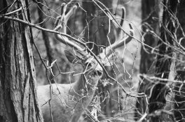
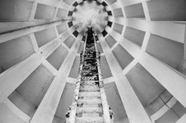
Culture (Cant find the right word, unique things that are different from somewhere else): 3 8-11

I will have to think you all in advance so I don't have to write thank you in every reply (Just know that I am grateful for your advice).

Also, I know that there are some things wrong with developing. I am not in school right now so I don't have access to a place where I can develop my own images. So, I had to have somewhere else to get them developed and they truly aren't the best.
 

Attachments

  • 02380021.JPG
    02380021.JPG
    827 KB · Views: 152
  • 02380032.JPG
    02380032.JPG
    897.1 KB · Views: 140
  • 02400021.JPG
    02400021.JPG
    600.7 KB · Views: 173
  • 02400024.JPG
    02400024.JPG
    746.8 KB · Views: 136
  • 02400028.JPG
    02400028.JPG
    776.5 KB · Views: 143
  • 02500034.JPG
    02500034.JPG
    1 MB · Views: 145
  • 02270029.JPG
    02270029.JPG
    800.2 KB · Views: 118
  • 02530029.JPG
    02530029.JPG
    829.9 KB · Views: 133
  • 02540003.JPG
    02540003.JPG
    652.9 KB · Views: 132
  • 02420020.JPG
    02420020.JPG
    997.4 KB · Views: 145
  • 02500012.JPG
    02500012.JPG
    950.3 KB · Views: 188
Last edited by a moderator:

Jaf-Photo

Member
Allowing Ads
Joined
Feb 12, 2014
Messages
495
Format
Medium Format
No 3 has the best composition. No 7 has good composition and good light. The silhouette is excellent.

The development is really awful. With some more effort in the scanning and post processing they should come out a lot better.

Why not get a tank and some easy chems?
 

ruby.monkey

Member
Allowing Ads
Joined
Sep 17, 2009
Messages
98
Location
Orpington, L
Format
Medium Format
General observations - reticulation and dirt make it hard to judge the innate picture quality. Think about using something like XP2 which can be processed by any minilab.

1) Focus too short of the subject? Girl well placed but man's head fades a into sea. Might work better with greater DoF - background objects are just distracting blobs.
2) Nice feeling of action, but I would prefer it cropped such that the framing were centred on the two dogs. Focus is completely off.
3) Well balanced and interesting composition. Unfortunately lines draw eye to OOF region. Needs greater depth of field to get roof sharp.
4) Centred horizon doesn't help - birds disappearing into sea/sand. Should have got down in the dirt and silhouetted them against the sky.
5) It's a blob amidst three shaded bands.
6) Not really interesting. I think it could have worked if you had shot from down in the sand, bringing the horzon down to below the girl's waist. As it is, she doesn't really stand out against the sea.
7) Composition is good, subject is interesting and I love the energy of the waves and running child. Again, greater DoF needed to get the child in focus too. Perhaps a tighter vertical crop, full height but with the child on the right thirds line?
8) Needs to be framed to exclude the trees; and you shot from the wrong side given from where the light is coming.
9) Shaky hands? And you had a deer in the shot, and instead focussed on the branch in front of it? Why?
10) Interesting, and I like the exposure. The sloping horizon is distracting, and perhaps the bridge could have been placed higher to remove most of the empty sky and bring in more of the lit water.
11) (Apart from falling over) - cropped too tightly at the top and needs to have been shot from straight on. The mural loses its impact when viewed from an angle.
 
OP
OP
LifeIn35mm

LifeIn35mm

Subscriber
Allowing Ads
Joined
Apr 5, 2014
Messages
122
Location
Boulder, Co
Format
35mm
General observations - reticulation and dirt make it hard to judge the innate picture quality. Think about using something like XP2 which can be processed by any minilab.

1) Focus too short of the subject? Girl well placed but man's head fades a into sea. Might work better with greater DoF - background objects are just distracting blobs.
2) Nice feeling of action, but I would prefer it cropped such that the framing were centred on the two dogs. Focus is completely off.
3) Well balanced and interesting composition. Unfortunately lines draw eye to OOF region. Needs greater depth of field to get roof sharp.
4) Centred horizon doesn't help - birds disappearing into sea/sand. Should have got down in the dirt and silhouetted them against the sky.
5) It's a blob amidst three shaded bands.
6) Not really interesting. I think it could have worked if you had shot from down in the sand, bringing the horzon down to below the girl's waist. As it is, she doesn't really stand out against the sea.
7) Composition is good, subject is interesting and I love the energy of the waves and running child. Again, greater DoF needed to get the child in focus too. Perhaps a tighter vertical crop, full height but with the child on the right thirds line?
8) Needs to be framed to exclude the trees; and you shot from the wrong side given from where the light is coming.
9) Shaky hands? And you had a deer in the shot, and instead focussed on the branch in front of it? Why?
10) Interesting, and I like the exposure. The sloping horizon is distracting, and perhaps the bridge could have been placed higher to remove most of the empty sky and bring in more of the lit water.
11) (Apart from falling over) - cropped too tightly at the top and needs to have been shot from straight on. The mural loses its impact when viewed from an angle.

I have a few questions. What does it mean if the focus is too short on the subject? What do you mean when you say greater DoF (Smaller aperture)? On 3 I actually got a shot with the roof in focus but I liked this one more. Is there a reason why the roof should be in focus? What is a tighter vertical group? On 8 I also got a shot from the other side, why would a shot from the other side be better? On 9 I actually didn't focus it correctly (first time using a zoom lens). What do you mean when you say falling over?
 

StoneNYC

Member
Allowing Ads
Joined
Aug 5, 2012
Messages
8,345
Location
Antarctica
Format
8x10 Format
Anyone else?

All I know is the birds one is great, I disagree completely that this should have been in the sky, the ground detail adds context to the image, anyone can take an image of birds in the sky, but getting them low on the ground like that with a great silhouette exposure isn't easy "in the moment" so I would say that's my favorite shot and wouldn't change a thing about it (besides maybe the dust).

It would help to know what film and what developer and the exposure index you used and the dev times just out of curiosity.

If it was lab done, then at least what film and exposure index you used (and you should find out from them what dev they use for the future when you do it yourself).
 
OP
OP
LifeIn35mm

LifeIn35mm

Subscriber
Allowing Ads
Joined
Apr 5, 2014
Messages
122
Location
Boulder, Co
Format
35mm
All I know is the birds one is great, I disagree completely that this should have been in the sky, the ground detail adds context to the image, anyone can take an image of birds in the sky, but getting them low on the ground like that with a great silhouette exposure isn't easy "in the moment" so I would say that's my favorite shot and wouldn't change a thing about it (besides maybe the dust).

It would help to know what film and what developer and the exposure index you used and the dev times just out of curiosity.

If it was lab done, then at least what film and exposure index you used (and you should find out from them what dev they use for the future when you do it yourself).

I use Ilford HP5 400. I can develop it at school and I have never messed it up, yet.
 

ruby.monkey

Member
Allowing Ads
Joined
Sep 17, 2009
Messages
98
Location
Orpington, L
Format
Medium Format
LifeIn35mm said:
I have a few questions. What does it mean if the focus is too short on the subject? What do you mean when you say greater DoF (Smaller aperture)? On 3 I actually got a shot with the roof in focus but I liked this one more. Is there a reason why the roof should be in focus? What is a tighter vertical group? On 8 I also got a shot from the other side, why would a shot from the other side be better? On 9 I actually didn't focus it correctly (first time using a zoom lens). What do you mean when you say falling over
Focus too short of the subject - it looks like you've focussed on the sand short (towards the viewer) of the man and girl. Unless that sand is your intended point of interest, your focus is off. DoF == depth of field (sorry, I was beefing up some rough notes and forgot to expand that abbreviation), so shooting with a smaller aperture would be one way of increasing this.

With photo number three, everything is drawing one's attention to the - I won't say roof, but, rather, the circle from which all the lines radiate. Of course you can play with that, as you did, by focussing on something other than the expected, but I don't think the ladder is interesting enough to make that work in this case.

Photo seven - 'What is a tighter vertical group' - I was talking about cropping off the sides of the image to place more emphasis on the running child. Something like:
02420020_crop.JPG
(This is only a suggestion for an alternative presentation. Your photo as it stands is a good one.)

Photo eight - looks like the light is coming from the other side of the boat; also from the angle between the boat and background row of trees it looks like you'd have more chance of working with an uncluttered background - and you wouldn't have that street light sticking out of your subject.

Photo the Last - needs rotating to portrait orientation.

One thing I'd suggest is that, when editing your photos, you also view them as thumbnails (like they're shown in your opening post). You'll quickly see the overall structure of your image and where is the natural point of interest lies within the frame.
 

ruby.monkey

Member
Allowing Ads
Joined
Sep 17, 2009
Messages
98
Location
Orpington, L
Format
Medium Format
Also, traditional black and white film is wonderful when you can process it yourself, or get it done correctly; but C41 film (which includes Ilford XP2) is a far better bet if you have to rely on a high-street processor since that's what they're set up to handle.
 

ruby.monkey

Member
Allowing Ads
Joined
Sep 17, 2009
Messages
98
Location
Orpington, L
Format
Medium Format
All I know is the birds one is great, I disagree completely that this should have been in the sky, the ground detail adds context to the image, anyone can take an image of birds in the sky, but getting them low on the ground like that with a great silhouette exposure isn't easy "in the moment" so I would say that's my favorite shot and wouldn't change a thing about it (besides maybe the dust).
I don't think I explained very well - I meant that he should take the shot from lower down to silhouette the birds against the sky just above the horizon line, while still keeping sea and sand in the photo.
 

StoneNYC

Member
Allowing Ads
Joined
Aug 5, 2012
Messages
8,345
Location
Antarctica
Format
8x10 Format
I don't think I explained very well - I meant that he should take the shot from lower down to silhouette the birds against the sky just above the horizon line, while still keeping sea and sand in the photo.

Oh gotcha, although, I'm not sure the birds would have cooperated with that shot, as some were still on the ground in this image. But I see what you mean.
 
Photrio.com contains affiliate links to products. We may receive a commission for purchases made through these links.
To read our full affiliate disclosure statement please click Here.

PHOTRIO PARTNERS EQUALLY FUNDING OUR COMMUNITY:


Ilford ADOX Freestyle Photographic Stearman Press Weldon Color Lab Blue Moon Camera & Machine
Top Bottom