Controlling mid-tones during printing

about to extinct

D
about to extinct

  • 0
  • 0
  • 52
Fantasyland!

D
Fantasyland!

  • 9
  • 2
  • 119
perfect cirkel

D
perfect cirkel

  • 2
  • 1
  • 124
Thomas J Walls cafe.

A
Thomas J Walls cafe.

  • 4
  • 8
  • 298

Recent Classifieds

Forum statistics

Threads
198,748
Messages
2,780,318
Members
99,693
Latest member
lachanalia
Recent bookmarks
1

Jonathan R

Member
Joined
Jan 3, 2008
Messages
86
Location
UK
Format
35mm RF
How can I gain control of the mid-tones when printing? A problem I commonly face is boosting mid-tone contrast without spoiling highlights and shadows separation. I can do it by burning in selected areas of the print with a higher grade filter, but what if the problem is across the whole print? Is there some subtle aspect of multigrade printing I have failed to understand, or can one do this by choice of print developer, or what?

Thanks in anticipation.
 

Neal

Subscriber
Joined
Dec 3, 2004
Messages
2,019
Location
Chicago, West Suburbs
Format
Multi Format
Dear Jonathan,

Tough to do (I have similar problems when printing very fair skinned people). Contrast (unsharp) masking can help with the shadows. I suppose a positive version should help with the highlights. Maybe you are having issues with the non linear nature of multigrade paper? Try graded paper for the images in question. I have had good luck more than once going in that direction.

Neal Wydra
 

Oren Grad

Member
Joined
Feb 17, 2005
Messages
1,619
Format
Large Format
The most important driver of tonal rendition is the interaction between the characteristic curves of the film and paper. The closer you get with that, the less you need to do labor-intensive local manipulations with each print. So the first thing to do is find a film/paper combination that gets you closest to what you're looking for.

Read Phil Davis's "Beyond the Zone System" if you would like to understand how this works.
 
OP
OP

Jonathan R

Member
Joined
Jan 3, 2008
Messages
86
Location
UK
Format
35mm RF
Even if I could change my future negatives, I still have those existing problem negatives to print!

Actually I am shooting 35mm (diverse subjects on each roll), and I always use the Thornton 2-bath (T2b). I settled on this through about 25 years of frustration, trial and error. I'm very happy with my choice for many reasons and I am not going to change, so please don't suggest it. A real joy of my negatives since settling on T2b is that long 'tails' of shadow and highlight detail are recorded on the negative, contributing to a very rich tonality when everything goes right. The cost is that in a small minority of shots where the the mid-tones matter more it can be hard to inject any sparkle. This is fairly easy to correct digitally using Curves, accepting some compression in highlights or/or shadows, but still retaining the detail at those ends of the scale. What I'm looking for is the analogue equivalent. I thought maybe the answer would be different print developers?
 

baachitraka

Member
Joined
Apr 6, 2011
Messages
3,553
Location
Bremen, Germany.
Format
Multi Format
It depends on film/paper curves. BTZS may be the answer for you.

Chapter 10 : Image Gradation.
 

Blighty

Member
Joined
Oct 11, 2004
Messages
914
Location
Lancaster, N
Format
Multi Format
I sometimes have this problem when printing negs and it can't always be avoided at the exposure/neg/development stage. If you're mids are a bit muddy you could try dodging the area during the soft exposure; this, in effect, is increasing contrast without increasing exposure and stops that propensity for the dark tones to block up with too much hard exposure
 

brian steinberger

Subscriber
Joined
Jan 5, 2007
Messages
3,007
Location
Pennsylvania
Format
Med. Format RF
Split grade printing is how I would handle it. Find the exposure for the shadows first. Then find the highlight exposure for your main highlights and dodge the midtone areas you want more contrast during the highlight exposure.

OR, you could find the contrast that gives you good midtone separation and then burn your main highlights with g0 or g1. This may be easier. Every negative is different. For a simple landscape on a overcast day, I would find the contrast that gives the foreground good separation (as usually this is pretty flat in the negative), this is usually rather high, like g3 or g4. Then I'll find the exposure for the sky at g00, or if there is some separation in the sky I may choose g2 or g3. This is part of the fun of printing, and especially split grade printing!
 
Joined
Jan 21, 2003
Messages
15,708
Location
Switzerland
Format
Multi Format
Everything is a compromise, but you can make your work flow less of a compromise by starting in the right place.

Your choice of negative developer and developing technique has entirely to do with what your paper and paper developer of choice can do. Whether you want to change film developer or not, that is your major control point. If you choose to use a film developer for any other reason than making negatives that fit your paper, then you have to live with the consequences of that compromise. That's the harsh reality. Two bath developers are a good compromise, but if you're not happy with how the negatives print, then honestly your film developing is not ideal for what you're trying to do. So I broke your rule of 'not mentioning it', but I did it on purpose in order to be disruptive on purpose, to get you to think about why you make choices that will not suit what you're trying to accomplish.

In lieu of accomplishing that MichaelR1974 has explained it perfectly. If you want to continue with what you're doing now at the film stage, you should learn fine printing tools and controls to compensate for what's lacking in your negatives.

Good luck!
 

Oren Grad

Member
Joined
Feb 17, 2005
Messages
1,619
Format
Large Format
Even if I could change my future negatives, I still have those existing problem negatives to print!

Actually I am shooting 35mm (diverse subjects on each roll), and I always use the Thornton 2-bath (T2b). I settled on this through about 25 years of frustration, trial and error. I'm very happy with my choice for many reasons and I am not going to change, so please don't suggest it. A real joy of my negatives since settling on T2b is that long 'tails' of shadow and highlight detail are recorded on the negative, contributing to a very rich tonality when everything goes right. The cost is that in a small minority of shots where the the mid-tones matter more it can be hard to inject any sparkle. This is fairly easy to correct digitally using Curves, accepting some compression in highlights or/or shadows, but still retaining the detail at those ends of the scale. What I'm looking for is the analogue equivalent. I thought maybe the answer would be different print developers?

That's fine, it just means that your film is a given. You still need to decide how to allocate your effort between finding a best paper match, trying to change the paper curve with choice of developer, and doing complex manipulations on each print.

Assuming that the film choice is already made, the biggest influence by far on curve is the choice of paper. Choice of print developer will generally have a much smaller effect, if any. Local manipulation is needed to fix the problems caused by not having a paper with the curve you need to match the film/developer combination you've settled on.

There's no guarantee that you can find a paper with a perfect match, because there's a limited set of papers available. If you can't find one that's right, and you don't want to change your film/developer, then you're stuck doing local manipulation.

What paper are you currently using?
 
Last edited by a moderator:

Oren Grad

Member
Joined
Feb 17, 2005
Messages
1,619
Format
Large Format
Your choice of negative developer and developing technique has entirely to do with what your paper and paper developer of choice can do.

Or, you can view it the other way around: your choice of paper depends entirely on what your film and film developer will do. That's how it works for me: I use Tri-X and HP5 Plus, developed in D-76. I keep a selection of papers on hand, with a variety of characteristic curves, so that I can print the resulting negatives with a minimum of hassle.

In reality, of course, the choice of film/film developer and paper/paper developer jointly determine the result. "Paper priority" or "film priority" is a restriction that we impose arbitrarily.
 
Joined
Jan 21, 2003
Messages
15,708
Location
Switzerland
Format
Multi Format
Or, you can view it the other way around: your choice of paper depends entirely on what your film and film developer will do. That's how it works for me: I use Tri-X and HP5 Plus, developed in D-76. I keep a selection of papers on hand, with a variety of characteristic curves, so that I can print the resulting negatives with a minimum of hassle.

In reality, of course, the choice of film/film developer and paper/paper developer jointly determine the result. "Paper priority" or "film priority" is a restriction that we impose arbitrarily.

True, but you have far more control over your negatives than you do your paper. A paper does not change in contrast much by developing longer, for example, it just adds density fairly uniformly, while a negative will continue to add contrast as you develop longer, for all practical reasons in perpetuity.
But whatever floats your boat is fine with me. I kind of like printing everything on one kind of paper. It makes it far more economical by needing less paper stock, and I know exactly what I need to do with my negatives in terms of exposure and development in order to print in the darkroom where most of my negatives are dead easy to print. Rarely do I have to fight a negative to get what I want.
 
OP
OP

Jonathan R

Member
Joined
Jan 3, 2008
Messages
86
Location
UK
Format
35mm RF
I kind of like printing everything on one kind of paper. ..... Rarely do I have to fight a negative to get what I want.

I'm with both of those statements. I stick with 2 film types and one paper type in 2 sizes, because this gives a consistent look to my 'portfolio' (if that isn't too pretentious). It also gives the opportunity to get really familiar with the materials. Currently I use FP4+ and HP5+, both in BT2b; and Ilford MG IV FB developed in Ilford Print Dev. I like the neutral tones of the MG. And as I've said, this problem of muddy mid-tones is a small minority of my negs. Quite a lot of my negs print absolutely straight on Grade 2, and most of the rest I cope with quite competently. A real gap in my competence is that I have never done split-grade printing: partly because I haven't found a need, and partly because I have no colour head and am picky about using filters under the lens.

Look, I hate to keep harking back to the same point, but I'm sure that in the days when we all used separate grades of paper, there were ways of obtaining intermediate contrast grades by judicious use of chemicals. I'm certain I once read about it - but because I was already using MG paper I didn't think I'd ever need it, and failed to commit it to memory. I suppose it's likely that developers with different activity would alter image tone, but I'd still like to know what's possible.
 

Oren Grad

Member
Joined
Feb 17, 2005
Messages
1,619
Format
Large Format
Look, I hate to keep harking back to the same point, but I'm sure that in the days when we all used separate grades of paper, there were ways of obtaining intermediate contrast grades by judicious use of chemicals. I'm certain I once read about it - but because I was already using MG paper I didn't think I'd ever need it, and failed to commit it to memory. I suppose it's likely that developers with different activity would alter image tone, but I'd still like to know what's possible.

Yes there were ways of modifying paper contrast with fixed grades. People would often split paper development between a higher and lower contrast developer to get intermediate grades. Flashing was also a more important tool with graded paper. These techniques wouldn't do much for your midtone issue though. They are mostly aimed at controlling total contrast. Your issue seems to have more to do with local contrast in the midtones.

What Michael said. The problem you're having is with the shape of the curve - the way tones are distributed between highlights, midtones and shadows - not with the slope or overall contrast. Print developers aren't going to give you much help with the shape. If you're committed to using the same paper for everything, and you don't want to change your film/film developer, then I end up in the same place as Michael - the only thing left is to learn how to balance overall contrast and local manipulation most effectively.
 

MattKing

Moderator
Moderator
Joined
Apr 24, 2005
Messages
52,873
Location
Delta, BC Canada
Format
Medium Format
Split grade is definitely the way to proceed - and below lens filters work very well if they are handled carefully.

There is lots of good advice already in this thread.

As an experiment I would suggest trying a print where your only attention is to those problematic mid-tones. Get to a print where you are happy with those, and then determine what split grade modifications you need to print the other tones.

FWIW, this is essentially how I approach all my prints - I focus first on the most important tones - usually, but not always the mid-tones - and then work with the rest.
 

DREW WILEY

Member
Joined
Jul 14, 2011
Messages
13,926
Format
8x10 Format
I generally prefer relatively straight-line films so that I get good value separation even deep down in
the shadows, but might "plus" develop to expand the midtones and highlights, then burn will in the
highlights with a deep green filter on a premium VC paper. A more elegant method is unsharp masking.
Actually, I intend this as a clue - my personal route will vary from image to image. The more tools in
your kit of strategy, the better.
 

David Allen

Member
Joined
Nov 6, 2008
Messages
991
Location
Berlin
Format
Med. Format RF
Dear Jonathan,

My first question is what times are you using with what film in BTTB developer? - This is important in giving you meaningful advice.

Secondly, negatives developed with BTTB developer should print fine on normal grades but what are you looking for?

If you look at the images on my website, please let me know how they relate to the type of images YOU want to produce and then I can advise further.

Bests,

David
www.dsallen.de
 

Bob Carnie

Subscriber
Joined
Apr 18, 2004
Messages
7,735
Location
toronto
Format
Med. Format RF
I found mask making necessary for Cibachrome images, we would make all kinds of masks, would increase or decrease contrast for slides , we would hold highlight detail without dulling overall the highlights by using a pre mask when making the contrast reducing mask .
This is something I cut my teeth on, for years I was a photo comp specialist in a major lab, and I think I have basically burned out my eyeballs by looking intently into light boxes.

Drew is correct, for major work where you are making masks day in day out a registration system along with vacumn is really required. I swore I would never get back into this world but it seems Ultra Stable registration printing is pulling me back and I am very happy to have had the experience.

I just picked up a small strosser punch systemto go with my larger one over the weekend and soon will be back making all kinds of separation negatives and carmalizing what is left of my eyes.
 

NedL

Subscriber
Joined
Aug 23, 2012
Messages
3,388
Location
Sonoma County, California
Format
Multi Format
I sometimes have this problem when printing negs and it can't always be avoided at the exposure/neg/development stage. If you're mids are a bit muddy you could try dodging the area during the soft exposure; this, in effect, is increasing contrast without increasing exposure and stops that propensity for the dark tones to block up with too much hard exposure

I'm sure Thomas Bertilsson and Michael1974* are giving the best advice here. It must be amazing how much printing experience they have between the two of them! I'm only going to say that I've been surprised at the amount of midtone contrast control that is possible by dodging the soft exposure, just as Blighty said. One thing I sometimes do is make a test strip just to determine that dodging ( or sometimes more than a "strip" if I want to vary the dodging in several places on the print). Usually not much dodging is needed at all, but the amount of control is great, and sometimes a print will just suddenly look great when the midtone contrast is at a certain point. Please note that I'm a beginner so I like test strips. :smile:


Edit: *and Bob Carnie and everyone else! I meant as opposed to me!
 
Last edited by a moderator:

DREW WILEY

Member
Joined
Jul 14, 2011
Messages
13,926
Format
8x10 Format
Michael - with a "typical" neg (whatever that is), the whole point of a generic unsharp mask is to reduce contrast overall yet use a much harder paper grade than you usually would, hence increasing
microcontrast and visible textural detial the entire range - toe, midtones, and highlights. But there are
all kinds of variation on the theme; in black and white printing there can sometimes be too much of an
allegedly good thing. It's an esthetic decision, one which I generally defer to split printing. Back when
graded papers were dominant, I masked more often. Nowadays I use such tricks mainly for color printing, but find the option itself to be quite valuable at times. Maybe one eats antelope on a routine
basis, but every once in awhile you get a negative like a charging rhino and need a more substantial
kind of weapon.
 
OP
OP

Jonathan R

Member
Joined
Jan 3, 2008
Messages
86
Location
UK
Format
35mm RF
To all those who have given their advice here, my sincere thanks. I will go no further until I have explored all you say.

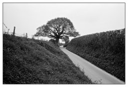
To DS Allen: I usually give 4 1/2 min in both baths of the BT2b, for both FP4+ and HP5+. I do vary these slightly according to subject type. Funnily enough, the kind of subjects that give me most trouble don't feature at all on your website. They often involve grass or vegetation. Here's an example, which I have 'fixed' digitally here.
Portfolio3 45.jpg
 

Alan Ross

Member
Joined
Feb 25, 2010
Messages
22
Location
Santa Fe, Ne
Format
Multi Format
It's hard to say what the problem is without seeing negative or print - but the issue would seem to be a bit puzzling since the mid-tones are typically the steepest (most contrasty) part of a film's characteristic curve! Since you say that it is sometimes an over-all problem making specific dodging/burning difficult - like a speckled deep forest with a multitude of scattered deep shadows and sparkling sunspots with patches of "low-contrast" midtones, one approach might be using a combination of increased contrast to perk up the mid-tones, with Selective Masking to dodge the shadows and start with a bit of pre-exposure to tame the highlights. You could also use masking to burn in troublesome highlights with a lower contrast.

Good luck!
 

David Allen

Member
Joined
Nov 6, 2008
Messages
991
Location
Berlin
Format
Med. Format RF
Hi there,

What I use is Delta 400 with an EI of 200. This I process for 5.5 minutes in both baths. Agitation is 4 inversions in the first 30 seconds followed by one inversion every 30 seconds all at 20 degrees Celsius.

As you mentioned, for a number of years I have focussed on urban landscape so am not having to deal with foliage, etc.

So, how to help?

Firstly, two-bath developers - such as Barry Thornton's - protect you against burnt out highlights. Therefore, exposure is the key control.

Generally, I have found with people that I have taught, that they have been giving insufficient exposure. Increasing exposure moves the various tonal values further up the curve and results in more detail (which can always be printed down later if the image so requires).

The simple way to test if you are giving enough exposure is to pick a negative with an area that should be black in the print (do not use the rebates or gaps between the negatives as these have not received in camera flare).

Do a test strip to determine what is the minimum exposure required to achieve full black.

Now expose the whole negative for the time needed for full black.

If your dark tones and mid-tones come out too dark for your liking, you are giving insufficient in-camera exposure.

Secondly, way back when I used to do natural landscape photography, I quickly learnt that foliage often recorded darker than how I visualised it in the final print. My solution was two-fold: (a) to increase exposure and then print-down the lower mid-tones. This gave them much more 'sparkle' and visually more contrast. (b) I almost always used a Wratten 12 (Minus blue) filter. This had an effect somewhat like a red filter for skies (without too much contrast and a loss of three stops) and for the mid-tones and darker tones it increased the visual contrast. Effectively, in a mid-tone or dark tone area (which is actually a compendium of various tones - highlight on a branch, leaves in shadow, etc) the blue light is filtered making any small areas of deep shadow darker and any small areas of highlight lighter thereby giving a visual increase in contrast.

My final suggestion is in regard to print developer. For many years, my standard print developer has been Dokumol mixed 1 + 6 with a development time of 3 - 3.5 minutes. I have found that this developer adds a level of micro-contrast that is lacking in other developers. This was especially noticeable on the (sadly deleted) Adox Fine Print Variable Contrast FB paper and with the current Kentmere equivalent.

Hope this is of some help.

Best,

David
www.dsallen.de
 

ChuckP

Subscriber
Joined
Jan 8, 2003
Messages
721
Location
NW Chicagola
Format
Multi Format
For a more open mid tone look you could try moving up to a higher contrast paper, using flashing to control the highlights and printing with a minimum exposure to just get a hint of black. Still going to mess up your highlight contrast but sometimes for a high contrast scene it looks OK.
 
OP
OP

Jonathan R

Member
Joined
Jan 3, 2008
Messages
86
Location
UK
Format
35mm RF
David, thank you so much. I'm very impressed by your images, so your technique is of great interest, even though your the subject matter is so very different from mine. How did you arrive at 5.5 minutes for D400?

Firstly, two-bath developers - such as Barry Thornton's - protect you against burnt out highlights. Therefore, exposure is the key control.

Generally, I have found with people that I have taught, that they have been giving insufficient exposure. Increasing exposure moves the various tonal values further up the curve and results in more detail (which can always be printed down later if the image so requires).

The simple way to test if you are giving enough exposure is to pick a negative with an area that should be black in the print (do not use the rebates or gaps between the negatives as these have not received in camera flare).

Do a test strip to determine what is the minimum exposure required to achieve full black.

Now expose the whole negative for the time needed for full black.

If your dark tones and mid-tones come out too dark for your liking, you are giving insufficient in-camera exposure.

I learned a different way to determine optimal film speed, namely to find the exposures that give you printable detail at highlight and shadow end. I used the back of a sheet of hardboard, which I think was an Ansel Adams suggestion, and in effect found zones IX and I using standard development and grade 2 paper. On that basis, I expose FP4+ at 125 ISO(box speed ), and HP5+ at 640 ISO (i.e. 1/2 stop speed gain). By the usual standards, my negs have printable detail at both ends, and appear good in terms of overall density.

However, I think your test will almost certainly tell me that my mid-tones are printing too dark, which I guess is another way of saying that the characteristic curve is the wrong shape. So are you saying that increased exposure will overcome this? I'll try lowering film speed for a few films and see how I get on.

Your filter suggestion is excellent, too. Because I like things simple, I tend to use a yellow filter only, and only for sunny landscapes or portraits in good light - I should think more often of using filters in other situations.

I still have the problem of existing negatives though, and really want to control the print. I like the idea of increasing micro-contrast. I'll give Dokumol a try. Wish I could do it with raw chemicals, though.

Many thanks again!

Jonathan
 
Photrio.com contains affiliate links to products. We may receive a commission for purchases made through these links.
To read our full affiliate disclosure statement please click Here.

PHOTRIO PARTNERS EQUALLY FUNDING OUR COMMUNITY:


Ilford ADOX Freestyle Photographic Stearman Press Weldon Color Lab Blue Moon Camera & Machine
Top Bottom