• Welcome to Photrio!
    Registration is fast and free. Join today to unlock search, see fewer ads, and access all forum features.
    Click here to sign up

Contrast with Ilford Multigrade Art 300

Fujino Trail

H
Fujino Trail

  • 0
  • 0
  • 0
Dead and Living.

H
Dead and Living.

  • 5
  • 4
  • 83

Recent Classifieds

Forum statistics

Threads
201,820
Messages
2,830,676
Members
100,973
Latest member
Arthur Deomi
Recent bookmarks
1

mesh

Member
Allowing Ads
Joined
Oct 11, 2009
Messages
313
Location
Adelois
Format
8x10 Format
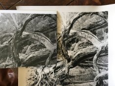
I've just finished a darkroom session printing with Ilford Art in 11x14. I just love this paper, but previously have used it for photograms. I am absolutely amazed how different my print times are, and also how much contrast this paper has compared to other Ilford paper... I've been using no filters and still dodging and burning to tame contrast.

My negs are pretty normal, and on other Ilford RC and FB papers results are predictable. I'm really trying to find a combination for a current project - forcing myself to get a bit more 'controlled' with my photography. Not sure if this paper is just too 'left field' for me... I'm shooting Tri-X and Plus-X, developing in XTOL 1:1 and printing on a Durst Laboratory 138s. lford multigrade dev at 1+9 at 20 C (although it's winter here and mornings are below 0... I have a tray heater and check temp, but maybe it's getting too cold??)

I'm tossing up whether to continue using Art 300 or sticking with Warmtone FB... any thoughts? I'd be interested to hear any of your experiences with Art 300. Thank you.
 

Attachments

  • IMG_1942.jpg
    IMG_1942.jpg
    738.7 KB · Views: 563
Last edited:

mike c

Subscriber
Joined
Jan 5, 2009
Messages
2,863
Location
Los Angeles
Format
Multi Format
It certainly looks like the 300 is has more contrast , I do not use Ilfords print developer, but I would use a lower contrast filter and or more dilute developer maybe. The !38 is a condenser enlarger so one would expect a higher contrast print. Can not explain the difference in contrast between the two papers except that the 300 is a more contrasty paper.
 

MartinP

Member
Allowing Ads
Joined
Jun 23, 2007
Messages
1,569
Location
Netherlands
Format
Medium Format
Why do you think that the two papers in your photo should behave identically? The base is different, the emulsion is different and the age of the paper is different. :smile: For the specifications of the papers when new, look in the documentation PDFs on the IlfordPhoto website.
 
OP
OP
mesh

mesh

Member
Allowing Ads
Joined
Oct 11, 2009
Messages
313
Location
Adelois
Format
8x10 Format
Why do you think that the two papers in your photo should behave identically? .

I don't. The issue is that I am surprised that NONE of my prints on this paper have required ANY filtration. I have never printed previously without using at least a grade 1. I was interested if this was normal. Thanks for your reply Martin but I did look at the PDFs and they don't correlate with my experience hence my post.
 

Nige

Member
Allowing Ads
Joined
Sep 8, 2002
Messages
2,327
Format
Multi Format
generally no filtration means about G2 for most VC papers. I'm not sure where Art300 fits in (just got some recently myself) but read the doco.
 
OP
OP
mesh

mesh

Member
Allowing Ads
Joined
Oct 11, 2009
Messages
313
Location
Adelois
Format
8x10 Format
Yeah I've read the docs but thanks for the info. For what it's worth, I did a test on 5 different types of VC papers tonight and Art 300 is about 3 grades of extra contrast. So I guess that's it - it's just a very contrasty paper. All good. I like it - just thought it was interesting. Guess not many people here use it. Posted elsewhere and got a lot of feedback from users that say the same. So in case anyone else reads this in the future, Art 300 is about 3 extra grades of contrast. Thanks for your help.
 

Bob Carnie

Subscriber
Allowing Ads
Joined
Apr 18, 2004
Messages
7,735
Location
toronto
Format
Med. Format RF
I am pretty sure its the same emulsion as Ilford Warmtone, every time I print with Art 300 it reacts much the same.
 

Sim2

Member
Allowing Ads
Joined
Nov 21, 2009
Messages
492
Location
Wiltshire UK
Format
Medium Format
From my experience this looks strange behaviour by the paper!
I have printed with MG300, warmtone, previous MG and new Classic and found the contrast between them to be reasonably consistent, no more than 1 grade difference, which may be personal preference depending on the paper type and finish - I do not have to alter initial contrast on tests prints between papers - exposure or ISO ratings, a different matter altogether. If the same dev, time and dilution were used I do not know why you get this result, not much help except to let you know that this user doesn't find the same as you, only caveat being that I haven't printed with 300 purchased in the last year so has there been an emulsion change? Nice pic though.
 

MattKing

Moderator
Moderator
Joined
Apr 24, 2005
Messages
55,182
Location
Delta, BC Canada
Format
Medium Format
Try printing both your the Art 300 and some of your old papers with a #2 filter, to see if you observe similar behavior.
 

kreeger

Member
Allowing Ads
Joined
Jun 21, 2009
Messages
207
Location
Missouri
Format
Multi Format
Mesh, I feel the same way about MG300. I love it but I find myself printing with a 1 filter, but instead, I have a Beseler 45MXII with the Zone VI cold light head and stabilizer and also use Multigrade developer 1:9.

In a controlled test, my results are similar to your observation regarding contrast being higher on MG300 than the other Ilford FB papers. I recently printed the same negative on 3 papers to compare, MG Warmtone has a almost 1 grade lower contrast, MG FB Classic appears right, and MG300 is closer to a 3 without the filter. If this were my normal paper I would need to reduce my negative development time by 20%. I saved all my test strips, when they are dry I will try and upload an image showing the differences.
 
OP
OP
mesh

mesh

Member
Allowing Ads
Joined
Oct 11, 2009
Messages
313
Location
Adelois
Format
8x10 Format
Thanks Sim2, MattKing and kreeger. I tried grade 2 with all my papers and the 300 was still way more contrasty. I'm having the same experience as kreeger. Thanks for the tip re: dev time. I've gone to 1min from 1:30 and that's helped a lot. Have been getting some decent prints this evening and very happy. Thank you. I've been using no filtration with 1min DEV. Now here's something really strange... I've also been printing on 5x7 ART300 and the contrast seems fairly normal (maybe one grade more than usual). Only with the 11x14 do I notice the big contrast issue... Anyway - maybe it was a batch problem?
 

kreeger

Member
Allowing Ads
Joined
Jun 21, 2009
Messages
207
Location
Missouri
Format
Multi Format
I've gone to 1min from 1:30 and that's helped a lot.

You can also go more dilute on your developer, try mixing a tray of your Ilford Multigrade Developer 1:14 and go 2 minutes. In my opinion 1 minute is hard to control consistency with, especially with large pieces of paper.

Only with the 11x14 do I notice the big contrast issue... Anyway - maybe it was a batch problem?

My box is a 50 sheet, 8x10, which I got it from B&H In NYC.
 

MattKing

Moderator
Moderator
Joined
Apr 24, 2005
Messages
55,182
Location
Delta, BC Canada
Format
Medium Format
I'm wondering if this behavior is at least partially related to the surface of the Art 300 paper, and how it presents an image.

Looking at the example posted at the beginning of the thread, it appears to me that the highlights in the Art 300 print have been printed to a much lighter tone than in the other prints.

It seems to me, that to perform a proper comparison you need to match highlight tones, rather than shadows, and then observe how the mid-tones and shadows appear. The matte surface of the paper will most likely result in the shadow densities plateauing.

I would expect that a match of highlight tones will require a longer exposure because, IIRC, Art 300 is a slower (less sensitive) paper than most.

Part of my rationale for suggesting that you match the highlight tones is that the speed of the paper is measured in relation to those tones.
 

mike c

Subscriber
Joined
Jan 5, 2009
Messages
2,863
Location
Los Angeles
Format
Multi Format
I was thinking along the same as Mattking, although his shadow density on the 300 seems dark already maybe adding exposure to darken the highlights will balance out everything, or maybe not? Worth a try anywho.
 

Nige

Member
Allowing Ads
Joined
Sep 8, 2002
Messages
2,327
Format
Multi Format
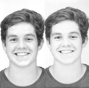
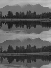
Hopefully this works. I made 2 comparison prints. I've scanned the prints together so even if they don't look exactly the same on your screen as on my screen and the actual prints (they are pretty good match between my screen and the print considering reflective vs backlit screen), they will be relative to each other without the scanner adding to the confusion! Since the scanner can't scan all of both prints at once I've tried to clip out a similar section.

First one is my son, left is Ilford RC, right the Art300. Important print parameters were :
I/RC - 12.5secs @ f11, 60M
Art300 - 25secs @ f11, 60M

RC_Art300_Brendo.jpg

Second is Lake Matheson, NZ, top is RC, bottom Art300
I/RC 14sec @ f11, 40M plus burn (time not recorded) on sky
Art300 13sec @ f8, 40M + 10sec burn on sky

RC_Art300_Mountains.jpg
 

pentaxuser

Member
Allowing Ads
Joined
May 9, 2005
Messages
20,339
Location
Daventry, No
Format
35mm
Yes there is clearly a difference on my screen, especially in the portrait shots where there is a lot more highlight tones. The RC looks to be the better print but no doubt the Art 300 can be made to look as good. I have never tried the Art 300 but it makes me wonder what are its advantages over Ilford RC given what your scans show. As a paper it seems to be a stop slower which may be an advantage I suppose depending on what time the printer needs to do his stuff under the enlarger.

pentaxuser
 

MattKing

Moderator
Moderator
Joined
Apr 24, 2005
Messages
55,182
Location
Delta, BC Canada
Format
Medium Format
The Art 300 print of your son needs to be printed longer to match the highlights.
 

gone

Member
Allowing Ads
Joined
Jun 14, 2009
Messages
5,504
Location
gone
Format
Medium Format
It's not just that there's more contrast, the highlights are almost completely blown out. As mentioned, this is strange behavior. Do some test strips and play w/ the exposure times, experiment w/ filters, etc. In any case, do that on the test strips, not the prints. One or two strips, w/ and w/o filters, should fix it. I'm also wondering if the paper has had enough time in the developer to get those mid tones to appear.
 
Last edited:

Nige

Member
Allowing Ads
Joined
Sep 8, 2002
Messages
2,327
Format
Multi Format
It's not just that there's more contrast, the highlights are almost completely blown out.

looking at this on screen (at work,) I'd agree, didn't get that feeling on screen at home... will have another look at home. Will need to look at the prints again (they're at home too).

Also did you click through (ie. click thumbnail. right click, view image, click to view full size) to the full size images?

regardless, I don't think there's a huge difference in contrast. Maybe the surface differences (RC was Pearl) have effected the scanning and I'm sure looking at this now, screen brightness is an issue (none of my screens are calibrated).
 

Nige

Member
Allowing Ads
Joined
Sep 8, 2002
Messages
2,327
Format
Multi Format
The Art 300 print of your son needs to be printed longer to match the highlights.

After close examination of the prints, I'm going to agree with this, but not to the degree the scans imply.

I'm wondering if this behavior is at least partially related to the surface of the Art 300 paper, and how it presents an image.

I reckon this contributes. In my examples the RC is Pearl so if I was serious, I'd reprint using matt paper, probably FB.

However, in my two examples, I can't see a major difference (ie. 1 or more) paper grades. That's IMO and YMMV :smile:
 

Ron789

Subscriber
Allowing Ads
Joined
Nov 17, 2014
Messages
382
Location
Haarlem, The
Format
Multi Format
Printing on Art 300 and Ilford MGFBWT I recall there were some differences but I did not experience a huge difference in contrast. My developer is Ilford Multigrade Developer and I develop all prints for 2 minutes. I found Art 300 to be less contrasty in the end since it has a lower DMAX. I tried selenium toning but that did not make much difference. While I like Art 300 for some very specific images I find that in most prints it does not match the richness and intensity of MGFBWT.
 

Maris

Member
Allowing Ads
Joined
Jan 17, 2006
Messages
1,594
Location
Noosa, Australia
Format
Multi Format
The Art 300 print of your son needs to be printed longer to match the highlights.
Yes! To compare contrasts first match the highlights not the mid-tones or the shadows. Then if the shadows are too dark take out some contrast. Go from G3 to G2 or even G1 if you have to. And go the other way if the shadows are too light. It's a nice question when changing contrasts what becomes different and what stays the same. Answer: the highlights are set by exposure and stay the same and the shadows are racked up and down, lighter or darker, by changing contrast.
 
Photrio.com contains affiliate links to products. We may receive a commission for purchases made through these links.
To read our full affiliate disclosure statement please click Here.

PHOTRIO PARTNERS EQUALLY FUNDING OUR COMMUNITY:


Ilford ADOX Freestyle Photographic Stearman Press Weldon Color Lab Blue Moon Camera & Machine
Top Bottom