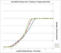
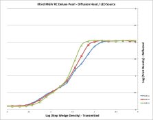
I recently purchased a densitometer (Xrite-810) to get a better handle on the relationship between my exposure, negatives and prints. I also purchased a Stouffer step wedge that I used to make prints on Ilford MGIV Deluxe RC Pearl paper using Ilford VC filters. Development was done in Dektol 1+2 20C and 1m30sec development. When I measured the results I was a little surprised in that the contrast in the hi-light region appeared to be the same in grades 1,2 and 3 with the only separation being in the shadows. Attached is the data for both a LED Diffusion head and Tungsten Condenser (75W bulb). Both are quite similar. The densitometer checks out vs it's calibration material (reflected metal piece and the transmitted step wedge). I also measured the Stouffer step wedge using the densitometer. Do these results seem typical? They do not seem to match the graphs that Phil Davis has in his BTZS book. Then again, I think he was using single graded paper. My concern is that in practice the shadows will print at a higher relative contrast vs the highlights.
-
Welcome to Photrio!Registration is fast and free. Join today to unlock search, see fewer ads, and access all forum features.Click here to sign up
You are using an out of date browser. It may not display this or other websites correctly.
You should upgrade or use an alternative browser.
You should upgrade or use an alternative browser.
Contrast Curves using VC Paper
-
A
- Thread starter jlpape
- Start date


Recent Classifieds
-
Sold Efke PL 100 M
- Started by Roger Thoms
-
For Sale Omega C760 XL Medium Format Condenser Enlarger with Schneider Enlarger Lens - UK
- Started by Gary Holliday
-
For Sale Nikon FE2 / 50mm 1,4 AI-S
- Started by Jammoh
-
Found WTB: 4x5 field camera, wooden, simple
- Started by Dan Daniel
-
Found Looking for a good spot meter
- Started by Premier
Forum statistics
You have your Density data plotted correctly, but you have the Density vertical axis labeled as 'Log' - which it isn't (and shouldn't be).
Such plots are referred to as D - log E plots. ( Density-Versus-the-Log-of-Exposure )
BTW, the condensor plots look OK to me. Plot the three different grades on separate sheets of paper so you can slide them back and forth to more easily see the differences.
Such plots are referred to as D - log E plots. ( Density-Versus-the-Log-of-Exposure )
BTW, the condensor plots look OK to me. Plot the three different grades on separate sheets of paper so you can slide them back and forth to more easily see the differences.
Last edited by a moderator:
Thanks Prof_Pixel. Both axis would be a labeling issue, the numbers are the densitometer readings. Horizontal in transmitted mode, vertical in the reflected mode.
I see what you mean, if I align by a mid tone, then the curves would indeed look better. At least for the condenser / tungsten bulb. When I look at the LED source across grades 00 thru 5 and align by the mid-tone, I see the curves again make more sense. There seems to be a "kink" in the LED curve (around a print density of 0.75) that I would like to understand better. Could this be an effect of absorption between the blue and green LED's in regards to the paper? Could an additional filter under the light source help smooth this out?
I suppose I should repeat the experiment to see if I get the same result.
Last edited by a moderator:
Did you mask the step tablet?
No, I did not need to. I inserted the 4x5 step tablet in the enlarger and filled the field of an 8x10 sheet of paper.
- Joined
- Feb 17, 2008
- Messages
- 2,178
- Format
- Multi Format
Interesting measurements! But not so surprising finding, when you remember that variable contrast is achived by superposing (adding) the densities of 2 (3 for some papers) layers: one soft, the other hard contrast; at the highest print densities, the hard layer dominates the response. I had assumed that paper manufacturers had somehow addressed that issue; it does not seem to be the case, unfortunately.
This said:
(1) presumably you placed the step wedge in the negative carrier, not lying on the paper; since you see different responses for different heads, I assume that is what you did;
(2) if you want to address the response curve of the paper, and isolate it from the response of the system (projection system + paper) you should plot the paper density versus the (log)illumination measured on the enlarger board, on the projected image of the step wedge. Otherwise, you are measuring a combination of the paper response and of the effective density of the step wedge, for which the Calllier effect depends on the illuminant. Alternatively, you might place the step wedge in contact with the paper; that would eliminate the role of the head (condenser versus diffusion) but would still not guarantee that the effective density (seen by the paper) is the same as measured by the densitometer.
Thanks bernard_L, as Prof_Pixel points out, the condenser / tungsten curves look reasonable when you align the curves by the mid tone. I downloaded the tech sheet from the Ilford web site for MGIV RC and it contains a similar plot, showing that my results are quite similar to the tests done by Ilford. So I am satisfied that my measurements and values I obtain are reasonable.
The Diffusion / LED source has me interested. There is a more pronounced "kink" in these curves that leads me to believe that I am getting a substantially different contrast for the shadows than I am for the highlights. I need to absorb your comments a bit more, but I was starting to look at the spectrum of the LED vs a tungsten source to see if this could explain the difference. A tungsten curve is fairly constant in the 400-600nm wavelength as opposed to the LED that has some sharp peak's and valley's. Could some of the "missing" wavelengths cause this? Maybe I guess I would need to compare the spectrum to the pass wavelengths of the filters. I am also going to generate curves for non-VC grade 2 & 3 papers using the diffusion/LED head and condenser / tungsten head. My guess is that they will look a lot more similar to one another.
The Diffusion / LED source has me interested. There is a more pronounced "kink" in these curves that leads me to believe that I am getting a substantially different contrast for the shadows than I am for the highlights. I need to absorb your comments a bit more, but I was starting to look at the spectrum of the LED vs a tungsten source to see if this could explain the difference. A tungsten curve is fairly constant in the 400-600nm wavelength as opposed to the LED that has some sharp peak's and valley's. Could some of the "missing" wavelengths cause this? Maybe I guess I would need to compare the spectrum to the pass wavelengths of the filters. I am also going to generate curves for non-VC grade 2 & 3 papers using the diffusion/LED head and condenser / tungsten head. My guess is that they will look a lot more similar to one another.
- Joined
- Feb 17, 2008
- Messages
- 2,178
- Format
- Multi Format
Good point! MGIV has three emulsions since 1984; see:I was starting to look at the spectrum of the LED
http://www.photomemorabilia.co.uk/Ilford/Multigrade.html
and possibly the response of the "medium-hard" emulsion falls in a hole of the LED spectrum. See:, e.g.
http://www.ecse.rpi.edu/~schubert/L...chap21/F21-10 Electroluminescence spectra.jpg
http://www.ecse.rpi.edu/~schubert/L...20/F20-06 3-color measurement and fitting.jpg
Then you are left with only the two extreme emulsions, which makes more evident the inherent problem of variable-contrast paper, when the curves of individual emulsions don't merge well into the equivalent of a single-grade paper.
So much for my (vague) plans to try an LED lamp in my enlarger.
See:
http://www.darkroomautomation.com/support/appnotevcworkings.pdf
In general, changes in contrast in the lower grades are in the shadows while the contrast changes in the higher grades are in the highlights.
The 'bump' in the middle of the lower VC grades is an intrinsic property of VC paper. The difference you are seeing is because the two heads are printing at slightly different contrasts because they have different spectral curves.
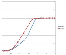
I got hold of some graded paper (Ilford Ilfospeed Grade 2) and ran the same test. Sorry for not labeling the axis horizontal = step tablet density, vertical = paper density. The red curve is the graded paper, blue the VC paper printed with a grade 2 filter. Seems to confirm that the spectral distribution is playing a role.
I am going to start using graded paper and will optimize my exposure and development around this.
I am going to start using graded paper and will optimize my exposure and development around this.
Attachments
From bernard_L: So much for my (vague) plans to try an LED lamp in my enlarger.
VC printing was set up around a tungsten source (I would think), so the ratio of dyes would have been derived accordingly. So if an LED has a different spectral distribution, I'm really not surprised by the result. I think the graded paper shows that an LED source can be a perfectly viable option. Just need to understand the response characteristics. In practice I'm not sure how much the "kink" in the VC curve would be a problem, as long as you understand the relative difference in the shadows and highlights.
VC printing was set up around a tungsten source (I would think), so the ratio of dyes would have been derived accordingly. So if an LED has a different spectral distribution, I'm really not surprised by the result. I think the graded paper shows that an LED source can be a perfectly viable option. Just need to understand the response characteristics. In practice I'm not sure how much the "kink" in the VC curve would be a problem, as long as you understand the relative difference in the shadows and highlights.
See:
http://www.darkroomautomation.com/support/appnotevcworkings.pdf
In general, changes in contrast in the lower grades are in the shadows while the contrast changes in the higher grades are in the highlights.
The 'bump' in the middle of the lower VC grades is an intrinsic property of VC paper. The difference you are seeing is because the two heads are printing at slightly different contrasts because they have different spectral curves.
Thanks for the pointer to the application notes. Really helps me understand the results I see. Especially the grade 00 curve.
So it seems (to net it out) that the kink in the curve is there for VC paper in general and the particular LED source I am using may exaggerate the kink a bit compared to the tungsten source. Your paper describes the impact of this effect. If you want a "kink free" curve, you should be using graded paper.
Given the benefits of the LED source (economical diffusion head + cool operation) and paper characteristics, I am going to look at switching papers to the graded variety and adjust my upstream processes accordingly.
Last edited by a moderator:
- Joined
- Feb 17, 2008
- Messages
- 2,178
- Format
- Multi Format
Well, except that as a direct consequence of the hypothesis made in this application note,Thanks for the pointer to the application notes. Really helps me understand the results I see.
there should be a bump in the middle of the D-versus-log(exp) curve (see the graphs there). And what you see is a dip, consistent with the superposition of two emulsions, one soft, one hard.That first point is worth stating again: All emulsions have the same intrinsic contrast - the same
range of illumination that takes them from white to their DMax. There is a common
misconception that the paper is made from a blue sensitive high contrast emulsion and low
contrast green sensitive emulsion - this is not the case.
Well, except that as a direct consequence of the hypothesis made in this application note,
there should be a bump in the middle of the D-versus-log(exp) curve (see the graphs there). And what you see is a dip, consistent with the superposition of two emulsions, one soft, one hard.
Maybe I misunderstood his paper, but for 3 emulsion papers, such as Ilford MGIV, his Theroy section shows a bump in the grade 00 filter plot, which I see as well, or more accurately, show each of the three emulsions kicking in. The rest are harder to tell where each kicks in (grades 2, 3.5 and 5). In the "Real World" section for 3 emulsion papers, he does show a break in the curve (change in slope or "dip" if you will). The position and degree of the change in slope is where the different emulsions kick in and their additive effect given a specific spectral distribution. So the net effect could "look" like a dip or a bump... I think... my brain hurts thinking about this.
By the way, thanks for the links you provided. The one one on Memorabilia is quite interesting.
Last edited by a moderator:
- Joined
- Oct 9, 2010
- Messages
- 7,887
- Format
- 35mm RF
I recently purchased a densitometer (Xrite-810) to get a better handle on the relationship between my exposure, negatives and prints. I also purchased a Stouffer step wedge that I used to make prints on Ilford MGIV Deluxe RC Pearl paper using Ilford VC filters. Development was done in Dektol 1+2 20C and 1m30sec development. When I measured the results I was a little surprised in that the contrast in the hi-light region appeared to be the same in grades 1,2 and 3 with the only separation being in the shadows. Attached is the data for both a LED Diffusion head and Tungsten Condenser (75W bulb). Both are quite similar. The densitometer checks out vs it's calibration material (reflected metal piece and the transmitted step wedge). I also measured the Stouffer step wedge using the densitometer. Do these results seem typical? They do not seem to match the graphs that Phil Davis has in his BTZS book. Then again, I think he was using single graded paper. My concern is that in practice the shadows will print at a higher relative contrast vs the highlights.
Perhaps you should disregard the densitometer and step wedges and evaluate by eye? As this at the end of the day is what we all do.
what you see is a dip
A dip is the space between two bumps - or a bump is the space between two dips...
VC low contrast filtration with MGIV produces two areas of lower contrast. Or, if you will, three areas of higher contrast.
with the superposition of two emulsions, one soft, one hard.
"All parts of the emulsion have the same contrast." Quote from ILFORD CONTRAST CONTROL FOR ILFORD MULTIGRADE VARIABLE CONTRAST PAPERS (http://www.ilfordphoto.com/Webfiles/2010628932591755.pdf)
The earliest Ilford VC papers from the 1930's attempted contrast control with hard and soft emulsions. This approach has all sorts of problems: the two emulsions develop at different rates, one is warm and the other cold tone, they don't tone at the same rate....
Ilford soon gave up this approach and adopted the Defender system - better known as Dupont Varigam. This system uses emulsions with the same intrinsic contrast and properties and has been the basis for all VC paper for the past 70+ years (at least in the US; Ilford may have kept it's original method longer). The emulsions aren't perfect matches (well, they can't be with the addition of sensitizer to some of them) and VC paper continues to split tone slightly.
Last edited by a moderator:
Perhaps you should disregard the densitometer and step wedges and evaluate by eye?
Good advice.
It is worth knowing how materials work, but it is certainly secondary.
If knowing how it worked was the key then the chemists at Kodak and Ilford would be the world's best photographers.
Good advice.
It is worth knowing how materials work, but it is certainly secondary.
If knowing how it worked was the key then the chemists at Kodak and Ilford would be the world's best photographers.
I humbally disagree. I won't argue that at the end of the day we use our eyes and our intuition to determine what we want to convey, but why would we dismiss something that can give us some insight into what we do? This little exercise taught me something that I would not have picked up on as easily without some quantitative data. If running some tests to understand the difference between exposure and development a bit better, why would I not take advantage of that. I think that both can live in harmony with each other. Your last quote about Kodak and Ilford engineers could be re-written... Knowing how it works allows Kodak and Ilford engineers to give us some of the best materials in the world for us to convey our vision. Don't confuse knowing technically how photography works with artistic vision and intuition. Both have their place.
I humbly[non sic] disagree ...
??????? I'm not sure what you are disagreeing with, as I agree with what you just said.
My point is that one can make wonderful pictures without any knowledge of how it all works; knowing how it all works isn't a guarantee of wonderful pictures; but for some knowing how it works is a great help to making said wonderful pictures.
And I am one of the major uber-geeks around here. I once nearly bolted from my dentist's chair when he confessed he flunked calculus in college so many times they gave him a pass just to get rid of him - until it struck me that skill in dentistry really doesn't require calculus.
Hi Nicholas,
Possibly we go to the same dentist? Though mine, besides being an excellent dentist gives me the best discussions on the subject of history.
I was just reacting to the statement (not yours) previously of putting away the step tablet & densitomiter and doing it by eye. Your "good advice" had me hit the "reply with quotes" on your post. I think your point above say's it all with much less words than I used. For me a graph is worth a thousand words, but always needs to be tempered by what you see in the print.
Sorry for any misinterpretation.
Jim
Last edited by a moderator:
| Photrio.com contains affiliate links to products. We may receive a commission for purchases made through these links. To read our full affiliate disclosure statement please click Here. |
PHOTRIO PARTNERS EQUALLY FUNDING OUR COMMUNITY:  |