Color vs grayscale digital negatives

WPPD-2025-TULIPS

A
WPPD-2025-TULIPS

  • 0
  • 0
  • 0
Deco.jpg

H
Deco.jpg

  • Tel
  • Apr 29, 2025
  • 1
  • 0
  • 15
Foggy pathway

H
Foggy pathway

  • 3
  • 1
  • 57
Holga Fomapan 400

H
Holga Fomapan 400

  • 1
  • 0
  • 47

Recent Classifieds

Forum statistics

Threads
197,465
Messages
2,759,557
Members
99,379
Latest member
nicklinn
Recent bookmarks
0

jisner

Member
Joined
Sep 16, 2017
Messages
102
Location
Tucson, Arizona
Format
35mm
I've seen many discussions on this topic over the years, and most go off the rails pretty quickly. I'm looking for a concise (one sentence?) technical statement as to why one would choose color over grayscale when printing digital negatives from Photoshop on an inexpensive CMYK printer (with only one black ink). Thanks!
 

KenS

Member
Joined
Jan 2, 2005
Messages
941
Location
Lethbridge, S. Alberta ,
Format
Multi Format
Seek out and download George L. Smyth's "Creating the Digital Negative" (only 20 pages) which contains the information that might 'set you out in the "best direction"


Ken
 
OP
OP
jisner

jisner

Member
Joined
Sep 16, 2017
Messages
102
Location
Tucson, Arizona
Format
35mm
Seek out and download George L. Smyth's "Creating the Digital Negative" (only 20 pages) which contains the information that might 'set you out in the "best direction"
Ken

I'm not asking how to make them. I know how to do that. I'm asking for a technical argument for color over grayscale. Suppose you need a negative with a density range of 1.85. You can do it with either a grayscale or a color. But why choose one over the other? Does color use less ink? If so, that would be a good reason. Is the color negative capable of resolving greater image detail? If so, that would also be a good reason.
 

MattKing

Moderator
Moderator
Joined
Apr 24, 2005
Messages
51,945
Location
Delta, BC Canada
Format
Medium Format
All you really care about is how much UV light is blocked by the image.
That may very well vary with ink/pigment colour.
But you probably need to evaluate the inks/pigments available for your printer.
 

MattKing

Moderator
Moderator
Joined
Apr 24, 2005
Messages
51,945
Location
Delta, BC Canada
Format
Medium Format
Then you are saying there is no advantage of one over the other.
There may very well be, depending on which inks/pigments you are considering.
You need to ask the question of people who are using your printer, and have experimented with the choices.
That won't be me, because the experience I have in this area consists of listening to a bunch of people who have struggled with inks and pigments and RIPs and curves and calibrations etc., etc.
 
OP
OP
jisner

jisner

Member
Joined
Sep 16, 2017
Messages
102
Location
Tucson, Arizona
Format
35mm
Here's the problem: There are three or four Photoshop-based digital negatives systems that people are using. I won't name names. All of them do a certain amount of hand-waving and end up advocating color negatives. None of them makes a really convincing case for color over grayscale. That's what I'm looking for: a convincing case. If it's true, the case shouldn't be that hard to make.
 

nmp

Member
Joined
Jan 20, 2005
Messages
1,995
Location
Maryland USA
Format
35mm
Here's the problem: There are three or four Photoshop-based digital negatives systems that people are using. I won't name names. All of them do a certain amount of hand-waving and end up advocating color negatives. None of them makes a really convincing case for color over grayscale. That's what I'm looking for: a convincing case. If it's true, the case shouldn't be that hard to make.

To understand your question a little better, are you talking about:

1. A "colorized" negative (created by adding a color fill layer in screen mode after inversion and flip) vs. black and white negative without such a layer

or

2. A black and white negative printed from a gray scale gamma 2.2 file vs. the same image from RGB file with R=G=B?

:Niranjan.
 
OP
OP
jisner

jisner

Member
Joined
Sep 16, 2017
Messages
102
Location
Tucson, Arizona
Format
35mm
Are you talking about:

1. A "colorized" negative (created by adding a color fill layer in screen mode after inversion and flip) vs. black and white negative without such a layer

or

2. A black and white negative printed from a gray scale gamma 2.2 file vs. the same image from RGB file with R=G=B?

:Niranjan.

Yes, this is a vexing terminology problem.

When I say "grayscale" I mean either: (1) an image in Gray Gamma 2.2 or (2) an RGB image with R=G=B.

When I say "color" I mean an RGB image with R≠G≠B.

The color negatives are made by starting with a grayscale image and converting it to RGB if it is not already RGB, then adding a Photoshop adjustment that adds a color gradient (a curve, a color fill layer, a gradient map, or a LUT).
 

removed account4

Subscriber
Joined
Jun 21, 2003
Messages
29,833
Format
Hybrid
I'm not an expert by any stretch of the imagination, I've made digital negatives on paper for a longish time and on pictorio for about IDK 16 months? . so my comment should be consumed with a very large grain of salt. From what I understand. ... unless the printer only has black and white inks ( or pigment or toner ), black and white isn't really black and white.
 

nmp

Member
Joined
Jan 20, 2005
Messages
1,995
Location
Maryland USA
Format
35mm
Yes, this is a vexing terminology problem.

When I say "grayscale" I mean either: (1) an image in Gray Gamma 2.2 or (2) an RGB image with R=G=B.

When I say "color" I mean an RGB image with R≠G≠B.

The color negatives are made by starting with a grayscale image and converting it to RGB if it is not already RGB, then adding a Photoshop adjustment that adds a color gradient (a curve, a color fill layer, a gradient map, or a LUT).

In that case:

The reason for using a color negative is to increase/maximize the UV opacity (if needed for a given process) since for many printers, the UV-densest ink paradoxically is not the black but some other color that is unique for a given printer/ink combo.

:Niranjan
 
OP
OP
jisner

jisner

Member
Joined
Sep 16, 2017
Messages
102
Location
Tucson, Arizona
Format
35mm
I'm not an expert by any stretch of the imagin
In that case:

The reason for using a color negative is to increase/maximize the UV opacity (if needed for a given process) since for many printers, the UV-densest ink paradoxically is not the black but some other color that is unique for a given printer/ink combo.

:Niranjan

The maximum UV opacity is determined by the printer/ink set and it's exactly the same for grayscale and color.

For example, on my printer, the maximum density I can produce with a grayscale negative is 2.10. I can't increase it to 2.15 with a color negative, because the darkest (densest) color for any color is black.

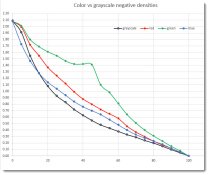
If you plot densities for red, green, blue, and grayscale negatives, all four curves start at the same density and end at the same density. But betwen the endpoints, the curves have very different shapes. So I think at least some of the arguments favoring color have to do with the intermediate shapes of the density curves. What do you think?

https://photos.app.goo.gl/JvntDurAjrZWeaTXA
 

Attachments

  • grayscale vs color negatives.jpg
    grayscale vs color negatives.jpg
    72.1 KB · Views: 267

revdoc

Member
Joined
Apr 12, 2015
Messages
280
Format
35mm
Based on some recent experience with this, I found that my printer (a cheap HP) created colour negatives (i.e., visually greyscale, but printed with CMYK inks) that had a strongly non-linear curve, in which UV absorption increased too rapidly as it moved towards black. A closer analysis showed that the CMY inks weren't able to block that much UV on their own, so the printer software was probably increasing the black ink nonlinearly as the tone reached max black.

I didn't want to used a massive curve to deal with that, so I tried making coloured negs with EDN. That was a whole other rabbit hole.

For the record, and from memory, the HP ink set looked like this, from least UV blocking to most: cyan, magenta, yellow, black. Also from experience, using black ink on its own was more prone to a dithering pattern being visible in my print highlights... but it's been a while since I tried that option.
 
OP
OP
jisner

jisner

Member
Joined
Sep 16, 2017
Messages
102
Location
Tucson, Arizona
Format
35mm
Based on some recent experience with this, I found that my printer (a cheap HP) created colour negatives (i.e., visually greyscale, but printed with CMYK inks) that had a strongly non-linear curve, in which UV absorption increased too rapidly as it moved towards black. A closer analysis showed that the CMY inks weren't able to block that much UV on their own, so the printer software was probably increasing the black ink nonlinearly as the tone reached max black.

I didn't want to used a massive curve to deal with that, so I tried making coloured negs with EDN. That was a whole other rabbit hole.

For the record, and from memory, the HP ink set looked like this, from least UV blocking to most: cyan, magenta, yellow, black. Also from experience, using black ink on its own was more prone to a dithering pattern being visible in my print highlights... but it's been a while since I tried that option.

The printer doesn't know it's printing on clear film. It thinks it's printing on paper. And so it applies a gamma correction to produce reflection densities which are perceptually linear to human vision when viewed in white light. But reflection densities aren't the same as transmission densities, and so the transmission density curves don't look exactly like gamma curves.

As I understand it, on a CMYK printer, grayscale uses CMY (with C=M=Y) up to a point, and then starts adding K until it gets to pure black. So up to that point, a grayscale negative is actually a color negative! If so, this talk about Black being the most blocking is a strawman argument, since we're not printing grayscale negatives with black ink alone. If the printer only had black ink, it would be a different story, but we're talking about CMYK printers. Color negatives also use CMY (with C≠M≠Y) up to a point, then they too begin adding K.

My measurements (made with an X-Rite 361T) show grayscale to be the least blocking of the four, at least up to where it lost that position to blue. My grayscale curve was also the most well-behaved of the four. Look at green!

The EDN ColorBlocker tool is trying to do a partial linearization in addition to adjusting the negatative density range. It does the partial linearization with a correction that applies a non-linear gradient to the inverted image, whereas the old-fashioned Color Fill layer in Screen mode applies a linear gradient. Many users of EDN seem to care more about how the starting linearization curve looks (.e., not "massive") than whether the negative has the correct density range. Sadly, if you don't get the density range fright, the image correction curve can't do anything about it.
 
OP
OP
jisner

jisner

Member
Joined
Sep 16, 2017
Messages
102
Location
Tucson, Arizona
Format
35mm
Not sure if I understand how you printed the Red, Green and Blue step wedges. Can you explain what the files would look like?

I measured four columns of Peter Mrhar's HSB grid: H=0 (red), H=120 (green), H=240 (blue), and the grayscale (K) column.
Mrhar HSB grid.jpg


These measurements do not give the same curves as you would get from a Color Fill layer in screen mode. The difference can be seen here:

EDN vs linear gradient.jpg


The solid line represents a Color Fill gradient. The dashed line is from measurements of the Green column of the EDN color grid, and is what I plotted.
 

Dan Pavel

Member
Joined
Sep 11, 2017
Messages
220
Location
Constanta, Romania
Format
Multi Format
I did a lot of tests with B&W and color Charts for DNs trying to decide which is the best.
As others said before, it depends of the inks of your printer. If the the black ink of your printer is not the best in blocking the UV light another color, better in this regard, could be used.
However, this doesn't come for free. By using another color you are using, in fact, a combination of the printer's inks and therefore you don't know what combination of inks is your printer using for each patch of your chart. As different inks have different power in blocking the UV light this will lead to less predictable results (lighter patches of your chart may use better UV blocking inks). However, this could happen with a B&W-printed chart, as well, if your printer uses different colors (amd not only the black ink) to print it. That's why for a printer with only 1 black using a colored DN is, probably, still a better approsh.
If the printer has a B&W advanced mode in which it uses only Black ink and some shades of Grey inks for a B&W print and the Black ink is good enough at blocking the UV color then using only Black and Gray inks will produce the best and most predictable results.
 

fgorga

Member
Joined
Aug 31, 2015
Messages
739
Location
New Hampshire
Format
Multi Format
Sorry I am late to this discussion, I spent yesterday afternoon/evening in my dim room. Anyway, here is my take on the "issue", which is in part similar to that of others above.

My statements derive from more than ten years experience making digital negatives for alternative process (i.e. UV contact printing) processes, mainly cyanotype.

#1 -- The only justification needed for making a choice like this is "it works for me". That is, do you get a print that satisfies you with the equipment you have at hand?

#2 -- 'What works" will depend on many variables and those variables will likely change over time. I understand that the black inks in early inkjet printers was not particularly opaque in the UV used for alternative processes. Thus, folks found that using color inks gave them better density in the UV compared to using just the black inks. My feeling that this difference in opacity (between black and color inks) has diminished as newer generations of inks arrived.

#3 -- I am of the opinion that one needs to make prints using your process of choice in order to optimise the production of digital negatives to be used for UV sensitive processes. Measuring densities in the visible region of the spectrum using commonly available tools (i.e. colorimeters, spectrophotometers, scanners) will tell you nothing about densities in the near UV.
 
OP
OP
jisner

jisner

Member
Joined
Sep 16, 2017
Messages
102
Location
Tucson, Arizona
Format
35mm
I understand that the black inks in early inkjet printers was not particularly opaque in the UV used for alternative processes. Thus, folks found that using color inks gave them better density in the UV compared to using just the black inks. My feeling that this difference in opacity (between black and color inks) has diminished as newer generations of inks arrived.
I think you have answered my question in the OP. Black ink = bad could simply be fokelore. Mark Nelson's Precision Digital Negative (PDN) system, which is one of the earliest, if not THE earliest color negative system, uses pure CMY colors that can be made without any black ink (see below). Total avoidance of black! His original tests showed he could get very high density range -- as high as 2.4 -- with these colors and Ultrachrome ink. But with my printer (an Epson SC P400), the maximum density I can achieve with PDN negatives is 1.35, which is not high enough for most processes. Anyone using PDN today would need a high-end Epson that lets you increase ink density in the print settings. Why bother? Just make grayscale negatives.


PDN step tables.jpg
 

nmp

Member
Joined
Jan 20, 2005
Messages
1,995
Location
Maryland USA
Format
35mm
I wouldn't say black ink is bad. But the fact that black ink is not the densest for some printers among all other combinations in the color gamut is not a folklore. I do not use any particular "system" but own experience with HP B9180, a greenish tone (R-G-B of 51-128-0 in the following attachment) clearly gave the whitest white in my Centennial POP prints:

ColorizeMe_2.jpg

As you can see, the black ink (top right corner and the grid) gives a fair amount of fog so gray negative was not a good option.

That printer died and since it was discontinued by HP at that point, I opted to get a P400. To my disappointment, the densities were much lower than what I was getting in HP. Moreover, there was no gain to be had with any other colors. So yes, as far as P400 is concerned adding colors do not improve upon the low bar set by the black inks. MK was better than PK, but not by much and it gave a lot of grain. This was still not adequate for POP which requires much higher density than other processes like cyanotypes. The ink density knob that is available for the higher models P600/800 is not available for P400. So I tried using QTR that allows more than 100% ink deposition, which involved a whole new learning curve that I was not ready to embrace yet.

Finally I started to look for an used HP B9180 and found one nearby that had been shelved for nearly a decade. Amazingly, I was able to clean it all up, with a couple of new heads bought dirt cheap and some expired inks and now I have a full functioning printer with sufficient UV blocking capability - how long it lasts is a good question though.


:Niranjan.
 
OP
OP
jisner

jisner

Member
Joined
Sep 16, 2017
Messages
102
Location
Tucson, Arizona
Format
35mm
Thank you, Niranjan. Your example is very helpful. You may be able to help straighten out my thinking on thi subject.

If I printed your 11x11 color grid transparency on my P400 and measured all 121 cells with my X-Rite 361T, I would find that the black cell had the highest density. If I had a process requiring a density range of (say) 1.85, I would simply look at my measurements, find the color having that density, and use it to make negatives for the process. I could do this only relying only on densitometer measurements.

But the color "methods" don't rely on density measurements. They print a target using the process and ask the process to tell you which color has a density matching its exposure scale. Now in your POP example, I might get two answers: one from the densitometer (black) and one from the process (green). I just don't understand how that can be. So how do you explain the discrepancy between direct measurement of transmission density and the indirect method of printing a target and looking for a paper white cell?
 
Last edited:

MattKing

Moderator
Moderator
Joined
Apr 24, 2005
Messages
51,945
Location
Delta, BC Canada
Format
Medium Format
Thank you, Niranjan. Your example is very helpful. You may be able to help straighten out my thinking on thi subject.

If I printed your 11x11 color grid transparency on my P400 and measured all 121 cells with my X-Rite 361T, I would find that the black cell had the highest density. If I had a process requiring a density range of (say) 1.85, I would simply look at my measurements, find the color having that density, and use it to make negatives for the process. I could do this only relying only on densitometer measurements.

But the color "methods" don't rely on density measurements. They print a target using the process and ask the process to tell you which color has a density matching its exposure scale. Now in your POP example, I might get two answers: one from the densitometer (black) and one from the process (green). I just don't understand how that can be. So how do you explain the discrepancy between direct measurement of transmission density and the indirect method of printing a target and looking for a paper white cell?
Do you have a densitometer that measures UV?
 

nmp

Member
Joined
Jan 20, 2005
Messages
1,995
Location
Maryland USA
Format
35mm
Thank you, Niranjan. Your example is very helpful. You may be able to help straighten out my thinking on thi subject.

If I printed your 11x11 color grid transparency on my P400 and measured all 121 cells with my X-Rite 361T, I would find that the black cell had the highest density. If I had a process requiring a density range of (say) 1.85, I would simply look at my measurements, find the color having that density, and use it to make negatives for the process. I could do this only relying only on densitometer measurements.

But the color "methods" don't rely on density measurements. They print a target using the process and ask the process to tell you which color has a density matching its exposure scale. Now in your POP example, I might get two answers: one from the densitometer (black) and one from the process (green). I just don't understand how that can be. So how do you explain the discrepancy between direct measurement of transmission density and the indirect method of printing a target and looking for a paper white cell?

Basically as Frank summarized in item #3 above, how much visible spectrum is let thru the ink does not correlate well with how much UV is. That is the reason why your measurements on 361T would diverge from an experimental outcome. If you had a densitometer with UV capability, the results would have been closer. Even then I suspect there would be some discrepancy since different chemistries might have peak sensitivity at different UV bands. So the exact position of Dmax maximum might also be process-dependent. I think that's the reason, there is no substitute to empirical testing to arrive at the best blocking color for a given digineg/process combination.

Hope this helps...

:Niranjan.
 

nmp

Member
Joined
Jan 20, 2005
Messages
1,995
Location
Maryland USA
Format
35mm
The X-Rite 361T can measure density with either UV or Ortho (white) light. My measurements were made with UV.

Darn...throw my thesis out the window! I thought your measurements were done in the visible spectrum.

Back to square one...

:Niranjan.
 
Photrio.com contains affiliate links to products. We may receive a commission for purchases made through these links.
To read our full affiliate disclosure statement please click Here.

PHOTRIO PARTNERS EQUALLY FUNDING OUR COMMUNITY:


Ilford ADOX Freestyle Photographic Stearman Press Weldon Color Lab Blue Moon Camera & Machine
Top Bottom