Color vs grayscale digital negatives

Recent Classifieds

Forum statistics

Threads
201,040
Messages
2,818,034
Members
100,492
Latest member
tsang28
Recent bookmarks
2
OP
OP
jisner

jisner

Member
Allowing Ads
Joined
Sep 16, 2017
Messages
105
Location
Tucson, Arizona
Format
35mm
Basically as Frank summarized in item #3 above, how much visible spectrum is let thru the ink does not correlate well with how much UV is. That is the reason why your measurements on 361T would diverge from an experimental outcome. If you had a densitometer with UV capability, the results would have been closer. Even then I suspect there would be some discrepancy since different chemistries might have peak sensitivity at different UV bands. So the exact position of Dmax maximum might also be process-dependent. I think that's the reason, there is no substitute to empirical testing to arrive at the best blocking color for a given digineg/process combination.

Hope this helps...

:Niranjan.

Any comment of yours helps a lot. Thanks! I made the measurements with UV (the X-Rite 361T has both UV and Ortho mode). To the best I can determine, the UV spectrum is 340-406 nm. Even though emulsions are sensitive to particular UV wavelengths, I wonder if the difference would be significant. A half stop? Hard to imagine. They're certainly good enough for my application (running computer simulations).

I think we should be looking at the printer, and not the process. Here is what I suspect is going on. On your printer, green 51/128/0 prints with higher density than black 0/0/0. If I printed your grid on my P400, it will be just the opposite.

If you would be willing to upload the source file for your color grid, I'll make a transparency on my P400 and measure the UV densities of all 121 cells. If I had your physical transparency, I'd measure that too!

Earlier in this discussion, I posted a graph with four density curves. These were for four columns of the Mrhar HSB color grid: Red, Green, Blue, and Gray. I'm posting it again below. I printed a target using classic cyanotype, which has an exposure scale of 1.17 (determined by me). If I draw a horizontal line through the graph at 1.17, and then drop verticals down to the HSB axis from where the line intersects each curve, it should tell me which HSB value to use for that Hue to get the correct negative density range. The agreement is perfect! In fact, I suspect the transmission densities give a more accurate color than the 5% steps of the target!

Mrhar HSB grid - 2.jpg
 

nmp

Member
Allowing Ads
Joined
Jan 20, 2005
Messages
2,054
Location
Maryland USA
Format
35mm
Any comment of yours helps a lot. Thanks! I made the measurements with UV (the X-Rite 361T has both UV and Ortho mode). To the best I can determine, the UV spectrum is 340-406 nm. Even though emulsions are sensitive to particular UV wavelengths, I wonder if the difference would be significant. A half stop? Hard to imagine. They're certainly good enough for my application (running computer simulations).

I think we should be looking at the printer, and not the process. Here is what I suspect is going on. On your printer, green 51/128/0 prints with higher density than black 0/0/0. If I printed your grid on my P400, it will be just the opposite.

If you would be willing to upload the source file for your color grid, I'll make a transparency on my P400 and measure the UV densities of all 121 cells. If I had your physical transparency, I'd measure that too!

Earlier in this discussion, I posted a graph with four density curves. These were for four columns of the Mrhar HSB color grid: Red, Green, Blue, and Gray. I'm posting it again below. I printed a target using classic cyanotype, which has an exposure scale of 1.17 (determined by me). If I draw a horizontal line through the graph at 1.17, and then drop verticals down to the HSB axis from where the line intersects each curve, it should tell me which HSB value to use for that Hue to get the correct negative density range. The agreement is perfect! In fact, I suspect the transmission densities give a more accurate color than the 5% steps of the target!
View attachment 267089

The data I showed before were for HP B9180. As I mentioned before, for P400 black inks indeed (MK > PK) were the densest - I did the grid for that as well. In that regard, you data are in agreement with me. I am combing thru my scans, I will post if I find them. I can also put the grid template somewhere you can access it.

Sorry about the snafu about thinking your results were based on visible light measurements.

:Niranjan.
 

nmp

Member
Allowing Ads
Joined
Jan 20, 2005
Messages
2,054
Location
Maryland USA
Format
35mm
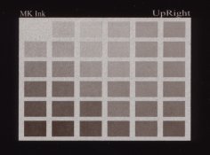
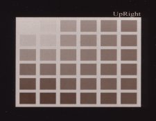
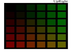
Here are my results on P400. I narrowed the gamut somewhat from the previous matrix not going all the way to pure green and pure red.

The template:

DiginegColorMatrix1_wide.jpg

Centennial POP with MK on Pictorico:

2018-03-14-0002.jpg

Centennial POP with PK on Pictorico:

2018-03-13-0004_2.jpg


I think MK was selenium toned, hence the color shift to more neutral. In both cases, the (0,0,0) block is the clearest, MK more so than PK but suffers from horrendous graininess. None of them would suffice for what a good print should be.


:Niranjan
 
OP
OP
jisner

jisner

Member
Allowing Ads
Joined
Sep 16, 2017
Messages
105
Location
Tucson, Arizona
Format
35mm
Here are my results on P400. I narrowed the gamut somewhat from the previous matrix not going all the way to pure green and pure red. ... In both cases, the (0,0,0) block is the clearest, MK more so than PK but suffers from horrendous graininess. None of them would suffice for what a good print should be. :Niranjan

Do you attribute 100% of the graininess to the printer/ink?

I'm unfamiliar with Centennial POP. Is that one of those processes that doesn't have a well-defined standard exposure? In other words, the longer you expose, the darker the print gets, never reaching a well-defined DMax? Then the color you choose for your negative is pretty subjective, since you're not aiming for paper white, but merely a "convincing" white. You, rather than the process, define the exposure scale.

Last night I printed your matrix with my P400 on Pictorico Ultra. This morning I measured UV transmission densities on the full 11x11 matrix (see below). I also printed a target with classic cyanotype. It's drying now. After the print has had a chance to oxidize (12-24h) I'll correlate the transmission densities with the reflection densities. I'll post those results tomorrow.
naranjan matrix with transmission densities superimposed.jpg
 
Last edited:

nmp

Member
Allowing Ads
Joined
Jan 20, 2005
Messages
2,054
Location
Maryland USA
Format
35mm
Do you attribute 100% of the graininess to the printer/ink?

I'm unfamiliar with Centennial POP. Is that one of those processes that doesn't have a well-defined standard exposure? In other words, the longer you expose, the darker the print gets, never reaching a well-defined DMax? Then the color you choose for your negative is pretty subjective, since you're not aiming for paper white, but merely a "convincing" white. You, rather than the process, define the exposure scale.

The graininess is far more pronounced in MK but very subtle in PK (the photos exaggerate it a bit since the actual size of the paper is quite small, at print size you can hardly see it in PK) - so yes I would say it is the ink here. I got the same results printing pure inks using QTR. I suspect the it is a inherent property of all MK inks as I have seen being mentioned elsewhere too. I am sure the transparencies play a role in it to. Also, another strike against it was it also took a long time to dry so more prone to smudging.

Centennial POP was a commercial "gelatin chloride" printing-out paper last offered by Chicago Albumen Works. It was discontinued sometime right after I bought a pack in the naughts. When I started to work on digital negatives, I thought it would be a good vehicle to ease into it not having to worry about making/hand-coating the paper. This is a typical printing-out paper with self-masking effect at higher doses which does limit its Dmax at some point. If I remember correctly, I did end up cutting down the exposure from the "standard exposure" somewhat as a trade-off to get better whites at the cost of slightly lower Dmax. It also to kept printing frame from getting too hot which resulted in ink getting stuck on the gelatin overcoat of the paper (didn't have a cooling fan on my diy exposure unit at the time.)

Some of my POP work here:

https://niranjanpatel.zenfolio.com/p790410975

I tend not to think quantitatively about exposure scales and density ranges - at least not so far. I figure the final correction curve would take care of all that once the process (the hardest part) gets fixed.

The measurements looks pretty much what I would have expected - black ink is the king in P400...

:Niranjan
 
Last edited:
OP
OP
jisner

jisner

Member
Allowing Ads
Joined
Sep 16, 2017
Messages
105
Location
Tucson, Arizona
Format
35mm
View attachment 267236 [QUOTE="nmp, post: 2387611, member: 4638"
Some of my POP work here:
https://niranjanpatel.zenfolio.com/p790410975

I tend not to think quantitatively about exposure scales and density ranges - at least not so far. I figure the final correction curve would take care of all that once the process (the hardest part) gets fixed.

The measurements looks pretty much what I would have expected - black ink is the king in P400...

:Niranjan[/QUOTE]
Your prints have a really nice tonal range with excellent whites and blacks.

Unfortunately, an image correction curve can't "fix" problems with negative density. You will either lose highlight detail (negative too dense) or lose paper white (negative too thin). There's nothing the correction curve can do about it.

I plotted the densities in the columns of the matrix transparency. To my way of thinking, an 11x11 color matrix is a collection of individual 1x11 step tables that have been arranged in a matrix solely for convenience in printing. Each individual step table should be useful on its own. I think the plot shows that your matrix contains only three truly useful step tables:

black to green
black to red
black to yellow (the diagonal)

To be useful, a curve needs to have a steep slope. The shallower the slope, the less acurate the color determination.
naranjan step table curves.jpg
 
Last edited:

nmp

Member
Allowing Ads
Joined
Jan 20, 2005
Messages
2,054
Location
Maryland USA
Format
35mm
Unfortunately, an image correction curve can't "fix" problems with negative density. You will either lose highlight detail (negative too dense) or lose paper white (negative too thin). There's nothing the correction curve can do about it.

If the negative density is too high, there are two ways I deal with it. One is let it be where it is and print the step wedge as usual and derive the correction curve. Blown out highlights will simply bunch up at the top right hand side like so.

Curve_when_density_too_high.jpg

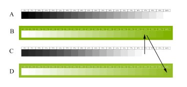
The other is after the first iteration, move the (0,0,0) point to the first blown out step before there is any measurable print density. If you are using Color Fill in Screen mode layer, that would entail changing the fill color of the layer to the color corresponding to the first blown step as illustrated here:

21Steps_Flip_invert_2.jpg

A = original step-wedge; B = negative after invert + Fill Layer; C= Resulting print; and D = new negative

If the maximum negative density is still too low, then what else can you do but curse the printer :smile:and may be look for an alternative. Or change the chemistry/process to accommodate the lower UV density if there is a leeway there.
:Niranjan.
 

nmp

Member
Allowing Ads
Joined
Jan 20, 2005
Messages
2,054
Location
Maryland USA
Format
35mm
I plotted the densities in the columns of the matrix transparency. To my way of thinking, an 11x11 color matrix is a collection of individual 1x11 step tables that have been arranged in a matrix solely for convenience in printing. Each individual step table should be useful on its own. I think the plot shows that your matrix contains only three truly useful step tables:

black to green
black to red
black to yellow (the diagonal)

To be useful, a curve needs to have a steep slope. The shallower the slope, the less acurate the color determination.

This is interesting....there is catch here, however: the lower part of the curve for these 3 potential step-wedges – it does not end in a clear film required for Dmax. Also, I wonder what is the best way to convert the gray scale image to this hybrid black/green or red or yellow one. I am not familiar with the gradient map or LUT methods so I don’t know if it can be done in those. In Color Fill method, there are some blending modes that can go from full density to zero in addition to Screen - like Lighten, Color Burn, Overlay, Soft Light among others. Soft Light looks like this:

21Steps_invert.jpg

It would be interesting what kind of transmission measurements come out of such a step-wedge. I tried briefly printing with the Overlay mode - it seemed to make the ensuing correction curve more linear if I remember correctly, but I didn’t pursue it further. It's been a while but I think I was working under the premise that it might be better able to handle shadows in a self-masking process like POP or salt prints.

:Niranjan.
 
Last edited:

nmp

Member
Allowing Ads
Joined
Jan 20, 2005
Messages
2,054
Location
Maryland USA
Format
35mm
By the way, that funky thing the green curve, where it flattens out a bit in the middle - I wouldn't be surprised it is related to being out of gamut of the printer profile somewhere there and the Relative Colorimetric rendering intent merges several points to put them back inside the gamut. Green is also the outlying color in sRGB and AdobeRGB colorspaces. I think Perceptual rendering intent might be a better choice if that's the case.

:Niranjan.
 
OP
OP
jisner

jisner

Member
Allowing Ads
Joined
Sep 16, 2017
Messages
105
Location
Tucson, Arizona
Format
35mm
If the negative density is too high, there are two ways I deal with it. One is let it be where it is and print the step wedge as usual and derive the correction curve. Blown out highlights will simply bunch up at the top right hand side like so.

The other is after the first iteration, move the (0,0,0) point to the first blown out step before there is any measurable print density. If you are using Color Fill in Screen mode layer, that would entail changing the fill color of the layer to the color corresponding to the first blown step as illustrated here

A = original step-wedge; B = negative after invert + Fill Layer; C= Resulting print; and D = new negative

If the maximum negative density is still too low, then what else can you do but curse the printer :smile:and may be look for an alternative. Or change the chemistry/process to accommodate the lower UV density if there is a leeway there.

:Niranjan.

A widespread problem with color negatives is that people have been taught (mainly, by Peter Mrhar) to look for "the most blocking color." In EDN, for example, we are taught to scan the target and use the Photoshop threshold adjustment to find the last remaining island of white and choose the corresponding color for your negative. That's wrong. It often gives a negative with too high density.

Instead, we should look for a color at the threshold of tone: the last color in a step table (that is, a column of the matrix) that prints as paper white. Colors above it in the step table should all print at paper white, while colors below it should all print with tone. A step table with a steep slope (rapidly decreasing density) is better than one with a shallow slope because it enables you to identify the "threshold of tone" more accurately. This is why I said your matrix contains only three useful step tables, all beginning at black (on my printer).

If a negative is too dense, there's never an issue because density can always be decreased. If the negative is to thin, you may run up against your printer's density limit while trying to increase it. As you say, you may be able to do something chemical to decrease the process exposure scale. Lowering exposure also shortens exposure scale.

Or get a high-end Epson with Color Density setting (to increase the amount of ink).
 
OP
OP
jisner

jisner

Member
Allowing Ads
Joined
Sep 16, 2017
Messages
105
Location
Tucson, Arizona
Format
35mm
After the print has had a chance to oxidize (12-24h) I'll correlate the transmission densities with the reflection densities. I'll post those results tomorrow.
View attachment 267218
This morning, I measured the reflection densities of the cyanotype target printed with your color matrix transparency. Here are the results (explanation below).
naranjan color matrix target densities.jpg


I made the measurements with an X-Rite model 400 reflection densitometer. The values in the table are relative to the paper base, so a zero means no detectable tone.

I'll consider the three good step tables: Black to Green, Black to Red, and Black to Yellow. Again, I am looking for the threshold of tone. That is, the last zero reading before tone is seen. In the chart above, I outlined the "threshold" cells in black.

Black to Green: step 7 (counting from the black toward green) corresponds to a color with transmission density 1.53
Black to Red: step 4 (counting from black toward red) corresponds to a color with transmission density 1.53
Black to Yellow: step 4 (counting from black toward yellow along the diagonal) corresponds to a color with transmission density 1.57

The cyanotype process that I printed with has an exposure scale of 1.50, so I think the step table did a good job in matching negative density.

FYI I determine the exposure scale based on a 21-step and 31-step Stouffer targets covered with clear film and exposed at the standard exposure. If you're interested in the method, I have a paper on it. To avoid subjective bias, I also make reflection density readings on the target and analyze them in a "Plotter" tool that I made:
BTNS Plotter - cc2.jpg
 

revdoc

Member
Allowing Ads
Joined
Apr 12, 2015
Messages
306
Format
35mm
A widespread problem with color negatives is that people have been taught (mainly, by Peter Mrhar) to look for "the most blocking color." In EDN, for example, we are taught to scan the target and use the Photoshop threshold adjustment to find the last remaining island of white and choose the corresponding color for your negative. That's wrong. It often gives a negative with too high density.

I don't know how EDN worked in the past, but in its current form it offers two approaches: an optimal blocker, which is the colour gradient that shows the most steps; and a maximum blocker, which blocks the most UV. Peter is pretty clear that the latter is intended for processes like salt printing, whic require extremely high DR negs. This is using the free Javascript code that he provides on his website.

It certainly can work well, at least under some circumstances, but like any semi-automated processes, success depends on operator skill, individual circumstances, and a bit of luck.
 
OP
OP
jisner

jisner

Member
Allowing Ads
Joined
Sep 16, 2017
Messages
105
Location
Tucson, Arizona
Format
35mm
I don't know how EDN worked in the past, but in its current form it offers two approaches: an optimal blocker, which is the colour gradient that shows the most steps; and a maximum blocker, which blocks the most UV. Peter is pretty clear that the latter is intended for processes like salt printing, whic require extremely high DR negs. This is using the free Javascript code that he provides on his website.

It certainly can work well, at least under some circumstances, but like any semi-automated processes, success depends on operator skill, individual circumstances, and a bit of luck.

Salt and certain other printing out processes do not have a standard exposure or a well-defined exposure scale. For such processes, it makes sense to use the color that blocks the most UV because it will give the best whites in your prints. But for a process with a well-defined exposure scale, the Maximum Blocker will give too dense a negative, resulting in loss of highlight detail. You want a color with a density that matches the process exposure scale. I am not convinced that the Optimal Blocker does this, but I see no reason why it shouldn't, since It has all the information it needs to determine it. Unfortunately, ColorBlocker has bigger fish to fry. It's trying to do a partial linearization (which is to say, deal with midtones). This is where the criterion of "the most steps" comes in. If it were only concerned with matching exposure scale, "the most steps" would be irrelevant.

The LUT or Gradient Map you get from ColorBlocker applies a non-linear gradient to your inverted image based on the tones in the Hue column that it chose. This gradient is different from the linear gradient you would get from a Color Fill layer in Screen mode. This should give you a sense of the difference:

EDN vs linear gradient.jpg


The solid line is the the Color Fill layer in Screen mode. It's a linear gradient from the chosen color (which presumably gives the right density range) to white. The dashed line represents the gradient that ColorBlocker applies (the actual gradient will depend on the steps it is able to use in the column). As you can see, it is non-linear.

If you know where I can find the actual javascript code, please tell. I'd love to read it!
 
OP
OP
jisner

jisner

Member
Allowing Ads
Joined
Sep 16, 2017
Messages
105
Location
Tucson, Arizona
Format
35mm
This is interesting....there is catch here, however: the lower part of the curve for these 3 potential step-wedges – it does not end in a clear film required for Dmax. Also, I wonder what is the best way to convert the gray scale image to this hybrid black/green or red or yellow one. I am not familiar with the gradient map or LUT methods so I don’t know if it can be done in those. In Color Fill method, there are some blending modes that can go from full density to zero in addition to Screen - like Lighten, Color Burn, Overlay, Soft Light among others. Soft Light looks like this:

View attachment 267277

It would be interesting what kind of transmission measurements come out of such a step-wedge. I tried briefly printing with the Overlay mode - it seemed to make the ensuing correction curve more linear if I remember correctly, but I didn’t pursue it further. It's been a while but I think I was working under the premise that it might be better able to handle shadows in a self-masking process like POP or salt prints.

:Niranjan.

For a step table used to determine negative density range, there's no need to go to zero (clear film). The grayscale step table I use goes from B=0% (black) to B=30% (dark gray). At 30%, the density is 0.80. I don't know if I'll ever print with a process having an exposure scale that low.

DMax should have already been determined by the time you get to this step. It was determined when you found the standard exposure. Once that is done, you move on to the next step: matching negative density to exposure scale. DMax doesn't enter into it at all. When you complete this step, you have DMax and DMin, you move on to the next step, linearization. Linearization assumes fixed endpoints and works on the intermediate tones. Linearization can do nothing about the endpoints. It can't "fix" negative density problems or under/overexposure.

Regarding Color Fill in Screen mode: unless you want to get into the math of screen modes, it's better to look at curves. In fact, I don't use Color Fill, I use a Curve.

Say the color you find is HSB=(90,100,20). Get the equivalent RGB by entering the HSB values into Colo
r Picker and reading off the RGB values:
color picker.jpg


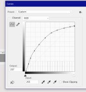
Now make a new Curves adustment layer. Select the Red channel and enter Input=0, Output=26. Then select the Green channel and enter Input=0, Output=51 (see below). This has exactly the same effect as the Color Fill layer in screen mode. And it shows you what I mean by "linear gradient".

curves alternative to color fill in screen mode.jpg
 
OP
OP
jisner

jisner

Member
Allowing Ads
Joined
Sep 16, 2017
Messages
105
Location
Tucson, Arizona
Format
35mm
By the way, that funky thing the green curve, where it flattens out a bit in the middle - I wouldn't be surprised it is related to being out of gamut of the printer profile somewhere there and the Relative Colorimetric rendering intent merges several points to put them back inside the gamut. Green is also the outlying color in sRGB and AdobeRGB colorspaces. I think Perceptual rendering intent might be a better choice if that's the case.

:Niranjan.

I'm using the print settings you recommended, so yes, I am using Relative Colorimetric. Hard to believe that a gamut error would have that much of an effect. More likely, it's the ink. Maybe that's where the printer starts adding black to the magenta to neutralize the green. You never know!
 

revdoc

Member
Allowing Ads
Joined
Apr 12, 2015
Messages
306
Format
35mm
If you know where I can find the actual javascript code, please tell. I'd love to read it!

Download the zip file from his website and look for the .js file. It's just text.
 

nmp

Member
Allowing Ads
Joined
Jan 20, 2005
Messages
2,054
Location
Maryland USA
Format
35mm
I'm using the print settings you recommended, so yes, I am using Relative Colorimetric. Hard to believe that a gamut error would have that much of an effect. More likely, it's the ink. Maybe that's where the printer starts adding black to the magenta to neutralize the green. You never know!

You might be right about the ink mixing and its possible non-linear effect on the UV absorption/transmission. Color management and printing modules kind of operate like a black box (at least for a novice like me) so it is hard to pinpoint.

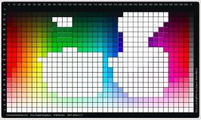
Just for reference, here the gamut warning displayed as white areas on Mhrar's color chart for SC P400 Premium Glossy profile generated using soft-proofing in Ps:

MhrarChart_out-of_gamut.jpg

:Niranjan.
 

nmp

Member
Allowing Ads
Joined
Jan 20, 2005
Messages
2,054
Location
Maryland USA
Format
35mm
For a step table used to determine negative density range, there's no need to go to zero (clear film). The grayscale step table I use goes from B=0% (black) to B=30% (dark gray). At 30%, the density is 0.80. I don't know if I'll ever print with a process having an exposure scale that low.

DMax should have already been determined by the time you get to this step. It was determined when you found the standard exposure. Once that is done, you move on to the next step: matching negative density to exposure scale. DMax doesn't enter into it at all. When you complete this step, you have DMax and DMin, you move on to the next step, linearization. Linearization assumes fixed endpoints and works on the intermediate tones. Linearization can do nothing about the endpoints. It can't "fix" negative density problems or under/overexposure.

Regarding Color Fill in Screen mode: unless you want to get into the math of screen modes, it's better to look at curves. In fact, I don't use Color Fill, I use a Curve.

Say the color you find is HSB=(90,100,20). Get the equivalent RGB by entering the HSB values into Colo
r Picker and reading off the RGB values:
View attachment 267332


Now make a new Curves adustment layer. Select the Red channel and enter Input=0, Output=26. Then select the Green channel and enter Input=0, Output=51 (see below). This has exactly the same effect as the Color Fill layer in screen mode. And it shows you what I mean by "linear gradient".

View attachment 267331

So I misunderstood (not the first time) what you were referring to as "step table." Anyway, I think by and large my process is substantially the same as yours, except for the lack of use of densitometer and Stouffers on my part. I don't see a UV densitometer in my near future so I will stick to the empirical way of doing things. But it's really good to know there is some method in the madness of alternative process world.

Lots of enlightening discussion on this thread. Thanks for sharing all your data.

:Niranjan.
 
OP
OP
jisner

jisner

Member
Allowing Ads
Joined
Sep 16, 2017
Messages
105
Location
Tucson, Arizona
Format
35mm
You might be right about the ink mixing and its possible non-linear effect on the UV absorption/transmission. Color management and printing modules kind of operate like a black box (at least for a novice like me) so it is hard to pinpoint.

Just for reference, here the gamut warning displayed as white areas on Mhrar's color chart for SC P400 Premium Glossy profile generated using soft-proofing in Ps:

View attachment 267371

:Niranjan.
Those gamut warnings are interesting, especially considering how many there are in the "pure" colors (colors with S=100 and B=100). But gamut warnings haven't been useful or reliable since Adobe introduced color management (which included the rendering intents) in 1998. I was taught to ignore them. I have a feeling that you would get the same density with any of the rendering intents. Or the differences would be smaller than 0.01, which is the resolution of my densitometers.
 
OP
OP
jisner

jisner

Member
Allowing Ads
Joined
Sep 16, 2017
Messages
105
Location
Tucson, Arizona
Format
35mm
So I misunderstood (not the first time) what you were referring to as "step table." Anyway, I think by and large my process is substantially the same as yours, except for the lack of use of densitometer and Stouffers on my part. I don't see a UV densitometer in my near future so I will stick to the empirical way of doing things. But it's really good to know there is some method in the madness of alternative process world.

Lots of enlightening discussion on this thread. Thanks for sharing all your data.

:Niranjan.
When you print a target using a step table/matrix transparency, you use your eyes to find the best color or tone. You don't even have to know the process exposure scale. This is an easy and accurate method, but it assumes your process variables (darkroom, etc.) are perfect. You can't get a good answer from a bad print.

If you're measuring the negative with a transmission densitometer, accurate knowledge of the exposure scale is essential. You need to know the number you're trying to match. There are two ways to know it (1) you can estimate it to within 1/2 or 1/3 stop by visually inspecting a Stouffer 21-step or 31-step target exposed at the standard exposure or (2) you can measure Stouffer target reflection densities and plot them in a program like BTZS Plotter. I wrote my own version of BTZS Plotter which allows me to merge 21-step and 31-step densities, average them, and smooth them. Hopefully I can get within 1/4 stop. The advantage of this method is it is unaffected by darkroom variables. If you have the instruments, it's fast!

In fact, an entire calibration (standard exposure, negative density, image correction curve) can be done with only a single trip to the darkroom. At least in theory :smile:
 

nmp

Member
Allowing Ads
Joined
Jan 20, 2005
Messages
2,054
Location
Maryland USA
Format
35mm
The difference between a step table and a step wedge: $50

:smile:

By the way did you ever find out if Stouffer's numbers are UV based or visible light based?

Also, can you share your paper about doing ES calculations? You never know I might want to use it at some point.

Thanks.

:Niranjan
 
OP
OP
jisner

jisner

Member
Allowing Ads
Joined
Sep 16, 2017
Messages
105
Location
Tucson, Arizona
Format
35mm
I seem to remember that I measured the Stouffer with my transmission densitometer in UV mode, and that I got very close agreement.

Send me an email and I'll send you a draft manuscript: john dot isner at gmail dot com

It will be a few days. I need to incorporate some ideas from this discussion.
 
Photrio.com contains affiliate links to products. We may receive a commission for purchases made through these links.
To read our full affiliate disclosure statement please click Here.

PHOTRIO PARTNERS EQUALLY FUNDING OUR COMMUNITY:


Ilford ADOX Freestyle Photographic Stearman Press Weldon Color Lab Blue Moon Camera & Machine
Top Bottom