Color Paper Viability

Musician

A
Musician

  • 0
  • 0
  • 9
Your face (in it)

H
Your face (in it)

  • 0
  • 0
  • 41
A window to art

D
A window to art

  • 3
  • 0
  • 45
Bushland Stairway

Bushland Stairway

  • 4
  • 1
  • 103

Recent Classifieds

Forum statistics

Threads
199,246
Messages
2,788,521
Members
99,841
Latest member
Neilnewby
Recent bookmarks
0
OP
OP
RedSun

RedSun

Member
Joined
Aug 27, 2012
Messages
680
Location
New Jersey,
Format
Multi Format
I normally use the negatives along with the actual prints to compare. Those are from regular local labs.
I get Fuji PIII and Super Type C. They were sealed and stored in basement.
 

koraks

Moderator
Moderator
Joined
Nov 29, 2018
Messages
23,508
Location
Europe
Format
Multi Format
A few observations concerning your test strips:
* They're pretty small and show only a small part of the negative. That makes it quite difficult to judge and dial in colors. I generally try to make strips that capture the full contrast range of the image and preferably also the most relevant (to me) areas of color in the same strip. That way I am less likely to run into the problem that I balance OK for a particular part of the scene while the rest goes out of whack. Moreover, it's easier to balance colors if you can see how different colors in the image relate to each other as opposed to trying to match a single color. Often, as I get somewhat close to what I believe is a good color balance, I will print the entire frame to see how it ends up and then make minor adjustments as needed.
* The negative you appear to be using is a bit odd; I'm referring to the unevenness and the strange striped/checkered pattern - I've never seen something like this across an image so it makes me wonder what we're looking at and how this negative was made exactly. It doesn't look like a 'typical' negative.
* A negative taken under apparently challenging lighting conditions (with not a lot of light, and possibly a light source that deviates quite a bit from daylight) can be rather difficult to finetune in terms of color. I'd start with some negatives taken under daylight and made with sufficient exposure; these are generally somewhat easier to get the hang of color balancing. It also helps if there are e.g. a grey sky and/or clouds in an image as they generally tend to be fairly close to neutral and you can color balance on those and see how the rest of the colors snap into place once you get the clouds right (this is obviously less effective if you're dealing with setting/rising sun). Alternatively, a test negative as described by @MattKing can be very useful. This is generally a negative that contains the primary colors as well as some subtle hues that occur frequently and require careful balancing; skin tones have always been popular for this, likely because the human eye/brain is very sensitive to deviations from 'normal' in skin tones.

So in short, maybe consider printing some other (easier) negatives, and waste a little more paper on your test strips. Once you've found a good baseline for an easy negative, other negatives on the same kind of film will print well with fairly similar filter values.
 
OP
OP
RedSun

RedSun

Member
Joined
Aug 27, 2012
Messages
680
Location
New Jersey,
Format
Multi Format
Those are the Jobo ColorLine "grey" calibration strips, not from any regular negative. The analyzer has the "grey" negative, initial color setup, test strip. Then the analyzer tests the new test strip and adjusts the new color balance. The analyzer only need to read 3-5mm area of the strip. When the color balance does not change any more, the calibration is complete. But the issue is that, the test at this time is not truly "grey". So the base color balance may not be correct.

After the color head is balanced, the analyzer can read the real negative and set the color settings for printing.

If you research online, you can see Jobo ColorLine 5000 and 7000. They are very advanced equipment.

I believe some commercial color printers have similar color "calibration". But they are more automate and better.
 

koraks

Moderator
Moderator
Joined
Nov 29, 2018
Messages
23,508
Location
Europe
Format
Multi Format
Oh yeah of course, you're trying to zero in a color analyzer. To be frank, I gave up on that as I found myself wasting too much time to my liking calibrating for different papers and then still having to run test strips to balance individual shots. Might as well skip the entire analyzer if you have to do test strips anyway, but that's just me. A friend of mine always used his color analyzer and wouldn't want to print without one. I tried two different ones, tested extensively and don't even think of using one now. I used the LiCi ColorStar devices BTW, an older one and a new model with separate cartridges for different papers. Very neat piece of equipment, but I just happen to not find it particularly useful myself.
 

mshchem

Subscriber
Joined
Nov 26, 2007
Messages
14,789
Location
Iowa City, Iowa USA
Format
Medium Format
I've been printing color for longer than I would like to say. The analyzer will just complicate things right now, very much so. If you are learning, get fresh supplies. Make some negatives with normal daylight and fill flash. Film doesn't have auto white balance.

There's a ton of good advice here, follow it and you will find success.

Fast, cheap, and easy = inkjet = no fun.
 

MattKing

Moderator
Moderator
Joined
Apr 24, 2005
Messages
53,277
Location
Delta, BC Canada
Format
Medium Format
The workflow you want is:
1) start with a known good negative with a good distribution of tones and colours, including flesh tones that range between shadows, through mid-tones and into highlights. If it can also include a grey card and control patches, that is great;
2) using trial and error, including test strips, make an excellent print;
3) record the settings on the enlarger and the details of processing and the paper used;
4) using the analyzer, take measurements at the easel of important parts of the image. This is where including the grey card and control patches helps the most, but don't ignore other areas of the subject. You may wish to write those measurements right on to the print, in the locations that correspond to where you took the measurements - otherwise a hand drawn facsimile of the image or a colour photocopy can work;
5) record the measurements with a description of where exactly in the image you took them - the annotated print is the best way to do that;
6) save the negative with the annotated print/facsimile showing all the settings and measurements and details, including details of the processing and the paper used;
7) together, that negative (your "Shirley") and your recorded details are what permit you to make best use of the analyzer with new negatives.
 

mshchem

Subscriber
Joined
Nov 26, 2007
Messages
14,789
Location
Iowa City, Iowa USA
Format
Medium Format
I still have Kodak Color Darkroom Data guides with a standard Ektacolor-S negative (C-22) and a Ektacolor Professional paper print. When I started printing always had better luck with Kodacolor-X, that stuff was bullet proof. I think most of the filter pack was in the orange mask.:laugh:.
Surely, don't call me Shirley!
 

DREW WILEY

Member
Joined
Jul 14, 2011
Messages
14,101
Format
8x10 Format
Most of the problem regardless is developing a good color eye. That takes experience as well as objective strategy. It's as much psychological as physiological. And it's darn rare to see a good inkjet print anywhere; and when you do, it was made by someone with many years of color darkroom experience prior, who already knows what they want, and is realistic about the inherent limitations of every single color medium ever invented.
 

koraks

Moderator
Moderator
Joined
Nov 29, 2018
Messages
23,508
Location
Europe
Format
Multi Format
Most of the problem regardless is developing a good color eye. That takes experience as well as objective strategy. I
What helps me is to paste a color wheel to my darkroom wall with a gray scale (as neutral as possible) along with it. The color wheel is an easy reminder which filtration is needed for whatever color shift you want (although this becomes second nature quite quickly), and the gray scale is an good benchmark for adjusting negatives with neutral greys (think clouds). Especially in the latter case I find the eye/brain keeps playing tricks on you regardless of how much experience you have. The brain does a very good job at telling us something is neutral gray if it knows it should be, even if there's a color cast present in reality.
 
OP
OP
RedSun

RedSun

Member
Joined
Aug 27, 2012
Messages
680
Location
New Jersey,
Format
Multi Format
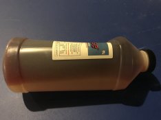
Here is the RA-4 developer, one solution, not parts. It has been like this all the years. Still mix well. Not sure if this is still good.

IMG_7900 2.jpg
 
OP
OP
RedSun

RedSun

Member
Joined
Aug 27, 2012
Messages
680
Location
New Jersey,
Format
Multi Format
Most of the problem regardless is developing a good color eye. That takes experience as well as objective strategy. It's as much psychological as physiological. And it's darn rare to see a good inkjet print anywhere; and when you do, it was made by someone with many years of color darkroom experience prior, who already knows what they want, and is realistic about the inherent limitations of every single color medium ever invented.

So what you said is that color printing is a very tall task and only people with many years' experience can get it right..... Or do not bother....
 

brbo

Member
Joined
Dec 28, 2011
Messages
2,151
Location
EU
Format
Multi Format
I got results that I was very pleased with after less than an hour. And this was my first time in darkroom.

I did use fresh paper and chemicals, though.
 

koraks

Moderator
Moderator
Joined
Nov 29, 2018
Messages
23,508
Location
Europe
Format
Multi Format
I got results that I was very pleased with after less than an hour. And this was my first time in darkroom.
Me too. I now think those prints are crap, but the initial success was enough to keep me going. That's what matters. Every journey starts with the first step. Don't expect to get to the destination immediately, and you don't need to.
 

MattKing

Moderator
Moderator
Joined
Apr 24, 2005
Messages
53,277
Location
Delta, BC Canada
Format
Medium Format
So what you said is that color printing is a very tall task and only people with many years' experience can get it right..... Or do not bother....
I don't think Drew is saying that (although he might be).
What I would say is that it takes some care and diligence to become good at evaluating colour.
It is a rewarding process though - just expect that if you do it for a while, you may end up wanting to "tweak" some of your earlier prints after you refine your abilities.
One partial downside - you may find yourself more "picky" when you look at other people's work. It can be both a blessing and a curse to be able to look at a print and say "that is about 5 CC too blue".
 

mshchem

Subscriber
Joined
Nov 26, 2007
Messages
14,789
Location
Iowa City, Iowa USA
Format
Medium Format
I have a 6500°K LED flood lamp above my work area. Illumination for print evaluation huge deal. There is a very straightforward process for balancing prints, as described by folks here.
Start with a good standard negative, shot in daylight
Fresh paper and chemistry
Make ring around prints
It's not difficult, but you need a negative that's been exposed in daylight or proper flash.
This is a handy tool
cvx-3052-fd-real_1.png
 

DREW WILEY

Member
Joined
Jul 14, 2011
Messages
14,101
Format
8x10 Format
What I am saying is that one gets better at it over time. You have to start somewhere. RA4 Çhromogenic printing is very easy in principle. It's even easy technically. But truly getting color under control is not simple. Any decent watercolorist can mix hues in minutes that are nearly impossible to replicate with ANY kind of color photographic medium. You have to learn the corral of specific limitations and learn how to make the most of them. But a person could be taught in just a few hours to make a much better print than a minilab would provide. The worst printers are those who go around stating, "I can do anything in Photoshop". Yeah, that's like saying you know a thousand different ways to cook roadkill that's been salvaged from the vultures. So a vital part of the process is learning to find a good marriage between the film and print medium to begin with.
 

mshchem

Subscriber
Joined
Nov 26, 2007
Messages
14,789
Location
Iowa City, Iowa USA
Format
Medium Format
What I am saying is that one gets better at it over time. You have to start somewhere. RA4 Çhromogenic printing is very easy in principle. It's even easy technically. But truly getting color under control is not simple. Any decent watercolorist can mix hues in minutes that are nearly impossible to replicate with ANY kind of color photographic medium. You have to learn the corral of specific limitations and learn how to make the most of them. But a person could be taught in just a few hours to make a much better print than a minilab would provide. The worst printers are those who go around stating, "I can do anything in Photoshop". Yeah, that's like saying you know a thousand different ways to cook roadkill that's been salvaged from the vultures. So a vital part of the process is learning to find a good marriage between the film and print medium to begin with.
In my former life I had some responsibly for matching colors for home appliances. You have it right. The best color control is a experienced human being. We went through all kind of gyrations over "what's white" for thermoformed and injection molded plastic parts. We had a engineer in production who went out and spent a huge sum buying Macbeth instruments, huge reflectance specs, standards etc. He was using these tools, still all over the place.......wait for it........He finally admitted he was color blind!
I got this dumped in my lap, I enlisted the help of our industrial design people, I worked with these guys, trained a very level headed young woman who worked for me, problem solved.
I have a helluva time unless I print ring around prints. I have to walk away and come back the next day. The brain does a great job correcting for weird light, leads me down the wrong path.
My friend that owns the last remaining camera store nearby has a woman who is amazing, master printer, 10+ years full time. She sits and bangs away prints making slight corrections.
Still, when she wants it dead on she prints out 3 or 4 test prints to determine the exact filtration. When you watch her work it looks easy, it is, for her.:smile:
 

DREW WILEY

Member
Joined
Jul 14, 2011
Messages
14,101
Format
8x10 Format
For a number of years I did color consultation as well as training pro color matchers. There's a heck of a lot to it. It helps to study basic color theory first, as well as firmly learn the fact that you need to look at things more than once, preferably with unfatigued eyes a second time (NEVER after a long computer or phone screen session), and using different light sources to avoid metamerism. There's no such thing as "white", although pure barium sulfate pigment comes darn close. They used to line the interiors of spectrophotometers with that. You can still get it, at around $200 per half a pint. But there was a nice old sales gent I worked with who decided he wanted to collect color photographs. So he came over and looked at some prints, then suddenly spotted a particular 11X14 Cibachrome in my trashcan, still unwrinkled. He was thrilled and even paid me to frame it. The color balance was atrocious; maybe a bulb had gone bad in the enlarger; I don't remember. Only afterwards did I learn he was color blind and saw things in an entirely different manner than most of us.
 
Photrio.com contains affiliate links to products. We may receive a commission for purchases made through these links.
To read our full affiliate disclosure statement please click Here.

PHOTRIO PARTNERS EQUALLY FUNDING OUR COMMUNITY:


Ilford ADOX Freestyle Photographic Stearman Press Weldon Color Lab Blue Moon Camera & Machine
Top Bottom