Color adjustments for Portra scans

Bushland Stairway

Bushland Stairway

  • 3
  • 1
  • 42
Rouse st

A
Rouse st

  • 6
  • 3
  • 85
Do-Over Decor

A
Do-Over Decor

  • 1
  • 1
  • 103
Oak

A
Oak

  • 1
  • 0
  • 80

Recent Classifieds

Forum statistics

Threads
199,234
Messages
2,788,331
Members
99,837
Latest member
Agelaius
Recent bookmarks
0
Status
Not open for further replies.

revdocjim

Member
Joined
Nov 17, 2010
Messages
357
Location
Tokyo
Format
Multi Format
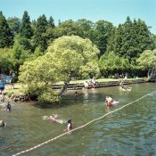
Almost everything I shoot in film is medium format B&W or slide film. I develop my own B&W and send the slide film to a lab. Then I scan the developed film and work with it from there on my computer. I've tried Portra 400 negative film a few times but am not happy with the colors I get when scanning my negatives. In fact they really suck and I'm looking for some advice.

I have an Epson V-700 and find that it works great for B&W and slide film. I used a cheap calibration software package called EZColor to make a profile for velvia slide film and it is really good. For B&W and color negatives I just use the drivers included in the Epson software. But the colors I get with color negatives are very unsatisfactory. They remind me of old faded prints from the eighties. I tried a few adjustments but haven't been happy with anything. I do PP in LR and none of the Auto settings get anywhere close and I just don't have good enough color instincts to know what manual changes to make.

I'm including a link to some examples.
http://www.pbase.com/revdocjim/bad_colors
In this roll I selected the pre-set for faded photos in two or three of them because it seemed to help just a bit. But still I think you will see that the colors are not very realistic. To my eye the blues and greens look way off.

Any advice will be great appreciated!
 

mts

Member
Joined
Feb 12, 2004
Messages
372
Location
Los Alamos,
Format
Multi Format
Post in DPUG, the digital forum.
 

F/1.4

Member
Joined
May 16, 2011
Messages
233
Format
Multi Format
I dunno what you're complaining about, but those look about right to me.
 

coigach

Member
Joined
May 23, 2006
Messages
1,593
Location
Scotland
Format
Multi Format

lxdude

Member
Joined
Apr 8, 2009
Messages
7,094
Location
Redlands, So
Format
Multi Format
OP
OP

revdocjim

Member
Joined
Nov 17, 2010
Messages
357
Location
Tokyo
Format
Multi Format
OK. Sorry about putting this in the wrong place. I'm not very familiar with the DPUG but assumed it was about digital cameras and digitally captured photos where as my question is about film. But I will try it there too.
 

lxdude

Member
Joined
Apr 8, 2009
Messages
7,094
Location
Redlands, So
Format
Multi Format
OK. Sorry about putting this in the wrong place. I'm not very familiar with the DPUG but assumed it was about digital cameras and digitally captured photos where as my question is about film. But I will try it there too.

Well, there's hybridphoto, too.:wink::wink:
 

nworth

Member
Joined
Aug 27, 2005
Messages
2,228
Location
Los Alamos,
Format
Multi Format
I generally use about the same workflow. The color comes out pretty well most of the time, but it almost always needs some adjustment for a really fine print. In most cases, but definitely not all, the automatic adjustment in Photoshop (and others) does a pretty good job.
 
Joined
Jan 17, 2005
Messages
1,355
Location
Downers Grov
Make a neg of a color checker or other subject with all the colors. SET THE SCANNER TO MANUAL and FORGET ALL THE PRESETS and easy stuff that turns out to be hard. Get a scan that is the best color you cam get. Then save the RGB setting as a preset. You will need to know how to color balance. Same as printing color neg.

Use that for every frame of that type film from then on. It will be very close unless you expose daylight film under tungsten or some such error. They make filters for that.
 
OP
OP

revdocjim

Member
Joined
Nov 17, 2010
Messages
357
Location
Tokyo
Format
Multi Format
The colours all look perfectly natural to me.

pentaxuser

Thanks for all the replies. I've found that by simply toning down the brightness many of them look better. It's interesting how the software tends to make these negatives brighter than the original when converting them to positive colors.
But honestly, I'm surprised that some folks think these colors are ok. Granted, some of them are closer than others, and this certainly doesn't have anything to do with digital photos because my main comparison, as explained in the OP, is slide film (and yes I know that velvia is intentionally over-saturated). But to those who think this looks natural...

large.jpg

I am left scratching my head. My monitor is calibrated and I have reasonably good eye sight. I can do those online exercises where you line up the colors in a spectrum and I frequently get perfect scores. But I can assure you that in all my fifty years on this planet I have never seen a sky that is this color. And the trees look extremely fake as well. And as for the water color, I can promise you, it is not that weird algae like color in real life at all. How can this look natural to anyone? The only place I've seen these colors is in old, faded color prints from the 70s and 80s.

But when I try to make adjustments in the color I just can't seem to find the spot where everything snaps into place...
 

pentaxuser

Member
Joined
May 9, 2005
Messages
20,022
Location
Daventry, No
Format
35mm
Only you know what the colours actually were but looking from above and given that it appears to be a lake and not the open sea which is affected by the sky it seems to takes its colours from the green background provided by the trees.

The sky looks a little cyanish but dependent on the weather conditions sky often looks more cyanish in real life than we assume when we look at a photograph.

Overall I can see no obvious colour cast and a cyan cast normally shows itself more easily than most casts. Colours appeared slightly muted but still real.

Maybe there are films that meet your colour requirements better or a scanning method that gives you more saturation.

I hope so as my comments seem to have made things worse rather better. Best of luck in finding what you want


pentaxuser
 

coigach

Member
Joined
May 23, 2006
Messages
1,593
Location
Scotland
Format
Multi Format
Use ColorPerfect, a Photoshop plug-in to use with your neg scans that matches colour accurately to different film types. It’s not very user-friendly program to set up, but worth sticking with as results are excellent.
http://www.c-f-systems.com/Plug-ins.html

Here is more info:
http://www.colorneg.com/oldneg.html?lang=en
and
http://www.flickr.com/groups/colorperfect/

As I said earlier, use Colorperfect plugin - this accurately matches scans to the colours of a wide range of different colour neg film emulsions - that way you can be sure that what you are seeing is what the film should look like...
 
OP
OP

revdocjim

Member
Joined
Nov 17, 2010
Messages
357
Location
Tokyo
Format
Multi Format
Well, I really do appreciate all the feedback and I guess I shouldn't string this out since I was told right off that this was the wrong place for it anyway. So I will work with the various excellent tips given and see where it takes me. Thanks to everyone!
 

polyglot

Member
Joined
Jun 12, 2009
Messages
3,467
Location
South Australia
Format
Medium Format
Your black-point is too low and the gamma is wrong, both of which make the contrast too low and the result is, as you say, faded. I recommend using VueScan and pushing the "brightness" slider downwards to bring back the right gamma, and being very aggressive in choosing a black-point. The negs contains 10-12 stops of dynamic range whereas you can fit maybe 6 into a print/jpeg. So you have to throw away information.

And yes, stuff is green. If you set the "lock colour" option in vuescan, you get separate R, G, B sliders for both black and white points. That'll fix any pesky casts; in this case I suspect the green portion of the blackpoint could be brought up a fair bit. Where there are casts in the shadows, that's an indication that your scanning software has improperly detected the film base colour.
 
Last edited by a moderator:
OP
OP

revdocjim

Member
Joined
Nov 17, 2010
Messages
357
Location
Tokyo
Format
Multi Format
Thanks polyglot! I tried to follow your advice or the LR4 equivalent of it and while I still don't think I have it spot on, I'm liking it better.
006-3.jpg
 

Diapositivo

Subscriber
Joined
Nov 1, 2009
Messages
3,257
Location
Rome, Italy
Format
35mm
But to those who think this looks natural...

View attachment 56030

Most of your pictures look OK to me. This is one of the pictures that are not OK. Excess yellow, I would say.

Here is a proposed fast correction. Possibly there is a little bit of yellow still left.
 

Attachments

  • Troppo_giallo.jpg
    Troppo_giallo.jpg
    205.6 KB · Views: 79
  • Troppo_giallo_corretta.jpg
    Troppo_giallo_corretta.jpg
    606.9 KB · Views: 89
Last edited by a moderator:
Status
Not open for further replies.
Photrio.com contains affiliate links to products. We may receive a commission for purchases made through these links.
To read our full affiliate disclosure statement please click Here.

PHOTRIO PARTNERS EQUALLY FUNDING OUR COMMUNITY:


Ilford ADOX Freestyle Photographic Stearman Press Weldon Color Lab Blue Moon Camera & Machine
Top Bottom