CMY Pigments - Attaining Theoretical Curves

Exhibition Card

A
Exhibition Card

  • 0
  • 0
  • 16
Flying Lady

A
Flying Lady

  • 5
  • 1
  • 48
Wren

D
Wren

  • 0
  • 0
  • 28

Recent Classifieds

Forum statistics

Threads
199,037
Messages
2,785,090
Members
99,786
Latest member
Pattre
Recent bookmarks
0

holmburgers

Member
Joined
Aug 13, 2009
Messages
4,439
Location
Vienna, Austria
Format
Multi Format
In my reading about pigment & dye printing techniques, namely dye-transfer & color-carbon, it is always mentioned and understood that the pigments/inks/dyes that we have available to us are far from theoretically perfect.

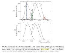
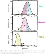
Yellow comes the closest to reaching the ideal curve for a subtractive color. Ideally, Cyan should completely transmit green & blue while absorbing all red, Magenta should transmit blue & red and completely absorb green, Yellow should transmit 100% of red & green while absorbing all blue.

In other words, if you looked at a graph of ideal CMY colors, they would be rectangular, encompassing all wavelengths of the colors they should transmit with a sharp cut-off at the point of desired absorption.

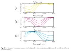
This PDF (follow link) shows graphically the ideal and real color response of dyes used in DT; it is analogous to all "process colors" that we use, whether it's pigment, ink or dye. You'll see that the colors we use are far from the ideal.

(there was a url link here which no longer exists)

Now, this information is old, but in 1982 Luis Nadeau says the same exact things about color-carbon pigments. I believe this is still the case today.

So, my question is totally theoretical, but I'm curious how we (as in humans in the 21st century... not you or me necessarily) might be able to achieve the ideal, hard-cutting pigments.

I think the answer lies in nanotechnology. (something that I know very little about.)

Another interesting side note is that these process colors are picked for attributes other than just their color, namely light-fastness & transparency. They are generally acid dyes, but basic dyes are known to have much purer and brighter colors, though they fade quickly. It would be interesting to see a print made with these fugitive dyes, if only for a short period of time. I'm curious about their color curves, and how close they approach the ideal.

But back to nanotechnology. I don't know enough to be helpful, just enough to be dangerous. But nanotechnology seems to be the "hat rack for future development" so I too will hang my hat on it and wait for the nano-messiah. Anyways, it seems that if we can create tiny structures with a high degree of customization and control, perhaps we can attain perfect color curves.

I'd love to hear from someone who might actually know a thing or two about this, but at any rate, it's food for thought.
 
Joined
Oct 29, 2006
Messages
4,829
Location
İstanbul
Format
35mm
I had been posted a post couple of years ago about using nanopowders as the six inkjet nozzles inks for different visual response to the eye , not color , bw.

There is also a printer here which have a 300000 dollars machine for architects which laser ablated the powders on paper.

Chris ,

All that going on is not about correctness , its all about the culture. Kodak , Leica , Zeiss finds their color spectrum from the art history. If you want correctness , collect some money and find a ccd which has no preelected colors , I mean without any culture and take your photographs. You will have a picture but no chance to be approved by all cultures.

In this world most widely accepted culture created by Romans and so the Byzantines. They managed the land from England , All Europe , Africa , Middle East and effect China and India.

usa have 500 years history and a state for 200 years , you cant have a multicultural culture been straightforwarded the past in 200 years , may be hamburgers or eminem

So you go for older widely accepted cultures.

So study art history , art chemistry and you will see the truth.

If you want correctness , go for astrophotography.

You can not reach to the audience with perfectly cube shaped car.

Umut
 
OP
OP
holmburgers

holmburgers

Member
Joined
Aug 13, 2009
Messages
4,439
Location
Vienna, Austria
Format
Multi Format
Umut, you raise a very interesting point about the subjectivity of color.

But, the goal of perfect pigments is to create perfectly objective rendering, that is, colors that are just as nature's color. Those cannot be said to be culturally influenced.

Kodak, Fuji, lens manufacturers, etc., have had to make concessions for the shortcomings of the dyes, sensitivities of film and the physics of glass. But with the ability of absolutely analogous color, only the subject would have an influence on the color subjectivity.
 
Joined
Oct 29, 2006
Messages
4,829
Location
İstanbul
Format
35mm
I am sending a book on Byzantine Icons in 15 minutes , you will find there Autochromes to Picasso to Kodak to Swedish glass colors.
Believe me your question is not a question for art directors of these companies. They look for culture as you look for perfectness. Young people always goes for perfectness , this is goodand creates a huge library in their heads.
If you can post the cover to here , people understand what we are talking about. I dont know snapping a image from pdf. load latest adobe reader.
 

Photo Engineer

Subscriber
Joined
Apr 19, 2005
Messages
29,018
Location
Rochester, NY
Format
Multi Format
Perfect wide dyes are horrible and perfect narrow dyes are horrible. The mean is best. Moderate bandwidth. The problem is unwanted absorption, and that cannot be totally beaten.

PE
 
OP
OP
holmburgers

holmburgers

Member
Joined
Aug 13, 2009
Messages
4,439
Location
Vienna, Austria
Format
Multi Format
What exactly do you mean by perfect wide and narrow dyes? What makes them perfect and why are they horrible?

I thought that ideally the dye's should not be wide nor narrow, but just right. I'm just confused on the terminology I think.

I find it very fascinating that on Earth, in this day and age, that we are unable to create certain colors. It's kind of reassuring actually... we're still at the whim of the natural world, we haven't yet conquered it.
 
OP
OP
holmburgers

holmburgers

Member
Joined
Aug 13, 2009
Messages
4,439
Location
Vienna, Austria
Format
Multi Format
Ok... already read it. So you're saying that there are dyes that match those curves?

How are they horrible? I guess that is the operative question. I assumed you meant visually horrible, but perhaps you mean light-fastness, and the like?
 

Photo Engineer

Subscriber
Joined
Apr 19, 2005
Messages
29,018
Location
Rochester, NY
Format
Multi Format
The block dyes do not really exist but can be simulated. The other dyes exist. The simulations of block dyes are dark and muddy. If the dyes are too narrow they begin to suffer from other problems than just hue. They show a huge degree of metamerism and sometimes other severe problems such as loss of detail in objects. The measure of a dye is peak absorption, half band width, and level of unwanted absorptions. Certain "center" values must be met.

PE
 
OP
OP
holmburgers

holmburgers

Member
Joined
Aug 13, 2009
Messages
4,439
Location
Vienna, Austria
Format
Multi Format
Hmmm, I'm intrigued. How can they be simulated?

I don't understand why they would be dark and muddy I guess, since they'd be perfectly transmitting 2/3rds of the light and perfectly absorbing the remaining third. Shouldn't they appear as incredibly pure forms of cyan, magenta and yellow?

I can see how narrow band would lead to metamerism.

Is it also true that certain basic dyes have more desirable hue characteristics at the expense of light-fastness?

Thanks for your insight.
 

Photo Engineer

Subscriber
Joined
Apr 19, 2005
Messages
29,018
Location
Rochester, NY
Format
Multi Format
They can be simulated by both hand calculation and by computer simulation. They can also be simulated by blending dyes with different lambda max values (as shown in your reference - the cyan is double peaked). Although the light is purer, the amount of light transmitted is less. The overall effect, when compared to a "normal" dye is muddy, just as a narrow cutting dye is very pure and bright but looks surprisingly desaturated given equal density.

Light fastness and hue are always tradeoffs. The idea is to get both and that is done in modern films and papers.

PE
 
OP
OP
holmburgers

holmburgers

Member
Joined
Aug 13, 2009
Messages
4,439
Location
Vienna, Austria
Format
Multi Format
I see. So it really, truly is a balancing act.

Well then, is there any type of theoretical concept or technology that surpasses these considerations? Interference colors for instance, don't they behave in a totally different manner than dyes?

Signing off for the day. Ciao!
 
OP
OP
holmburgers

holmburgers

Member
Joined
Aug 13, 2009
Messages
4,439
Location
Vienna, Austria
Format
Multi Format
Sensation Curves, Dye Transmissions, Retinal Response of Dyes

Here are some figures from Hunt's The Reproduction of Color.

1) The first graphs show the sensitivity curves for the cone's in our eyes.

How do you get the data for a graph such as the first one?; by "indirect" methods. Was Maxwell the first to investigate these values, or did Young & Helmholtz do any testing of their own?

Since each human has a somewhat unique response to color, what are the deviations from this mean? Wouldn't it be interesting to characterize sub-sets of color-vision, and then make photographs that would cater to each set? Imagine having 3 different prints, optimized for 3 (just as an example) different vision-types. Would these 3 people all prefer a different print?

2) The 2nd figure is a graph of the transmissions of CMY "dyes". Which dyes? This figure from the 2000 edition is no different than that from the 1950's edition; is it really the case that no progress has been made in attaining more "perfect" colors?

3) These are the retinal responses induced by the three CMY dyes. Notice how yellow is nearly perfect, magenta less so, and cyan quite lousy.

That is why the green & red separations (magenta & cyan respectively) must be masked to counteract these unwanted responses. In theory, each dye should only stimulate one of our cones.

Thinking this through aloud.... cyan should theoretically only absorb in the red, but it absorbs in the green to a great extent. In effect there is magenta intermixed with the cyan dye. Therefore a weak positive from the green filter separation is added in register to the red filter negative, subtracting the green densities from this layer.

Again, the magenta dye has unwanted absorption in the red (and to a lesser extent the blue) whereas it should only absorb green. The effect is having cyan intermixed (and yellow too). A positive is made from the red filter separation and registered with the green filter negative (and a lesser mask from the blue sep).

Have I got this right?

How do you determine the mask percentage? The area under the curve??

I appreciate the previous comments in this thread for sure, particularly about the importance of subjective evaluation, but I am hoping to gain a little more quantitative understanding of how color reproduction works.

TGIF!
 

Attachments

  • TRICOLOR - Sensitivity Curves.JPG
    TRICOLOR - Sensitivity Curves.JPG
    49.8 KB · Views: 67
  • TRICOLOR - Transmission of CMY.JPG
    TRICOLOR - Transmission of CMY.JPG
    41.8 KB · Views: 71
  • TRICOLOR - Retinal Responses of CMY.JPG
    TRICOLOR - Retinal Responses of CMY.JPG
    53.5 KB · Views: 70

Photo Engineer

Subscriber
Joined
Apr 19, 2005
Messages
29,018
Location
Rochester, NY
Format
Multi Format
As Bob says in his book, these curves for the eye were obtained indirectly, but they are a fair representation. As for your second figure, these are drawn "upside down" from general practice their being transmission curves instead of density.

For more information on a variety of "modern" dye sets see my thread on Kodachrome, a love hate relationship. In it, I mention the different human responses to dye sets based on variations in human vision.

I should add that I took my first extensive course from Bob and a fellow scientist of his who cam to Kodak Park to give the course to some newbies (like me) way back in the late 60s. In June 2009, Bob gave an invited lecture at RIT on color science. He then went to GEH and had lunch with our group. The occasion was his being granted the title of Sir Robert Hunt OBE by Her Majesty, Queen Elizabeth II.

PE
 
Last edited by a moderator:
OP
OP
holmburgers

holmburgers

Member
Joined
Aug 13, 2009
Messages
4,439
Location
Vienna, Austria
Format
Multi Format
Thanks Ron, I do recall that discussion about different eye responses. That was in the back of my head while writing this.

More specifically, my thinking is that the sensitivity curves must be the average of many people, right? But what if we tested a million people and instead of averaging the whole population into one curve, we find several groups that show a statistical significance to one another in the way that they skew from the mean. Does that make any sense?

So we have X number of groups, and the members within a group see things similarly, but different from the other groups. There will of course be the median population, but maybe there are groups of outliers that have never seen a print really pop for them.

Anyways, this is kind of a tangent. I'm really interested in why there hasn't been much progress in reducing unwanted absorptions in CMY dye sets. This seems independent of the narrow/wide band discussion above.

I recall seeing a headline on ScienceDaily.com once that "Scientists Discover Blackest Black", and well, I'm waiting for "Scientists Discover Magentaist Magenta".

:wink:
 

Photo Engineer

Subscriber
Joined
Apr 19, 2005
Messages
29,018
Location
Rochester, NY
Format
Multi Format
Magenta is not a color! :D :D :D

Actually, the human response can be derived from extracting the dye "sensitizers" from the eyes of cadavers. That is, if you insist on knowing how it is done. Then the researcher can also compare this to light reflected from a living eye by shining light into the eye in narrow beams and recording what comes back. So, there are two sources to derive families of sensitivity.

What we find is that many like one color over another based on the family of dyes in the eye. This is a very rough statement as color is subjective as well. In the end, we have to average.

As for improving dyes, well it has been done over the years. The current magenta is quite improved over that of 70 years ago in both hue and stability, but azomethine dyes have this property of having unwanted absorptions due to resonance effects. So, a cyan has some blue and lots of red absorption, and it always will.

PE
 
OP
OP
holmburgers

holmburgers

Member
Joined
Aug 13, 2009
Messages
4,439
Location
Vienna, Austria
Format
Multi Format
Ahah! That's the kind of info I was looking for!

And right, sorry.... "Scientists Discover Complete Opposite of Green".

Well, tell me more about these resonance effects. This sounds interesting. What conditions would have to exist to eliminate these problems, and are there any super cutting edge sciences that might be able to address these problems?

Again, I'm thinking nanotechnology. Afterall, that's where the colors are made.. in the nano's... :D

Ok, it's weekend time... enjoy yourself Ron.
 

Photo Engineer

Subscriber
Joined
Apr 19, 2005
Messages
29,018
Location
Rochester, NY
Format
Multi Format
An azomethine dye is fundamentally made from a C=N chromophore whereas an azo dye is made from an N=N chromophore. These two dye classes have different spectra comparing dyes with the same lambda max. Basically, the azo dye will generally have less unwanted absorption.

Drawing the different forms of the molecule is difficult and will not "prove" anything to anyone and the math is quite esoteric and not my field. This is a job for a physical chemist to explain and understand, so it will be meaningless here as well. Sorry.

The bottom line is that we have apples and oranges and they behave differently as you can see if you compare spectra.

Unfortunately, I have no spectra for you to compare. Ideally, Ilfochrome dyes should be compared to Endura or Crystal Archive papers for a proper understanding of this topic. Kodak has published the Endura dyes, but a search for the Ilfochrome spectra came up with nothing.

PE
 
Photrio.com contains affiliate links to products. We may receive a commission for purchases made through these links.
To read our full affiliate disclosure statement please click Here.

PHOTRIO PARTNERS EQUALLY FUNDING OUR COMMUNITY:


Ilford ADOX Freestyle Photographic Stearman Press Weldon Color Lab Blue Moon Camera & Machine
Top Bottom