Closest thing to Ektar 100 in a 400 speed 120 film?

Diner

A
Diner

  • 3
  • 0
  • 68
Gulf Nonox

A
Gulf Nonox

  • 9
  • 3
  • 86
Druidstone

A
Druidstone

  • 8
  • 3
  • 123
On The Mound.

A
On The Mound.

  • 1
  • 0
  • 71
Ancient Camphor

D
Ancient Camphor

  • 6
  • 1
  • 82

Forum statistics

Threads
197,806
Messages
2,764,788
Members
99,480
Latest member
815 Photo
Recent bookmarks
1

Mark Antony

Member
Joined
Mar 27, 2007
Messages
789
Location
East Anglia,
Format
Multi Format
It emphasises red even during normal exposures, Kodak even tout this feature. There is no 'colour wheel' as such just a relationship between the three layers, Kodak have ensured the three records are kept pretty parallel over the normal exposure densities. The red is emphasised because of the structure of the dyes in the cyan layer being quite pure (they are vinyl colloids & synthetic) and sharper than old technology.
You can see this at all exposures because the dyes themselves govern the range of colour and the gamut. So it is entirely possible for films to emphasise blue or red and yet still be capable of neutral results under the right conditions.
The dyes aren't exposed 'askew' in relationship if you take a red rose on a grey b/g you can retain the neutral and have a saturated red, dyes are generated during development and the purity of the dye in the final image can be and is often down to the chemical make up of the coupler.
So you can emphasise reds while keeping neutrals and relationships tonally within an emulsion.
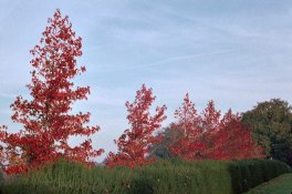
71258231.jpg

The way it works is the narrower the spectral peaks the purer the dyes, compare Portra and Ektar below:

160542594.jpg

You can see Ektar has narrower peaks (thus greater saturation) and also it shows nicely the extended red and the little peak in the red (650nm) this is why Ektar makes reds 'pop'
 
Last edited by a moderator:

Paul Verizzo

Member
Joined
Jan 20, 2008
Messages
1,643
Location
Round Rock, TX
Format
35mm
@Mark: Interesting, the dye stuff. But I'd like to know, as I asked above, were your images pushed in development? If so, by how much?
 

DREW WILEY

Member
Joined
Jul 14, 2011
Messages
13,769
Format
8x10 Format
Mark, I know you're shooting from the hip a tiny bit when you say certain things, cause I've tested this film sideways and backwards and upside down in everything from 35mm to 8x10 format using a custom additive enlarger more sophisticated than anyone can buy. Just haven't tested for long exposures at night yet. Narrower peaks count, yes. But even more important is the foot of each mountain, how far down they're separated. Taking a carefully balanced target like a MacBeath Color Checker chart, when things are in balance not only will all the gray patches appear neutral, but all the primaries and secondaries (R,G,B, then CMY) will sing at the same volume and purity. Well, absolutely no film/paper combination will ever do this perfectly, especially if you're trying to keep all the warmish neutrals accurate too.
But Ektar does a pretty damn good job when printed on a modern RA4 papers like CAII. I've run comparable tests with chrome films onto
Cibachrome, dye transfer etc. Ektar is the clear winner in terms of "clean" when it comes to color negative films, so much so that I've
pretty much accepted it as a suitable replacement for chrome films in certain color situations, provided Kodak doesn't completely tank down the line. But a pure green patch should reproduce with just as much punch and accuracy as a hypothetically pure red. Blues are a bit
more complicated problem with Ektar, as well as violets trending toward blue rather than magenta. And just to cut to the case, anyone who
asks for visual proof of this on the web doesn't know ding-dong, because the web is utterly incapable of that kind of color communication
or accuracy to begin with. But I would agree with you that, yes, you can get reasonably saturated reds with Ektar, and decent oranges.
But compared to Ciba or DT prints from chromes, not so impressive. Compared to most color neg films, intended for portraiture, impressive.
 

Mark Antony

Member
Joined
Mar 27, 2007
Messages
789
Location
East Anglia,
Format
Multi Format
Mark, I know you're shooting from the hip a tiny bit when you say certain things, cause I've tested this film sideways and backwards and upside down in everything from 35mm to 8x10 format using a custom additive enlarger more sophisticated than anyone can buy. Just haven't tested for long exposures at night yet. Narrower peaks count, yes. But even more important is the foot of each mountain, how far down they're separated. Taking a carefully balanced target like a MacBeath Color Checker chart, when things are in balance not only will all the gray patches appear neutral, but all the primaries and secondaries (R,G,B, then CMY) will sing at the same volume and purity. Well, absolutely no film/paper combination will ever do this perfectly, especially if you're trying to keep all the warmish neutrals accurate too.
But Ektar does a pretty damn good job when printed on a modern RA4 papers like CAII. I've run comparable tests with chrome films onto
Cibachrome, dye transfer etc. Ektar is the clear winner in terms of "clean" when it comes to color negative films, so much so that I've
pretty much accepted it as a suitable replacement for chrome films in certain color situations, provided Kodak doesn't completely tank down the line. But a pure green patch should reproduce with just as much punch and accuracy as a hypothetically pure red. Blues are a bit
more complicated problem with Ektar, as well as violets trending toward blue rather than magenta. And just to cut to the case, anyone who
asks for visual proof of this on the web doesn't know ding-dong, because the web is utterly incapable of that kind of color communication
or accuracy to begin with. But I would agree with you that, yes, you can get reasonably saturated reds with Ektar, and decent oranges.
But compared to Ciba or DT prints from chromes, not so impressive. Compared to most color neg films, intended for portraiture, impressive.

Thank you for your thoughts Mr Wiley. I too have tested it from 35mm to LF and think that some of those emulsions differ within those groups; as for shooting from the hip? Well I'm no newbie I have worked as a flush tester for a couple of film companies over the years and owned my own lab.
If anything I've stated is incorrect please feel free to point it out; education and information are never wasted on me.

It is true that no film/paper combination will ever give perfect results when pointed at a screen printed target like the Macbeth or Kodak no13 most of that is due to metameric failures from lighting in real world situations, we make constant evaluations of emulsions in a range of lighting to know what adjustments to make.

Visual proof on the web or otherwise is 'coloured' by the fact that we all perceive colour slightly differently, have different monitors or view under different lighting, so accuracy isn't a 100% guarantee for a whole host of reasons.

When Kodak test a new emulsion they do so on a series of both Objective aims (normally Munsell) and subjective (skin tones and real world light sources) colour film is pretty accurate but never can be (by the nature of dyes combined with human perception) perfect.

Pure green is a difficult one, Kodak and most film companies put the magenta/green record on 550nm because it is in the centre of human visual stimulus, compare Portra and Ektar the green/magenta record with their peaks at exactly the same spectral value. Red and blue can have much more variance and you'll notice they are different especially in Ektars extended red response, which despite your advanced testing methods you deny existed.

The reds of Ektar are indeed saturated when compared with Portra and of narrower and purer density when compared to say Velvia which has a wider response which means skin tones go red, Ektar can do this in bright conditions but to a lesser extent.

I have used ciba though no longer and can say that although it may give increased contrast there is a world of control that is available to the Ektar user that ciba can't compete with, I have yet to make a single contrast mask for Ektar (nor will I have to) I wish the same could be said for printing transparencies on ciba/Ilfochrome.
Dye transfer is a whole different medium really with control over density of different records during printing and was a superior process-I mean how red do you want that phone box? OK not red!-- blue? no problem.
I lament the passing of that material for the flexibility.
 
Last edited by a moderator:

DREW WILEY

Member
Joined
Jul 14, 2011
Messages
13,769
Format
8x10 Format
I don't have any more time to banter it today, but I do mask Ektar as needed. There are all kinds of applicable advanced darkroom controls. Ciba was highly idiosyncratic, and masking was basically a sledgehammer. Masking any color neg is basically gentle power steering, quite different. And sometimes with color negs one needs contrast-increase rather than decrease masks as routine in Ciba. It's far easier to get neutral color balance with Ektar and RA4 than Ciba ever had. But I still miss it. Portra is more deliberately muddied for that "pleasing skintone" thing, esp 160. You won't ever get the mud completely out of the oranges or poison out of the greens, but it is a long long ways from ole Vericolor days. But no, I don't see any red bias in Ektar at all. It can be had, but only by tipping the scale away from
something else. It's a very well balanced film.
 

Mark Antony

Member
Joined
Mar 27, 2007
Messages
789
Location
East Anglia,
Format
Multi Format
But no, I don't see any red bias in Ektar at all. It can be had, but only by tipping the scale away from
something else. It's a very well balanced film.

Neither do I and I have never stated it has a red bias, just it has extended red recording sensitivity--the two are VERY different.

My point is about Ektars SPECTRAL sensitivity! Not about how 'clean' it can look or other simplistic evaluative language.
So once again Ektar emphasises reds with its dye technology, not that it has a red cast or anything silly like that--its all about the dyes and their spectral responses.
 
Last edited by a moderator:

DREW WILEY

Member
Joined
Jul 14, 2011
Messages
13,769
Format
8x10 Format
OK. I see where you're coming from. My apologies. But I'd just flip it on it's head and say that if there's an engineering deficiency in the dye
performance cumulatively, it's in cyan arena, which is of course the complement of red. This can either work for you or against you. In the positive sense, Ektar can respond to intense turquoise colors like tropical water splendidly, quite unlike typical color neg films. But true blue is rather fussy about where you are on the curve. Hence the frequent complaints about blue in outdoor situations. This is complicated when a scene has split lighting, some in deep shadow, and some in open sun. Or with serious underexposure, blues can actually shift violet. There are strategies for dealing with this, but I won't go into them here. It is very difficult to post-correct these. The correction is most effective at the time of exposure. Still, this film is the first color neg film that seems to compete reasonably with chromes, and has a bit
more latitude too. And it can resolve fairly subtle distinctions between related earthtones and greiges, etc, something traditional color neg
films are poor at. It's nice to have a neg film that doesn't just dump these kinds of hues into a generic "fleshtone" homogeneity, or pumpkinish warm. But word does need to get out how to correctly use it to optimize these qualities.
 

Mark Antony

Member
Joined
Mar 27, 2007
Messages
789
Location
East Anglia,
Format
Multi Format
OK. I see where you're coming from. My apologies. But I'd just flip it on it's head and say that if there's an engineering deficiency in the dye performance cumulatively, it's in cyan arena, which is of course the complement of red.

What you state is true, but when Kodak engineers looked at Ektar (at least the new version) they wanted to create a saturated negative film that could still be used for skin tones, that's why the cyan dye has a peak at 650nm to make the red sing (then cut off at 575nm ) without making the Caucasian face look lobster like.
Obviously cyan dye = red response in negatives. The big difference between Ektar and Portra is this narrow spectrum dyes and how the cyan doesn't have any overlap with the blue.
So when you say 'deficiency' Kodak engineers and testers might like to point out that they made it that way as part of the brief, possibly they knew the Portra VC emulsions were for the chop and wanted to design a product that had saturated colours but at the same time wanted cool blue and vibrant red to replace the for the chop slide films.
When I print Ektar I see the same design challenges that Fuji faced with the Velvia (original version) to create vibrant colours at the red end (very hard) but instead of making the film render skin cool red they decided to render cyan sky with a larger magenta component to make it rich blue, and cool the green at the same time--I don't think that is a failure just a different decision in how the film renders colour.
 

DREW WILEY

Member
Joined
Jul 14, 2011
Messages
13,769
Format
8x10 Format
The old Ektar was a very different animal. It's hard to be objective about it because the only visual sample I still have was printed on Kodak paper and is now conspicuously faded. But it did have the same problem with cyan, but distinctly worse. My feeling about their current marketing strategy is that they have two excellent general purpose pro films for general use including portraiture, namely Portra 160 and 400, so had the liberty to turn Ektar into something more lively which would give them an excuse for getting out of chrome manufacture. But if they had pushed that idea just a tad further they might have gotten a film that would resolve closely related yellow, yellow-oranges, etc. I don't think many skilled photographers are going to choose Ektar for portraiture anyway. But overall, they've got a superb trio of color neg films at the moment, and I just hope they can keep the mfg momentum going.
 
OP
OP
TheFlyingCamera

TheFlyingCamera

Membership Council
Advertiser
Joined
May 24, 2005
Messages
11,546
Location
Washington DC
Format
Multi Format
I don't think I'd shoot studio portraits with Ektar 100 over Portra 160, but for shooting natural light portraits on-the-go, it has worked out quite well. I have a couple examples here in my gallery that were shot with Ektar both in full sun and in open shade, and the skin tones (on some rather pale caucasians) look very natural, not overly red or pink.
 

DREW WILEY

Member
Joined
Jul 14, 2011
Messages
13,769
Format
8x10 Format
No problem with people shots if you know what you're doing. But it's not the kind of thing somebody would want taking school pictures with
a bunch of teenagers with zits. I recently bagged a few very nice 35mm snapshots on Ektar which might be classified as "environmental portraiture", where the fortunate coincidence of costume and rich Victorian paint colors on an old restored hotel made Ektar the ideal film
rather than Porta. Then after that I had one of those "dumb luck" opportunities where I had the 4x5 Sinar set up for a very interesting drying meadow shot with various shades of grass along with wildlowers - then just at the right moment, two hoseback riders appeared in the distance, with not only their personal clothing, but the color of the horses themselves, seeming as if it had been Hollywood-scripted for
a movie set, in terms of matching coloration. Eager to print these.
 
Photrio.com contains affiliate links to products. We may receive a commission for purchases made through these links.
To read our full affiliate disclosure statement please click Here.

PHOTRIO PARTNERS EQUALLY FUNDING OUR COMMUNITY:


Ilford ADOX Freestyle Photographic Stearman Press Weldon Color Lab Blue Moon Camera & Machine
Top Bottom