I avoid the word "push" as much as possible!
With black and white film, contrast is easily controllable, and varying development time is the easiest way to exercise that control.
As an example, not too long ago it was very common for photographers to customize their development (and the resulting contrast index) to the type of enlarger they had - higher contrast for diffusion sources, lower contrast for condenser enlargers.
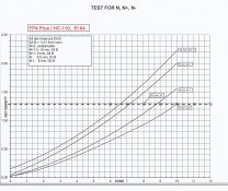
If you wander into the world of Zone System work, you may find yourself shooting individual sheets of film, and adjusting the development on each (N, N-1, N+1) to expand or contract the contrast, in the hope of adjusting for the inherent contrast of the subject. The goal being to match the scene and to print as close to effortlessly as possible.
In the interest of pedantry, I will mention that dreaded word "push". It only refers to a change in development and has nothing to do with how you expose or meter.
One "pushes" development to increase near shadow and mid-tone contrast, usually in circumstances where a photographer is forced to under-expose film. A "push" doesn't retrieve any of the shadow detail lost because of the under-exposure, but it does make those near-shadows and under-exposed mid-tones look more pleasing. The "push" will often negatively affect how highlights are rendered - highlight detail is often either lost or rendered with poor contrast.


 but a good print is a good print be it FP4 or HP5 can't see why you would want to go looking for a FP4 look from a good HP5 negative anyway, I like the results HP5 gives when shot at 250 ASA.