Avoiding Colour Crossover with C-41 + Jobo

Recent Classifieds

Forum statistics

Threads
199,137
Messages
2,786,834
Members
99,820
Latest member
Sara783210
Recent bookmarks
0

Kuby

Member
Joined
Aug 25, 2017
Messages
66
Location
Toronto, Ontario
Format
Medium Format
I'm curious as to how to avoid colour crossover with c-41 in a Jobo unit (I use a CPP2).

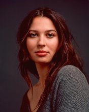
As per PE and other's advice, I have recently used 2x 38C pre wets @ about 30 sec before developing in an effort to keep the temp up. While my negs are streak-free, I seem to be experiencing some disconcerting colour crossover. Please see the attached image for an example (the backdrop and her shirt are grey, but come out ~very~ cyan/blue).

I can't help but wonder if the heavy cyan in the shadows is in fact caused by the pre wet. In any event, I concede there is going to have to be some acceptable level of colour crossover. But this is too much.

Does anyone have any advice as to what to try next?

One thought I had was to pre-warm for ~10 minutes to get the tanks temp as high as possible, heat the chem to somewhere higher than 37.8 (say 38.8), anticipate a 2 degree drop in the temp throughout the process, thus maintaining a mean temp of 37.8 throughout the 3.15 minutes.

Any thoughts or advice?
 

Attachments

  • Lucette 001B.jpg
    Lucette 001B.jpg
    363.7 KB · Views: 267

MattKing

Moderator
Moderator
Joined
Apr 24, 2005
Messages
53,194
Location
Delta, BC Canada
Format
Medium Format
Are you sure that the problem is crossover, and not simply a general colour cast?
Were you using a reddish light source?
Some time with some software yields this version. The flesh tones and hair are quite red, but that might be accurate?

Lucette 001c.jpg
 
OP
OP
Kuby

Kuby

Member
Joined
Aug 25, 2017
Messages
66
Location
Toronto, Ontario
Format
Medium Format
@MattKing I was using a Profoto Acute 1200 lighting system, so shouldn't be an issue with light colour. But I admit that I am not sure if it is colour crossover or a colour cast. And perhaps this type of result is to be expected from c-41 (and if I want perfection in colour to move towards E-6?).
 

MattKing

Moderator
Moderator
Joined
Apr 24, 2005
Messages
53,194
Location
Delta, BC Canada
Format
Medium Format
@MattKing I was using a Profoto Acute 1200 lighting system, so shouldn't be an issue with light colour. But I admit that I am not sure if it is colour crossover or a colour cast. And perhaps this type of result is to be expected from c-41 (and if I want perfection in colour to move towards E-6?).
Your colour may be right on! It may simply be your scanning software.
When you are working in the studio, include a colour reference chart in one frame. Then set your scanning software to manual (as much as possible), balance your scan settings to get good rendering from that colour reference chart, and then use the same settings for the entire roll.
How does her hair, skin tone and eye colour look to you in the version I posted? How do the background and her sweater appear?
 
OP
OP
Kuby

Kuby

Member
Joined
Aug 25, 2017
Messages
66
Location
Toronto, Ontario
Format
Medium Format
Your colour may be right on! It may simply be your scanning software.
When you are working in the studio, include a colour reference chart in one frame. Then set your scanning software to manual (as much as possible), balance your scan settings to get good rendering from that colour reference chart, and then use the same settings for the entire roll.
How does her hair, skin tone and eye colour look to you in the version I posted? How do the background and her sweater appear?

I'm using a Hasselblad Flextight X1, so that shouldn't be an issue either! haha. I also have a calibrated monitor and such. I like to think I have taken the necessary precautions.

In your version, everything is much too red, and I prefer the version I posted. I assume that you brought the image into photoshop and neutralized the images with curves on her sweater, as it now looks grey.

My thoughts regarding neutralizing in this situation is that at least I should get her skin tones correct. If everything else is wrong, at least her skin should look nice :smile:

But you may have good advice regarding using the colour reference chart moving forward. I have one, and maybe I should learn to use it.
 
OP
OP
Kuby

Kuby

Member
Joined
Aug 25, 2017
Messages
66
Location
Toronto, Ontario
Format
Medium Format
@MattKing A relevant question then remains for me: Do you not believe this to be colour crossover? Perhaps I shouldn't be messing around with my development process.
 

Anon Ymous

Member
Joined
Feb 7, 2008
Messages
3,661
Location
Greece
Format
35mm
Shooting a target with a grayscale and reading the densities of the developed film can tell you a lot about the quality of your processing and any crossovers.
 

MattKing

Moderator
Moderator
Joined
Apr 24, 2005
Messages
53,194
Location
Delta, BC Canada
Format
Medium Format
I'm not suggesting the software or scanner are off. I'm suggesting that the software profile for your self developed film may need to be adjusted from the one you are using.
My monitor isn't well calibrated. But your original image does look to me to have an overall cyan-blue cast - including in particular her skin tones.
One of the reasons I don't think that your problem is crossover but rather either with your light source or your scan is that neither version of the shot shows anything of the most obvious indicators of crossover - a change of tone as a surface transitions from full light to shadow. Look at her skin tone as you move from the fully lit chin to the shadowed area under the chin - there is no visible change of hue.
FWIW, I've seen lots of examples where high quality equipment yields poor colour casts.
With respect to lighting colour - which does tend to change over time even with top line equipment - the automatic white balance functions in modern digital equipment often automatically hides problems with colour shift. Any chance you had a warming filter on the camera?
And with respect to scanning software, I would be very surprised if you don't need a separate profile. I'm assuming you aren't running a full control strip system.
 

Raphael

Subscriber
Joined
Jul 26, 2006
Messages
416
Location
Europe, Fran
Format
Multi Format
Hi all,

I routinely process C41 with my ATL1 (which is basically a CPP-2 with automated lift arm) and don't experience color crossover, (unless I use long time opened chemical), outside the classical scanning artifacts, when scanning C41.
How about asking a pro lab (if there is still such thing in your neighbours) to make a print from your negative ?
Best regards,

Raphael
 

TheFlyingCamera

Membership Council
Advertiser
Joined
May 24, 2005
Messages
11,546
Location
Washington DC
Format
Multi Format
My color in my Jobo is generally dead on. I've had other issues with color processing, but not color drift. I use my chemistry one-shot, freshly made, and freshly purchased to minimize the potential for problems with the chemistry. To be honest, in the first image you posted, if you hadn't told me there was an issue with the color, I wouldn't have given it a thought, because her skin tones looked perfect - her lips are nice and pink, the skin is smooth and natural, and the whites of her eyes are nicely white. You might be able to add a hint of yellow and/or magenta to kill the blue/cyan in the shadows, but it's not painfully obvious.
 

Photo Engineer

Subscriber
Joined
Apr 19, 2005
Messages
29,018
Location
Rochester, NY
Format
Multi Format
That is not color crossover, but rather a color cast. The correct image would probably be between the two images above.

PE
 
OP
OP
Kuby

Kuby

Member
Joined
Aug 25, 2017
Messages
66
Location
Toronto, Ontario
Format
Medium Format
Thanks all for the input. I'm relieved to know that it's likely not an issue with my developing but more so a byproduct of my scanning and post production.

That being said, I'm curious to know what would cause a colour cast in a situation like this. I use no filters on my medium format cameras as I'm always shooting in studio. And the lights are not old so it's unlikely they are to blame for the colour temperature.

@Raphael my thought process seems to be along the line of yours. If everything is wrong but the skin is "on", all can be forgiven.
 

MattKing

Moderator
Moderator
Joined
Apr 24, 2005
Messages
53,194
Location
Delta, BC Canada
Format
Medium Format
After checking some colour space issues, this is my latest edit of your original:

Lucette-001d_1.jpg
 
Joined
Jul 31, 2012
Messages
3,362
Format
35mm RF
Kuby, my inclination looking at your image in Photoshop, and being able to fix it in a few seconds makes me think it is perhaps not the negative... Color crossover can be complicated to fix in a scan. And just whatever PE says, believe it....

Scanning issues almost always come from the operator. Take a close look at your workflow and try to find the problem. I'd go back and zero everything in the software then make another scan with minimal adjustments. The histogram on your file is crushed at the ends and has odd "humps" which makes me think you manipulate the software quite a bit before the scan. Also look at the color spaces you are using and make sure you convert between them, not just apply the new one. That can cause problems as well.

Hope that helps.
 

Mr Bill

Member
Joined
Aug 22, 2006
Messages
1,483
Format
Multi Format
Hi, speaking as one who has worked with this sort of thing on a large scale and a fairly serious level, I would say that you have pretty big color problems here. I can't say anything, for sure, about your film processing, but I'm pretty certain you have significant scanning issues. Here's a rundown:

First, consider two qualities of color, the "hue," which is roughly the "direction" the color is going in, and what I'll call "saturation," for the "strength" of that color. For example, pink and red would be roughly the same hue, but one has weak saturation and the other has strong saturation.

Ok, to your image - digital color numbers don't really have a meaning until some sort of "scale" is defined. One such scale is defined by a so-called "color space;" in your case the image is tagged as being in "sRGB," so now the numbers have a meaning.

Your skin tones have a roughly correct hue, but very, very weak saturation. For example, in the brightest highlight areas (not center) of the forehead I get pixel values of about 240, 233, and 230 for rgb (red, green, blue). The fact that these numbers are close to each other means that the color is close to neutral, or grey. Actually, since the red is higher than the other two, it means it is reddish, but only slightly. But it is roughly the correct hue for skin color - it's just too weak. A reasonable set of numbers here would be about rgb = 254, 200, 180. (As a note, some people do have very pale skin, but just from her appearance, your model is not one of them.)

Regarding Matt's version, it is very much closer to being "correct" than the original, the skin tones are just somewhat oversaturated which most people would say is too red - but the proper fix is to remove some saturation, not to "remove red" by adding cyan, etc. As a note, if you read values of the camera-right cheek highlights on Matt's version, you'll find rgb values of about 253, 201, and 180, really close to what I called reasonable sRBG numbers previously. So desaturating slightly to give that as a more average saturation level would give much more believable skin tones.

Anyway, if you take the original image file, I don't think you can boost saturation high enough to get to these skin tones, at least without getting fluorescent lips and eyes, etc. So there is a fundamental problem with the original scan (decently behaved color films will not lose skin tone saturation like this under electronic flash).

I don't think you can go any farther with this train of evaluation until you get some scanning issues sorted out. (Actually you could fall back on the traditional methods of process control; I think I might be just wasting my breath to describe it, though.)

[Update on Matt's new edit] as everyone can probably see, Matt has pulled back on the strength (saturation) of the skin tone color, and I would say that the flesh HIGHLIGHTS (forehead and top of cheeks) now look pretty good. But... if you look at the shadowed skin tones, especially her neck, they now have a bluish and desaturated, what I would call a "dead" tone, appearance.

I'm sure it's a result of his trying to let the dark parts of the hair get dark (as opposed to having high r values) while getting the "grey" background to actually be grey. So the skin tones now have a bonafide color crossover - normal highlights, but bluish shadows.

Unfortunately there is no straightforward way to correct this without the grey background coming along for the ride. (This could be adjusted with specific color selection editing, but not simple rgb adjustments) Again, I'm sure that scanning issues are a major part of the problem - so until these get sorted out ...

So thanks Matt, for the great editing examples.
 
Last edited:

pentaxuser

Member
Joined
May 9, 2005
Messages
20,003
Location
Daventry, No
Format
35mm
Matt's rendition looks pretty good to me which suggests that lack of scanning skills may be the OP's problem. If the negative is OK then a good print should be possible. If the OP is a hybrid user then the advice needed may be better provided in that section.

pentaxuser
 

markbarendt

Member
Joined
May 18, 2008
Messages
9,422
Location
Beaverton, OR
Format
Multi Format
One click in LR with white balance dropper on her shoulder.
Lucette 001B.jpg
 

MattKing

Moderator
Moderator
Joined
Apr 24, 2005
Messages
53,194
Location
Delta, BC Canada
Format
Medium Format
One click in LR with white balance dropper on her shoulder.
Mark
I like that rendition. Unfortunately, (on my screen) it leaves the background and top as a blue-green, even though they were described as being grey in real life.
 
Joined
Apr 2, 2017
Messages
639
Format
Multi Format
I like the OP’s rendition albeit there seems to be a cyan cast. In my experience this comes from the film mask and its treatment by scanning software and or scanner operator.

My priority with portraits is to match skin and eye color. Some people want their age matched to their last portrait taken 15 years ago. This I haven’t found a solution for.
 

markbarendt

Member
Joined
May 18, 2008
Messages
9,422
Location
Beaverton, OR
Format
Multi Format
Mark
I like that rendition. Unfortunately, (on my screen) it leaves the background and top as a blue-green, even though they were described as being grey in real life.
One thing that is tough about correcting color photos like this is that the lighting is probably mixed. I see in her eyes catch lights which I'd guess is from strobes. The rest of the scene may be lit by other light sources. Mixed lighting like that changes what the film sees/renders. The film naturally responds and renders the colors as they are, human vision on the other hand tends to fix the colors. If we know the sweater is gray to start with, the it's hard for us to see it as green; it takes real thought to see the real color until you understand what to look for.

A simple example of this is shadows outside tend to be blue, until you know that though gray looks gray in the shadows, once you know that it's not tough to see and understand what shadows are going to do to a photo.
 

MattKing

Moderator
Moderator
Joined
Apr 24, 2005
Messages
53,194
Location
Delta, BC Canada
Format
Medium Format
I don't disagree. I don't think however that mixed lighting is the problem here though, because it looks to me like we can probably take the OP at his word that the the light consisted solely of light from studio strobes.
Of course, it is not out of the range of possibility that the OP has multiple strobes and those strobes are of slightly different colour.
Nor is it out of the range of possibility that the background and the women's top were of such a construction that they appear to be of different colour under ambient light than they do under electronic flash light. They also may reflect flash in such a way that film responds slightly different than the human eye.
It would be really interesting to see how these negatives print optically. That is where most of my colour printing experience came from, and mostly for professional photographers. And I certainly know that their negatives weren't immune from colour problems.
 
  • RPC
  • Deleted

RPC

Member
Joined
Sep 7, 2006
Messages
1,630
Format
Multi Format
And perhaps this type of result is to be expected from c-41 (and if I want perfection in colour to move towards E-6?).

Could you please explain the reasoning behind that statement? Color negatives, due to masking and higher dynamic range, are technically superior to slide films in overall quality.
 

markbarendt

Member
Joined
May 18, 2008
Messages
9,422
Location
Beaverton, OR
Format
Multi Format
I don't disagree. I don't think however that mixed lighting is the problem here though, because it looks to me like we can probably take the OP at his word that the the light consisted solely of light from studio strobes.
Of course, it is not out of the range of possibility that the OP has multiple strobes and those strobes are of slightly different colour.
Nor is it out of the range of possibility that the background and the women's top were of such a construction that they appear to be of different colour under ambient light than they do under electronic flash light. They also may reflect flash in such a way that film responds slightly different than the human eye.
It would be really interesting to see how these negatives print optically. That is where most of my colour printing experience came from, and mostly for professional photographers. And I certainly know that their negatives weren't immune from colour problems.
So I just played with different points in the background with the eyedropper and each point gives a different result/correction. To me that says the ambient light is affecting the photo. For example when I use the background next to her face as the reference the gray sweater gets a noticeably warm yellow cast like a sunset might cast.
 
Photrio.com contains affiliate links to products. We may receive a commission for purchases made through these links.
To read our full affiliate disclosure statement please click Here.

PHOTRIO PARTNERS EQUALLY FUNDING OUR COMMUNITY:


Ilford ADOX Freestyle Photographic Stearman Press Weldon Color Lab Blue Moon Camera & Machine
Top Bottom