Any tips on getting good color balance faster or is it just experience?

Recent Classifieds

Forum statistics

Threads
199,129
Messages
2,786,644
Members
99,819
Latest member
stammu
Recent bookmarks
1

rpavich

Member
Joined
Aug 24, 2015
Messages
1,520
Location
West virginia, USA
Format
35mm
So I started printing color a few days ago and after my first success (relatively speaking) I hit the darkroom to go at it again and was underwhelmed with my results. I think I just hit on a more difficult negative than the first time so I had an exaggerated sense of how balancing the color would go.

I'm using the Kodak viewing filters for reference.

Example.
I had a keepsake negative from when my stepson shipped out to Europe and tried printing it. It was VERY orange/yellow. I started increasing the M and Y filters and got to a point where I thought I nailed it as well as I could but in getting up this morning and seeing the results, I definitely overshot it...it's too green. Skin tones look sickly.

Most of the time my images are family snap shots so elaborate set ups like shooting a grey reference card every time isn't feasible.

Just looking for folks who've been through it and have tips to ease my pain :smile:

From top to bottom is the sequence. The pictures don't look exactly like they do in real life. In real life they are more reddish and the second to last one is not as green as it looks here. The last one is greenish.

IMG_1081.jpg
 

RPC

Member
Joined
Sep 7, 2006
Messages
1,630
Format
Multi Format
Yes, color balancing will come easier after a little experience. You are still a beginner! If you don't already know the basics of color theory, it would be helpful to learn it. And do a lot of playing around with filtration changes to see what they do.
 
OP
OP
rpavich

rpavich

Member
Joined
Aug 24, 2015
Messages
1,520
Location
West virginia, USA
Format
35mm
Yes, color balancing will come easier after a little experience. You are still a beginner! If you don't already know the basics of color theory, it would be helpful to learn it. And do a lot of playing around with filtration changes to see what they do.
Thanks.
Sad to say I didn't pay attention to that part of art classes :smile:

I'll look around the web to educate myself.
 

Mr Bill

Member
Joined
Aug 22, 2006
Messages
1,483
Format
Multi Format
Yep, mostly experience. But you'll probably get there faster by printing a reference color ring-around. Use whatever increments you're seeing; for example, perhaps you print a "red" series as: -10, -5, normal, +5, and +10. Then, with a new test print, you compare against the reference. Obviously your reference should be typical of what you shoot, and can not only guide you on the amount of correction, but also the color. People new to this sort of thing often mistake cyan for blue and magenta for red; having a printed reference can help a lot.

BTW, your sample image may well have been shot under some flaky light sources; if so, you may not be able to get a satisfactory color balance - the spectral output may not produce the right colors throughout skin variations. You may be fooled into thinking that it is your lack of skill in color balancing, when it's really not completely fixable.

Also, be sure to use a good light source to view the prints. If you're not sure about the light, use natural light from outdoors for a reality check.
 
OP
OP
rpavich

rpavich

Member
Joined
Aug 24, 2015
Messages
1,520
Location
West virginia, USA
Format
35mm
Yep, mostly experience. But you'll probably get there faster by printing a reference color ring-around. Use whatever increments you're seeing; for example, perhaps you print a "red" series as: -10, -5, normal, +5, and +10. Then, with a new test print, you compare against the reference. Obviously your reference should be typical of what you shoot, and can not only guide you on the amount of correction, but also the color. People new to this sort of thing often mistake cyan for blue and magenta for red; having a printed reference can help a lot.

BTW, your sample image may well have been shot under some flaky light sources; if so, you may not be able to get a satisfactory color balance - the spectral output may not produce the right colors throughout skin variations. You may be fooled into thinking that it is your lack of skill in color balancing, when it's really not completely fixable.

Also, be sure to use a good light source to view the prints. If you're not sure about the light, use natural light from outdoors for a reality check.
Thanks mr bill!
I do think the light was flaky, marines don't worry about proper skin tones :smile:

Can you explain mor about this color ring around?
 

Mr Bill

Member
Joined
Aug 22, 2006
Messages
1,483
Format
Multi Format
Can you explain mor about this color ring around?

Sure. When you get a good color balance (on a typical subject), you print a bunch of reference strips with every major color offset. (These are only useful for future printing sessions, not for this one.) But in the future, starting on a new negative, you compare your first test print to the ring-around, and you have a real good idea as to what correction is needed.

For example, you could do a series of plus and minus cyan, magenta, and yellow, in increments of 5cc and 10cc filter changes. This results in one "normal" print plus twelve color offset prints (four of each "color," where the "cyan" series runs from cyan to red, "magenta" series is magenta to green, and "yellow" series is yellow to blue. Don't make full-size prints, just a narrow strip slicing through the most important area. If you mount all the test strips on a board, it's very convenient to use.

It's a lot of work, but it will likely pay off if you do a lot of printing.

Note: you might want to use much larger increments than what I suggested, it just depends on how far out your negs run.
 
OP
OP
rpavich

rpavich

Member
Joined
Aug 24, 2015
Messages
1,520
Location
West virginia, USA
Format
35mm
Sure. When you get a good color balance (on a typical subject), you print a bunch of reference strips with every major color offset. (These are only useful for future printing sessions, not for this one.) But in the future, starting on a new negative, you compare your first test print to the ring-around, and you have a real good idea as to what correction is needed.

For example, you could do a series of plus and minus cyan, magenta, and yellow, in increments of 5cc and 10cc filter changes. This results in one "normal" print plus twelve color offset prints (four of each "color," where the "cyan" series runs from cyan to red, "magenta" series is magenta to green, and "yellow" series is yellow to blue. Don't make full-size prints, just a narrow strip slicing through the most important area. If you mount all the test strips on a board, it's very convenient to use.

It's a lot of work, but it will likely pay off if you do a lot of printing.

Note: you might want to use much larger increments than what I suggested, it just depends on how far out your negs run.
Thank you very much, i will certainly do that. It sounds like it would be very useful to have.
 

Bob Carnie

Subscriber
Joined
Apr 18, 2004
Messages
7,735
Location
toronto
Format
Med. Format RF
Ring around mounted on board near your viewing area is incredibly helpful... trick is having a good starting balance that is not crossed over .. and attention to detail when making the rings.
 

Bob Carnie

Subscriber
Joined
Apr 18, 2004
Messages
7,735
Location
toronto
Format
Med. Format RF
My first three jobs required intense colour correction, I always used a ring around even though I had a pretty good eye if I say so myself.

they are absolutely invaluable reference and helps one understand colour.
 

Berri

Member
Joined
Feb 7, 2017
Messages
627
Location
Florence, Italy
Format
Multi Format
It will come easier with the experience. When I started fw years ago I already had a very good knowledge of colour theory because of the job I was doing at the time but still took me a while to get the results I was hoping for. The photo you printed looks like it was shot in a difficult light situation with lots of different colour temperature therefore not easy to balance in the first place, but you did a good job in the end, that's what matter.
Now I started using a colour analyzer known to be one of the best, if not the only one worth using, the ColorStar. It gives very reliable results in no time once correctly calibrated. It is very nice being able to print without having to do any test strips or colour balancing prints which are time and money consuming. But you being a beginner I'd suggest you to start learning to without any device so that you get the knack of it.
 

btaylor

Subscriber
Joined
Dec 28, 2010
Messages
2,257
Location
Los Angeles
Format
Large Format
One of these days I'll have to make myself a ring-around! Slothfulness has prevented me so far. Along with learning the Zone System.

Concerning your color correction problem, it looks like a light source issue. I don't think when we're making family snaps we think that much about it, and the 3x5 print from the drugstore looked okay. But when we decide to do something bigger with it we see the flaws. Growing up shooting reversal movie film (no correction after the latent image is in the emulsion!) its almost a reflex for me to consider it. That said, when it's family stuff one has to capture the moment-- that's the most important thing!

I did learn a great tip from a colorist (that's the person who color grades video), if you can't shoot a gray card, shoot some known colors like a Coke can or similar consistently colored objects-- that way you have known color to reference. That can also help when you find these objects in the background of a scene.
 
Last edited:

RPC

Member
Joined
Sep 7, 2006
Messages
1,630
Format
Multi Format
It's a good idea to try to shoot a gray card on at least one frame of a roll. Color balance using that, (with a ring-around if desired) and it should get you close for the other frames which you can tweak as needed. Gray is good because it shows the slightest color shift, better than any other color, when compared with the original.
 

Bob Carnie

Subscriber
Joined
Apr 18, 2004
Messages
7,735
Location
toronto
Format
Med. Format RF
We used a image with a good representation of the colour wheel on it with fleshtone, good black and white area against a grey background
 

MattKing

Moderator
Moderator
Joined
Apr 24, 2005
Messages
53,182
Location
Delta, BC Canada
Format
Medium Format
If you can access someone who is experienced at colour printing, they could help you choose a good negative for the purpose of creating your ring-around - that negative is not the one you want to use!
One trick that I used to find invaluable was to look for some part of the scene where a fully lit area transitions to an area in shadow. The transition between light and dark makes it easy to observe a colour cast. The transition between someone's chin and neck is often a good choice (but be sure to watch out for reflections off of coloured areas like lawns or carpets).
 

EdSawyer

Member
Joined
Sep 3, 2008
Messages
1,793
Format
Multi Format
The right tools help too. The beseler minolta 45a color head will do automated color ringarounds, plus it has a built in color analyzer you can calibrate for multiple different film, lighting and subject scenarios. Once dialed in, you can hit a near-perfectly color balanced print on the first try, from any film or light situation, basically.
 

Bob Carnie

Subscriber
Joined
Apr 18, 2004
Messages
7,735
Location
toronto
Format
Med. Format RF
Should be added that if you want to make exceptional prints the enlarger way a good understanding of Colour Theory will help you.. not the Munsell system btw.
 

BMbikerider

Member
Joined
Jul 24, 2012
Messages
2,961
Location
UK
Format
35mm
As more or less everyone has suggested it is down to experience. However there is one little aid that will go a long way to helping you get that experience and that is a set of Kodak Printing Filters. They are as far as I know no longer made but are seemingly readily available second hand - EBay is a good source. What they are, is a wallet with 6 sets of filters one each of Magenta, Yellow and Cyan, plus Red, Blue and Green.

Each card has three filters which give a good guide to which direction you may need to change the filtration. This guide is in steps of 5 units, 10 units and 20 units. However there is a small problem, but easily sidestepped, in that these adjustments are in Kodak Units so if you enlarger is calibrated in Durst units, you will have to use a little guesswork. Equally, unless you can get access to Kodak paper, Fuji paper will give different results, but the method of working is exactly the same. Fortunately I use Kodak paper bought in rolls so that equasion is cancelled. Also my enlarger is an LPL, also callibrated in Kodak units.

If you don't know what units your enlarger is, in every pack of Ilford Multigrade paper is a chart telling you what you enlarger will callibrated with.

Finally, don't try to assess colour balance until the tst strip is washed and dried. I use an old hair drier to hurry this up because there is a subtle colour change in the emulsion when it goes from wet to dry. The assessment should also be done in daylight conditions, or by using a daylight quality bulb. The one I use is a 6500 degree Kelvin mains power LED bulb (13w equivalent to 75 watt tungsten).

Good luck.

PS if you don't have any luck finding a set of Kodak Colour printing filters near where you live then a dealer in UK called 2nd Hand Darkroom Supplies does have the priced about £12 or about 15$ plus shipping. click on the link to get their contact details:- https://www.secondhanddarkroom.co.uk/
 

mklw1954

Member
Joined
Dec 2, 2009
Messages
396
Location
Monroe, NY
Format
Medium Format
I have been printing now for about 5 years and found you can get better quickly with experience. I have a Beseler color analyzer and Kodak viewing filters from an enlarger deal but I don't use them. For learning which direction to go with filtration I found the guidance in the attached file and Tables 1 and 2 from this link to be useful:
https://catalog.extension.oregonstate.edu/sites/catalog/files/project/pdf/4-h7743.pdf

Check your whites and you can see if there's too much yellow or red/magenta, which will tell you where you need more filtration. The examples you attached appear to have a yellowish/green cast, indicating they may have been shot with daylight color film under fluorescent lighting; this would require more color correction than normal.
 

Attachments

  • Color Print Filtration Adjustment.pdf
    12.3 KB · Views: 110

bvy

Member
Joined
Jul 22, 2009
Messages
3,285
Location
Pittsburgh
Format
Multi Format
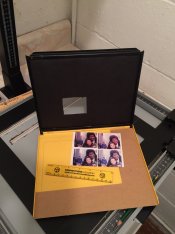
What helped me a lot was a multi test print easel. I decided to make my own because I wanted to see the SAME area of the print under different filtrations. Say I'm color balancing off of a known white object, like a T-shirt (I don't always shoot gray cards, but it would still apply in this case). Then I want to see the T-shirt under every filtration that I'm testing. That could be tricky if I'm blocking off portions of the frame say with an 8x10 mask with a 4x5 quadrant removed (as described above). The contraption here lets me make four exposures of the same small area of the print onto a single sheet of 4x5 sheet paper. The L-shaped cardboard guide lets me move the paper around a 6x7.5 area, and the mask has a 2x2.5 rectangle cut out that comes down right in the middle. I place the paper in the top left, expose using filtration 1, move it to the right, filtration 2, down, 3, left, 4. And it's easy to do in the dark. So suppose I started with 50M+50Y and decided there's too much blue in the print. Or is it cyan? I might make exposures of 50M+45Y, 50M+40Y, 45M+45Y and 45M+40Y in that order. Large adjustments (especially of magenta) will require corresponding changes of exposure.

By the way, this is an old 8x10 easel that I repurposed. The mask is black construction paper taped to a hinged frame that comes down over the paper. By itself, it creates a thin border around an 8x10 print. I plan to make a larger one that will allow me to expose four 4x5 areas to a full 8x10 sheet of paper.
2017-03-12 15.51.13.jpg

Now the controversial part. For analyzing color balance, I never could make use of those viewing filters. What looked right one minute, looked totally wrong if I came back to it some time later. What I ended up doing is taking my test prints and scanning them using my Epson V500 scanner with (this is important) color correction turned OFF. This produces a raw scan in TIF format. I can then open the image in PhotoShop or some other editing software, hover over the known gray or white area, and read off the RGB values. Sometimes I'll blur the image to get a more uniform reading. So if my gray area reads 160/167/175 (red/green/blue), I know I need to dump a little magenta (5-10cc) and a lot of yellow (10-20cc). It's not as perfect as a color analyzer, but for difficult negatives, it sends me down the right path. I don't consider this "hybrid talk," by the way, since I'm only using it as an aid.
 
Last edited:

Mr Bill

Member
Joined
Aug 22, 2006
Messages
1,483
Format
Multi Format
Now the controversial part. For analyzing color balance, I never could make use of those viewing filters.

I also do not think much of these. Now, if it's the only way you have to judge, it's better than nothing. One of the biggest problems is its effect on white areas of the print - the viewing filters change the (viewed) color of white, whereas this won't happen on an actual print. If you DO use them, note that, as Richard.L mentions, the filter has its spec value when held at one's eye, but the value is doubled when laid on top of the print being evaluated.

BTW, in the past I've worked with dozens of professional color correctors, and virtually none of them used the viewing filters (although same were available). Let me modify that, actually they DID pull out the viewing filters occasionally - whenever lab management wanted to second guess proposed corrections. (If this didn't work, the solution was to make an extra print per the "management" correction.)
 
OP
OP
rpavich

rpavich

Member
Joined
Aug 24, 2015
Messages
1,520
Location
West virginia, USA
Format
35mm
Thanks everyone..much to learn and pay attention to!
I don't know why the thread wasn't alerting me to new posts...hmmm..
 
OP
OP
rpavich

rpavich

Member
Joined
Aug 24, 2015
Messages
1,520
Location
West virginia, USA
Format
35mm
Well, I tried one last print and so I lessened the greenish tint slightly; almost like the previous print. I tried a test print first, and then an 8X10. I got a good test print, and then exposed the 8x10 and put it in the drum backwards...whoops! It's ..."interesting"..
Then I did one last 8x10 and it came out nice. A keeper.

One thing; my stop bath came out RED!!
I hope that's not a problem but the wash water was blue, and then the stop poured out red after stopping.
 
Photrio.com contains affiliate links to products. We may receive a commission for purchases made through these links.
To read our full affiliate disclosure statement please click Here.

PHOTRIO PARTNERS EQUALLY FUNDING OUR COMMUNITY:


Ilford ADOX Freestyle Photographic Stearman Press Weldon Color Lab Blue Moon Camera & Machine
Top Bottom