-
Welcome to Photrio!Registration is fast and free. Join today to unlock search, see fewer ads, and access all forum features.Click here to sign up
You are using an out of date browser. It may not display this or other websites correctly.
You should upgrade or use an alternative browser.
You should upgrade or use an alternative browser.
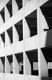
Any suggestions on how to crop this photo,
-
A
- Thread starter timbo10ca
- Start date
Recent Classifieds
-
For Sale Arca Swiss Z1+ fliplock ball head
- Started by Guivd
-
Want to Buy Intellifaucet D250 K250 etc
- Started by Rafal Lukawiecki
-
For Sale RB67 and Graflex odds & ends
- Started by OrientPoint
Forum statistics
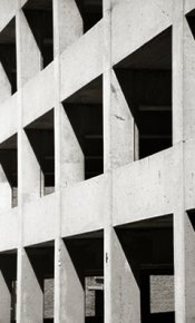
It looks better to me with the bottom cropped, up to the edge of the shadow in the top of that bottom section (if you understand what I mean). But then the right side looks a bit unusual, so that probably needs to be cropped too, probably right back to the first pillar. I think the shot has potential, so I wouldn't give up on it.
Thomas Bertilsson
Member
I think if it was my neg, I'd try not to get shadow detail by printing down both low values as well as the high and mid values for more texture. I'd print on warm tone paper, and I'd crop it as attached here.
You have a little bit of converging lines. If you stop your enlarging lens down, you can tilt your easel a little bit to compensate for that convergence. I simulated by using a distortion tool in p-shop.
- Thomas
You have a little bit of converging lines. If you stop your enlarging lens down, you can tilt your easel a little bit to compensate for that convergence. I simulated by using a distortion tool in p-shop.
- Thomas
or should I scrap it? I'm just not "feeling" it- I don't know if its the lines or the angle I shot it from that's bothering me..... Right now, I find it boring- too static.
Thanks,
Tim
Attachments
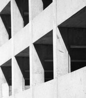
I agree that the bottom must go.
I think I would go for a more abstract crop, emphasizing the angles, though it is a bit obvious that it wasn't shot with this particular crop in mind.
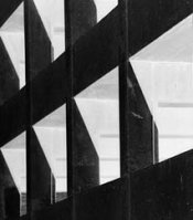
To heighten the abstractness, let me suggest printing it as a negative image. Then you appear to have unusual night-lighting from within, and the concrete texture, which isn't a strong feature of this subject in my honest opinion, is underplayed.
Attachments
To heighten the abstractness, let me suggest printing it as a negative image
How would you actually do that?
It looks great the way it is.
How would you actually do that?
Print to RC paper, then flip that over onto another sheet of paper and contact print; the resulting image will be a negative. If you want to get excessively fancy then you could make a film interpositive.
Thanks everybody- great ideas. I'm feeling the love......
Tim

Tim
There isn't a law that says that a print must be square, or rectangular, or indeed have straight edges. Maybe an unorthodox shape would suit you image.
| Photrio.com contains affiliate links to products. We may receive a commission for purchases made through these links. To read our full affiliate disclosure statement please click Here. |
PHOTRIO PARTNERS EQUALLY FUNDING OUR COMMUNITY:  |


