• Welcome to Photrio!
    Registration is fast and free. Join today to unlock search, see fewer ads, and access all forum features.
    Click here to sign up

acutance vs contrast

Forum statistics

Threads
203,268
Messages
2,852,150
Members
101,753
Latest member
Janek201
Recent bookmarks
0

SoonerBJJ

Member
Allowing Ads
Joined
Dec 1, 2009
Messages
30
Location
Oklahoma
Format
Medium Format
I'm just beginning to develop my own negatives at home, so forgive my efforts to wade through some technical issues.

I believe I have a firm grasp of the definitions of both "acutance" and "contrast" as they apply to a negative. But I'm trying to understand how those qualities are inter-related and might be manipulated in the development process.

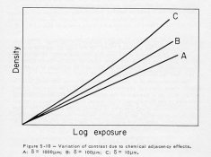
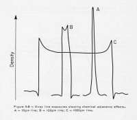
Acutance or microcontrast (to borrow from Roger Hicks, Shutterbug 2003) might be maximized by minimizing agitation in the development process. Minimal agitation will allow for acutance-enhancing adjacency effect to take place.

However, INCREASED agitation is known to INCREASE contrast and by extension compromise acutance. Is this a matter of macro- vs microcontrast? Whereby agitation is increasing contrast on a macro level while compromising microcontrast.

Does this make high "macro" contrast and high acutance mutually exclusive? Is my question clear or am I complicating an otherwise simple concept?
 
Correct me if I'm wrong. It's been over 20 years out of photo school, but I think acutance is how sharp the grain is. Some fine grain film developers, low acutance developers dissolve the edges of the grains of silver with the amount of sodium sulfite. I would think that Mr.Hicks theory of minimizing agitation to increase acutance is to decrease sodium sulfite from dissolving the grain. There are two kinds of contrast that I know of, the first and most obvious one is the contrast range of the film or print and the other type of contrast is local contrast which is contrast within an area. For example highlight areas like snow could look like crisp snow with defined ice crystals versus snow that looks like mush. I'd like to learn more about this. I'm sure there's an APUGer that could teach us something about this interesting subject.
Best,

Don
 
Acutance is best thought of as the derivative of density with respect to distance when you image some fine lines onto the film. Resolution is obviously how close you can get the lines and still resolve them. If you google for definitions of Modulation Transfer Function (MTF), you'll find a nice explanation - it basically boils down to "acutance is local contrast", or "how sharp do my edges look". Nothing much really to do with grain at all.

Increased agitation for a fixed dev time will increase the total level of density dynamic range in the neg, which people sometimes call contrast. It does that by making the characteristic curve steeper, so you get more acutance (in the neg) and more dynamic range (in the neg) but then have to print at a softer grade (to tame the dynamic range) so the acutance goes away again.

With certain developers, decreasing the agitation while extending development will allow compensation effects - your total dynamic range (contrast between brightest and darkest areas) will be about the same, while local contrast/acutance will increase.

If you use minimal agitation, the developer sits next to the film without moving and the film consumes/exhausts that developer at a rate dependent on how much exposure the film had there. So dense areas consume lots of developer, slowing development in the highlight areas without slowing development in the shadows. You get an increase in acutance because there is diffusion of exhausted developer across the boundary between light to dark, thereby even further slowing development in a dark area next to a light area. And conversely, fresh developer diffuses from the dark area to the edge of the light area, developing it further. The net effect is very similar to an unsharp mask, which is a postprocessing tool for increasing acutance.

The result of an unsharp mask is that where you have a step-change from dark to light, the steepness of the step is increased and it can overshoot a bit on either side - a very fine dark halo around bright things and a very fine bright halo around dark things. If overdone (eg digitally) then it looks bad. A small amount of this effect is very beneficial to perceived sharpness though, and it's pretty much impossible to overdo it on film using reduced-agitation techniques. You're limited by effects like bromide drag before the halos become unsightly.
 
Last edited by a moderator:
Thanks, polyglot.

I found more clarification in the first chapter of Th Film Developing Cookbook. Anchell and Troop distinguish between three types of contrast: macro, local and micro and how they are interrelated.

Another piece of the puzzle falls into place.
 
There is macro contrast, intermediate contrast and micro contrast. You basically see 3 types of contrast in a given film, if it is properly designed. You also see edge effects which govern the amount of enhancement given to edges to increase the sharpness. Contrast can sometimes be mistaken for sharpness and sharpness can be mistaken for contrast.

Ideally, a small line in a photo (a wire between two poles for example) should stand out at any level of magnification, say from 35mm to 4x5. But this is not always true. Some lines fill in and some lines spread. Ideally, the edges should be enhanced.

See the first two attached examples courtesy of one of the great experts in this, Mike Kriss of EK.

The third picture is a definition chart which can be photographed and then printed to actually see the sharpness and contrast of your image in conjunction with a step scale to measure contrast.

PE
 

Attachments

  • Micro Contrast.jpg
    Micro Contrast.jpg
    126.5 KB · Views: 252
  • Edge Effects.jpg
    Edge Effects.jpg
    139.5 KB · Views: 258
  • print def ilford.jpg
    print def ilford.jpg
    58.7 KB · Views: 290
Some Questions...

Ron;

Is there some commentary that goes along with those pixs?

It looks like a 10 micron line is both non-linear (first picture) and fails to exhibit the same sort of edge effect... as the larger lines (second picture)...

How do you "read" that 3rd picture?
(What does it say to you... about whatever material it represens?)

Can you define, or point to a specific edition/page # ref to the terms:

macro contrast
intermediate contrast and
micro contrast.

"You basically see 3 types of contrast in a given film, if it is properly designed."
Can you expand on this?

Which "type" can you lose sight of under what conditions?

Sorry-I am reading this last post first... if answers already exist in the thread, I will find them but if you have a non-Anchell/Troop ref. for the those terms that would be better as they are not in my collection.

Thanks...
 
Last edited by a moderator:
Is there a concise clear visual guide that VISUALLY demonstrates these often confusing terms?
If not, why not?

Wouldn't such a guide make these concepts easier to grasp and differentiate?

acutance
MTF
local contrast
intermediate contrast
macro contrast
micro contrast
sharpness
"contrast"
resolution
edge effects

etc.
 
Edge effects vary with the width of the line based on difffusion outward of the halide ions or DIR fragments that cause the effect (there are others such as agitation, developer exhaustion and pH changes to name a few). Therefore, in practice, the lines are the names of the contrast levels and the density of the line as measured by a microdensitometer are the means by which both the 1st and 2nd picture are derived.

If they are non-linear, so be it! This can happen based on conditions. The shape of the lines is also determined by the type of chemical interaction that is causing the effect. In fact, if there were no edge effects the contrast curves would be reversed as would the densities of the second example.

The third graph can be read by said microdensitometer. It is generated in positive and negative forms for the most useful result concerning flare and fill in which is an exposure problem. To avoid that, these charts are most often paired as light and X-Ray exposures to give the same densities as far as is possible.

The references are found in the articles by Kriss et al in SPSE journals. I have a copy and Mike's prior permission to post this data. Most any journal article on edge effects describe these things. Since they are generally not used outside of R&D situations on film design and development, these are not common topics elsewhere and definitions do not abound. I suggest you may wish to construct a dictionary if these are of general interest. OTOH, you may be the only person interested in these details.

PE
 
Thanks, PE.

Ray, I found Thornton's treatment of these terminology in Edge of Darkness to be very enlightening.

In the past few months I've accumulated a 2 foot stack of books on various related subjects. I'll reference any I find to be helpful.
 
Thanks, PE.

Ray, I found Thornton's treatment of these terminology in Edge of Darkness to be very enlightening.

In the past few months I've accumulated a 2 foot stack of books on various related subjects. I'll reference any I find to be helpful.

Thanks SonnerBJJ,

I think I have heard the name Barry Thornton (or something similar) here on apug, but I do not know who he is or what he has written....

If you find something, please do post it! :smile:
 
There is macro contrast, intermediate contrast and micro contrast. You basically see 3 types of contrast in a given film, if it is properly designed. You also see edge effects which govern the amount of enhancement given to edges to increase the sharpness. Contrast can sometimes be mistaken for sharpness and sharpness can be mistaken for contrast.

PE

The terminology macro contrast, intermediate contrast and micro contrast is just the equivalent of low, medium and high spatial frequencies in MTF language, the language for image quality (not just in photography, but whereever image quality plays a role).
From that one can see that one can influence the macro contrast, intermediate contrast and micro contrast in an independentt way. And that was, I think, the question in this thread.
The possibility to influence these in an independent way is the purpose of the MTF data, supplied by the manufacturars of lenses, film.

Jed
 
Jed;

In most cases, all 3 move together in the same direction. Maybe not by the same amount, but they do move in a roughly concerted fashion. And, they differ from film to film and developer to developer, so it takes a lot of work to get to the right position. And, I do agree with your terminology, but how many people understand MTF (Modulation Transfer Function)?

PE

I agree, on one film they move generally in the same direction, but the amount is different for the three. In particular the microcontrast in comparison to the other two.
The influence of the three contrast types can be controlled by the proper selection of lenses, film, and developer. MTF can be an useful tool.

It is my experience that MTF is easy to learn. I explain it to people within 15 minutes. Nevertheless, I hesitate to put the subject in a thread. The reason is that it is about image quality, and it is difficult to write on the subject without showing actual photos. In photos on internet, the micro contrast will get lost, so that medium is to be excluded for that purpose.

We are in the process to see if there are possibilities to transfer this kind of knowledge within Apug. Now we do this by meeting each other in person.

Jed
 
It is my experience that MTF is easy to learn. I explain it to people within 15 minutes.


Jed,

Can you explain it here in 15 sentences? (or 30 or 45 if you want.)
 
It would make sense to me that all 3 would generally trend in the same direction with a given film, but how about the effects of agitation in the development process? Since the mechanisms by which macro contrast and micro contrast (or acutance) develop differ, would they move in opposing directions with varying agitation? Is agitation the variable through which you can best affect opposing effects in macro and micro contrast?
 
Jed,

Can you explain it here in 15 sentences? (or 30 or 45 if you want.)

There are internetsites, where MTF is explained. Just on one (internet) page. So, that is not much. And I could copy such a page, but I have learned that it doesnot work.
Some people think, it is the math, the graphs etcetera. Of course, many people dont like that.
But the main problem is in my opinion that one cannot get a feeling for image quality by writing a lot of words.
When I introduce the subject of image quality, I show relevant images, real photography. And I show them how that relates to the negative image ( using a magnifying glass). In that process, a feeling for image quality develops. Once, there is a feeling for image quality, the MTF language is easy stuff and thus a handy tool.
And an insight in image quality is not anly useful in selecting your photographic materials. It will change the way yoiu are looking at the world around you. Of course at that time image quality is no math anymore, but as automatic as counting is.
But the start of the proces is to show real images. One image says more than thousands words.

Jed
 
It would make sense to me that all 3 would generally trend in the same direction with a given film, but how about the effects of agitation in the development process? Since the mechanisms by which macro contrast and micro contrast (or acutance) develop differ, would they move in opposing directions with varying agitation? Is agitation the variable through which you can best affect opposing effects in macro and micro contrast?


The agitation in the development process plays an very important role in how the micro contrast develops. The edge effects are an example. There are genereal rules how to control the micro contrast, but it is my experience that the finishing touch can only be determined by trying out. Image quality is in fact different from person to person.

Jed
 
Well, Jed, in many cases, people confuse contrast with sharpness. A high contrast image appears sharper to them when it is not. Therefore, the demonstrations must be done at the same contrast. They must also be done at the same magnification.

And, as an example of macro and micro contrast and sharpness being "off", one can take a high iodide film in which the wide line and macro contrast appear "normal" with big ears or edges, but the fine line is barely a blip and micro contrast is very low due to this reduced density. This is due to the iodide effect. In this case, micro contrast is very low but macro contrast is high to normal. In actual practice this film could only be used in an LF camera because the tinier images in 35mm would be very low in contrast and very unsharp.

These are things that must be guarded against in the design phase.

PE

Ron
I agree with you remarks.

But, as I said , it is my experience that one can get a feeling for image quality only by looking at real images. Of course, the selection of those images is not at random. The selection is such that certain features show up clearly. It will show you how the photographic process works in the technical sense, but more importantly in the artistic sense.

After, a certain feeling has developed, one can switch to the publications on the subject of image quality in photography. . In this stage, one can bring order in the complex photographic process.

Jed
 
Jed;

I don't disagree, but this is very difficult and subjective. I have taken part in many surveys of image quality both as one of the subjects viewing print and as one giving the test to others. I have found that almost invariably, people pick the more contrasty image or if color, pick the one with more garish colors. Usually, these tests were conducted using hundreds of prints and hundreds of viewers.

They were backed up by careful density measurements and tests for sharpness and contrast. Along with them, we did the tests I mentioned earlier with resolution charts and light and X-ray exposures.

The bottom line is that the eye can be fooled, and the visual tests are subjective no matter how much science you put into it, therefore "make what people like". The science part of it allows us to pick the point that most people like.

BTW, amateurs pick a different poplulation of prints than professionals to some extent. The areas do overlap but are not identical. However, a pro must satisfy his customer. That further confounds the final output of the pro.

PE
 
Ray, I would definitely take a look at the first few chapters of Edge of Darkness. Thornton doesn't speak in terms of MTF and the language is less technical than what is being discussed here, but I believe he gives a good explanation of the differences between sharpness, resolution, acutance, etc and provides representative visuals. IIRC he doesn't differentiate 3 types of contrast but understanding the other terminology gives a good basis from which to explore the more complex issues.
 
Jed;

I don't disagree, but this is very difficult and subjective. I have taken part in many surveys of image quality both as one of the subjects viewing print and as one giving the test to others. I have found that almost invariably, people pick the more contrasty image or if color, pick the one with more garish colors. Usually, these tests were conducted using hundreds of prints and hundreds of viewers.

They were backed up by careful density measurements and tests for sharpness and contrast. Along with them, we did the tests I mentioned earlier with resolution charts and light and X-ray exposures.

The bottom line is that the eye can be fooled, and the visual tests are subjective no matter how much science you put into it, therefore "make what people like". The science part of it allows us to pick the point that most people like.

BTW, amateurs pick a different poplulation of prints than professionals to some extent. The areas do overlap but are not identical. However, a pro must satisfy his customer. That further confounds the final output of the pro.

PE

Ron,
This is certainly a difficult, but also an important subject.

The studies where you are referring too were not to give people a feel for image quality. They were set up to see the reaction of people on a given set of images. The result of such a study is important for a photographic industry, because they learn the preferences of people. But other industries made similar studies. It is of course important from a commercial point of view to see how images are viewed.

But, here the selection of the images is just for a learning process. How the knowledge is being used, is another story. A landscape photographer will use it in another way as a portait photographer.

It is like with the painters. They learned the profession by copying old masters in museums. And what did they learn most: careful looking. After that, they did their own thing. One did a landscape, another a portrait.


Jed
 
Last edited by a moderator:
I cannot disagree. I'm just saying that that learning process (painting) that you use as an analogy is both time consuming and expensive and in the end, not 100% perfect. Many aspiring painters fail to "get the point" regardless of how hard they work.

And, to add to this, there is an intermediate position. I've known people who know what must be designed down to the finest points in image quality, but they cannot design the product themselves. I'm near the other end of the scale. Tell me what you want a product to look like and I'll make it. :wink:

PE
 
I believe Kodak only publish Film MTF for a standard developer.
Even if the MTF curve is found it has no predictive value except for resolution as to change an aspect of contrast a different non-standard developer and agitation would be used.
It is more productive to research threads dealing with stand development and agitation IMO.
 
I cannot disagree. I'm just saying that that learning process (painting) that you use as an analogy is both time consuming and expensive and in the end, not 100% perfect. Many aspiring painters fail to "get the point" regardless of how hard they work.

And, to add to this, there is an intermediate position. I've known people who know what must be designed down to the finest points in image quality, but they cannot design the product themselves. I'm near the other end of the scale. Tell me what you want a product to look like and I'll make it. :wink:

PE
I think there is no learning process with 100% garantee on success. But besides that. I am now 63 years working in photography, and still learning, and that is the marvelous thing about is. It is a never ending process.
Imagine all the new and challenging developmentments in photographic technique during that time.
I am very grateful to Zeiss, that they published in 1947 a method to oversee the complete photographic procedure in terms of image quality.
How would you ever take advantage of all these numerous technical possibilties in photography? I metione just a few of them: suberb optical qualities of moderm lenses, the introduction of variable contrast paper, reliable chemicals, and quality control in the photographic industry.
The missing link: most photographers do not understand the Zeiss description on image quality. And I think this is not because of the Zeiss description, but because of the way it is introduced in photography.
Millions of ( very simple-minded people) in the world are using the Zeiss approach. Why is this not possible in photography? Of course, I must admit, in photography , the situation is complicated bacause of the different steps in the negative-positive process.

Jed
 
Photrio.com contains affiliate links to products. We may receive a commission for purchases made through these links.
To read our full affiliate disclosure statement please click Here.

PHOTRIO PARTNERS EQUALLY FUNDING OUR COMMUNITY:


Ilford ADOX Freestyle Photographic Stearman Press Weldon Color Lab Blue Moon Camera & Machine
Top Bottom