A new daunting challenge....

Recent Classifieds

Forum statistics

Threads
199,028
Messages
2,784,900
Members
99,780
Latest member
Theb
Recent bookmarks
0

removed account4

Subscriber
Joined
Jun 21, 2003
Messages
29,832
Format
Hybrid
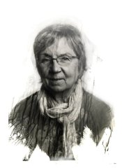
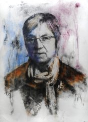
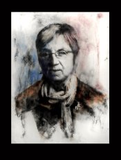
#3 has a nice upright presence.
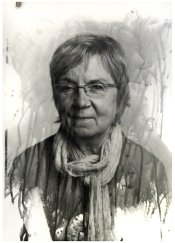
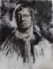
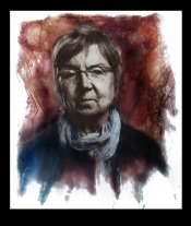
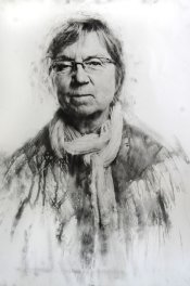
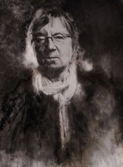
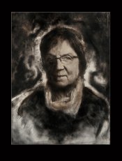
a nice black/brow bromoil with
encaustic paints added to give a hint of color
would look beautiful .. i am sure it is up your alley :smile:
but then again, the others you did seem to be part of
this series, why don't you keep this one in the same "vein" ?

i am confident no matter how you print this, it will be pretty special ..

you know how to have fun!
john
 
OP
OP
gandolfi

gandolfi

Member
Joined
Jan 28, 2005
Messages
1,820
Location
Denmark
Format
Large Format Pan
UPDATE

I finally made some liquid emulsion prints - choosing two different negs and made two of each..

Then the bromoil bleach and finally messing around with some oil...

going to be interesting..
 

Attachments

  • 1.jpg
    1.jpg
    232.9 KB · Views: 129
  • 2.jpg
    2.jpg
    227.9 KB · Views: 146
  • 3.jpg
    3.jpg
    340.5 KB · Views: 132
  • 4.jpg
    4.jpg
    356.5 KB · Views: 128

Heinz

Member
Joined
May 9, 2009
Messages
108
Location
Herdecke, Germany
Format
Multi Format
They look great (I like the first two in particular). And now I think I understand why you had the (in my opinion) quite contrasty lightning in the straight prints. You need this so that the contrast stands again the pattern produced by your alternative techniques - and you know how to anticipate this. Is this correct?
 

cliveh

Subscriber
Joined
Oct 9, 2010
Messages
7,542
Format
35mm RF
Out of those 4, my vote would definately be number 4.
 
OP
OP
gandolfi

gandolfi

Member
Joined
Jan 28, 2005
Messages
1,820
Location
Denmark
Format
Large Format Pan
Gandolfi, I am surprised that you ruled out Number 2. I think that is the photo that de-emphasizes her right eye the best and with fill on that cheek.

yes - but there's no catchlight in her eye... I think it will end up looking "dead"...
 
OP
OP
gandolfi

gandolfi

Member
Joined
Jan 28, 2005
Messages
1,820
Location
Denmark
Format
Large Format Pan
Out of those 4, my vote would definately be number 4.

me too actually, but everything is open for now.. when I ink the images (just bleached them - they're hanging to dry right now) I can destry all of them - or no one..

Time will tell....
 
OP
OP
gandolfi

gandolfi

Member
Joined
Jan 28, 2005
Messages
1,820
Location
Denmark
Format
Large Format Pan
well - I have now inked two - they are not totally finished; especially the B/W version.

an explanation on the coloured one:

Here in Denmark the colour of the political right wing is blue and the left is red.
The minister belongs to a party just in bewteen those two; albeit leaning towards the blue..

I thought it could be interesting to use those two colours, but I also added warmth as I actually think she is a warm person..

The B/W image isn't done yet - I am not convinced by it - it needs something extra - something in the background, and maybe also some warmth...

Tomorrow I'll take another look and se....

(sorry for the image quality - just quick snaps...)

(and BTW the image size is approx 50x70cm or 20x27")
 

Attachments

  • marianne-jelved2.jpg
    marianne-jelved2.jpg
    251.8 KB · Views: 124
  • marianne-jelved.jpg
    marianne-jelved.jpg
    283.2 KB · Views: 121

johnnywalker

Subscriber
Joined
Sep 23, 2002
Messages
2,323
Location
British Colu
Format
Multi Format
I'm sure she'll be happy with whatever you end up with Emil. She has an impish almost-smile that you've captured. Personally I like number 3 (in the originals) but I'm sure I'll change my mind if I keep looking at them.
 

Bill Burk

Subscriber
Joined
Feb 9, 2010
Messages
9,319
Format
4x5 Format
I'm afraid it doesn't get much better! But I also know I'm wrong. These are great!
 
OP
OP
gandolfi

gandolfi

Member
Joined
Jan 28, 2005
Messages
1,820
Location
Denmark
Format
Large Format Pan
I'm afraid it doesn't get much better! But I also know I'm wrong. These are great!

aah thanks, but I just changed the B/W.. I didn't like the white background and felt her to be too flat in presence..

I'll attach what I have come up with
 
OP
OP
gandolfi

gandolfi

Member
Joined
Jan 28, 2005
Messages
1,820
Location
Denmark
Format
Large Format Pan
quick snap (still wet) of a canged version of teh B/W image..

Added dramatic darkness in the background and also some warmth in her faxe...

Not finished I think, but how to finish it I don't know yet..
 

Attachments

  • marianne-jelved3.jpg
    marianne-jelved3.jpg
    254.4 KB · Views: 102

removed account4

Subscriber
Joined
Jun 21, 2003
Messages
29,832
Format
Hybrid
emil -

all i can say is these are dynamite!
can you add a subtle shimmering glowing hue
to the b/w one that is there, but not there at the same time?
kind of like the iridescent gold hue a black goldfish has
its there, but not there at the same time ...
(encaustic/wax based paints? )
 
Joined
Feb 23, 2006
Messages
789
Location
Wicklow, Ireland
Format
Multi Format
quick snap (still wet) of a canged version of teh B/W image..

Added dramatic darkness in the background and also some warmth in her faxe...

Not finished I think, but how to finish it I don't know yet..

Thanks for sharing your thinking and your process, it is wonderful to see how you are adding drama and an expression, layer by layer. I hope you don't take my suggestion too readily and so upset your own feeling of balance and your instinct, as I'd hate to spoil your creation, but since you asked for suggestions, I'd say I'd like something in-between the white and the newer blacker one, as I find the black maybe a touch heavier, and therefore sadder. Perhaps a slightly less symmetrical crop, too? I cannot wait to see the next versions.
 

pbromaghin

Subscriber
Joined
Sep 30, 2010
Messages
3,809
Location
Castle Rock, CO
Format
Multi Format
Thank you so much for letting us see the evolving work of art. This has been, and remains, fascinating.
 
OP
OP
gandolfi

gandolfi

Member
Joined
Jan 28, 2005
Messages
1,820
Location
Denmark
Format
Large Format Pan
Thanks for sharing your thinking and your process, it is wonderful to see how you are adding drama and an expression, layer by layer. I hope you don't take my suggestion too readily and so upset your own feeling of balance and your instinct, as I'd hate to spoil your creation, but since you asked for suggestions, I'd say I'd like something in-between the white and the newer blacker one, as I find the black maybe a touch heavier, and therefore sadder. Perhaps a slightly less symmetrical crop, too? I cannot wait to see the next versions.

First: Thanks all - it is nice to get feedback!!

Rafal I understand your suggestion, but I am afraid it is too late.. :wink:

I have just made this even darker!... (will post an image tomorrow).
I thought here she started to look like an old witch from a Harry Potter story... (I think the bottom half of the image had this effect..) - I am thinking about adding at least some warmth to the background as well...

I have also thought about cropping.. and I might do that...

To top it all, I have now begun my third version...

stay tuned..
 
OP
OP
gandolfi

gandolfi

Member
Joined
Jan 28, 2005
Messages
1,820
Location
Denmark
Format
Large Format Pan
The "B/W" version isn't B/W anymore... I added some warmth - both in the background as well as in her clothes...

I also decided to make the scarf less dominant..

Finally I tilted it a little to the right..

All in all better I think..

The third version is also now almost completed - I'll upload an image tomorrow..
 

Attachments

  • marianne-jelved4.jpg
    marianne-jelved4.jpg
    203.5 KB · Views: 95

eddie

Member
Joined
Jul 24, 2005
Messages
3,258
Location
Northern Vir
Format
Multi Format
That looks great, Emil...
I'm happy to report that your photos are now framed, and looking for a place to hang, in my house:

emilframed.jpg.jpg
 

pbromaghin

Subscriber
Joined
Sep 30, 2010
Messages
3,809
Location
Castle Rock, CO
Format
Multi Format
Dante's inferno. Acid trip. You don't mess around.
 
Joined
Feb 23, 2006
Messages
789
Location
Wicklow, Ireland
Format
Multi Format
The "B/W" version isn't B/W anymore... I added some warmth - both in the background as well as in her clothes...

I also decided to make the scarf less dominant..

Finally I tilted it a little to the right..

All in all better I think..

Thanks for sharing. I like this version very much, though still not 100% sure about the whiter strip at the very bottom, and bottom-right, as it draws my eye away from the figure. However, this is probably just me...
 
OP
OP
gandolfi

gandolfi

Member
Joined
Jan 28, 2005
Messages
1,820
Location
Denmark
Format
Large Format Pan
UPDATE

well - I have now written our Minister (Secretary) of Culture and sent her the three images to jugde...

That is nerve wrecking...

I made some final images - SO hard to make them look right on a screen... and added a kind of framing to show how I picture them...

I wonder how she will react... Maybe she'll die of a culture shock?:pouty:

We'll see....
 

Attachments

  • mar1-a.jpg
    mar1-a.jpg
    177.2 KB · Views: 96
  • mar2-a.jpg
    mar2-a.jpg
    224.2 KB · Views: 95
  • mar3-a.jpg
    mar3-a.jpg
    260.2 KB · Views: 101
OP
OP
gandolfi

gandolfi

Member
Joined
Jan 28, 2005
Messages
1,820
Location
Denmark
Format
Large Format Pan
..and finally the fourth version...
 

Attachments

  • mar4-a.jpg
    mar4-a.jpg
    360.6 KB · Views: 89
Photrio.com contains affiliate links to products. We may receive a commission for purchases made through these links.
To read our full affiliate disclosure statement please click Here.

PHOTRIO PARTNERS EQUALLY FUNDING OUR COMMUNITY:


Ilford ADOX Freestyle Photographic Stearman Press Weldon Color Lab Blue Moon Camera & Machine
Top Bottom