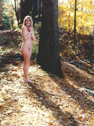
Silena1
Ed Sukach

Silena1

Backlighting study.
Location
Oxford, MA
Equipment Used
Hassellad 503Cx; 80mm Planar
Exposure
1/125 @ f16 (?)
Film & Developer
Aggfacolor 100; Tetenal CN2
Paper & Developer
Iflocolor/ Tetenal RA4
Lens Filter
none
It's a sleeper. At first a had some of Gustavo's reaction but I kept going back to it. The composition is perfect, the lighting is perfect for subject/place & Time and the expression is a surprise(Especially Here). Works for me too.
 
Approaching this as a "study" as you title suggests, I won't worry too much about the pose, I am not sure that you did either. Hard to judge my my monitor, but as Gustavo mentioned, highlights are blown out and shadows blocked. Might work as a small print, but the larger the print, the larger these areas of no information are, and the less the image will work.

The model's shadow does help to break up the large sun-lit area in the lower left, otherwise I might suggest having her leaning against the tree trunk to reduce the size of the black chunk of the trunk.

Looks like I'll talk about the pose anyway...the pose shows a reaction to the photographer/camera, and thus with the viewer. There is some sense of the model interacting with the environment (possibly trying to get warm in the sunlight), but primarily it is the interaction with the camera I see. If this is what you wanted, great! Personally, in my images I prefer more of a feeling of an interaction with the landscape than with the camera...but that is just my preference for my work...your mileage may differ.

Vaughn
 
First, the "persistence of vision" here is in itself a measure of success. There must be enough energy in this image for it to be REMEMBERED - not just glanced at lightly and forgotten.
It may be of interest to note that I am fully aware of the "highlights"; another print had been made utilizing pre-flashing of the paper to control contrast - toning down and restoring highlight detail. At the same time the (supposedly completely black - it isn't) tree trunk texture became more easily defined. The end result was, in MY vision, a failure ... much of the impact was lost - a bland, dull, LIFELESS affair.
The exhibition print is matted with a black window mat; it rests in a 20" x 28" frame - there is, for some reason, an illusion of DEPTH - something like a bas-relief three inches or so deep.
I only wish all could see the exhibition print.
 
Ed,

OK, we have had our differences before but please accept my comments as my viewpoint. Its is not about superiority or inferiority, only opinion:

I find the tree trunk very distracting at feel that it completely dominates the frame, thus detracting from the woman. I personlly, don't find the empty bottom part of the frame works in this case. Empty space CAN work, only I don't find it does here....for me. I find the pose and smile out of kilter with everything else. To me it is a juxtaposition that seems to make no point. I don't know what this image represents, what it is (trying to do) in aesthetic terms or why it was taken. To be honest it leaves me at a loss. Was the intention to shoot such a pose/expression or did this come and get get because it 'happened'. What took the two of you out to the woods - what was the intention/aim or inspiration behind setting this up? For me the hot spots are not a killer but they are very distracting and whilst they do occur in nature, they do not neccessarily make a positive showing in every picture, but that of course depends on the circumstances and a myriad of other factors. Can you not flash or burn the affected areas a touch rather than flash the whole print, just to restore some detail whilst preserving the sense of bright light? Not a colour man so I would not know!

Rgds
 
Yes, I certainly COULD pre-flash/ burn the "hot spots" but I choose not to. To do so, would in my view, dimininsh the *brilliance* of the scene.
The emotion I tried to capture was "JOY and its exuberant expression".
These are all *interesting* comments - although I'm trying to grasp just what is meant by "the smile and pose as an out-of-place `juxtaposition' (placing close together?)"? I don't have any idea where else they should/ could be.
BTW - the leaves at the lower area add texture.
 
I have no problem with the hot-spots at all. I honestly like them. I'm also impressed that you have still got wonderful tones in her skin.

The only downside is that I would like to be able to view it more enlarged. I really love portraits and faces, so I would like to see her expression more.
 

Media information

Category
Critique Gallery
Added by
Ed Sukach
Date added
View count
1,477
Comment count
16
Rating
0.00 star(s) 0 ratings

Image metadata

Filename
silena1.jpg
File size
182.3 KB
Dimensions
365px x 490px

Share this media

Photrio.com contains affiliate links to products. We may receive a commission for purchases made through these links.
To read our full affiliate disclosure statement please click Here.

PHOTRIO PARTNERS EQUALLY FUNDING OUR COMMUNITY:


Ilford ADOX Freestyle Photographic Stearman Press Weldon Color Lab Blue Moon Camera & Machine
Top Bottom