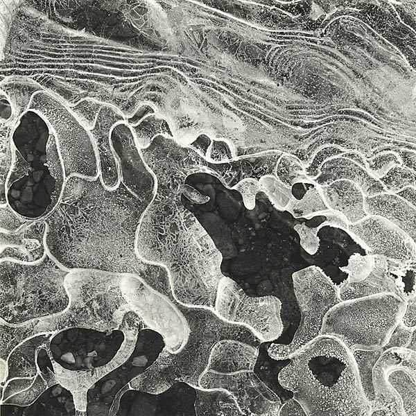
Regarding the choice of contrast and blacks, I think I understand the desire to push the darker tones deeper, making the image even more abstract and less recognizable. I wanted to retain detail in the gravel bed to add another layer of interest. When I look at the print from afar, I get the larger impression of abstract shapes, and when I get closer in I can see into the layers.
William, this was taken with a Hasselblad, 80mm lens and extension tube.
Thom, I've printed rarely on Galerie (damn, it's expensive stuff), and try to select negatives that I think will be especially suitable with the paper. Really wonderful paper though.
Photrio.com contains affiliate links to products. We may receive a commission for purchases made through these links. To read our full affiliate disclosure statement please click Here.
PHOTRIO PARTNERS EQUALLY FUNDING OUR COMMUNITY:
This site uses cookies to help personalise content, tailor your experience and to keep you logged in if you register.
By continuing to use this site, you are consenting to our use of cookies.