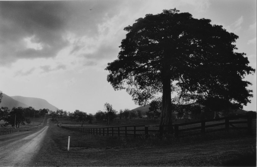
Please feel free to critique. Nobody ever critiques in th that forum and I need as much help as possible.
Used multi grade ilford pearl 5x7
split contrast 5 secs with 0 filter and 5 secs with 5 filter.
Dodge road with no.5
gave the sky an extra 10 secs burn with 0 filter and 5 sec with 5.
BTW Print is sharp, cant seem to get a sharp print scan.
Any tips on toning down the white post? Tried with a mask with a small slot, but looked worse.
I like the composition, and it looks like you've done nice work with the sky, the tree is a little dark but maybe that's where you're going.
Old timers might actually 'paint' the post down with a spotting brush...
I'm with dasBlute. I'm curious - do you like the sky as it is? Do you like the tree? Besides the white post, what do you want to change? I know what I'd do, but I don't know what you want from it or what you've already done. I'd test and come up with a good basic exposure with a #2-#3 filter and get the tree how I wanted. Then I'd burn in the sky with the #0 or #00. But then I'd try other things if I didn't like how that looks. As for the post, yeah, that's tough. I might try spotting it some just to make it a little darker, not match what's around it.
Scanning pearl is a pain in the neck. If this were my print, I'd try dodging the entire dark area to the right of the road ( from bottom of print up to distant trees ) just a little during the grade 0 exposure. I think there are variations in tone that will separate out, and if it's slightly lighter it will more smoothly lead the eye toward the road. Hard for me to guess how much to dodge because your lamp is different from mine, but maybe 1 or 1.5 seconds? I like the way the distant hill to the left of the road looks.
Good one, Awty. 'Like the composition (nothing new for your work). The lower key printing seems consistent w/ the turbulent sky (like the burn results). 'Makes for a consistent mood & a nice pastoral landscape.
@dasBlute@winger@NedL@HiHoSilver
Thanks for the feed back.
It isnt a good negative, the sky is a bit over exposed and the tree foliage is a bit under exposed/thin, rest is ok. Its a good one to play with cause there is plenty of options I think(just a beginner).
I was primarily following a Ilford technician tutorial on split contrast. So a test print using a 2 filter, came to 10 secs, then splitting between an 0 and a 5. Did try burning as suggested with a 0 filter, but wasn't very strong in contrast, maybe I should just give it more time.
Its good to get others perspectives so I can play some more.
Here is one I posted on flickr using graded ilfospeed 1.1 gloss postcard paper, little more dramatic, but no direction. https://www.flickr.com/photos/144284773@N06/33698944822
You know I like the post. One thing I might do as an experiment is very slightly bleach those light areas on the tree trunk to bring them out. This might act as a balance to the post.
Photrio.com contains affiliate links to products. We may receive a commission for purchases made through these links. To read our full affiliate disclosure statement please click Here.
PHOTRIO PARTNERS EQUALLY FUNDING OUR COMMUNITY:
This site uses cookies to help personalise content, tailor your experience and to keep you logged in if you register.
By continuing to use this site, you are consenting to our use of cookies.