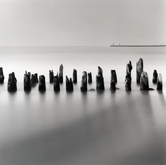
At first glance, I would crop out mostof the bottom to make moreof an 8x12-type format and burn the darker water in the loer right corner to emphasize it. I would experiment with a graduated burn on the sky.
I like this print the way you've portrayed it here. Perhaps, cropping out some of the bottom area of the print might improve it a shade. Whatever you do this is a fine print and one that I would like hanging on my wall. BTW what time of day did you take this picture ? Thanks for sharing.
Warm regards
Julian
Dan, you are the man.......this is fabulous. Simply incredible. Is this the one off oval beach??? It's tough to improve on, however, you may want to burn the top left a little to even out the tonal balance in the sky. You could just leave it alone.
I find the pier to be too distracting for the rest of the image. You have these nice organic shapes that make a beautiful rhythm thru the image, but then you have this bold black line coming in from the side which makes it unbalanced. I think that line needs to go and you will have a nice panoramic image. The line is just not working in harmony with the rest of the image.
I wouldn't crop a thing here, the composition is excellent. I think the pier works in the composition and contributes to the zig-zag flow. Perhaps its too man made for some but I like it.
I would also burn the upper left and upper right corners a touch and possibly darken the black sleaks in the mid to lower right portion.
Photrio.com contains affiliate links to products. We may receive a commission for purchases made through these links. To read our full affiliate disclosure statement please click Here.
PHOTRIO PARTNERS EQUALLY FUNDING OUR COMMUNITY:
This site uses cookies to help personalise content, tailor your experience and to keep you logged in if you register.
By continuing to use this site, you are consenting to our use of cookies.