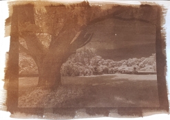
Van Dyke Brown dark and muddy

Mansion

A
Mansion

  • 0
  • 1
  • 18
Lake

A
Lake

  • 3
  • 0
  • 16
One cloud, four windmills

D
One cloud, four windmills

  • 1
  • 0
  • 16
Priorities #2

D
Priorities #2

  • 0
  • 0
  • 16
Priorities

D
Priorities

  • 0
  • 0
  • 14

Recent Classifieds

Forum statistics

Threads
199,016
Messages
2,784,666
Members
99,773
Latest member
jfk
Recent bookmarks
0

Lynn R

Member
Joined
Dec 19, 2021
Messages
3
Location
07432
Format
35mm
Hello,
I've been working on VDB printing after spending many months with Cyanotype with happy results. I am using the B&S kit and following their directions using a homemade UV light box.
First, my exposures are really short - 1 minute to 1.5 mins - vs. up to 6 minutes with the same negative I used for cyanotype. I realize I need a higher contrast neg for VDB, but just getting started.
Next, even with the short exposure time, my prints are dark and muddy. Hardly any highlight at all.
Suggestions? What am I doing wrong? Thanks.
 

Attachments

  • VDBtest.jpg
    VDBtest.jpg
    1,020.7 KB · Views: 224

fgorga

Member
Joined
Aug 31, 2015
Messages
772
Location
New Hampshire
Format
Multi Format
Digital or analog negative?

I think you simply need more contrast in the negative.

This means a better/different curve if you're using a digital negative. Using a digital negative tailored for one process with a second process is likely to give suboptimal results. The ability to tailor a negative to match the process you are using is a great feature of digital negatives.

If you are using an analog (film) negative you can use dichromate to increase contrast when you print. Details can be found here: https://www.alternativephotography.com/vandyke-notes/
 

removedacct1

Member
Joined
Nov 12, 2014
Messages
1,875
Location
97333
Format
Large Format
Lynn,
The problem you're experiencing is that the negative doesn't have sufficient contrast/density to allow you to print the blacks dark enough and still have some appropriately light values in the highlights. Many of these "alt" processes require a negative with far more contrast than normal and fairly dense highlight values on the neg.

My question is: are you working from a digital negative (inks on Pictorico film) or from an actual film negative, produced in-camera? If its the latter, then you need to develop the film much longer to obtain more density in the highlights. The ideal materials for VanDyke Brown and other alt printing processes is Ilford FP4 exposed at 100 ASA, developed in double strength (2:4:100) PMK (Pyro) developer for approximately 10 minutes. This will give you a much better negative for the process you're doing.

If you're using digital inkjet negatives to make the print, then you need to increase the contrast of the file and print with much greater density in the highlights. I dislike working with digital negatives, so I cannot give you more details, since my experience with the materials is limited. But I know many people use these materials for alt print making and get excellent results. I prefer a negative made in-camera from traditional film materials. I feel it gives a much richer tonal scale.

A Van Dyke print made from a wet plate collodion negative (very contrasty)
 
OP
OP

Lynn R

Member
Joined
Dec 19, 2021
Messages
3
Location
07432
Format
35mm
Digital or analog negative?

I think you simply need more contrast in the negative.

This means a better/different curve if you're using a digital negative
Digital or analog negative?

I think you simply need more contrast in the negative.

This means a better/different curve if you're using a digital negative. Using a digital negative tailored for one process with a second process is likely to give suboptimal results. The ability to tailor a negative to match the process you are using is a great feature of digital negatives.

If you are using an analog (film) negative you can use dichromate to increase contrast when you print. Details can be found here: https://www.alternativephotography.com/vandyke-notes/
Yes, It's a digital negative. Question, to get the darks darker and lights lighter, do you go beyond the point of blowing out? I'll really crack up the contrast and test again. Thanks.
 
OP
OP

Lynn R

Member
Joined
Dec 19, 2021
Messages
3
Location
07432
Format
35mm
Lynn,
The problem you're experiencing is that the negative doesn't have sufficient contrast/density to allow you to print the blacks dark enough and still have some appropriately light values in the highlights. Many of these "alt" processes require a negative with far more contrast than normal and fairly dense highlight values on the neg.

My question is: are you working from a digital negative (inks on Pictorico film) or from an actual film negative, produced in-camera? If its the latter, then you need to develop the film much longer to obtain more density in the highlights. The ideal materials for VanDyke Brown and other alt printing processes is Ilford FP4 exposed at 100 ASA, developed in double strength (2:4:100) PMK (Pyro) developer for approximately 10 minutes. This will give you a much better negative for the process you're doing.

If you're using digital inkjet negatives to make the print, then you need to increase the contrast of the file and print with much greater density in the highlights. I dislike working with digital negatives, so I cannot give you more details, since my experience with the materials is limited. But I know many people use these materials for alt print making and get excellent results. I prefer a negative made in-camera from traditional film materials. I feel it gives a much richer tonal scale.

A Van Dyke print made from a wet plate collodion negative (very contrasty)

Thanks. Your print is a world away from my results and the tonal range I can only dream of right now. Yes, I am using digital negatives. I'll work on the files to get more contrast and range in the negative. My processing of digital images has me shy away from too much contrast. I will work on that for alt process. I'm surprised such a difference in contrast for negatives for cyanotype & VDB. Thanks.
 

Rick A

Subscriber
Joined
Mar 31, 2009
Messages
9,942
Location
Laurel Highlands
Format
8x10 Format
It looks to me like you have uneven coating, plus it could be your choice of paper. Have you used any sizing on your paper?

It is possible to obtain more contrast in the print by using a drop or two of 10% Potassium Dichromate in the first wash. You will need to experiment as to how much to add plus how much extra exposure to compensate. I use in camera negatives and over develop to get the contrast necessary for a decent print, but I do add the dichromate at times if I'm not satisfied with the result.
 

fgorga

Member
Joined
Aug 31, 2015
Messages
772
Location
New Hampshire
Format
Multi Format
Lynn,

It sounds to me like you are not approaching the preparation of digital negatives the way that most folks do.

The most common (I think) way to make a digital negative is to process your image (in black and white) more-or-less normally. Then to invert the image to get a negative and finally to apply a curve to the negative that matches the contrast of the negative to the process you intend to print with.

The "Curve Corner" at alternativephotography.com (see: https://www.alternativephotography.com/curve-corner-photoshop-curves/) has curves that will get you started. These curves may need some tweaking in order to optimize them your exact working methods, but they are better than starting from scratch. There is information at the bottom of this page on how to use these curves in PhotoShop.

Bostick & Sullilvan have information and curves for making digital negatives more-or-less as described above.

Additionally, Bostick & Sullivan have an alternative method (using LUT tables) for adjusting the contrast of digital negatives, see: https://www.bostick-sullivan.com/digital-negatives-lut/. I have not tried this method so I can't vouch for it.

--- Frank

P.S.I agree with RickA that the coating in the print you show is quite uneven, but that issue is not related to the negative or the contrast.
 

revdoc

Member
Joined
Apr 12, 2015
Messages
291
Format
35mm
Regarding exposure time: I find that traditional cyanotypes need about 4 times as much exposure as VDB, so your exposure is in the right range.

Regarding contrast: your highlights will have to be at least twice as dense as the highlights on your cyanotype negs. You might want to take a look at Easy Digital Negatives. It helped me a lot with digital negs.

 
Joined
Mar 22, 2005
Messages
2,193
Location
Mars Hill, NC
Format
Multi Format
“Yes, It's a digital negative. Question, to get the darks darker and lights lighter, do you go beyond the point of blowing out?”

NO! All that does is lose detail in the clipped areas and goof up your transitions to and from the midtones. Take it from one who’s already tried.

First, you need to develop your coating skills, so that you lay a thin even coat of the chemicals onto the paper. You can’t really troubleshoot the tones until you can get an even tone across the paper.

Then you need to sort out your times and curves. There are a lot of ways to get there. I like Richard Boutwell’s software, Quickcurve DN, which works with QuadToneRIP. But there are other solutions as well.

It takes some practice to get the coating technique down. None of this is difficult, but it does take time.
 

ole-squint

Subscriber
Joined
Jul 17, 2007
Messages
43
Format
Medium Format
I follow the Wynn White article at alternativephotography.com already mentioned. Double coating the paper makes a world of difference (dry between coats). I'm using Rives BFK without any sizing on my part. Also, toning helps a lot--even with selenium, as mentioned in the White article.
 
Joined
Mar 22, 2005
Messages
2,193
Location
Mars Hill, NC
Format
Multi Format
I follow the Wynn White article at alternativephotography.com already mentioned. Double coating the paper makes a world of difference (dry between coats). I'm using Rives BFK without any sizing on my part. Also, toning helps a lot--even with selenium, as mentioned in the White article.

There are a lot of opinions online about how to coat paper effectively. Some people swear by double-coating. My experience has been to the contrary. A single even coat, not too thick, will give you all the dynamic range the process can give. A second coat will not make your blacks blacker. Apart from wasting time and chemistry, a second coat increases the chances of ending up with a stained print from too much chemistry on the paper. If you have the chemistry and technique right, you will not need a second coat.

The internet has all sorts of half-baked information about these processes, often posted by well-meaning people. And I count myself in this group. In my Post #9 above, I took the OP to task for failures of coating the paper, based on the splotchy appearance of the print. But now I realize that I leapt too quickly to that conclusion -- it could as easily be a poor choice of paper, with an alkaline buffer or base. It might also be caused by water with an alkaline pH -- it is important to keep the process acidic through development and wash.

In theory any paper can be used with proper sizing. In practice, there are a handful of papers you can use without need of sizing. My preferred paper for these processes is a Legion paper, Revere Platinum. It has a cool smooth surface, similar to Hahnemuhle Platinum Rag, and it is completely free of additives that might interfere with development. It is sourced by Legion, an American company, and the owner is accessible and personally invested in the paper's use by alt printers. And it is a good deal less expensive than the competition -- Hahnemuhle Platinum, Arches Platine, Bergger COT. They all reliably print without sizing; but Revere Platinum has never failed me and I use it all the time now.

EDIT: My experience is based on kallitypes, not VDB prints. Kallitypes and VDB prints are in the same family of silver/iron processes and I am assuming that my experience with kallitypes fairly informs VDB printmaking. But that is only my assumption, based on the similarity of the chemistry and the processes -- I have no experience on which to base it.
 
Last edited:

koraks

Moderator
Moderator
Joined
Nov 29, 2018
Messages
23,115
Location
Europe
Format
Multi Format
Some people swear by double-coating. My experience has been to the contrary. A single even coat, not too thick, will give you all the dynamic range the process can give.

I agree; this is also my experience - with VdB's specifically, not kallitypes, but I agree also that it's probably the same principle. Perhaps double coating can be a workaround sometimes, but personally I prefer to solve the underlying problem that makes a single coat insufficient.
 

pfrand

Member
Joined
Sep 17, 2006
Messages
9
Format
Pinhole
I agree with the comments above about the paper. It makes a huge difference. With VDB I have had the most success with Rives BFK and Revere Platinum sized with gelatin. (Sizing is extra work, but I like the results). Arches Platine works well too but it produced an almost black image for me. I like the brown tone in your image.
 

removedacct1

Member
Joined
Nov 12, 2014
Messages
1,875
Location
97333
Format
Large Format
I found VDB to work beautifully on various papers as long as it was sized with Arrowroot starch first. Bergger COT 320 was excellent, as was HPR. I have used Revere and Arches Platine only for Salt Printing, but I suspect either would work well for VDB and Arrowroot sizing.
 

Rick A

Subscriber
Joined
Mar 31, 2009
Messages
9,942
Location
Laurel Highlands
Format
8x10 Format
Unsized Strathmore Bristol works well, and it's cheap.
 

Holden

Member
Joined
Mar 2, 2009
Messages
8
Location
North Carolina
Format
8x10 Format
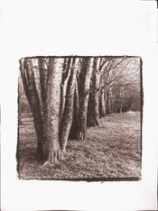
Van Dyke Brown Single Layer on Canson Watercolor. Toned in Gold and Selenium
 

Attachments

  • Print_3_sm.jpg
    Print_3_sm.jpg
    251.5 KB · Views: 48
Photrio.com contains affiliate links to products. We may receive a commission for purchases made through these links.
To read our full affiliate disclosure statement please click Here.

PHOTRIO PARTNERS EQUALLY FUNDING OUR COMMUNITY:


Ilford ADOX Freestyle Photographic Stearman Press Weldon Color Lab Blue Moon Camera & Machine
Top Bottom