


AndrewBurns
Member
So far I've mostly been printing with toned cyanotype, and a small amount of experimentation with carbon printing using DAS (which worked but my exposure unit is really the wrong wavelength to make it work well...). I'm currently printing using an LCD screen as a digital negative, and I'm putting together a 'UV projector' (basically a UV enlarger with an LCD screen in place of the negative). The big downside with using LCD screens, particularly when enlarged, is that they block 90-95% of the UV light you have to play with, and so you either need a LOT of UV light (which runs into thermal limitations) or you need to expose for a very long time.
Unless your printing technique is very fast...
Which brings me to Zerochrome SbQ, which is a non-toxic direct-pigment process similar to gum printing, except using polyvinyl alcohol modified with a light-sensitive compound called SbQ. Conveniently enough, a 'raw' version of the PVA-SbQ emulsion is available to directly purchase from a Chinese company in 1kg+ quantities for a reasonable price. This process seems to have all of the attractions of gum printing without the toxicity, and notably for my particular case it's fast, like 10 times faster than gum-bichromate.
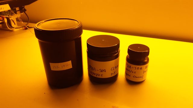
I ordered a 1kg container of raw PVA-SbQ from China which should be enough to last me a long time. Based on the Zerochrome guidance I'm diluting my raw emulsion 1:5 with distilled water for a clear working solution and 1:8 with distilled water + pigment for a pigmented working solution.
Like gum, each layer of PVA-SbQ has a pretty narrow tonal range, so typically a good tonal range and dense blacks are built up by stacking multiple layers of emulsion. Calvin Grier has developed a very nice system for his Printmaker's Friend product of stacking multiple layers of emulsion with different pigment loads and different exposure times to generate a full tonal scale. A good explination of how it works is available on his website: https://printmakersfriend.com/
In my case I'm going to divide my image into 6 layers, layer 1 has maximum pigment load and each subsequent layer has half the previous layer. Similarly layer 6 gets the maximum exposure time, and every previous layer gets roughly half the exposure time. A table of the pigment:clear ratio and % exposure time for my 6 layers is as follows:
My target pigment concentration in the lightest layer (layer 6) is about 0.8% india ink, which means that the pigment concentation of my darkest layer (layer 1) needs to be a whopping 24% india ink! Here are my 6 layer formulations, plus a clear layer, painted onto some watercolour paper. Ignore the pencil annotations, they didn't end up lining up to the actual layers because my brush was wider than expected.
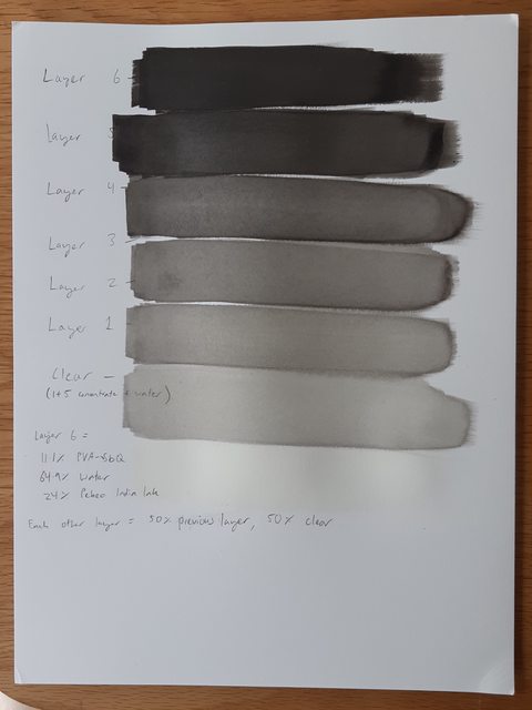
You can imagine that a stack of those 6 different layers should result in a nice tonal range!
The next step is to find your target exposure time. From Calvin's website he suggests how to do this with the lightest emulsion layer. I set up an automatic exposure test with my LCD printing rig that exposes the same test pattern 10 times, with 6 seconds between each exposure. So in the following print exposure 1 was 6 seconds and exposure 10 was 60 seconds.
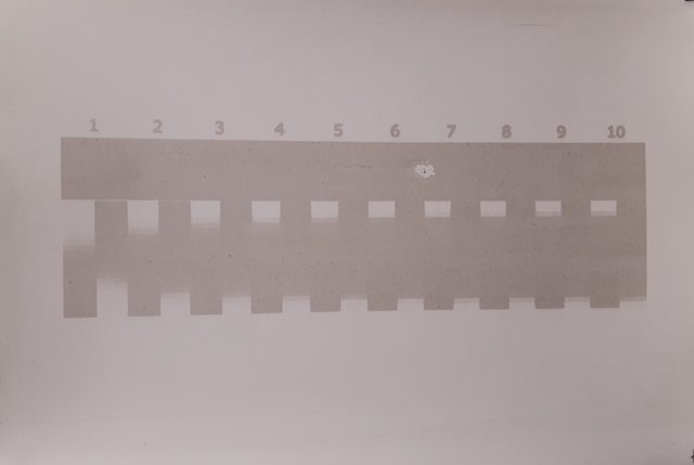
You can see a few interesting things here, firstly as exposure goes up the dynamic range of the tonal scale reduces significantly, starting at something like 5 to 6 steps out of 21 at the 6 second exposure, down to about 3 steps for anything above 36 seconds. Secondly there's a lot of irradiation/halation, particularly at longer exposures, presumably because very low pigment density is allowing UV light to travel horizontally in the emulsion and to harden PVA outside of where it should.
Based on this test I'm choosing 18 seconds (step 3) as my target exposure for this layer, which is CRAZY FAST. For reference, my classic cyanotype exposure time is 240 seconds. And keep in mind that every other layer is exposed for less time, so layer 1 is only exposed for just over 1 second. Also this is with a 405nm light, no short wavelengths needed. In fact this stuff is probably quite sensitive to even blue light, so you really need to work with it under at least a yellow safelight.
Last night I had a go at exposing 6 test strips following the pigment densities and exposure times I gave in the table above. Each test strip was watercolour paper sized with two layers of liquitex matte varnish diluted 1:1 with water and then coated with a clear layer of PVA-SbQ (1:5 diluted) before coating the pigment layer. Results were as follows:
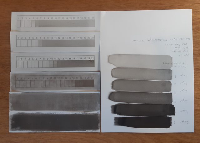
As you can see, there were some good and bad things about the test.
The first good thing is that you can clearly see that with each subsequent layer the pigment is darker and the 'tonal window' moves along the scale, which is what I want. Also you can see that the darker layers are sharper (most obvious in the lines and numbers) which confirms that the irradiation/halation effects in the lighter layers go away as pigment concentration goes up.
The obvious problem is that from layer 3 pigment staining suddenly gets really bad, and layers 1 and 2 stained so badly that no image was recoverable. For layer 3 I used 'spray development' where spraying water onto the print helps dislodge some of the stain, but it didn't work that well. For layer 2 I tried brushing the print under water but that just destroyed the image completely if there even was one. For layer 1 I tried washing in very hot water but that didn't help either.
I don't think this staining issue is going to be a killer though, as the 'correct' use of these layers is to stack them one on top of the other starting from lightest and going to darkest, only developing after every layer has been coated and exposed. That means that in practice the darker layers will always have several hardened lighter layers between them and the surface of the paper, and when the print is developed the layers below the dark pigment melt away which should prevent the pigment ever getting down to the paper and staining like that.
I also noticed when I was brushing on the layers, particularly the ones in the middle of the tonal scale, that the pigment appeared to be clumping and forming blotches, it was also impossible to avoid really obvious brush stroke marks. I think that both of these problems are related and to do with the emulsion not wetting nicely to the surface and trying to 'bead up', pulling pigment into clumps under surface tension rather than spreading over the surface nicely. I think in the future I'm not going to bother sizing the paper with acrylic in the first place as I don't think it helps at all, and I'm also going to try adding something like Tween 20 to the emulsion to encourage it to wet to the surface.
Overall, I'm pretty excited about this process and it seems like it has real potential. There are definitely some issues to overcome but there are other people getting good results with it, so it should just be a matter of refining my technique.
Unless your printing technique is very fast...
Which brings me to Zerochrome SbQ, which is a non-toxic direct-pigment process similar to gum printing, except using polyvinyl alcohol modified with a light-sensitive compound called SbQ. Conveniently enough, a 'raw' version of the PVA-SbQ emulsion is available to directly purchase from a Chinese company in 1kg+ quantities for a reasonable price. This process seems to have all of the attractions of gum printing without the toxicity, and notably for my particular case it's fast, like 10 times faster than gum-bichromate.
I ordered a 1kg container of raw PVA-SbQ from China which should be enough to last me a long time. Based on the Zerochrome guidance I'm diluting my raw emulsion 1:5 with distilled water for a clear working solution and 1:8 with distilled water + pigment for a pigmented working solution.
Like gum, each layer of PVA-SbQ has a pretty narrow tonal range, so typically a good tonal range and dense blacks are built up by stacking multiple layers of emulsion. Calvin Grier has developed a very nice system for his Printmaker's Friend product of stacking multiple layers of emulsion with different pigment loads and different exposure times to generate a full tonal scale. A good explination of how it works is available on his website: https://printmakersfriend.com/
In my case I'm going to divide my image into 6 layers, layer 1 has maximum pigment load and each subsequent layer has half the previous layer. Similarly layer 6 gets the maximum exposure time, and every previous layer gets roughly half the exposure time. A table of the pigment:clear ratio and % exposure time for my 6 layers is as follows:
| Layer | % Black Emulsion | % Clear Emulsion | % Exposure |
1 |
3.125 | 96.875 | 100 |
2 |
6.25 | 93.75 | 58 |
3 |
12.5 | 87.5 | 33.6 |
4 |
25 | 75 | 19.5 |
5 |
50 | 50 | 11.3 |
6 |
100 | 0 | 6.6 |
My target pigment concentration in the lightest layer (layer 6) is about 0.8% india ink, which means that the pigment concentation of my darkest layer (layer 1) needs to be a whopping 24% india ink! Here are my 6 layer formulations, plus a clear layer, painted onto some watercolour paper. Ignore the pencil annotations, they didn't end up lining up to the actual layers because my brush was wider than expected.
You can imagine that a stack of those 6 different layers should result in a nice tonal range!
The next step is to find your target exposure time. From Calvin's website he suggests how to do this with the lightest emulsion layer. I set up an automatic exposure test with my LCD printing rig that exposes the same test pattern 10 times, with 6 seconds between each exposure. So in the following print exposure 1 was 6 seconds and exposure 10 was 60 seconds.
You can see a few interesting things here, firstly as exposure goes up the dynamic range of the tonal scale reduces significantly, starting at something like 5 to 6 steps out of 21 at the 6 second exposure, down to about 3 steps for anything above 36 seconds. Secondly there's a lot of irradiation/halation, particularly at longer exposures, presumably because very low pigment density is allowing UV light to travel horizontally in the emulsion and to harden PVA outside of where it should.
Based on this test I'm choosing 18 seconds (step 3) as my target exposure for this layer, which is CRAZY FAST. For reference, my classic cyanotype exposure time is 240 seconds. And keep in mind that every other layer is exposed for less time, so layer 1 is only exposed for just over 1 second. Also this is with a 405nm light, no short wavelengths needed. In fact this stuff is probably quite sensitive to even blue light, so you really need to work with it under at least a yellow safelight.
Last night I had a go at exposing 6 test strips following the pigment densities and exposure times I gave in the table above. Each test strip was watercolour paper sized with two layers of liquitex matte varnish diluted 1:1 with water and then coated with a clear layer of PVA-SbQ (1:5 diluted) before coating the pigment layer. Results were as follows:
As you can see, there were some good and bad things about the test.
The first good thing is that you can clearly see that with each subsequent layer the pigment is darker and the 'tonal window' moves along the scale, which is what I want. Also you can see that the darker layers are sharper (most obvious in the lines and numbers) which confirms that the irradiation/halation effects in the lighter layers go away as pigment concentration goes up.
The obvious problem is that from layer 3 pigment staining suddenly gets really bad, and layers 1 and 2 stained so badly that no image was recoverable. For layer 3 I used 'spray development' where spraying water onto the print helps dislodge some of the stain, but it didn't work that well. For layer 2 I tried brushing the print under water but that just destroyed the image completely if there even was one. For layer 1 I tried washing in very hot water but that didn't help either.
I don't think this staining issue is going to be a killer though, as the 'correct' use of these layers is to stack them one on top of the other starting from lightest and going to darkest, only developing after every layer has been coated and exposed. That means that in practice the darker layers will always have several hardened lighter layers between them and the surface of the paper, and when the print is developed the layers below the dark pigment melt away which should prevent the pigment ever getting down to the paper and staining like that.
I also noticed when I was brushing on the layers, particularly the ones in the middle of the tonal scale, that the pigment appeared to be clumping and forming blotches, it was also impossible to avoid really obvious brush stroke marks. I think that both of these problems are related and to do with the emulsion not wetting nicely to the surface and trying to 'bead up', pulling pigment into clumps under surface tension rather than spreading over the surface nicely. I think in the future I'm not going to bother sizing the paper with acrylic in the first place as I don't think it helps at all, and I'm also going to try adding something like Tween 20 to the emulsion to encourage it to wet to the surface.
Overall, I'm pretty excited about this process and it seems like it has real potential. There are definitely some issues to overcome but there are other people getting good results with it, so it should just be a matter of refining my technique.


