too much contrast of too much tonal range?

Signs & fragments

A
Signs & fragments

  • 1
  • 0
  • 0
Summer corn, summer storm

D
Summer corn, summer storm

  • 1
  • 1
  • 21
Horizon, summer rain

D
Horizon, summer rain

  • 0
  • 0
  • 26
$12.66

A
$12.66

  • 6
  • 5
  • 160
A street portrait

A
A street portrait

  • 1
  • 0
  • 161

Recent Classifieds

Forum statistics

Threads
198,814
Messages
2,781,222
Members
99,710
Latest member
LibbyPScott
Recent bookmarks
0

fralexis

Member
Joined
Dec 7, 2010
Messages
57
Location
Atlanta, GA
Format
Large Format
I developed a 4x5 Arista 200. It looks like a good negative on the lightbox with plenty of texture in both the shadows and the highlights. It is a scene of a winter graveyard with snow and dark trees in the background and headstones in the mid ground.

When I print, the background trees are very dark and the snow completely blown out with no texture. I had exposed at f11 with a magenta filter set at 140 on a Beseler Dicro 45S. The time was 12 seconds. Perhaps I need to print with no magenta. To get everything correct maybe I would need to do extensive bring and dodging. I am not good at that and isolating the headstones would be really difficult for me. Can it be that the tonal range is simply too great to make a decent print? Thanks!

Alexis
 

Kevin Harding

Member
Joined
Nov 28, 2013
Messages
169
Format
Multi Format
What paper are you using? Pardon my ignorance, but what grade is 140M supposed to be?
 

pentaxuser

Member
Joined
May 9, 2005
Messages
19,949
Location
Daventry, No
Format
35mm
I don't have this enlarger but the magenta filter setting sounds as if it is for a print at grade 5 or close to 5 whereas if the negative has been properly exposed and processed and it sounds as if it has, then grade 5 is way too much contrast which would fit the description of the print. Try printing with the filter set at grade 2/2.5 and see how that turns out.

pentaxuser
 
Joined
Jan 21, 2003
Messages
15,708
Location
Switzerland
Format
Multi Format
Two reasons for not having enough shadow detail or highlight texture in a print:

1. You have the enlarger set to too great contrast.
2. The enlarging paper is unable to see the tones in the negative, i.e. the film is incorrectly exposed and developed.

Or both.

You should target what your paper is capable of when you shoot and process your film. Start with neutral filtration, adding no magenta and yellow, or equal amounts magenta and yellow.
Making a decent negative is the starting point. Then you fine tune your printing after you achieved that.
I recommend more film exposure, and then dial back developing time until you have a negative that prints OK at something roughly equal to Grade 2. That gives you a lot of wiggle room to increase and decrease contrast at the time of printing.

I developed a 4x5 Arista 200. It looks like a good negative on the lightbox with plenty of texture in both the shadows and the highlights. It is a scene of a winter graveyard with snow and dark trees in the background and headstones in the mid ground.

When I print, the background trees are very dark and the snow completely blown out with no texture. I had exposed at f11 with a magenta filter set at 140 on a Beseler Dicro 45S. The time was 12 seconds. Perhaps I need to print with no magenta. To get everything correct maybe I would need to do extensive bring and dodging. I am not good at that and isolating the headstones would be really difficult for me. Can it be that the tonal range is simply too great to make a decent print? Thanks!

Alexis
 

snapguy

Member
Joined
Jan 1, 2014
Messages
1,287
Location
California d
Format
35mm
wet

What I love about wet printing is that you can do test strips. Cut up a sheet of film into narrow trips and try several different filtrations, exposure time, etc.
 

cliveh

Subscriber
Joined
Oct 9, 2010
Messages
7,524
Format
35mm RF
What does a print or contact look like with no contrast control and no dodging. That will tell you volumes.
 
Last edited by a moderator:

cjbecker

Member
Joined
Dec 9, 2010
Messages
1,378
Location
IN
Format
Traditional
You could burn the snow and dodge the trees.
 

markbarendt

Member
Joined
May 18, 2008
Messages
9,422
Location
Beaverton, OR
Format
Multi Format
Contrast is a challenging subject to understand.

Adding Magenta reduces the range of what prints, so try printing with no filters; 0,0,0.

I've attached a diagram that hopefully helps you understand better.

The black "line" represents a "normal" film curve. The red lines represent the range the paper can print. (Just FYI it is normal, as is shown, not to print the whole film curve.)

0,0,0 is normally the middle of the print grade range.

Starting from 0,0,0 and adding 140 magenta, as you did, when using VC paper brings the red lines quite a bit closer together. That means less highlight and shadow detail prints than "normal".

Starting from 0,0,0 and adding 140 yellow when using VC paper moves the red lines quite a bit further apart. That means more highlight and shadow detail prints than "normal".
 

Attachments

  • a.jpg
    a.jpg
    205.9 KB · Views: 125
OP
OP

fralexis

Member
Joined
Dec 7, 2010
Messages
57
Location
Atlanta, GA
Format
Large Format
Thanks. I am going to try a zero magenta and then try adding some yellow and just experiment. I had been told (apparently incorrectly) that the yellow has little effect. I see that this is not good advice. The negative looked pretty good with plenty of detail so I am thinking it must be the filter amount. I'll try again. Thanks!

Alexis
 

markbarendt

Member
Joined
May 18, 2008
Messages
9,422
Location
Beaverton, OR
Format
Multi Format
Experimentation is good.

Starting at normal is good.

At each grade experiment with exposure.
 

cliveh

Subscriber
Joined
Oct 9, 2010
Messages
7,524
Format
35mm RF
Read a book on darkroom printing, or take a course.

When I see posts like this and ones that say read the negative or print by AA, I can't help thinking they are not very useful to the original poster. If someone has a problem in their photographic processing or technique and they post as such on APUG, then the least we can do is provide advice to get them to the next stage. Telling them to read a book or study XY or Z is a cop out.
 

pentaxuser

Member
Joined
May 9, 2005
Messages
19,949
Location
Daventry, No
Format
35mm
Read a book on darkroom printing, or take a course.

Excellent advice and whether you take a course or read a book you will probably come across a good piece of advice which is to print the neg with the full range of grades from 0-5. See which grade makes the best print then look closely at the neg again and after a few attempts at this you will very quickly be able to work out what each neg requires in terms of grade.

My experience is that with a scene of normal range and normal light conditions and exposed at box speed and processed according to the manufacturer's instructions the neg will print at between 2.5/ 3.5.

This is what the manufacturer of the film and developer intended to be the case and for the sake of its sales of film and developer it has to work. If it didn't then we would not have to bother about the future of analogue. It would have been: Analogue photography RIP a long time ago

pentaxuser
 

gone

Member
Joined
Jun 14, 2009
Messages
5,504
Location
gone
Format
Medium Format
I think the advice here has been very good, especially about first making a contact print, then using a test strip, and not using any filtration to start with. That, of course, is what will be stressed in a book or a course.
 
Last edited by a moderator:

gone

Member
Joined
Jun 14, 2009
Messages
5,504
Location
gone
Format
Medium Format
Sorry, double post. I'd better read a book :}
 

jp498

Member
Joined
Oct 5, 2009
Messages
1,525
Location
Owls Head ME
Format
Multi Format
The enlarging paper has a chart to show what contrast 140M is. It's pretty high in contrast and I hardly ever need that much magenta. Set it to zero and increase or decrease contrast as needed.
 

jcc

Member
Joined
Jul 18, 2012
Messages
489
Location
Norman, Okla
Format
Multi Format
The magenta filter will cut your contrast on paper, as people have already noted. If the range of the film is too great for the paper to handle, you can try split filtration. Assuming you're using multigrade paper, test the highlights with 00 or -1 (or whatever your lowest contrast filter is; usually yellow) and choose the shortest time that gives you the detail that you want from the brightest highlights; test the shadows with 5 or 5+ (or whatever you highest contrast filter is; usually magenta/red) and choose the longest time that gives you the detail that you want from the darkest shadows. Make the final print using the corresponding times with the proper filter—so expose the same paper twice with each filter. All the gray values in between those two should fall into place. Tweak it from there if it still doesn't please you.

Disclaimer: This is not the end all be all—there are lots of ways to print. This is just how I would deal with it, as I'm sure others have their own ways.
 
Joined
Sep 10, 2002
Messages
3,589
Location
Eugene, Oregon
Format
4x5 Format
I developed a 4x5 Arista 200. It looks like a good negative on the lightbox with plenty of texture in both the shadows and the highlights. It is a scene of a winter graveyard with snow and dark trees in the background and headstones in the mid ground.

When I print, the background trees are very dark and the snow completely blown out with no texture. I had exposed at f11 with a magenta filter set at 140 on a Beseler Dicro 45S. The time was 12 seconds. Perhaps I need to print with no magenta. To get everything correct maybe I would need to do extensive bring and dodging. I am not good at that and isolating the headstones would be really difficult for me. Can it be that the tonal range is simply too great to make a decent print? Thanks!

Alexis

Alexis,

With all due respect, it seems that you do not fully understand how variable contrast paper works with your dichroic head. Your 140M setting is the MOST contrasty you can get, and you complain about too much contrast...

Although it does seem a bit flippant just to say, "read a book or take a course," literacy is a wonderful thing, and there is much information easily available about this topic (including the instruction sheet that came with your paper :smile: 
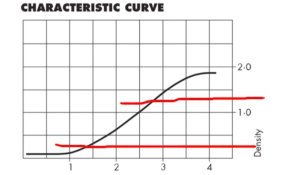
) to get you going with your filter settings and contrast. You will, however, have to read, digest and understand the information first.

Start here:

http://www.ilfordphoto.com/Webfiles/2006130201152306.pdf

Good luck,

Doremus
 

mwdake

Member
Joined
Aug 25, 2007
Messages
780
Location
CO, USA
Format
Multi Format
You may also want to think about using the Dual Filtration method indicated by your papers instruction sheet. This uses a mixture of M and Y and usually results in more even exposure times between the grades.
 

markbarendt

Member
Joined
May 18, 2008
Messages
9,422
Location
Beaverton, OR
Format
Multi Format
You may also want to think about using the Dual Filtration method indicated by your papers instruction sheet. This uses a mixture of M and Y and usually results in more even exposure times between the grades.

Dual filtration does keep you closer on time but I found that it only kept me close enough to get a first test print.

With a little experience with one color filtration I got to where I knew roughly how much to change exposure after a grade change. With just one filter it is much easier to remember what is what and to look at the enlarger and understand where I am.
 

pentaxuser

Member
Joined
May 9, 2005
Messages
19,949
Location
Daventry, No
Format
35mm
The OP hasn't come back to tell us his next step. Maybe he has gone away to read a book :D I look forward to his doing as we suggest and reporting total success or at least a vast improvement.

pentaxuser
 
OP
OP

fralexis

Member
Joined
Dec 7, 2010
Messages
57
Location
Atlanta, GA
Format
Large Format
I just wanted to get back to all of you with my results. Special thanks to Mark Barendt who made a little light go on in my head. This morning I followed his advice and got terrific results. Another poster sent a private message giving me some great information on contrast filter adjustments for my enlarger. It was indeed a matter of making those adjustments and experimenting. I still have a lot to do, but it is headed in the right direction.

Just to make another comment. I have been shooting 35 mm film since around 1974. So, I am familiar with a lot, but still need to learn a lot. My foray into large format is exciting but a different animal. It is always good to read and take classes. In fact I have taken classes, watched videos and I have a very extensive library. All that is good. HOWEVER, it is always better to find a good and kind person to share their knowledge and experience. Books don't always convey things in an understandable way. Sometimes, just sometimes a nice person will be helpful and word things just right so others can understand. For those people I am always grateful and indebted. For others, well.....

Alexis
 

markbarendt

Member
Joined
May 18, 2008
Messages
9,422
Location
Beaverton, OR
Format
Multi Format
Glad to hear that Alexis. You are welcome.
 
Photrio.com contains affiliate links to products. We may receive a commission for purchases made through these links.
To read our full affiliate disclosure statement please click Here.

PHOTRIO PARTNERS EQUALLY FUNDING OUR COMMUNITY:


Ilford ADOX Freestyle Photographic Stearman Press Weldon Color Lab Blue Moon Camera & Machine
Top Bottom