Tonality I cannot describe

Agawa Canyon

A
Agawa Canyon

  • 2
  • 2
  • 48
Spin-in-in-in

D
Spin-in-in-in

  • 0
  • 0
  • 32
Frank Dean,  Blacksmith

A
Frank Dean, Blacksmith

  • 13
  • 8
  • 227
Woman wearing shades.

Woman wearing shades.

  • 1
  • 1
  • 154

Recent Classifieds

Forum statistics

Threads
198,860
Messages
2,782,078
Members
99,733
Latest member
dlevans59
Recent bookmarks
0

takilmaboxer

Member
Joined
Mar 3, 2007
Messages
397
Location
East Mountains, NM
Format
Med. Format RF
Y'all might as well be arguing about how many angels you can fit on the head of a pin.
Art is intrinsically subjective. In monochrome photography the term tonality has a different meaning for every photographer.
Oh, and by the way, I don't know about Denmark, but on this forum, being polite is generally considered a desirable trait.
Now, back to my corn flakes.
 

Helge

Member
Joined
Jun 27, 2018
Messages
3,938
Location
Denmark
Format
Medium Format
So... this proves that more grain = more shades of gray, therefore that more is indeed more. Thus Large format offer more.
138S is that you on a new account?
Again, no. The tonality will develop within or below the image forming "clusters" that make up visible grain.

And for the third time (?) tonality as is talked about here, is something that is perceived over larger areas of the film.
It's is tangentially connected with sharpness, resolution and acuity etc. But It is a separate subject.

We're into https://en.wikipedia.org/wiki/Sorites_paradox territory.
Because something is fuzzy around the edges and overlaps with other ideas/concepts, doesn't mean it does not exist as a separate concept.
 
Last edited:
Joined
Aug 29, 2017
Messages
9,468
Location
New Jersey formerly NYC
Format
Multi Format
I thought my 4x5's had better tonality than my medium format shots. The three on the left are Tmax 100 in 4x5 developed by a lab normally in Clayton F76 (D76 equivalent) and scanned with a Epson V850. The four on the right are Tmax 100 in 6x7 medium format developed in a different lab normlayy in XTOL scanned on a more inferior Epson V600. https://www.flickr.com/search/?sort=date-taken-desc&safe_search=1&tags=tmax100&user_id=55760757@N05&view_all=1

By comparison here are (3) 4x5 Tmax 400 developed by a lab normally in Clayton F76 (D76 equivalent) and scanned with a Epson V850.
https://www.flickr.com/search/?sort=date-taken-desc&safe_search=1&tags=tmax400&user_id=55760757@N05&view_all=1

MY views are the 4x5 have a nicer tonality, more gradient. Of course, this could have do do with the scanning. The medium format ones were scanned with a more inferior Epson V600 vs. a V850 with higher scanner dMax for the 4x5's. ALso, how I edited them could have a huge effect on the final look. If I was more in a higher contrast mood, then the editing could have favored higher contrast in the final image. Similarly, the pictures the OP presented were scanned by different people and edited to their preferences. The ship appears to me to be lower contrast, where the shadow areas were made lighter and details brought out. It's very difficult to know what's really going on. Every scan has different scanners, different edits, and different people making them. It's best for the person to experiment on his own with different films and processes and make a determination on their own. It's the only way to compare apples to apples.
 

Helge

Member
Joined
Jun 27, 2018
Messages
3,938
Location
Denmark
Format
Medium Format
Y'all might as well be arguing about how many angels you can fit on the head of a pin.
Art is intrinsically subjective. In monochrome photography the term tonality has a different meaning for every photographer.
Oh, and by the way, I don't know about Denmark, but on this forum, being polite is generally considered a desirable trait.
Now, back to my corn flakes.
Tell me where I have been anything but polite?

It often becomes a question of tone, when you don't like what is being said.

Also there is such a thing as being overly, mechanically, obsessively, insistently "polite" to the point of reversal.
A popculture name for that is sealioning.
Peasant politeness, sultan of smarm or cargo culture could be other names.
 

MattKing

Moderator
Moderator
Joined
Apr 24, 2005
Messages
52,967
Location
Delta, BC Canada
Format
Medium Format
You're confusing concepts. What you are talking about is essentially microcontrast (in the original as invented by Kodak sense of the word).
Tonality in the sense meant here, and in 99.9% of the time people use the word, alludes to larger swathes of the image with gradations and absolutely global contrast differences.
I'm going to respectfully disagree.
To my mind, tonality is completely related to how tones transition, and micro-contrast is integral to that.
Global contrast differences are just that - they are often more integral to mood, weight, presence and dramatic impact.
If we have different concepts of tonality, it is a challenge to discuss it productively.
 

Vaughn

Subscriber
Joined
Dec 13, 2006
Messages
10,082
Location
Humboldt Co.
Format
Large Format
The way I look at it, one is talking about a print's tonality and the other is talking about what affects the qualities of a print's tonality (a larger negative allows for a smoother tonality to their eyes.) sort of like this (thanks a heap for the link, Helge);

"The continuum fallacy (also called the fallacy of the beard,[9][10] or line-drawing fallacy) is an informal fallacy closely related to the Sorites paradox. Both fallacies cause one to erroneously reject a vague claim simply because it is not as precise as one would like it to be. Vagueness alone does not necessarily imply invalidity. ..."

But I will put my vote in for lighting. It is rare, but when time, place and weather collide and one can get a light cloud/fog to mellow the sunlight just enough to keep distinct shadows it can be pretty sweet.
 
Joined
Sep 10, 2002
Messages
3,590
Location
Eugene, Oregon
Format
4x5 Format
@Doremus Scudder:
Thanks for qualifying the look and detailing how you would arrive there. I agree that lighting does indeed help, at least the first two pictures are definitely taken on overcast days. On the Titanic pic is was not too overcast, but shadows seem softened still. I haven't though about the filters. Do the shadows contain more blue because they are comparably more brightened by the sky than directly lit parts?

Some exposure/development experiments are still on my list. Luckily I now a have a 4x5, so this is easier and faster than with other types of film.

Back on topic...

Yes, when shadows are primarily lit by blue skylight (i.e., not on overcast days, but days with lots of blue sky), they have a distinct blue cast to them. Using films that are primarily blue-sensitive or filtering to get the same effect renders the shadows lighter than they would be with panchromatic film, which has sensitivity into the red.

Orthochromatic film is sensitive to blue and green, but not red. Using a filter that cuts out red can boost shadow values a lot, while taming the more red-containing parts of the image lit by direct sunlight. The standard filter to get an orthochromatic effect with panchromatic film is the Wratten #44 or #44A, which is cyan colored. However, I've found that the color-balancing filters, 80B and 80C (harder to find) do well too.

To approximate a blue-sensitive emulsion, you can use a #47 blue filter. This balances sunlit and shaded areas even more, but exposures end up being quite long.

Best,

Doremus
 

takilmaboxer

Member
Joined
Mar 3, 2007
Messages
397
Location
East Mountains, NM
Format
Med. Format RF
The first two images have a rather soft contrast. They look like they were printed for publication. They definitely look like old school large format and maybe even ortho film, as another poster has noted. Also the contrast could be related to use of an uncoated lens. But to my eye the tonality is hard to judge on a computer screen. An analogue print would be easier to evaluate. And the Rollei review images were done with what is naturally a high contrast film; digital manipulation makes it impossible to objectively evaluate them.
At every step of the way - choice of film and camera, development choices, printing technique, choice of paper, the artist makes decisions that produce a specific style or tonality. To add scanning variables to it...even more choices. But it's the lighting that really makes the image. It is often unrepeatable. This is a common thread topic here: I love this tonality, how do I achieve it? You achieve it by being in the right place at the right time, with a camera that you know how to use. It is a never ending quest especially for landscape photographers:laugh:.
 

JPD

Member
Joined
Mar 24, 2007
Messages
2,155
Location
Sweden
Format
Medium Format
You're confusing concepts. What you are talking about is essentially microcontrast (in the original as invented by Kodak sense of the word).
Tonality in the sense meant here, and in 99.9% of the time people use the word, alludes to larger swathes of the image with gradations and absolutely global contrast differences.

It's basically the same thing, though. In my example a single large pixel was divided into four smaller pixels, but I could just have said that doubling the amount of pixels would allow for a smoother gradient on the global scale. Micro-contrast is important here, but too much of it isn't good either as the tonality would be percieved as less smooth.
 

Vaughn

Subscriber
Joined
Dec 13, 2006
Messages
10,082
Location
Humboldt Co.
Format
Large Format
...But it's the lighting that really makes the image. It is often unrepeatable. This is a common thread topic here: I love this tonality, how do I achieve it? You achieve it by being in the right place at the right time, with a camera that you know how to use. It is a never ending quest especially for landscape photographers:laugh:.
Yes indeed! It helps a lot to be able to wander (if one is the wandering type) in a landscape over different seasons, weather, moods...eventually one is bound to come across incredible lighting (hard, soft, or in between) and be able to recognize the light as such...and as noted above, be able to get what one wants on film.
 

Helge

Member
Joined
Jun 27, 2018
Messages
3,938
Location
Denmark
Format
Medium Format
It's basically the same thing, though. In my example a single large pixel was divided into four smaller pixels, but I could just have said that doubling the amount of pixels would allow for a smoother gradient on the global scale. Micro-contrast is important here, but too much of it isn't good either as the tonality would be percieved as less smooth.

Sure they are connected, as I started out by saying, everything is connected if you know enough.

If four "primitives", be they pixels or crystals, (though I'm not crazy about calling silver halide crystals primitives (the real primitive here is the sensitivity centers, activated by three or more photons)), display a range of contrast, it's impossible to determine whether you are seeing just raw resolution and acutance, or ability to discern fine differences in gradients.

What you are talking about is really resolution. Though made cryptic to yourself with the wrong semantics and words.

There is a limit to how many steps a human can determine within a given contrast range.
Within the possible range from base fog to Dmax of even the densest film, you are is more than amply covered, with what film can display within very little space (of course it varies with the stock).
Within the statistical cluster of the perceptive "grain", there is as much range as is possible for the whole global frame.
More dynamic range and a straight (possible) curve is of course always desirable, but that is much the same (if not exactly the same) between film formats.

Development chemistry and process plays various tricks with edges and sharp transitions in the negative. So tonality is still a thing here, but not as much determined by the stock itself, as with less contrasty areas of the film.

What I will give you is that the aforementioned edge effects on LF is less than on MF, where they are again less than with 135.
But that has little to do with what is being discussed here.
 
Last edited:

Helge

Member
Joined
Jun 27, 2018
Messages
3,938
Location
Denmark
Format
Medium Format
Nah, that's an interesting phenomenon in itself, but not related to politeness.
I was just casually inventing a tongue in cheek compound nomenclature.
It is Cargo Cult, not cargo culture.
And yes, it could very much entail politeness too.
It's a phenomenon that characterises people under stress, transition and confusedness.

They can see others are doing better and they want some of the "that" too. They don't know whether to buy it by the yard or the tonne though.
The aping and with no deep grocking and internalisation of "something", is what characterises much of the cargo cult phenomenon.
Doing the surface of something, without fully getting the "when, where and how" but most importantly not knowing exactly "why".
Importantly cargo cults is also a way of wielding power over other weaker people, and taking advantage of their confusion and duress.
 
Last edited:

john_s

Subscriber
Joined
Nov 19, 2002
Messages
2,140
Location
Melbourne, A
Format
Medium Format
It’s not about film choices, it’s about the photographer exposing the film to get good shadow information, developing it properly, and printing it on a paper grade to maximize the grey values. A prints lifeblood is in its greys: the more you preserve these values, the more tactile the image is.

Spot on.
 

Helge

Member
Joined
Jun 27, 2018
Messages
3,938
Location
Denmark
Format
Medium Format
The first two images have a rather soft contrast. They look like they were printed for publication. They definitely look like old school large format and maybe even ortho film, as another poster has noted. Also the contrast could be related to use of an uncoated lens. But to my eye the tonality is hard to judge on a computer screen. An analogue print would be easier to evaluate. And the Rollei review images were done with what is naturally a high contrast film; digital manipulation makes it impossible to objectively evaluate them.
At every step of the way - choice of film and camera, development choices, printing technique, choice of paper, the artist makes decisions that produce a specific style or tonality. To add scanning variables to it...even more choices. But it's the lighting that really makes the image. It is often unrepeatable. This is a common thread topic here: I love this tonality, how do I achieve it? You achieve it by being in the right place at the right time, with a camera that you know how to use. It is a never ending quest especially for landscape photographers:laugh:.

You are of course right.
But the right answer is often a bit like kissing your sister.

What would be nice would be a comprehensive work on the the exact effects of filters, developers, paper, contrast filters, development of paper etc.

But it is important to know, as said in the above quoted post, that within the range of the aim for a "normal" or "best" negative and print (that is, non "overly" artistic graphic print, aiming for the straightest line and most range captured) , there is only so much you can do to the print, or scan of a normal negative to force it in other directions, if it is not exposed under exactly the right light.
My shot from the hip guess, would be that only up to about twenty percent of the look that is casually described as "tonality", can be from work done after exposure.
 
Last edited:

braxus

Member
Joined
Oct 19, 2005
Messages
1,784
Location
Fraser Valley B.C. Canada
Format
Hybrid
I know the size of the format does affect the tones in the shots, but the film does as well. TMAX 400 has great mid tones and fine grain. Best of both worlds would be to shoot this film in 4x5 or 8x10. Its available in those sizes.
 

Vaughn

Subscriber
Joined
Dec 13, 2006
Messages
10,082
Location
Humboldt Co.
Format
Large Format
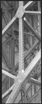
Would this be considered close to the tonality you are looking for?

Girders, Golden Gate Bridge, 2012
4x10 Carbon Print
Ilford FP4+, Kodak Dektol (undiluted)

Edited to add: My Pentax Digital Spot meter read from 9 to 12 and I exposed at ASA100 at 12. I 'underexposed' by a stop due to the high steady wind blowing on me and the camera through the Golden Gate (I was on the top of Fort Point). I felt I needed f16 and also felt I'd have better luck at 1/15th second compared to 1/8th sec. The wind was so strong, I did not try to fill the 8x10 sheet with another 4x10 (I would have tried 1/8). I am amazed I got away with it. At home I thought, "...highlights at middle gray, hmmm...the shadows will not be hurt by strong development, so lets see what straight Dektol can do!" (72F, 10 minutes in a Expert Drum). Not an out-of-the-blue experiment. I had been using Ilford PQ Universal developer for awhile.
 

Attachments

  • Girders_Golden_Gate_Bridge2.jpg
    Girders_Golden_Gate_Bridge2.jpg
    175.7 KB · Views: 108
Last edited:
OP
OP

distributed

Member
Joined
Sep 11, 2020
Messages
127
Location
Switzerland
Format
Multi Format
@Doremus Scudder :
That makes sense. Thanks for pointing out the filter and film choices.

@Vaughn:
Yes, this is the tonality I am looking for. What do the readings on your spot meter mean? Did you measure EVs between 9 and 12 for the whole scene? Do I understand correctly that you used rather long development?
 

Vaughn

Subscriber
Joined
Dec 13, 2006
Messages
10,082
Location
Humboldt Co.
Format
Large Format
I record the SBR (scene brightness range). Occassionally I will meter any significant areas in between the extremes if I think it is helpful.

So in this scene I measured four 'zones', 9,10,11 and 12 -- tho I think people call it a 3 stop range. I exposed so the darkest shadows would go to black without worrying about detail (Zone II) and with normal development the highlights would be Zone V, middle gray. I counted on there being some black areas too small to measure with the spot meter that would be a little darker ( Zone 1).

Carbon printing can capture a range of values of a negative that few process seems to be able to match. The process eats DRs of 3.0 for snacks. So I processed warm, long and with an extremely (relatively speaking) active developer...a paper developer at full strength. For printing with silver gelatin paper, you would not develop nearly so much.
 
Joined
Jan 26, 2010
Messages
1,286
Location
South America
Format
Multi Format
To OP:
Just well exposed and well developed film...
If you want it in small format, TMax100 and tripod and cable release, with a good lens stopped down.
 
Last edited:

warden

Subscriber
Joined
Jul 21, 2009
Messages
3,044
Location
Philadelphia
Format
Medium Format
Back on topic...

Yes, when shadows are primarily lit by blue skylight (i.e., not on overcast days, but days with lots of blue sky), they have a distinct blue cast to them. Using films that are primarily blue-sensitive or filtering to get the same effect renders the shadows lighter than they would be with panchromatic film, which has sensitivity into the red.

Orthochromatic film is sensitive to blue and green, but not red. Using a filter that cuts out red can boost shadow values a lot, while taming the more red-containing parts of the image lit by direct sunlight. The standard filter to get an orthochromatic effect with panchromatic film is the Wratten #44 or #44A, which is cyan colored. However, I've found that the color-balancing filters, 80B and 80C (harder to find) do well too.

To approximate a blue-sensitive emulsion, you can use a #47 blue filter. This balances sunlit and shaded areas even more, but exposures end up being quite long.

Best,

Doremus

Thanks for sharing that. I haven't experimented with blue filters but this makes sense and now I want to try. I imagine keeping the sky from blowing out would be an extra challenge if the sky is present in the image.
 
Photrio.com contains affiliate links to products. We may receive a commission for purchases made through these links.
To read our full affiliate disclosure statement please click Here.

PHOTRIO PARTNERS EQUALLY FUNDING OUR COMMUNITY:


Ilford ADOX Freestyle Photographic Stearman Press Weldon Color Lab Blue Moon Camera & Machine
Top Bottom