
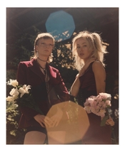
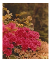
So, I only started printing on Monday. I had never been in a darkroom til I made my own space so please go easy. Today I was practicing adding warmth to my prints, would love some feedback. As I said, it’s only been a week so I know I have a long long way to go.


You are using an out of date browser. It may not display this or other websites correctly.
You should upgrade or use an alternative browser.
You should upgrade or use an alternative browser.
Today's prints.
-
A
- Thread starter Robbie
- Start date


Recent Classifieds
-
Want to Buy 135mm 5.6 enlarging lens
- Started by ediz7531
-
For Sale New 55 instant film (replacement for polaroid type 55)
- Started by Early Riser
-
Free 16x20 and 20x24 expired Ilford multigrade paper, Portland Oregon pick up
- Started by Early Riser
-
For Sale Helipan 112mm Circular Polarizer
- Started by Early Riser
-
Sold For Sale: 10 rolls of 120 film *SOLD*
- Started by Brad Bireley
Forum statistics
They are looking good.
A piece of advice though - to improve your printing you need something to use as a reference photo.
The problem with flower pictures ( or car pictures, or brightly painted wall pictures) is that it is difficult to say whether the resulting colours are accurate, or just nice and bright.
You need a "Shirley" negative.
Subjects with skin tones are good, but ideally they should be evenly lit, with partially diffused light that is of "daylight" colour temperature.
Ideally your reference should show skin tones that range between fully front illuminated to partially in shade. It is in the transitions from brightly lit to darker shadows that colour casts reveal themselves.
And if you can manage a group photo with people with different skin colours and complexions, that is even better.
Skin tones work as a reference, because we are closely attuned to how skin looks. Be careful of course of the potential to be fooled by poor makeup application.
A good reference helps you achieve consistency. Consistency breeds confidence. Confidence improves quality.
You are well on your way.
btaylor
Subscriber
For only printing for a week- great job!
I agree with everything Matt suggests, though I work a little differently. I have a gray card and color chart that I shoot under the same light as my subject will be. That helps me get to a neutral print quickly, once there I can deviate color balance if I feel it will benefit the photo. I’ve never had a “Shirley,” but my system has worked well enough.
I agree with everything Matt suggests, though I work a little differently. I have a gray card and color chart that I shoot under the same light as my subject will be. That helps me get to a neutral print quickly, once there I can deviate color balance if I feel it will benefit the photo. I’ve never had a “Shirley,” but my system has worked well enough.
Sirius Glass
Subscriber
Don't call me Shirley!
They are looking good.
A piece of advice though - to improve your printing you need something to use as a reference photo.
The problem with flower pictures ( or car pictures, or brightly painted wall pictures) is that it is difficult to say whether the resulting colours are accurate, or just nice and bright.
You need a "Shirley" negative.
Subjects with skin tones are good, but ideally they should be evenly lit, with partially diffused light that is of "daylight" colour temperature.
Ideally your reference should show skin tones that range between fully front illuminated to partially in shade. It is in the transitions from brightly lit to darker shadows that colour casts reveal themselves.
And if you can manage a group photo with people with different skin colours and complexions, that is even better.
Skin tones work as a reference, because we are closely attuned to how skin looks. Be careful of course of the potential to be fooled by poor makeup application.
A good reference helps you achieve consistency. Consistency breeds confidence. Confidence improves quality.
You are well on your way.
Thank you for that sound advice. There’s a lot of direct sun in that portrait image. I’d only been shooting for a couple of months when I took it but the reason I printed it was to attempt warmth with a pre flash. The bee image was tricky as it’s half magenta, half green. I’ll try and find reference images to colour match from.
Don't call me Shirley!
I am serious….
I am serious….
He's Sirius like the dog star, not like the attitude.
He's Sirius like the dog star, not like the attitude.
i was more serious along the lines of the quote from airplane “surely you can’t be serious.” “I am serious and don’t call me Shirley”
Vaughn
Subscriber
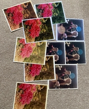
Hello! Looks like you are enjoying the process! My experience was limited and awhile back, I found that one can 'play' (RA4) with the color just a little before the blacks discolor and a print can quickly lose its snap. Your selection of prints using different setting are wonderful -- great reference.
My other suggestion(s) for the beginner trying to judge color and changes is (assuming RA4)
1) Do not look at your print until it is dry -- color shifts when dry...and looking when wet can bias how one judges color correction needs. But it is so tempting.
2) Do not look at your print until you get it under the same light as it will be displayed -- for the same reason as above. Try to judge the print's color under the same type of light it will be displayed under, or close -- and being consistent and using the same lamp type all the time will help.
When the university installed new energy-saving lamps in the outer darkroom space, they were more red than previous. Some students' first prints were coming out too cyan when seen under the normal display lights. They were not bothering taking their prints into the classroom to judge under the display lights there.
In taking the images, perhaps a golden mylar reflector to add selective warmth into the scene would be fun to work with.
Last edited:
Sirius Glass
Subscriber
I am serious….
i was more serious along the lines of the quote from airplane “surely you can’t be serious.” “I am serious and don’t call me Shirley”
This is getting to be like the finale of the movie "Spartacus".
I am Sirius!
This is getting to be like the finale of the movie "Spartacus".
I am Sirius!


Hello! Looks like you are enjoying the process! My experience was limited and awhile back, I found that one can 'play' (RA4) with the color just a little before the blacks discolor and a print can quickly lose its snap. Your selection of prints using different setting are wonderful -- great reference.
My other suggestion(s) for the beginner trying to judge color and changes is (assuming RA4)
1) Do not look at your print until it is dry -- color shifts when dry...and looking when wet can bias how one judges color correction needs. But it is so tempting.
2) Do not look at your print until you get it under the same light as it will be displayed -- for the same reason as above. And definitely, try to judge the print's color under the same type of light it will be displayed under. ( Or close, and being consistent and using the same lamp type all the time will help).
When the university installed new energy-saving lamps in the outer darkroom space, they were more red than previous. Some students' first prints were coming out too cyan when seen under the normal display lights. They were not bothering taking their prints into the classroom to judge under the display lights there.
In taking the images, perhaps a golden mylar reflector to add selective warmth into the scene would be fun to work with.
Thank you, I might actually give that a try, I do have a gold reflector. Yeah I have a squeegee and hair dryer on hand to dry before looking through my Kodak viewing filter kit. I’ve only been printing during the day and viewing my prints in daylight as I’ve only been printing to then scan on my flatbed.
i was more serious along the lines of the quote from airplane “surely you can’t be serious.” “I am serious and don’t call me Shirley”
I know. I was just hinting he's a close relative of Goofy.
Anyway, the great thing about colour printing is that you get to choose how your prints look. They don't have to look exactly like whatever you pointed the camera at. But a good poster that shows the impact of different levels of filtration is handy.
gordrob
Subscriber
Here is everything you need to know about Shirley - seriously
I spent a lot of time getting a reference set like these for the different colour films I used.
I spent a lot of time getting a reference set like these for the different colour films I used.
I know. I was just hinting he's a close relative of Goofy.
Anyway, the great thing about colour printing is that you get to choose how your prints look. They don't have to look exactly like whatever you pointed the camera at. But a good poster that shows the impact of different levels of filtration is handy.
Thanks. I’m gonna look at getting one just to help my eye to continue to get better at seeing any shifts.
Here is everything you need to know about Shirley - seriously
I spent a lot of time getting a reference set like these for the different colour films I used.
Perfect. Thanks for that!
Mr Bill
Member
- Joined
- Aug 22, 2006
- Messages
- 1,483
- Format
- Multi Format
Here is everything you need to know about Shirley - seriously
I would suggest to take this audio with a big grain of salt. They have largely missed the main purpose of these negs, at least in my lab experience, from roughly mid-1970s.
I have no idea what the so-called Shirley "card" is, unless that is used in reference to an actual print. I do recall a time when one could buy a so-called "Normal" negative, along with a "proper" print of that negative. Perhaps that's what the narrator, or whomever, meant as a "card."
Regarding the "Normal" reference, I think that this is being mistakenly interpreted to suggest that it means a Caucasian female is "normal," (and anyone else is not, I guess). The reality is that the film "exposure" can be seen as either "correct," or underexposed, or overexposed to some extent. Except that in the Kodak lingo, a "correct" exposure is referred to as "Normal."
Anyone who did serious lab work in a commercial setting, prior to serious scanners, had to set up their printers for each film type by running a set of "printer setup negatives." (These were typically 5 negatives, ranging from 2 f-stops underexposed to 2 f-stops overexposed, including one "normal" exposure.) The main purpose of these was to set up something known as "printer slope." Primarily "slope" corrected for reciprocity failure in the paper as printing exposure times vary.
In truth, printer setup negatives could have probably just been a photo of a gray card, but this doesn't lend itself to visual appraisal of the print. A full-range scene, with skin tones and some strong colors works well for this. This also served as a practical exposure reference for professional photographers who would sometimes ask the lab, how are my exposures?
I have never known of a case where the printer setup negs are used to establish a color reference for the lab. Perhaps this was done in the 1950s or 1960s? As I said, my lab experience didn't start until mid-1970s. The outfit where I worked did a very considerable volume, and at one time, owned three pro labs as well as the largest chain of of one-hour labs in the US.
I think these posters (or similar) are pretty good at helping you set colour filtration:

(This picture copied from this classified post)
You can find similar things in books. I actually have posters like that, somewhere, that came with the Kodak Complete Darkroom Dataguide. The great thing about these sets of images is they show you how you can head toward "correct" or just how you want things to look.
Mr Bill
Member
- Joined
- Aug 22, 2006
- Messages
- 1,483
- Format
- Multi Format
Thanks. I’m gonna look at getting one just to help my eye to continue to get better at seeing any shifts.
Hi, I'd say that the best thing you could do would be to print a color ringaround from one of your representative negatives.
[Update... this is similar to what Don H posts, except that they are exact, being made with your system. ]
What you do is to color balance to a good print, which you use as a reference. Then you make a series of color offsets from that. Using your standard printing filters you would make a set of minus cyan (aka red) and plus cyan, then similar with both magenta and yellow. So a total of 6 colors offset from the "Normal."
You would want to use several different increments of color strength. In our chain studio operation we used a 5cc maximum color tolerance for production work. So for in-plant references we used ringaround sets for 02CC, 05CC, and 07CC color increments. If there was any question about exceeding the 5CC limit, the rule was to kick it back for a remake (with color correction, of course).
Fwiw the human eye is easily "corrupted" with respect to color. (The more you look at a certain "bad" color, the better it looks. So your judgment can become biased.) The cure is to periodically re-center by getting out of that environment, and to keep an established reference around.
The ringaround also gives a clear reference as to what a given color correction looks like.
One last thing is that you need a good-quality light source (meaning a full spectral output) for judging color. Human eyes cannot generally determine this, so for a reality check use outdoor light coming in through a window.
| Photrio.com contains affiliate links to products. We may receive a commission for purchases made through these links. To read our full affiliate disclosure statement please click Here. |
PHOTRIO PARTNERS EQUALLY FUNDING OUR COMMUNITY:  |