David Lyga
Member
This comment can readily apply to both analog and digital. If it is misplaced into the incorrect category, please transfer it to an appropriate forum.
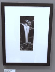
The human eye tends to gravitate towards light. That said, I have always wondered why prints are mounted with a white, or light, background. Intuitively, it would seem to me that a dark background would better isolate the print, rather than letting a white background lead the eye away from the central focus.
Obviously, there is a chance that my reasoning is faulty; I would be very interested in knowing why? Maybe I think differently (I am left-handed); yet, maybe I have imparted something of substance here.
Often, I peruse other forums on the Internet, be they photographically inclined or not. I have noticed that most forums conform to the dark text / light background like Photrio does. Some forums reverse this format by using a dark background and white text. When first viewing these "renegade / reversed" forums, I am at first a bit disturbed by the change in visual perception. But, with a little time, I acclimate to them and find, as a bonus, that my eyes are not as strained as they can get with the "normal" white background / black text format. In fact, I come to like them better.
In grade school, in the fifties, there was ALWAYS the blackboard with white chalk. Now, we have whiteboards.
I encourage comments on this and, most importantly, what do I seem to be missing here? I just might prefer seeing a print mounted with a dark background. Why do most not prefer this? - David Lyga