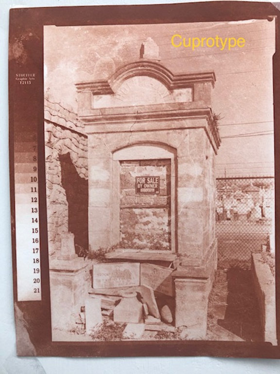
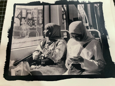
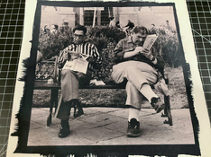
Being in the lucky possession of one of @fgorga's actual prints, I can say that the brick-red/brown hue in real life is even more vivid than how it appears here on my monitor. It's quite compelling, really. I've only tried cuprotypes once and ended up with a much weaker/flat result, btw. I understand there are generally speaking two approaches to the process: @fgorga's approach as documented e.g. here on the forum but also here https://www.alternativephotography.com/cuprotype-process/I’m personally most intrigued by the deep brick red as found in the complex toner. [...]
[edit] example posted is from @fgorga’s article and not my own work.
And then there's the process as described in the 1970s by Patterson's and that was reproduced some 20 years ago by @Cor : https://web.archive.org/web/20070923010637/http://silverghost.stanford.edu/copper/index.html


