Split Filter/Grade Printing Question

Red

D
Red

  • 2
  • 1
  • 57
The Big Babinski

A
The Big Babinski

  • 2
  • 4
  • 82
Memoriam.

A
Memoriam.

  • 6
  • 6
  • 152
Self Portrait

D
Self Portrait

  • 3
  • 1
  • 69
Momiji-Silhouette

A
Momiji-Silhouette

  • 2
  • 3
  • 78

Recent Classifieds

Forum statistics

Threads
198,002
Messages
2,768,050
Members
99,523
Latest member
Seeker0221
Recent bookmarks
0

HerSmokeySun

Member
Joined
Jun 4, 2017
Messages
26
Location
Ohio
Format
Medium Format
Happy Saturday everyone!

About 6 months ago I began making prints in the darkroom and after gaining some confidence I began exploring techniques outside "the basics", the first of which was split filter printing. Over the first few prints I've seen dramatic differences between the single filter vs. multiple filter process for tone control. However recently I've been having some trouble.

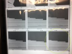
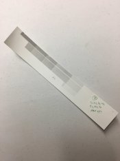
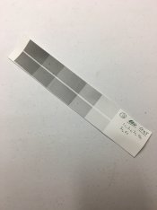
Currently I'm creating a small series of eight images made on overcast days (lot's of big white skies) with plenty of mid-tones and greys and often only occasional traces of black. I was able to wrestle with and produce prints that I was happy with from several of the negatives, yet with others I've had much less luck using the exact same process/procedure. The attached images are an example of such a photograph, which specifically is a shot of a medium gray parking garage against a grey-white overcast sky. All strips were made between f/8 and f/11 on an 80mm SK Componon-S Lens at a height of approximately 6-7" based on my Beseler's scale. I am using Ilford MGIV FB Mat Classic paper to create approximate 7.25"x7.25" prints.
  • The first image is of a test strip using the CF1 filter from 1 to 7 seconds.
  • The second image is of a test strip using the CF4.5 filter from 1 to 6 seconds.
  • The third image is a shot of some bracketed photos from the same roll (similar to the one I am printing) for your reference.
Based on my understanding of split filter printing and past experiences employing this technique, I should be able to identify and isolate the desired level of detail in the highlights and blacks across several exposures using several filters, and properly determine these using test strips. However this image is presenting me with similarly intense grays at high and low filters.

Put plainly, my issue is that I cannot capture the desired level of detail on the face of the garage (using high contrast filters to pull out the subtle blacks) without severely darkening the mid-tones on the garage to a point that is undesirable. Additionally, I can't seem to burn in the sky enough with a lower CF filter to provide any separation from a white border without also giving too much exposure to the mid-tones of the garage (though, I assume this can be resolved by dodging the garage and/or burning only the sky). Any suggestions for working through this issue? Is this an instance where a single filter may be more useful? Am I being dense and missing something obvious/making a dumb mistake/not reading the negative well enough?

Any advice is appreciated and I thank you for affording the time to read through this post. If there is anything that needs clarified please let me know and I will provide additional information as necessary. I will be in the darkroom again this afternoon to mess with this further and will post-back with any progress or updates. Have a great day!
CF1 Test Strip.jpg
CF4.5 Test Strip.jpg
Sample Negatives.jpg
 

Pieter12

Member
Joined
Aug 20, 2017
Messages
7,549
Location
Magrathean's computer
Format
Super8
Not being sure how you are proceeding. In broad terms, split-grade printing works by first determining one of the grade exposures (usually 0 for highlight detail), then after exposing the paper with that filter & time, making a series of test exposures on the same paper with the opposite grade (in this case 5 for shadow detail) to determine the final split exposure.
 
OP
OP
HerSmokeySun

HerSmokeySun

Member
Joined
Jun 4, 2017
Messages
26
Location
Ohio
Format
Medium Format
Not being sure how you are proceeding. In broad terms, split-grade printing works by first determining one of the grade exposures (usually 0 for highlight detail), then after exposing the paper with that filter & time, making a series of test exposures on the same paper with the opposite grade (in this case 5 for shadow detail) to determine the final split exposure.

Thank you for your response sir. I left out my exact methods to make my post more concise, but I will explain below:

With a typical negative I make test strips at a 0, 0.5, or 1 CF filter to establish the higlights. Once the best time is determined I make a test strip at just this time only leaving a mostly flat print with just enough detail in the highlights to be satisfactory as expected. After this I repeat the process using a 4, 4.5, or 5 CF to find a time where the blacks are where I want them. Then I follow up with a test strip at this single time which usually produces a strip lacking a lot of midtone and practically zero highlight detail as per the usual. From here I’ll make test prints and dodge and burn as necessary.

With the negative in question in this thread, I follow the process outlined above but end up with different results. For example, using a low contrast filter I can find a point where the highlights are good, but I’m left with substantial darkness to the midtones. When a high contrast filter is used I get zero highlight detail (as expected), but almost proportional exposure to the blacks and midtones. This combined with the optimal time with a low CF results in overly dark midtones/greys in the print.

I hope this helps. Thank you!
 

koraks

Moderator
Moderator
Joined
Nov 29, 2018
Messages
21,567
Location
Europe
Format
Multi Format
From your description, it's not clear to me if you are establishing the high grade (contrasty) exposure on a test strip that you've first given your established low-grade exposure.

Just to get this straight, this is the way it's done in my experience and understanding at least:
1. Establish your low-contrast exposure for desired highlight tones
2. Expose a new test strip with the in (1) established low-contrast exposure. Onto the same strip (don't move it!!), make your high-contrast steps.
3. Pick the one that gives desired shadow separation and/or black point.
4. Make full print to judge base exposures.
5. Reprint using burning and dodging as desired.

Again, from your process description, it's not clear how you're doing step 2.
 

cowanw

Member
Joined
Aug 29, 2006
Messages
2,226
Location
Hamilton, On
Format
Large Format
I would encourage you to work with just a 0 filter and a 5 filter for starts, a 1 filter is really just a bit of 5 mixed with a 0 and just muddies the water (and your print).
Secondly, I get the impression that you visualize the two different filters as having no effect at all on the other end of the scale. This is not correct; a 5 filter will shift tones all the way up to white, just less so as The tones get less. and a 0 filter will shift the dark tones to be darker. Eventually you get to the point where the garage door needs this much 0 and this much 5; the sky needs that much 5 and that much 0. and you doge or burn accordingly
Suppose for example
the door needs 6 sec of 5 filter and 3 sec of 0 filter.
The sky needs 11 sec of 0 filter and the door needs 3 sec of 5 filter.
So you set for 6 sec of 5 filter and dodge the sky for 3 sec
then set fir 11 sec of 0 filter and doge the door for 8 sec
As you get more experience you can use other filters (and some will say you should ) but remember at the end of the day you are only giving this much blue light and that much green light to each part of the print.
 

NedL

Subscriber
Joined
Aug 23, 2012
Messages
3,374
Location
Sonoma County, California
Format
Multi Format
I think Bill has the right idea here. With split-filter printing, after you've got the right low and high contrast exposures to set your highlight and shadows where you want them to be, if you just let the midtones fall where they may it can be disappointing. They can get "muddy". Dodging the midtones during the low contrast exposure can help a lot ( or equivalently, after a smaller "base" low contrast exposure, burn only the highlights with additional low contrast exposure ).
 
OP
OP
HerSmokeySun

HerSmokeySun

Member
Joined
Jun 4, 2017
Messages
26
Location
Ohio
Format
Medium Format
From your description, it's not clear to me if you are establishing the high grade (contrasty) exposure on a test strip that you've first given your established low-grade exposure.

Just to get this straight, this is the way it's done in my experience and understanding at least:
1. Establish your low-contrast exposure for desired highlight tones
2. Expose a new test strip with the in (1) established low-contrast exposure. Onto the same strip (don't move it!!), make your high-contrast steps.
3. Pick the one that gives desired shadow separation and/or black point.
4. Make full print to judge base exposures.
5. Reprint using burning and dodging as desired.

Again, from your process description, it's not clear how you're doing step 2.

My method involves making two separate test strips that individuallly showcase highlights and shadows before combining (something I’ve gleaned from watching a few videos and reading a couple articles on the subject). That being said, I’ve also read more than a few positive reports of people using the method you’ve described with great success, and it seems to be an even more efficient way to get to the final print. I will give it a try here shortly. Thanks!

I would encourage you to work with just a 0 filter and a 5 filter for starts, a 1 filter is really just a bit of 5 mixed with a 0 and just muddies the water (and your print).
Secondly, I get the impression that you visualize the two different filters as having no effect at all on the other end of the scale. This is not correct; a 5 filter will shift tones all the way up to white, just less so as The tones get less. and a 0 filter will shift the dark tones to be darker. Eventually you get to the point where the garage door needs this much 0 and this much 5; the sky needs that much 5 and that much 0. and you doge or burn accordingly
Suppose for example
the door needs 6 sec of 5 filter and 3 sec of 0 filter.
The sky needs 11 sec of 0 filter and the door needs 3 sec of 5 filter.
So you set for 6 sec of 5 filter and dodge the sky for 3 sec
then set fir 11 sec of 0 filter and doge the door for 8 sec
As you get more experience you can use other filters (and some will say you should ) but remember at the end of the day you are only giving this much blue light and that much green light to each part of the print.

I’ll switch back to the 0 and 5 to see how that turns out based on your advice. Your clarification was very helpful in allowing me to take a step back and remember how the filters work across the print and it’s tones. As you’ve described, I think some dodging and burning will go a long way here. I’m about to mix-up chemicals now and will get printing shortly with your advice close at hand. Thank you!!

I think Bill has the right idea here. With split-filter printing, after you've got the right low and high contrast exposures to set your highlight and shadows where you want them to be, if you just let the midtones fall where they may it can be disappointing. They can get "muddy". Dodging the midtones during the low contrast exposure can help a lot ( or equivalently, after a smaller "base" low contrast exposure, burn only the highlights with additional low contrast exposure ).

Agreed and very well said. The contrast between the alarmingly muddy and unattractively dark midtones versus the otherwise acceptable highlights and shadow tonality definitely was messing with my head a little. That said, I’m not sure why I expected the print to come together on it’s own without any burning and dodging as most of my previous prints required a bit of dodging and burning anyways!

I concur that holding back the midtones during the low contrast exposure should help greatly. I’ll give it a whirl here shortly. Thank you for your input.


All: Thank you all for your time and helpful advice on my situation. I think the gears are starting to turn like they should now and I think I can get this print figured out. APUG (Photrio) continues to be an incredible resource as I stumble my way through the learning curve of this process. I will post back with updates. Thanks again!
 

MattKing

Moderator
Moderator
Joined
Apr 24, 2005
Messages
52,299
Location
Delta, BC Canada
Format
Medium Format
For some negatives - primarily low contrast ones - it can help to start with the high contrast filter first, determine that exposure, and then add the test for the low contrast filter.
 

Pieter12

Member
Joined
Aug 20, 2017
Messages
7,549
Location
Magrathean's computer
Format
Super8
The issue here is the first exposure will effect the second one, it must be done on the same sheet. You can't judge by separate tests.
 

mshchem

Subscriber
Joined
Nov 26, 2007
Messages
14,399
Location
Iowa City, Iowa USA
Format
Medium Format
Darkroom Dave has you make a "decent" print at normal contrast. Then divide the time in two, use these times for the beginning point. IIRC correctly you adjust the time of the hard exposure, but leave the filtration alone . The soft you may need to raise the contrast and change exposure . This of course before you start dodging and burning etc.

I've simplified it somewhat, but his process is easy to follow. I was amazed how well it worked when I first tried it a couple years back. I have some fancy equipment, but all you need is a timer and under lens filters to make it work.
 
Joined
Jul 31, 2012
Messages
3,310
Format
35mm RF
Split printing makes printing easier only in relation to finding a grade. It isn't a magical panacea for a good print.

Personally for the image you have and the problem you seem to have, I would start with the high contrast filter. Get the shadows where you want them. Then I'd flash the higher tones in. If all you are looking for is separation from the paper white of the borders then flashing will provide that without messing up your midtones.

You might try one of the other negatives too. Looks like the one you chose is a little thin.
 

CMoore

Subscriber
Joined
Aug 23, 2015
Messages
6,198
Location
USA CA
Format
35mm
I would encourage you to work with just a 0 filter and a 5 filter for starts, a 1 filter is really just a bit of 5 mixed with a 0 and just muddies the water (and your print).
Secondly, I get the impression that you visualize the two different filters as having no effect at all on the other end of the scale. This is not correct; a 5 filter will shift tones all the way up to white, just less so as The tones get less. and a 0 filter will shift the dark tones to be darker. Eventually you get to the point where the garage door needs this much 0 and this much 5; the sky needs that much 5 and that much 0. and you doge or burn accordingly
Suppose for example
the door needs 6 sec of 5 filter and 3 sec of 0 filter.
The sky needs 11 sec of 0 filter and the door needs 3 sec of 5 filter.
So you set for 6 sec of 5 filter and dodge the sky for 3 sec
then set fir 11 sec of 0 filter and doge the door for 8 sec
As you get more experience you can use other filters (and some will say you should ) but remember at the end of the day you are only giving this much blue light and that much green light to each part of the print.
Just wondering......
1. Do you Usually/Typically start with either a 0 or 5 filter for most negs.?
2. Which do you prefer to start with.?
Thank You
 

MattKing

Moderator
Moderator
Joined
Apr 24, 2005
Messages
52,299
Location
Delta, BC Canada
Format
Medium Format
Just wondering......
1. Do you Usually/Typically start with either a 0 or 5 filter for most negs.?
2. Which do you prefer to start with.?
Thank You
See my post number 9 above for my answer to this question.
Although in my case it is 1 and 4, because that is what my Ilford Multigrade 400 offers.
 

CMoore

Subscriber
Joined
Aug 23, 2015
Messages
6,198
Location
USA CA
Format
35mm
See my post number 9 above for my answer to this question.
Although in my case it is 1 and 4, because that is what my Ilford Multigrade 400 offers.
Pardon the rudimentary question, but.......a high-contrast neg, that would be where the high-lights are very Dark/Black, and the lower zones are very bright, almost like there is a light shining through the negative.?
I might be exaggerating a bit, but you get what i am trying to describe.
Thank You
Sorry, that is the exact opposite of what you posted. But low contrast would be the opposite of what i described,
low contrast would be a "Thin" negative.?
 

cowanw

Member
Joined
Aug 29, 2006
Messages
2,226
Location
Hamilton, On
Format
Large Format
I actually find that separate test strips always need too much adjusted as a pair of colours, that I now estimate the grade of a negative and check my chart for the percentage blue and green for that shot. Say 15 sec green and 5 sec Blue ( about grade 2). and then go from there add a bit of G or B; take a bit of B or G; or move the overall exposure up or down with a proportion of G and B. Assess each test shot for what needs changing and how. IE contrast; change percentage B and G or overall exposure; change time.I also do at least a 4x5 (on my 8x10 enlargements) for each test. I also have a Grey scale and Value finder from the color Wheel Company which helps me see what one stop away is from any particular tone in the print, although I don't use that much any more.
 

MattKing

Moderator
Moderator
Joined
Apr 24, 2005
Messages
52,299
Location
Delta, BC Canada
Format
Medium Format
Pardon the rudimentary question, but.......a high-contrast neg, that would be where the high-lights are very Dark/Black, and the lower zones are very bright, almost like there is a light shining through the negative.?
I might be exaggerating a bit, but you get what i am trying to describe.
Thank You
Sorry, that is the exact opposite of what you posted. But low contrast would be the opposite of what i described,
low contrast would be a "Thin" negative.?
What you describe isn't really "high contrast" or "low contrast".
Yours is more a description of the range of tones than a description of how much contrast there is.
Contrast is a measure of how adjacent, slightly different tones render. Do the adjacent tones seem to jump from tone to tone, or do they transition gently from tone to tone.
You can have a low contrast image which has a wide range of tones that smoothly transition from one to the next.
You can also have a high contrast image with a narrow range of tones - high key images are often that way.
Here is an example of an image with a fairly wide range of tones, but moderate to low contrast:
upload_2019-2-24_16-50-19.png


I don't have a high contrast but low tonal range example handy - I rarely work with high key subjects :smile:.
 

CMoore

Subscriber
Joined
Aug 23, 2015
Messages
6,198
Location
USA CA
Format
35mm
What you describe isn't really "high contrast" or "low contrast".
Yours is more a description of the range of tones than a description of how much contrast there is.
Contrast is a measure of how adjacent, slightly different tones render. Do the adjacent tones seem to jump from tone to tone, or do they transition gently from tone to tone.
You can have a low contrast image which has a wide range of tones that smoothly transition from one to the next.
You can also have a high contrast image with a narrow range of tones - high key images are often that way.
Here is an example of an image with a fairly wide range of tones, but moderate to low contrast:
View attachment 218043

I don't have a high contrast but low tonal range example handy - I rarely work with high key subjects :smile:.
I see...Thank You.
I will be the first to admit that i am sorely lacking in technical knowledge of the darkroom, and the Language/Lingo to discuss it.
Thanks Again
 

NedL

Subscriber
Joined
Aug 23, 2012
Messages
3,374
Location
Sonoma County, California
Format
Multi Format
FWIW, I always started with the low contrast green filter until Matt wrote about his approach some years ago. I tried his approach and now I sometimes start with blue depending on the negative. Another thing that's interesting is the mindset of whether you are burning in blue or green, or "holding it back" by dodging. They are 100% completely equivalent but for whatever reason for some negatives it's easier for me to think one way or the other.
 

awty

Subscriber
Joined
Jul 24, 2016
Messages
3,638
Location
Australia
Format
Multi Format
Sorry, that is the exact opposite of what you posted. But low contrast would be the opposite of what i described,
low contrast would be a "Thin" negative.?
A thin negative is usually under exposed negative, barely any shadow or no shadow detail. A dense negative is usually one that is over exposed. Contrast is how Matt describes. You can simply make a print with a low contrast filter and do the same print with a high contrast to see what they do. You can also use a orange filter and blue filter on your camera lens to compare a high contrast negative to a low contrast negative. I find its best to experiment and see for your self, there is many ways to get a good print.
 
Photrio.com contains affiliate links to products. We may receive a commission for purchases made through these links.
To read our full affiliate disclosure statement please click Here.

PHOTRIO PARTNERS EQUALLY FUNDING OUR COMMUNITY:


Ilford ADOX Freestyle Photographic Stearman Press Weldon Color Lab Blue Moon Camera & Machine
Top Bottom