Recommendation for beginner - Van Dyke or Kallitype or ???

The Gap

H
The Gap

  • 4
  • 2
  • 47
Ithaki Steps

H
Ithaki Steps

  • 2
  • 0
  • 71
Pitt River Bridge

D
Pitt River Bridge

  • 5
  • 0
  • 78

Forum statistics

Threads
199,003
Messages
2,784,446
Members
99,765
Latest member
NicB
Recent bookmarks
0

Mark Fisher

Member
Joined
Dec 13, 2003
Messages
1,691
Location
Chicago
Format
Medium Format
Last year I tried my hand at cyanotypes and figured out how to do it at a basic level, but I never got too excited about the strident blue color so I let it drop. I now have some negatives that I managed to screw up in processing that are pretty darn contrasty and I am now thinking that this may be the time to think about alternate processes again. I think I want to stick to silver processes (I'm cheap and inexperienced!). What would be the best process to try out? I have a printing frame and light source already. It would be a bonus if I could use pyro developed negatives meant for silver also (probably a bit much to ask, I know!).

Thanks -- Mark
 

Jeremy

Member
Joined
Oct 26, 2002
Messages
2,761
Location
Denton, TX
Format
Multi Format
Mark,

It was always suggested to me to start with kallitypes or van dykes, but I jumped right into palladium printing and I love it! Something to think about?
 

Mike A

Member
Joined
Jan 14, 2005
Messages
320
Location
Yorkville, I
Format
ULarge Format
Mark,
I've been playing with silver contacts in 11x14 via the Michael and Paula methodology for a couple of months now and was also thinking about trying my hand at alternative printing.

I've read here and there by some reliable APUG posters that a properly toned Kallitype comes darn close to platinum http://www.alternativephotography.com/process_kallitype.html. What format are you working in? If it is large this could be a factor due to chemistry cost.

Mike A
 

donbga

Member
Joined
Nov 7, 2003
Messages
3,053
Format
Large Format Pan
Mark Fisher said:
Last year I tried my hand at cyanotypes and figured out how to do it at a basic level, but I never got too excited about the strident blue color so I let it drop. I now have some negatives that I managed to screw up in processing that are pretty darn contrasty and I am now thinking that this may be the time to think about alternate processes again. I think I want to stick to silver processes (I'm cheap and inexperienced!). What would be the best process to try out? I have a printing frame and light source already. It would be a bonus if I could use pyro developed negatives meant for silver also (probably a bit much to ask, I know!).

Thanks -- Mark

Mark,

Start with VDB prints as it is a less expensive process than making palladium or kallitype prints and also a little easier (although palladium printing isn't that difficult once you get comfortable with the process). After getting comfortable with VDB printing you can move on to palladium printing or kallitypes.

Making VDBs will teach you a lot and you will be able to leverage your skills and apply them to other alternative processes.

Don Bryant
 

sanking

Member
Joined
Mar 26, 2003
Messages
5,437
Location
Greenville,
Format
Large Format
The primary advantage of kallitype over VDB is that it offers the potential for extensive contrast control, just as you have with Pt./Pd. By contrast, VDB has little or no contrast control. This is a very important consideration if you are working with in-camera negatives because if the negative is not developed to the exact contrast needed for VDB you will never be able to make an optimum print. If you plan to print with digital negatives, however, you could tailor the negative very easily to fit the process.

Both VDB and kallitype can be toned with gold, palladium or platinum. In toning the more noble metal replaces a high percentage of the silver, giving the print permanence on the order of regular Pt./Pd. prints.

VDB prints toned with either palladium or platinum are much warmer (browner) than kallitype prints, which tend to be a warm black.

Sandy


Mark Fisher said:
Last year I tried my hand at cyanotypes and figured out how to do it at a basic level, but I never got too excited about the strident blue color so I let it drop. I now have some negatives that I managed to screw up in processing that are pretty darn contrasty and I am now thinking that this may be the time to think about alternate processes again. I think I want to stick to silver processes (I'm cheap and inexperienced!). What would be the best process to try out? I have a printing frame and light source already. It would be a bonus if I could use pyro developed negatives meant for silver also (probably a bit much to ask, I know!).

Thanks -- Mark
 

juan

Member
Joined
May 7, 2003
Messages
2,706
Location
St. Simons I
Format
Multi Format
I'd second the recommendation of VDB to begin. It's a cheap way to learn to coat paper, to learn about the various available papers, and to learn about dealing with the light source. I use my negatives developed in Pyrocat HD to print normally on the last Grade 2 Azo, so your negatives may well be usable.
juan
 

argus

Member
Joined
Dec 14, 2004
Messages
1,128
Format
Multi Format
And what about Gum bichromates?

I'm thinking of starting with that. It seems like an interesting process and you're not bound to any color.

G
 

Digidurst

Subscriber
Joined
Feb 16, 2005
Messages
636
Location
SC
Format
Multi Format
While you are considering which alt. process to try next, I hope you will consider Argyrotypes.

The process affords a look similar to Kallitypes but the chemistry and the process are a little easier to deal with.

Good luck and let us know what you decide :smile:
 
OP
OP
Mark Fisher

Mark Fisher

Member
Joined
Dec 13, 2003
Messages
1,691
Location
Chicago
Format
Medium Format
Thanks for all the replys. I believe I am going to try Kallitype prints at this point. Looking at Sandy's article on unblinkingeye together with Wynn White's VanDyke article, it looks like I'd probably be happy either way, though. I think I'll hold off on expensive toners until I get things dialed in a bit. I'll post my results when I get some (reasonable) prints.
 

donbga

Member
Joined
Nov 7, 2003
Messages
3,053
Format
Large Format Pan
argus said:
And what about Gum bichromates?

I'm thinking of starting with that. It seems like an interesting process and you're not bound to any color.

G
For a first alt. process it probably isn't the easiest one to start with.

Good luck,

Don Bryant
 
OP
OP
Mark Fisher

Mark Fisher

Member
Joined
Dec 13, 2003
Messages
1,691
Location
Chicago
Format
Medium Format
Well, I did it and it was amazing....

Mark Fisher said:
Thanks for all the replys. I believe I am going to try Kallitype prints at this point. Looking at Sandy's article on unblinkingeye together with Wynn White's VanDyke article, it looks like I'd probably be happy either way, though. I think I'll hold off on expensive toners until I get things dialed in a bit. I'll post my results when I get some (reasonable) prints.
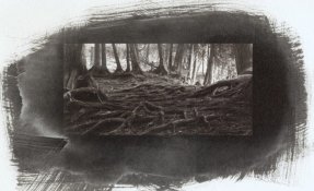
Well, I lied...I ended up starting with VanDyke since it is a printing out process and I figured it would help me tune my digital negative. The attached print (the print is a lot more subtle and smooth than the scan) is about my third attempt and it is a decent print, but I hope to do better.....although I was amazingly excited when I saw the print in the fix.

I do have a couple of questions/comments.
When I made my negatives, I found that the curves published on the web gave a very low contrast print...seriously muddy. For this one, I simply inverted and used it. It is now a bit contrasty (I exposed for the highlights). I used BFK Rives paper and double coated. Is the contrast dependant on paper used?
The other question is about the whitened areas beyond the image area. Any idea what that is and how I can prevent it?

Thanks of the help -- Mark
 

Attachments

  • first decent van dyke cedars at newport.jpg
    first decent van dyke cedars at newport.jpg
    108.3 KB · Views: 247

sanking

Member
Joined
Mar 26, 2003
Messages
5,437
Location
Greenville,
Format
Large Format
Mark,

Whose curve did you download from the web? If you expect to use someone else's curve with success a number of conditions must be met. You should have the same printer, with the same print setting, and the way you work your process should be almost identical to those of the person who supplied the curve. For example, my kallitype curve would be of absolutely no use to you unless you also make your negatives with an Epson 2200, use the same contrast controls I use with kallitype, and use the same paper.

Some of the generic curves may work reasonably well but for best results you need to tailor the curve to your printer and process.


Sandy


Mark Fisher said:
Well, I lied...I ended up starting with VanDyke since it is a printing out process and I figured it would help me tune my digital negative. The attached print (the print is a lot more subtle and smooth than the scan) is about my third attempt and it is a decent print, but I hope to do better.....although I was amazingly excited when I saw the print in the fix.

I do have a couple of questions/comments.
When I made my negatives, I found that the curves published on the web gave a very low contrast print...seriously muddy. For this one, I simply inverted and used it. It is now a bit contrasty (I exposed for the highlights). I used BFK Rives paper and double coated. Is the contrast dependant on paper used?
The other question is about the whitened areas beyond the image area. Any idea what that is and how I can prevent it?

Thanks of the help -- Mark
 
OP
OP
Mark Fisher

Mark Fisher

Member
Joined
Dec 13, 2003
Messages
1,691
Location
Chicago
Format
Medium Format
Thanks Sandy, that is pretty much what I figured. I hoped I could be more lazy about it :smile: I was not very clear, but on my second attempt at a negative, I simply took a good image on my screen, inverted and printed. It was mostly good except shadow areas. I am confident that I can develop a decent curve to do what I want. I'm looking forward to going the the APUG conference so I can see what "real" alternative process prints look like.
 
Photrio.com contains affiliate links to products. We may receive a commission for purchases made through these links.
To read our full affiliate disclosure statement please click Here.

PHOTRIO PARTNERS EQUALLY FUNDING OUR COMMUNITY:


Ilford ADOX Freestyle Photographic Stearman Press Weldon Color Lab Blue Moon Camera & Machine
Top Bottom