Pt/Pd Highlights come paper white

submini house

A
submini house

  • 0
  • 0
  • 39
Diner

A
Diner

  • 4
  • 0
  • 85
Gulf Nonox

A
Gulf Nonox

  • 9
  • 3
  • 106
Druidstone

A
Druidstone

  • 10
  • 3
  • 145
On The Mound.

A
On The Mound.

  • 1
  • 0
  • 85

Forum statistics

Threads
197,813
Messages
2,764,893
Members
99,480
Latest member
815 Photo
Recent bookmarks
0
Joined
Jun 3, 2018
Messages
55
Location
Doha
Format
Digital
Seeking the expert advise of the forum members once more regarding my paper white highlights.

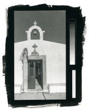
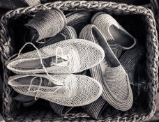
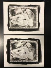
Original image attatched along with the image of two prints. Top print is 6 mins single coat, Bottom print is double coated (all coats same mix), 8mins 32secs (half stop increase in exposure since the first image obviously needed more exposure). My base exposure is 6 mins, this is the time used to develop my curve.

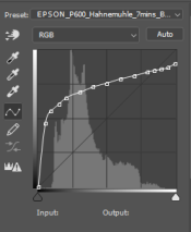
The original image highlights were shifted a bit down to RGB 235 before printing the negative on pictorico ultra premium with my curve applied on EpsonP600. FO is 7drops C is 5 drops Pt 2drosm and Pd 10 drops, ammonium citrate developer. What can possibly be the error, its not the first time i get such paper white highlights but i havent managed to fix them, any suggestions?

Should I just keep my highlights below a certain RGB value not to blow them ( i have no idea what this value can be)

Your help is always appreciated.

Minas
 

Attachments

  • Original.jpg
    Original.jpg
    303.9 KB · Views: 229
  • Top_6mins_bottom_8andhalfMins.jpg
    Top_6mins_bottom_8andhalfMins.jpg
    523.6 KB · Views: 230
Last edited:

jeffreyg

Subscriber
Joined
Jun 12, 2008
Messages
2,604
Location
florida
Format
Medium Format
Minas,

What you see on your monitor and print with ink is a different medium than pt/pd. My experience is to make a bracketed test print then make a print at what appears to be the best exposure time and then to go from there. When making a negative on Pictorico as opposed to enlarging a negative on to duplicating film I can go back to the computer and make changes if necessary and print a new negative. I have had times when printing several copies in pt/pt to have different results using the same mix and exposure time. I can't explain it. Several years ago I printed a limited edition for another photographer. He couldn't get why doing the exact same thing would give slightly different results. I had made 32 almost identical prints for him to select 14.
I just accept that's the way it is at least for me despite carefully measuring each drop and even having used pipettes calibrated to 1/10th of a ml.

http://www.jeffreyglasser.com/
 

nmp

Member
Joined
Jan 20, 2005
Messages
1,995
Location
Maryland USA
Format
35mm
Was the correction curve (or gradient layer) tailored on these particular set of conditions (including chemistry, development, exposure and ink/printer/paper)? It looks like the curve is not steep enough at the highlight end of the range. You should not have to bring down your white point in your highlights in the original image in order to stop them from blowing out if the correction is right (that will make your image look duller.)

Do you print a step wedge together with the image? If you do, you can see where the problem is. I always incorporate a 21step wedge on the side of all my images. A good way to keep track of the process and tweak the curve if need be.

:Niranjan.
 

Dan Pavel

Member
Joined
Sep 11, 2017
Messages
235
Location
Constanta, Romania
Format
Multi Format
To my eyes even the 8 mins. 32 secs. exposure doesn't have strong enough blacks when compared with the original image, even the outside-image zones look well exposed. And the highlights are a bit burned in comparison with the original, as well. That's a sign that a further increase in the exposure time may be needed. After you get the correct blacks you'll see if a modification of the correction curve is needed or not.
 
OP
OP
Joined
Jun 3, 2018
Messages
55
Location
Doha
Format
Digital
Minas,

What you see on your monitor and print with ink is a different medium than pt/pd. My experience is to make a bracketed test print then make a print at what appears to be the best exposure time and then to go from there. When making a negative on Pictorico as opposed to enlarging a negative on to duplicating film I can go back to the computer and make changes if necessary and print a new negative. I have had times when printing several copies in pt/pt to have different results using the same mix and exposure time. I can't explain it. Several years ago I printed a limited edition for another photographer. He couldn't get why doing the exact same thing would give slightly different results. I had made 32 almost identical prints for him to select 14.
I just accept that's the way it is at least for me despite carefully measuring each drop and even having used pipettes calibrated to 1/10th of a ml.

http://www.jeffreyglasser.com/

I totally understand that monitor and print are two different things, I guess I need to amend the negative and try again. In the meantime, i am gonna try the Na2 method (chemicals arrive soon) and see the differences there as well. Thanks a lot for your reply :smile:
 
OP
OP
Joined
Jun 3, 2018
Messages
55
Location
Doha
Format
Digital
Was the correction curve (or gradient layer) tailored on these particular set of conditions (including chemistry, development, exposure and ink/printer/paper)? It looks like the curve is not steep enough at the highlight end of the range. You should not have to bring down your white point in your highlights in the original image in order to stop them from blowing out if the correction is right (that will make your image look duller.)

Do you print a step wedge together with the image? If you do, you can see where the problem is. I always incorporate a 21step wedge on the side of all my images. A good way to keep track of the process and tweak the curve if need be.

:Niranjan.

There is a slight difference in the mix, used a drop less restrainer when made the curve. The curve was made for 6mins exposure (my base time). Also the curve was never used for double coating.
 
OP
OP
Joined
Jun 3, 2018
Messages
55
Location
Doha
Format
Digital
To my eyes even the 8 mins. 32 secs. exposure doesn't have strong enough blacks when compared with the original image, even the outside-image zones look well exposed. And the highlights are a bit burned in comparison with the original, as well. That's a sign that a further increase in the exposure time may be needed. After you get the correct blacks you'll see if a modification of the correction curve is needed or not.

Its an option to expose more i guess, 9m 30s or 12 minutes. My step tests though showed that above 6 mins i do not get significant increase in Dmax
 

nmp

Member
Joined
Jan 20, 2005
Messages
1,995
Location
Maryland USA
Format
35mm
I measured the Dmax (on the peripheral area) in the 2nd print at RGB of around 20 which pretty damn good...considering the scan/photo of the print is representing the levels correctly. Inside the image, the shadows do look slightly lighter as Dan mentioned which could be the problem of the correction curve as well. I would suggest to re-do the curve once you are absolutely certain of the process (you can use the old curve as a start-up curve and combine the two as discussed in a thread on Digital Negatives forum recently.)

Sometime ago I played around making a flow chart of the a generic alternative process using digital negative for my own understanding so I don't go in circles. It is still work-in-progress. See if it is useful. Comments/questions are welcome.

:Niranjan.

Edit: I modified the chart a bit...
 

Attachments

  • AltProcessDevFlowChart2.jpg
    AltProcessDevFlowChart2.jpg
    320.4 KB · Views: 163
Last edited:

NedL

Subscriber
Joined
Aug 23, 2012
Messages
3,374
Location
Sonoma County, California
Format
Multi Format
...
Sometime ago I played around making a flow chart of the a generic alternative process using digital negative...
:Niranjan.

I'm enjoying looking at this and thinking about it. There are obvious analogues if you produce your negatives in a camera. There are various ways this directed graph can be organized ...
 

nmp

Member
Joined
Jan 20, 2005
Messages
1,995
Location
Maryland USA
Format
35mm
I'm enjoying looking at this and thinking about it. There are obvious analogues if you produce your negatives in a camera. There are various ways this directed graph can be organized ...

I tried to make the simplest possible chart to get started. There are obviously some nuances/details that can be added or the chart organized differently. Can also be adapted for in-camera negatives. It can also be individually tailored for a particular process like the Pt/Pd.

Feel free to add/modify/suggest in any way you like...

:Niranjan.

Add: May be we should have a new thread if this discussion was going into a greater depth.
 
Last edited:
OP
OP
Joined
Jun 3, 2018
Messages
55
Location
Doha
Format
Digital
I measured the Dmax (on the peripheral area) in the 2nd print at RGB of around 20 which pretty damn good...considering the scan/photo of the print is representing the levels correctly. Inside the image, the shadows do look slightly lighter as Dan mentioned which could be the problem of the correction curve as well. I would suggest to re-do the curve once you are absolutely certain of the process (you can use the old curve as a start-up curve and combine the two as discussed in a thread on Digital Negatives forum recently.)

Sometime ago I played around making a flow chart of the a generic alternative process using digital negative for my own understanding so I don't go in circles. It is still work-in-progress. See if it is useful. Comments/questions are welcome.

:Niranjan.

Edit: I modified the chart a bit...

To be honest, this flowchart is very familiar to me as it is pretty much the way i do things... I guess i will wait next week that Na2 arrives and start all over... Learning curve ;-)
 

nmp

Member
Joined
Jan 20, 2005
Messages
1,995
Location
Maryland USA
Format
35mm
To be honest, this flowchart is very familiar to me as it is pretty much the way i do things... I guess i will wait next week that Na2 arrives and start all over... Learning curve ;-)

Yeah, nothing earth shattering about it...

By the way, did you get yourself a P600 after all?
 
OP
OP
Joined
Jun 3, 2018
Messages
55
Location
Doha
Format
Digital
Considering advise, I had my curve re-done for this specific mix i use now. Not a major change in curve i used before by the way. I made a few more prints adding a step wedge, please see attatched and let me know your thoughts.

There is an obvious coating issue (I need to get used to my new brush, you can see brushing marks). The step wedge looks ok, there is difference in shade from 0% to 5% and 10%, maybe an issue with the midtones? I do attatch the curve I used as well for your reference.

Any comment is always welcome

thanks!
 

Attachments

  • Curve.PNG
    Curve.PNG
    11.5 KB · Views: 173
  • img010.jpg
    img010.jpg
    581 KB · Views: 191
Last edited:

nmp

Member
Joined
Jan 20, 2005
Messages
1,995
Location
Maryland USA
Format
35mm
Considering advise, I had my curve re-done for this specific mix i use now. Not a major change in curve i used before by the way. I made a few more prints adding a step wedge, please see attatched and let me know your thoughts.

There is an obvious coating issue (I need to get used to my new brush, you can see brushing marks). The step wedge looks ok, there is difference in shade from 0% to 5% and 10%, maybe an issue with the midtones? I do attatch the curve I used as well for your reference.

Any comment is always welcome

thanks!

A couple of things:

1) This print looks much "cooler" than your previous ones. Is it real or something happened on digitization?

2) The step wedge shows all the 5% gradations with no breaks (good.) I made some very rough measurements (not very precise but probably in the ballpark) which suggest that the print might be brighter than the original. The correction curve I arrived at from the step wedge looks like this:

CC.jpg


As you can see it is slightly below the theoretical line. Again the measurements are from a low-res jpeg so take it for what it's worth. Of course, this may not represent truly your process as your brushing problem may have contributed to the discrepancy. So your original correction curve may still be right.

Other than that, your print looks like it has the full range of tones. What is it that you don't like about it?

:Niranjan.
 
OP
OP
Joined
Jun 3, 2018
Messages
55
Location
Doha
Format
Digital
A couple of things:

1) This print looks much "cooler" than your previous ones. Is it real or something happened on digitization?

2) The step wedge shows all the 5% gradations with no breaks (good.) I made some very rough measurements (not very precise but probably in the ballpark) which suggest that the print might be brighter than the original. The correction curve I arrived at from the step wedge looks like this:

View attachment 204646


As you can see it is slightly below the theoretical line. Again the measurements are from a low-res jpeg so take it for what it's worth. Of course, this may not represent truly your process as your brushing problem may have contributed to the discrepancy. So your original correction curve may still be right.

Other than that, your print looks like it has the full range of tones. What is it that you don't like about it?

:Niranjan.

First i would like to thank you for you time to work on the curve, you have been so helpful in this journey :smile:

This image looks cooler as it is scanned the previous were photos and obviously the ambient light made them warmer.

I guess i have to measure as well and see the correction but yes you are right, the image looks quite brighter than the original, in the church the original is much darker.

Finally, I would like to see deeper/richer blacks and better tone distribution, this is what i am missing, apart from the coating issue i face at the moment
 

jeffreyg

Subscriber
Joined
Jun 12, 2008
Messages
2,604
Location
florida
Format
Medium Format
I haven't noticed any mention of humidity. From your location I assume you are working under low humidity conditions. Relative humidity can influence tonality. I live in a high humidity location but my house and darkroom are air conditioned so I pre-humidify my paper by coating with distilled water and waiting until it is almost dry before coating. I find that has helped the coating process. You may be doing that but I didn't see it mentioned.

http://www.jeffreyglasser.com/
 
OP
OP
Joined
Jun 3, 2018
Messages
55
Location
Doha
Format
Digital
I haven't noticed any mention of humidity. From your location I assume you are working under low humidity conditions. Relative humidity can influence tonality. I live in a high humidity location but my house and darkroom are air conditioned so I pre-humidify my paper by coating with distilled water and waiting until it is almost dry before coating. I find that has helped the coating process. You may be doing that but I didn't see it mentioned.

http://www.jeffreyglasser.com/
Thanks Jeff, i print in a storage and the humidity was 63% during the print, i dont humidify the paper more than what is in the room.
 

nmp

Member
Joined
Jan 20, 2005
Messages
1,995
Location
Maryland USA
Format
35mm
First i would like to thank you for you time to work on the curve, you have been so helpful in this journey :smile:

This image looks cooler as it is scanned the previous were photos and obviously the ambient light made them warmer.

I guess i have to measure as well and see the correction but yes you are right, the image looks quite brighter than the original, in the church the original is much darker.

Finally, I would like to see deeper/richer blacks and better tone distribution, this is what i am missing, apart from the coating issue i face at the moment

You are quite welcome. Not much effort on my part.

Regarding the deeper blacks and the overall print look, the reality is because the greater than 0 of Dmax and less than 255 of Dmin, the print can not match visually what you see on the monitor even if you have perfect linearity with the correction curve. To counter that I usually add some contrast to the original image prior to the correction curve so the final print looks perceptually similar to the image on screen.

:Niranjan.
 
Photrio.com contains affiliate links to products. We may receive a commission for purchases made through these links.
To read our full affiliate disclosure statement please click Here.

PHOTRIO PARTNERS EQUALLY FUNDING OUR COMMUNITY:


Ilford ADOX Freestyle Photographic Stearman Press Weldon Color Lab Blue Moon Camera & Machine
Top Bottom