

Hi all,
Remark:
Before you start commenting: please take notice of the fact that I have spend MUCH time investigating and learning colormanagement, and am pretty much sure I understand the basics well now and know how to apply it in colormanaged software like Photoshop. My monitor is properly calibrated using a Spider 2.
The thread topic:
Searching for some other stuff, I came past this webpage:
http://www.pbase.com/petolino/image/55994572
It contains an image that consist of two area's: a completely white (RGB 0,0,0) and black (RGB 255,255,255) area. Both contain numbers, the value of which actually represent the RGB value of the grey value that constitutes the fonts color.
That may sound a bit difficult, but the purpose of this small test chart is to test highlight and shadow performance of your printing system. See the text below the image on the webpage for details on how to use it.
Now by opening it in Photoshop, asigning the AdobeRGB colorspace, and setting the "Proof Setup" in Photoshop for different paper types using manufacturer supplied ICC profiles, and using both the rendering intents "Perceptual" and "Relative Colorimetric", I noticed there is actually a pretty huge and slightly unexpected difference in the shadow rendering performance between the two rendering intents, with in most cases (but not all!) "Perceptual" performing better. Please note that "Paper Color" simulation was on in both cases, as can be witnessed by the greyish matte paper proofings.
And YES, I did switch ON "Black point compensation" too for "Relative Colorimetric"! (is by default on for Perceptual, because it's and integral part of that intent, although Photoshop doesn't show it. An excellent reference to the function of black point compensation is here: Gamutvision - Black Point Compensation)
To check this observation, I also printed on Harman FB Matt Warmtone using both rendering intents and Harman's ICC profile for this paper and letting Photoshop handle the colormanagement. The prints from my EPSON R2400 were consistent with the screen observations, just a little bit gain, meaning 1 or 2 scales extra visible in the print compared to the screen.
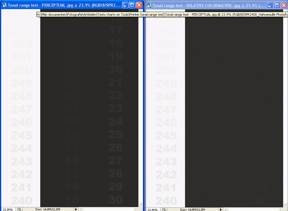
The difference is especially apparent in matte papers. For example, see the image below of Hahnemuhle PhotoRag, it doesn't separate any of the values below about RGB 20,20,20 with Relative Colorimetric, while it goes down to RGB 3,3,3 with Perceptual. Please note that you will need to strain hard to see these darkest values! I converted these screenshots from my monitor- to the sRGB-profile, but it will be better if you download the test chart yourself and set proofing using the profiles of the papers in Photoshop.
Using the "Perceptual" intent seems to be giving far better shadow separation than "Relative Colorimetric". Now this slightly surprises me, because the general consensus on many webpages seems to be that the difference is small, and that "You just need to try it and see which is best...", with many people opting for Relative Colorimetric too...
And "Black Point Compensation" used with Relative Colorimetric should (and will alleviate) part of the problem that exists with Relative Colorimetric potentially clipping deepest shadows (see the article mentioned above), but not to the extent I would have expected it.
Anyway, my questions to you:
PLEASE ALSO NOTE THE FOLLOWING:
I also noticed that the canned profiles for the EPSON papers that came with my R2400 actualy DO NOT do a "Black Ink" simulation, as the other profiles do. They also showed, probably as a consequence of this, NO difference between the proofing of the "Perceptual" and "Relative Colorimetric" rendering intents. It therefor seems likely that "Black Ink" simulation must be part of the ICC profile definition in order to properly see and proof these differences in rendering intent - and final print result!
Just look at the images below that represent the proofed images, captured as screenshots in Photoshop CS2:
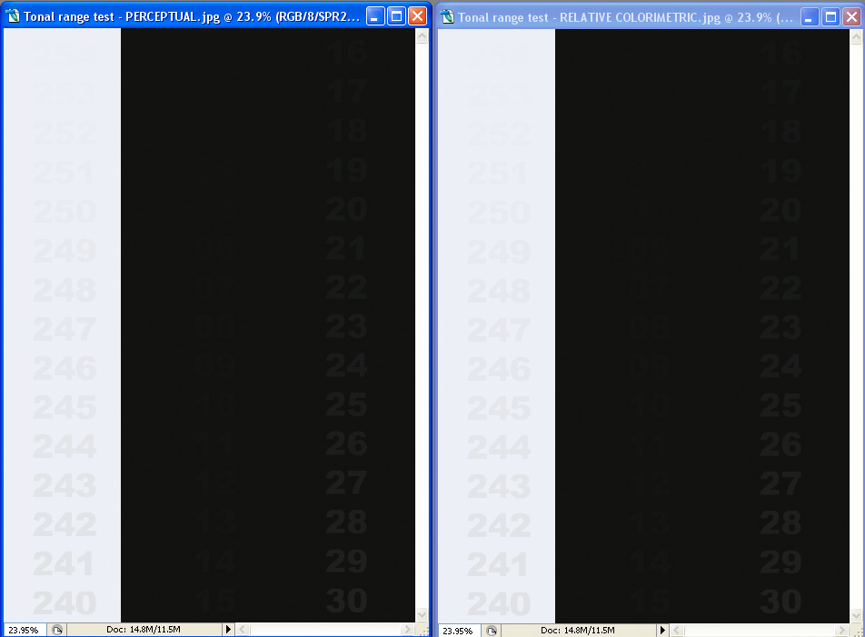
HAHNEMUHLE PHOTO RAG:
Perceptual: Deepest black visible: 3 (= RGB 3,3,3)
Perceptual: Brightest white visible: 253
Relative Colorimetric: Deepest black visible: 20
Relative Colorimetric: Deepest black visible: 253
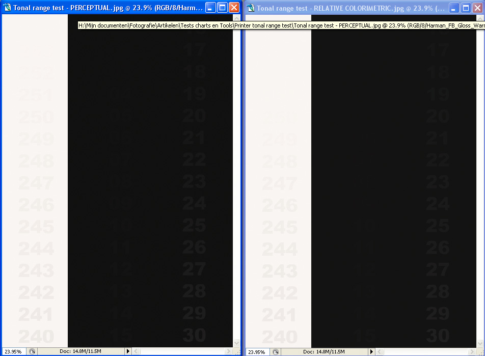
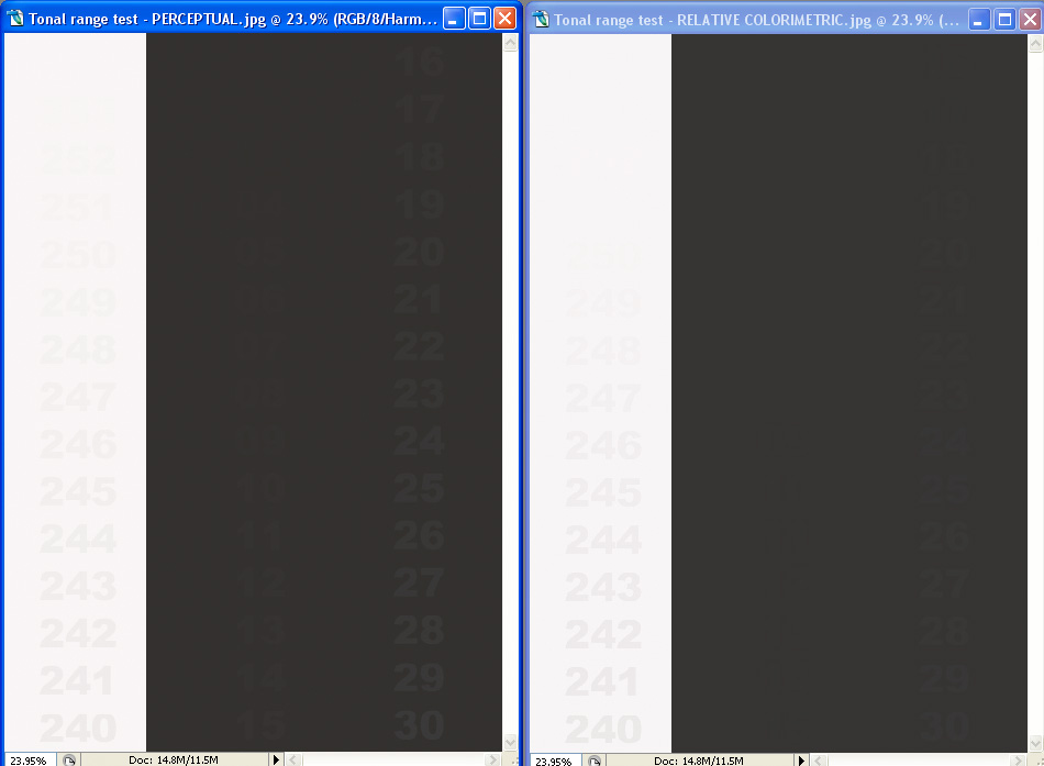
HARMAN FB GLOSSY:
Perceptual: Deepest black visible: 11
Perceptual: Brightest white visible: 251
Relative Colorimetric: Deepest black visible: 4
Relative Colorimetric: Deepest black visible: 249
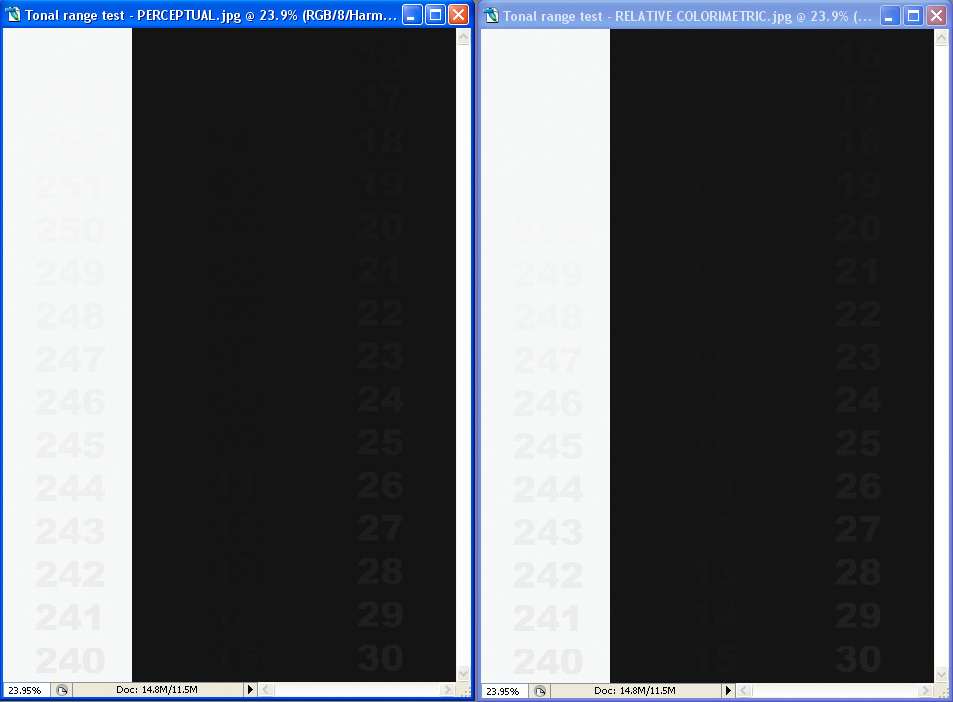
HARMAN FB GLOSSY WARMTONE:
Perceptual: Deepest black visible: 5
Perceptual: Brightest white visible: 251
Relative Colorimetric: Deepest black visible: 10
Relative Colorimetric: Deepest black visible: 249
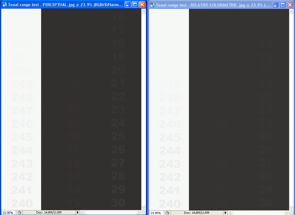
HARMAN FB MATTE:
Perceptual: Deepest black visible: 4
Perceptual: Brightest white visible: 251
Relative Colorimetric: Deepest black visible: 6
Relative Colorimetric: Deepest black visible: 249
HARMAN FB MATTE WARMTONE:
Perceptual: Deepest black visible: 5
Perceptual: Brightest white visible: 251
Relative Colorimetric: Deepest black visible: 9
Relative Colorimetric: Deepest black visible: 249
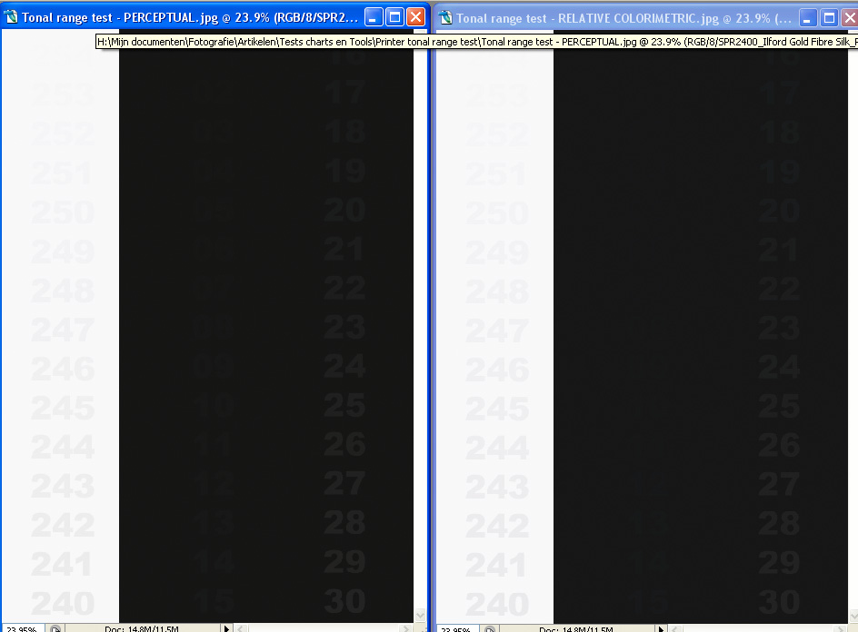
ILFORD GOLD FIBRE SILK:
Perceptual: Deepest black visible: 2
Perceptual: Brightest white visible: 252
Relative Colorimetric: Deepest black visible: 8
Relative Colorimetric: Deepest black visible: 252
ILFORD SMOOTH PEARL PAPER:
Perceptual: Deepest black visible: 5
Perceptual: Brightest white visible: 252
Relative Colorimetric: Deepest black visible: 16
Relative Colorimetric: Deepest black visible: 252
Remark:
Before you start commenting: please take notice of the fact that I have spend MUCH time investigating and learning colormanagement, and am pretty much sure I understand the basics well now and know how to apply it in colormanaged software like Photoshop. My monitor is properly calibrated using a Spider 2.
The thread topic:
Searching for some other stuff, I came past this webpage:
http://www.pbase.com/petolino/image/55994572
It contains an image that consist of two area's: a completely white (RGB 0,0,0) and black (RGB 255,255,255) area. Both contain numbers, the value of which actually represent the RGB value of the grey value that constitutes the fonts color.
That may sound a bit difficult, but the purpose of this small test chart is to test highlight and shadow performance of your printing system. See the text below the image on the webpage for details on how to use it.
Now by opening it in Photoshop, asigning the AdobeRGB colorspace, and setting the "Proof Setup" in Photoshop for different paper types using manufacturer supplied ICC profiles, and using both the rendering intents "Perceptual" and "Relative Colorimetric", I noticed there is actually a pretty huge and slightly unexpected difference in the shadow rendering performance between the two rendering intents, with in most cases (but not all!) "Perceptual" performing better. Please note that "Paper Color" simulation was on in both cases, as can be witnessed by the greyish matte paper proofings.
And YES, I did switch ON "Black point compensation" too for "Relative Colorimetric"! (is by default on for Perceptual, because it's and integral part of that intent, although Photoshop doesn't show it. An excellent reference to the function of black point compensation is here: Gamutvision - Black Point Compensation)
To check this observation, I also printed on Harman FB Matt Warmtone using both rendering intents and Harman's ICC profile for this paper and letting Photoshop handle the colormanagement. The prints from my EPSON R2400 were consistent with the screen observations, just a little bit gain, meaning 1 or 2 scales extra visible in the print compared to the screen.
The difference is especially apparent in matte papers. For example, see the image below of Hahnemuhle PhotoRag, it doesn't separate any of the values below about RGB 20,20,20 with Relative Colorimetric, while it goes down to RGB 3,3,3 with Perceptual. Please note that you will need to strain hard to see these darkest values! I converted these screenshots from my monitor- to the sRGB-profile, but it will be better if you download the test chart yourself and set proofing using the profiles of the papers in Photoshop.
Using the "Perceptual" intent seems to be giving far better shadow separation than "Relative Colorimetric". Now this slightly surprises me, because the general consensus on many webpages seems to be that the difference is small, and that "You just need to try it and see which is best...", with many people opting for Relative Colorimetric too...
And "Black Point Compensation" used with Relative Colorimetric should (and will alleviate) part of the problem that exists with Relative Colorimetric potentially clipping deepest shadows (see the article mentioned above), but not to the extent I would have expected it.
Anyway, my questions to you:
- Has anyone else noticed these differences?
- What rendering intent do you prefer, or how do you decide which one to use during printing?
- Any comments or good references to the rendering intents that might explain this difference better? I am especially intrigued that in at least one case (Harman FB Glossy paper) the performance of the Relative Colorimetric was not worse than Perceptual, meaning it's not just simply a matter of the choice of rendering intent alone and how that effects how image RGB values are translated in output device results (whether printer or screen), but has to do something with the ICC profiles as well.
PLEASE ALSO NOTE THE FOLLOWING:
I also noticed that the canned profiles for the EPSON papers that came with my R2400 actualy DO NOT do a "Black Ink" simulation, as the other profiles do. They also showed, probably as a consequence of this, NO difference between the proofing of the "Perceptual" and "Relative Colorimetric" rendering intents. It therefor seems likely that "Black Ink" simulation must be part of the ICC profile definition in order to properly see and proof these differences in rendering intent - and final print result!
Just look at the images below that represent the proofed images, captured as screenshots in Photoshop CS2:
HAHNEMUHLE PHOTO RAG:
Perceptual: Deepest black visible: 3 (= RGB 3,3,3)
Perceptual: Brightest white visible: 253
Relative Colorimetric: Deepest black visible: 20
Relative Colorimetric: Deepest black visible: 253
HARMAN FB GLOSSY:
Perceptual: Deepest black visible: 11
Perceptual: Brightest white visible: 251
Relative Colorimetric: Deepest black visible: 4
Relative Colorimetric: Deepest black visible: 249
HARMAN FB GLOSSY WARMTONE:
Perceptual: Deepest black visible: 5
Perceptual: Brightest white visible: 251
Relative Colorimetric: Deepest black visible: 10
Relative Colorimetric: Deepest black visible: 249
HARMAN FB MATTE:
Perceptual: Deepest black visible: 4
Perceptual: Brightest white visible: 251
Relative Colorimetric: Deepest black visible: 6
Relative Colorimetric: Deepest black visible: 249
HARMAN FB MATTE WARMTONE:
Perceptual: Deepest black visible: 5
Perceptual: Brightest white visible: 251
Relative Colorimetric: Deepest black visible: 9
Relative Colorimetric: Deepest black visible: 249
ILFORD GOLD FIBRE SILK:
Perceptual: Deepest black visible: 2
Perceptual: Brightest white visible: 252
Relative Colorimetric: Deepest black visible: 8
Relative Colorimetric: Deepest black visible: 252
ILFORD SMOOTH PEARL PAPER:
Perceptual: Deepest black visible: 5
Perceptual: Brightest white visible: 252
Relative Colorimetric: Deepest black visible: 16
Relative Colorimetric: Deepest black visible: 252
Last edited by a moderator:

