• Welcome to Photrio!
    Registration is fast and free. Join today to unlock search, see fewer ads, and access all forum features.
    Click here to sign up

Print looks off

Ecstatic Roundabout

A
Ecstatic Roundabout

  • 0
  • 0
  • 42
MIT. 25:35

MIT. 25:35

  • 1
  • 0
  • 80

Recent Classifieds

Forum statistics

Threads
202,959
Messages
2,848,122
Members
101,553
Latest member
JasonGoh
Recent bookmarks
0

mountainmanF2

Member
Allowing Ads
Joined
Jul 20, 2014
Messages
6
Format
35mm
This being my first thread I have posted, please forgive me.

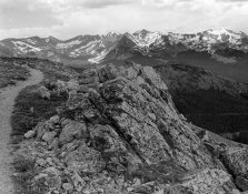
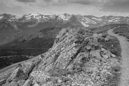
I have been using my darkroom for 5-6 months now and I finally bought a scanner that can scan both negatives and prints. I scanned this negative and did little editing (I darkened the sky) and then printed the negative in my darkroom on 8X10 Ilford classic glossy MGFB. The sky and mountains were exposed for 32 seconds and and the valley and foreground for 17 seconds at f/11. It is developed in LPD diluted 1:2 for 3 minutes. Why do my prints turn out so different from the scanned negatives? Any advice will help and be much appreciated. The print has the path on the left and the negative has the path on the right.
 

Attachments

  • img208.jpg
    img208.jpg
    752.5 KB · Views: 196
  • img175.jpg
    img175.jpg
    400.3 KB · Views: 179
That's why it's called a negative.....everything is reversed. Not having the negative in front of me, I can't say which is the "right" way, but obviously something simply got flipped.
 
hi, welcome to apug !

nice photographs :smile:


its just the contrast is different / harder in one image and not the other.
i am sure if you tweaked the lighter one ( film scan ) and desaturate both of them
they will look similar ...

a scanner will replicate and magnify everything. paper is unable to "print"
all the information that is in a negative so the images might look a little different because of
that too ...

have fun!
john
 
Thank you everyone! I should have clarified, when i say "off" i am talking about the tonal ranges from whites to blacks and the contrast differences. Im not concerned with the frame being flipped i can correct that. What could i do to make the rocks in the foreground have a similar white like in the negative scan? Would i use a bleach chemical for that?
 
If paper is not at premium try a test print with various exposure times (say 5 seconds). Cover the print paper with another paper and while exposing move the cover to one side per 5 seconds. Develop it and define the time you need to get the desired tonality.

Something like that:
https://www.youtube.com/watch?v=EiofPNoGTZQ
 
Without you showing a picture of the negative it is very hard to comment on the quality of your negative . . . There is no equivalence between scanning/software and printing in the darkroom.

The most useful advice to improve your printing would be to sell the scanner then use the money to buy several hundred sheets of paper and an appropriate book (for example, "Beyond Monochrome"). This is assuming that you have no possibility locally to take a course in printing. Regarding typical problems at the start of printing, in June I visited the last(?) local hire-darkroom and the instructor was getting frustrated with the negs the students were bringing in to print - a typical question to me was 'why are your negs so dark?', meaning why was there silver almost all over them instead of only in the highlights. Their negs were almost all under-exposed and/or under-developed, yet the instructor was obliged to use the students' negatives for the class. Lets see your negs and then some useful advice will appear I'm sure.
 
That's why it's called a negative.....everything is reversed. Not having the negative in front of me, I can't say which is the "right" way, but obviously something simply got flipped.

Yes. You should print with emulsion side down, not sure about scanning - could be different scanners behave differently. To make thinks easier - do you have some negative with some letters? - in that way you will see the flipping :smile:.
Photo of the negative itself would help a lot.
 
you might get less of a warm look, whiter whites better contrast if you use
a developer like dektol ( or ilford equiv. ) instead of a what i have understood to be like a warm toned / soft developer.
and if that doesn't work, maybe a higher grade filter. since you are filterless
maybe do your base exposure ( 2/3 ) without a filter and burn the rest of the exposure in with
a 3-4 filter ... it is an extremely simplified version of split grade printing ..
 
With the multigrade paper you are using you can use variable grade filters and alter the contrast in the entire print or different parts of the print as mentioned above. It is often easier to do some things with a computer then in the wet darkroom.

http://www.jeffreyglasser.com/
 
You're using multigrade paper, but you didn't say whether you used any contrast filters. If not, then got approximately what you'd have gotten had you used a #2 filter. It looks to me that a #3 would be a good place to start if you want the print to look like the scan. Since a scanner will do the same thing to the whole area, you shouldn't have to do anything selective like dodging or burning (though you may find areas you want to tweak once you've gotten the general contrast where you want it).
You don't say where you are. Maybe if you posted a location there might be an apuger who's decent at printing who can help you out?
The beauty and advantage of multigrade paper is to be able to change the contrast fairly easily, so if you don't have any contrast filters, you really should get some.
 
First and foremost this is an issue of using the proper contrast filter. Then using appropriate burning/dodging techniques if necessary.

BTW I much prefer the wider composition as shown in the negative scan.
 
The Good:
  • The pix, therefore negs, seem well exposed.
The Not So Good:
  • The light is flat. There is little contrast on the scene. Good light makes good pictures.
  • Choose a higher grade, paper or filter to print with.
  • Base your printing exposures on the most important region (key area) of the picture. If that is the rocks, and I agree that your composition, such as it is, features the rocks prominently, then that is were you should start. Dodge and burn to taste to even out tonality and express your visualization in the rest of the composition (see Making a Fine Art Print).
  • Digital scans, useful though they may be, are not prints.


Why on earth do you feel it necessary to watermark copyright on images such as these? :confused:
 
Photrio.com contains affiliate links to products. We may receive a commission for purchases made through these links.
To read our full affiliate disclosure statement please click Here.

PHOTRIO PARTNERS EQUALLY FUNDING OUR COMMUNITY:


Ilford ADOX Freestyle Photographic Stearman Press Weldon Color Lab Blue Moon Camera & Machine
Top Bottom