• Welcome to Photrio!
    Registration is fast and free. Join today to unlock search, see fewer ads, and access all forum features.
    Click here to sign up

Print Lacking Contrast

Recent Classifieds

Forum statistics

Threads
201,763
Messages
2,829,724
Members
100,930
Latest member
WBM
Recent bookmarks
0

Thanasis

Member
Allowing Ads
Joined
Nov 19, 2006
Messages
391
Location
Sydney, Aust
Format
Medium Format
Hi there,

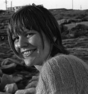
I was in a local photography centre darkroom making some prints yesterday and I struggled with the contrast of one particular print. I've posted a scan below.

The whole thing looks a little grey for my liking and giving the paper (Ilford Multigrade RC) it more exposure under the enlarger shifts everything to be too dark. Would I be correct in assuming the problem is with the negative? I used Tri-X 400 (35mm) in ID-11 at the recommended time and temp and spot metered off the right cheek (from memory)

I have never used enlarger contrast filters but I'm looking at going back and having another go at this print with these filters. Can anyone advise on how they work and the best way to use them to boost contrast in my print?

My other strategy is to try burning and dodging certain areas. Perhaps
try to darken the hair and lighten the face.

Any suggestions and comments are more than welcome...

Thanks and best regards,
Thanasis.
 

Attachments

  • g.jpg
    g.jpg
    35.1 KB · Views: 174
Last edited by a moderator:

nze

Member
Allowing Ads
Joined
Apr 12, 2004
Messages
714
Location
France
Format
Multi Format
You already find the solution "filters" . In your case you may need a 3 or higher filter to give you the contrast you want. Exposure with tungsten light and without filter is equivalent to a grade 2 ( filter 2) . the bigger the number the contrsatier it is.
 

Sparky

Member
Allowing Ads
Joined
Jun 19, 2005
Messages
2,096
Location
Los Angeles
Format
Multi Format
if i can fairly judge from your scan (you'd be surprised at how different a scan can be from a print!) - I'd say your contrast is already about as high as you want to go... assuming you're looking for something kind of 'natural' looking. I would hazard a guess that your neg is underexposed. I'd probably go lighter at the same contrast setting. Or dodge certain areas (you'll have to play with this yourself - I can't tell you what you want really).
 

pentaxuser

Member
Joined
May 9, 2005
Messages
20,335
Location
Daventry, No
Format
35mm
It looks OK to me but I may be easily pleased. You don't say at what grade you printed but whatever it was, try a print at one grade below and one above to see what looks like. If this is your start at printing, it's worth doing a print at each grade including half grades. You'll get a feel for what each grade looks like and a feel for what suits you.

pentaxuser
 

keithwms

Member
Allowing Ads
Joined
Oct 14, 2006
Messages
6,220
Location
Charlottesvi
Format
Multi Format
Maybe run it through some rapid selenium and see if that gives you what you're after, it might anchor the blacks a bit more for you.

Apart from that, go ahead and get a filter set and investigate split grade printing. But it really doesn't look half bad to me, honestly. There are some spots that look like they could blow pretty easily, so maybe you just want more separation in the midtones.
 

Sparky

Member
Allowing Ads
Joined
Jun 19, 2005
Messages
2,096
Location
Los Angeles
Format
Multi Format
Apart from that, go ahead and get a filter set and investigate split grade printing.

i'm not really sure if split-grade printing is quite what this guy's ready for at this point... it's a bit over the top maybe...! first things first maybe? but I'd encourage him to try using contrast filters to see what happens when he wants to try increasing or lowering the contrast.
 

Kevin Caulfield

Subscriber
Allowing Ads
Joined
Aug 3, 2004
Messages
3,845
Location
Melb, Australia
Format
Multi Format
It's a bit hard to tell looking at a scan of a print which you say is too low contrast, and not at the neg. Looking at the scan of the print though, there are three areas where there are specular highlights, or at least some burning out, on the subject's right cheek, nose and chin. Apart from those three areas, there is very little contrast in the print. I would definitely be tempted to try again with say a grade four filter, as I assume from your description that this is printed unfiltered, which I believe is usually around grade two.
 
OP
OP
Thanasis

Thanasis

Member
Allowing Ads
Joined
Nov 19, 2006
Messages
391
Location
Sydney, Aust
Format
Medium Format
It's a bit hard to tell looking at a scan of a print which you say is too low contrast, and not at the neg. Looking at the scan of the print though, there are three areas where there are specular highlights, or at least some burning out, on the subject's right cheek, nose and chin. Apart from those three areas, there is very little contrast in the print. I would definitely be tempted to try again with say a grade four filter, as I assume from your description that this is printed unfiltered, which I believe is usually around grade two.

The funny thing is that those areas which look like they're about to burn out on the scan actually look good on the print and show considerable detail too.
It was printed unfiltered (therefore Grade 2 by default). Would I need to adjust exposure time with a grade four filter?
 

bdial

Subscriber
Joined
Jan 2, 2005
Messages
7,514
Location
North East U.S.
Format
Multi Format
Going to a 4 filter seems a bit much, but to answer your question, yes, going from no filter to any filter will require an exposure increase, and going to a 4 filter, a little more. The details of how much more are in the data sheet, off hand, a stop or so, but a lot depends on your specfic equipment.
 

Kevin Caulfield

Subscriber
Allowing Ads
Joined
Aug 3, 2004
Messages
3,845
Location
Melb, Australia
Format
Multi Format
Regarding adjusting exposure time for different filter grades, I find I usually need to do a new exposure test for each filtration change.
 

MattKing

Moderator
Moderator
Allowing Ads
Joined
Apr 24, 2005
Messages
55,141
Location
Delta, BC Canada
Format
Medium Format
For beginning printers, I usually suggest concentrating first on the mid-tones.

I would first try just printing this lighter. It seems to me that the the mid-tones (much of the skin tones and the sweater) would benefit by being about 1/3 to a 1/2 stop lighter.

With the mid-tones lighter, you will be better able to evaluate the highlights and shadows, and determine if dodging, burning or a contrast change are needed as well.

All of this of course is based on the assumption that the scanned image on my screen reasonably approximates the appearance of the print itself.

My $0.02 worth.

Matt
 

nze

Member
Allowing Ads
Joined
Apr 12, 2004
Messages
714
Location
France
Format
Multi Format
grade 4 seems high for me . looking again at the scan (on my screen) I will print Expose 10 to 20 % less and use an higher grade. less time to get a good skin rendition and contrast to get better seperation in the hair. But my screen is not your print.
 
OP
OP
Thanasis

Thanasis

Member
Allowing Ads
Joined
Nov 19, 2006
Messages
391
Location
Sydney, Aust
Format
Medium Format
Thanks for all the suggestions...

I'll try printing it lighter and then add contrast filter in half-steps. I'll let you know how i get on.
 
Photrio.com contains affiliate links to products. We may receive a commission for purchases made through these links.
To read our full affiliate disclosure statement please click Here.

PHOTRIO PARTNERS EQUALLY FUNDING OUR COMMUNITY:


Ilford ADOX Freestyle Photographic Stearman Press Weldon Color Lab Blue Moon Camera & Machine
Top Bottom