Please critique me

Death's Shadow

A
Death's Shadow

  • 2
  • 3
  • 50
Friends in the Vondelpark

A
Friends in the Vondelpark

  • 1
  • 0
  • 71
S/S 2025

A
S/S 2025

  • 0
  • 0
  • 68
Street art

A
Street art

  • 1
  • 0
  • 63
20250427_154237.jpg

D
20250427_154237.jpg

  • 2
  • 0
  • 84

Recent Classifieds

Forum statistics

Threads
197,452
Messages
2,759,360
Members
99,374
Latest member
cyvilus
Recent bookmarks
0
Joined
Mar 2, 2007
Messages
1,464
Format
Medium Format
Ok so there is a portrait competition coming up in my country and I am going to enter. I have two portraits I'm considering. I would love all of you to view these two images, pick them to pieces and let me know which one you prefer and why.

~Steve
 

Attachments

  • frizzaweb.JPG
    frizzaweb.JPG
    240.4 KB · Views: 416
  • thaddeusweb.JPG
    thaddeusweb.JPG
    110.6 KB · Views: 360
Last edited by a moderator:

Bill Mobbs

Member
Joined
Mar 13, 2005
Messages
156
Format
Multi Format
I'm not going to pick them to pieces. I'm just going to pick. If I was a judge... Claudia's Guy would be the one I would choose.

Best Regards,
Bill
 

jd callow

Moderator
Moderator
Joined
Jan 31, 2003
Messages
8,466
Location
Milan
Format
Multi Format
I'd be hard pressed to call the first image a portrait (I like the photo though) and the second image is very good.

My complaints about the 2nd are that burning in on the corners seems a bit over done especially with such directional lighting and a seamless background and the picture appears to be more about an event or moment in time than about a person. Being about the person is how I see portraiture.
From a compositional point I think you'll find the winner(s) of the competition will be more of head shot or will have the face as the focal point. The reasoning is not to assume that the judges are hopelessly conventional, but because the face transmits so much more meaning -- most may even be subjective or unintentional. In your image you rely upon the pose to provide meaning and it works really well, but you've handicapped yourself by being so literal.
 
Joined
Dec 30, 2005
Messages
7,175
Location
Milton, DE USA
Format
Analog
Depends on my mood. The second image is superb however that first one has a magnetic 'LOOK AT ME!' quality to it. It IS an attention grabber. They are both very good images. I like them both, Steve-O.
 

MattKing

Moderator
Moderator
Joined
Apr 24, 2005
Messages
51,937
Location
Delta, BC Canada
Format
Medium Format
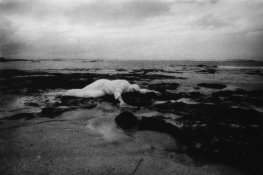
With respect to the first image, it is a strong photograph, but unless it is somehow a representation of someone who has a real connection with that environment (the person in it is either a performance artist or a marine biologist who likes to work in a sheet), I think it might be stretching it to call it a portrait.

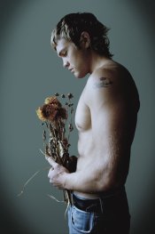
The second shot is a strong photograph as well, but if it is to appear as a portrait, rather than essentially as a performance, than it might actually require a caption (e.g. "the bereaved young widower").

On my non-calibrated monitor, the second shot is a bit "open sky" blue. That may very well be intentional, as it could suit the mood.

I'd echo John's comments about the burning in of the corners.

Hope this helps.

Matt

P.S every time I see the title of this thread, I'm tempted to start singing "Please critique me, let me go" (and you don't want to get me singing).
 

hec

Member
Joined
Jul 16, 2004
Messages
50
Location
Hermosillo,
Format
Multi Format
Hello Steve, I will tell you what each photograph means to me so that you may compare it to your intentions.

photo 1: mankind as victim of its own contamination, although I would expect the person to be smeared with oil.

photo 2: Claudia's dumped lover.

As for the composition:

1) bullseye composition. cropping around the subject would add more "movement" to the image, as it is now the strong line of horizon takes you out of the image very fast. I would treat the landscape as background adding environment to the person.

2) I feel the vignetting is excessive. if the flowers are slightly tilted forward it would make more "movement" between the face and the flowers, these two points are very close to the center, if placed a bit away it would make a path to the eye to go from the face through the arm and hands to the flower.

Even though photograph 1 is very interesting, I think the photograph 2 is better. Good luck with the competition!
 

markbb

Member
Joined
Oct 5, 2005
Messages
585
Location
SE London.
Format
Large Format
Photo 1 is not a portrait, IMHO. Looks more like the aftermath off a shipwreck.

Photo 2 is far to clichéd for my liking, & I find the closed eyes and the angle of the head unatural. The vignetting looks far too staged. As an aside, if you crop out his jeans; the image takes on a different feel.
 

cowanw

Member
Joined
Aug 29, 2006
Messages
2,217
Location
Hamilton, On
Format
Large Format
2. I wonder if the pectoral area is over lite or perhaps the back of the head might do with more fill light. I find I look at the most lite part of the photo as the main subject. Or you may have intended that. To much corner work as already mentioned. Still I like it.
1. Technically this is a tougher sell for me.
Again to much burning in the sides, Or ? lens vignetting.
And I agree with Hec here; Less sky and more beach and move the main subject away from centre more. Can you tell us more of the technique used here. With such a cloudy day I was thinking I should see more of the rock detail.
This is the more interesting picture for me. I feel that I can learn more from this if I knew more of the production details.
Brave of you to ask for critiques.
Regards
Bill
 
OP
OP
Stephen Frizza
Joined
Mar 2, 2007
Messages
1,464
Format
Medium Format
With the black and white it is shot on Kodak HIE infra red without using a filter which explains the blocked up rocks on such a gray day.there is no burning or dodging on this image but the neg is very dense and does some odd things in printing.

I have taken everyones advice on the colour image the vignette is too strong. it naturally occurs in the negative but i added upon it. i will re scan it without me working it.

The black and white image is totally composed obviously! hehehehe. However the colour image of Thaddeus was shot on the last morning we had together he was up out of bed before me and standing by the window. it was dull and gray outside, raining a little and he unwound a bunch of dried flowers from the window. (he used to dry them by hanging them from nails next to the window). i had my camera next to the bed. and there it was this is the first frame, un composed. there were only two other frames shot but he was conscious of my shooting then and all was lost. That was the last time my camera saw him.

P.S Claudia is his mother.

the feedback you have all been giving me is great thanks heaps.
 
Photrio.com contains affiliate links to products. We may receive a commission for purchases made through these links.
To read our full affiliate disclosure statement please click Here.

PHOTRIO PARTNERS EQUALLY FUNDING OUR COMMUNITY:


Ilford ADOX Freestyle Photographic Stearman Press Weldon Color Lab Blue Moon Camera & Machine
Top Bottom