I am going to address this in very simplified terms rather than go into really technical details. I will also have to make some assumptions about what you know already about the eye and about emulsions, but it will be a rather simple set of assumptions. This is the first in a planned series. Responses will be integrated into the text to be published on emulsion making and coating if this is feasible.
The human eye is assumed to have a response to intensity and exposure of 1:1. In other words, the response of the eye here is assumed to have a sensitivity to illuminant intensity vs LogE of 1, or a gamma of 1. Unfortunately, two things differentiate it from film already. The first is that the scale is a sliding scale due to the ability of the eye to stop itself down in a rather linear fashion as a function of bright light and it can iris open and dark adapt under low light conditions. These two capabilities allow the eye to sense scenes with what amounts to no toe or shoulder whatsoever. We will see that this is very important.
In a print, if we built the gamma or contrast of a print to be equal to the response of the eye, it would have a slope of 1.0, but unfortunately, due to the laws of physics and chemistry, all photo materials that exist reproduce a scene with a toe and shoulder. This toe and shoulder represent failure in reproducing the image at a slope of 1.0, but rather they reproduce the scene at a slope of less than 1.0. In fact, at Dmax and Dmin in a print, the slope decreases to zero. This is unfortunate, as the eye has one other capacity. It integrates the entire scene before it and thus a print with a toe and shoulder will be perceived as having a slope of far less than 1.0 and will appear dull and lifeless. Over many years of observation and comparison of gamma to perceived scene quality, it has been found that prints appear normal to the human eye if they have a mid scale slope of about 1.5 with a maximum value of about 1.7. This bump upwards in contrast by 0.5 units or change in density / change in loge combined with normal toe and shoulder cause the eye to think that the print has a normal tone scale. Variations in toe and shoulder reproduce the ability to see detail in highlights or see detail in shadows. This changes the snap or openness of a print. These terms and many others are used to describe the wide variety of tone scales that manufacturers try to build into their print materials.
So, we know that a print material, whatever it may be, must yield a final print with a contrast (or gamma) of about 1.5, and playing with the details in toe and shoulder will change some aspect of perceived quality.
It can also be added, that due to laws of physics, no matter how much silver is coated, the Dmax of a print will always be between about 1.9 and 2.2 depending on the nature of the surface. Matte surfaces are generally at the low end, and glossy surfaces are generally at the high end. There is some detail in this Dmax area, but it can only be revealed with very high intensity light which overcomes the problem. The problem is that due to multiple internal reflections of light from silver grains, the light is attenuated and cannot go over about 2.2 without this ultra high intensity light.
Now we come to the positive film.
It seems that a positive film behaves just like the print with two exceptions. The first is that the average contrast can be higher without sacrifice of perceived quality, and the second is that the Dmax is not limited by internal reflections. Therefore a positive film can have a gamma or contrast from 1.6 1.9 and a Dmax of 3.0 or even higher.
With this, we have established the design parameters of viewable materials. This was not a real science until the early part of this last century. Before that, the manufacturers were relatively clueless on this subject and products were designed by trial and error.
Ok, we have a print or a slide. Lets go back and design the negative.
It is known that the contrast of a print = contrast of negative X contrast of print material. Above, we showed that a good print had a contrast of about 1.5 and a good transparency had a contrast of about 1.8 on average. It can be shown easily (and most of us have done it) that the transparency material had very poor exposure latitude even though the picture might look good. We had to nail the exposure correctly though because the latitude was rather short. Well, it can also be shown that if you make a positive print of a positive transparency, you lose detail. Early on, it was found by observation that positive-positive printing yielded loss of detail in highlights and shadows. This is directly related to the fact that contrasts of the starting materials multiply and so in the toe, both the original and print material may have a contrast of 0.6 in the toe, but will reproduce the scene at a contrast of 0.36 (0.6 X 0.6) and thus the contrast of one or the other had to be manipulated to give the most viewable result. Well, this task has proven impossible even today and thus pos-pos printing is not a preferred method of printing photos. It works, it just does not work optimally.
Knowing this, it was further obvious that the best way to achieve a good viewable print was to start with a negative, with a Log E response that was linear and longer than the latitude of the desired print. This had two beneficial results. It allowed the print to be made from a straight line response curve rather than one that had a toe and shoulder, and in addition, it allowed for a very long exposure latitude. Further, by knowing the Dmax should be 3.0 just as in reversal films, and that Dmin is close to base density, a curve could be drawn for this negative material. It had a slope of about 0.5 0.8. The best results were about 0.6 0.7 with the higher value selected at that time due to the flare in old cameras. Today the values range from 0.5 0.65 due to the lower flare and higher quality lenses.
Working backwards then, we find that the contrast of todays print papers is about 2.5 to give the right print or 1.5 = 0.6 X 2.5 using the equation above.
Well, manufacturers didnt know this 100 years ago but here it is, nearly a century later. We have learned the details behind what was derived empirically by old experimenters. These are the basic rules governing the design of photographic materials. The major item to be covered is the design of a negative material.
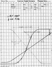
The attached diagram shows the approximate relationships between the curves of negatives, print material and print. The horizontal displacement of the curves and the toe and shoulder values of the positive print are not exact representations. They are only simulations.
Positive curves have Dmax on the left and negative curves have Dmax on the right.
PE
The human eye is assumed to have a response to intensity and exposure of 1:1. In other words, the response of the eye here is assumed to have a sensitivity to illuminant intensity vs LogE of 1, or a gamma of 1. Unfortunately, two things differentiate it from film already. The first is that the scale is a sliding scale due to the ability of the eye to stop itself down in a rather linear fashion as a function of bright light and it can iris open and dark adapt under low light conditions. These two capabilities allow the eye to sense scenes with what amounts to no toe or shoulder whatsoever. We will see that this is very important.
In a print, if we built the gamma or contrast of a print to be equal to the response of the eye, it would have a slope of 1.0, but unfortunately, due to the laws of physics and chemistry, all photo materials that exist reproduce a scene with a toe and shoulder. This toe and shoulder represent failure in reproducing the image at a slope of 1.0, but rather they reproduce the scene at a slope of less than 1.0. In fact, at Dmax and Dmin in a print, the slope decreases to zero. This is unfortunate, as the eye has one other capacity. It integrates the entire scene before it and thus a print with a toe and shoulder will be perceived as having a slope of far less than 1.0 and will appear dull and lifeless. Over many years of observation and comparison of gamma to perceived scene quality, it has been found that prints appear normal to the human eye if they have a mid scale slope of about 1.5 with a maximum value of about 1.7. This bump upwards in contrast by 0.5 units or change in density / change in loge combined with normal toe and shoulder cause the eye to think that the print has a normal tone scale. Variations in toe and shoulder reproduce the ability to see detail in highlights or see detail in shadows. This changes the snap or openness of a print. These terms and many others are used to describe the wide variety of tone scales that manufacturers try to build into their print materials.
So, we know that a print material, whatever it may be, must yield a final print with a contrast (or gamma) of about 1.5, and playing with the details in toe and shoulder will change some aspect of perceived quality.
It can also be added, that due to laws of physics, no matter how much silver is coated, the Dmax of a print will always be between about 1.9 and 2.2 depending on the nature of the surface. Matte surfaces are generally at the low end, and glossy surfaces are generally at the high end. There is some detail in this Dmax area, but it can only be revealed with very high intensity light which overcomes the problem. The problem is that due to multiple internal reflections of light from silver grains, the light is attenuated and cannot go over about 2.2 without this ultra high intensity light.
Now we come to the positive film.
It seems that a positive film behaves just like the print with two exceptions. The first is that the average contrast can be higher without sacrifice of perceived quality, and the second is that the Dmax is not limited by internal reflections. Therefore a positive film can have a gamma or contrast from 1.6 1.9 and a Dmax of 3.0 or even higher.
With this, we have established the design parameters of viewable materials. This was not a real science until the early part of this last century. Before that, the manufacturers were relatively clueless on this subject and products were designed by trial and error.
Ok, we have a print or a slide. Lets go back and design the negative.
It is known that the contrast of a print = contrast of negative X contrast of print material. Above, we showed that a good print had a contrast of about 1.5 and a good transparency had a contrast of about 1.8 on average. It can be shown easily (and most of us have done it) that the transparency material had very poor exposure latitude even though the picture might look good. We had to nail the exposure correctly though because the latitude was rather short. Well, it can also be shown that if you make a positive print of a positive transparency, you lose detail. Early on, it was found by observation that positive-positive printing yielded loss of detail in highlights and shadows. This is directly related to the fact that contrasts of the starting materials multiply and so in the toe, both the original and print material may have a contrast of 0.6 in the toe, but will reproduce the scene at a contrast of 0.36 (0.6 X 0.6) and thus the contrast of one or the other had to be manipulated to give the most viewable result. Well, this task has proven impossible even today and thus pos-pos printing is not a preferred method of printing photos. It works, it just does not work optimally.
Knowing this, it was further obvious that the best way to achieve a good viewable print was to start with a negative, with a Log E response that was linear and longer than the latitude of the desired print. This had two beneficial results. It allowed the print to be made from a straight line response curve rather than one that had a toe and shoulder, and in addition, it allowed for a very long exposure latitude. Further, by knowing the Dmax should be 3.0 just as in reversal films, and that Dmin is close to base density, a curve could be drawn for this negative material. It had a slope of about 0.5 0.8. The best results were about 0.6 0.7 with the higher value selected at that time due to the flare in old cameras. Today the values range from 0.5 0.65 due to the lower flare and higher quality lenses.
Working backwards then, we find that the contrast of todays print papers is about 2.5 to give the right print or 1.5 = 0.6 X 2.5 using the equation above.
Well, manufacturers didnt know this 100 years ago but here it is, nearly a century later. We have learned the details behind what was derived empirically by old experimenters. These are the basic rules governing the design of photographic materials. The major item to be covered is the design of a negative material.
The attached diagram shows the approximate relationships between the curves of negatives, print material and print. The horizontal displacement of the curves and the toe and shoulder values of the positive print are not exact representations. They are only simulations.
Positive curves have Dmax on the left and negative curves have Dmax on the right.
PE