batwister
Member
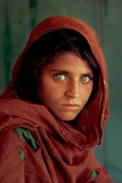
I've been spending a lot of time looking at this relatively famous picture by photographer Joachim Brohm:

It's one of those photographs that makes me think "if only I'd been there". It's almost entirely circumstantial, something that was begging to be photographed, something you couldn't fail to photograph well. He was featured in the Guardian a while ago and as usual, the comments section was filled with skepticism about the art of photography. One comment remarked, about this image, that there are a million similar on Flickr. I'm guessing the viewer only saw the burning car - which, admittedly, has become a bit of a photographic cliche in recent years. But what fascinates me about the picture is that the colour relationships seem more coincidental and photographic than the fire/setting juxtaposition.
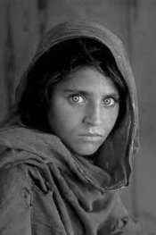
So I wondered, would he have even made the picture had the key colours been different? Even though, in a fundamental subjective sense, everything is there (certainly for most photographers), would the picture still be as strong aesthetically? And would that matter, given the significance of the subject? I edited the picture a little to see if I could come to a conclusion:

The cars could have conceivably been these colours, but I'm convinced that the vehicle on fire had to be blue and there had to be a red car beside it for the picture to work - even though I can much more easily imagine stumbling across the scene as it is in my edit. It has me thinking about the 'gift' of the photographer in a much more superstitious way, as if some have a psychic connection to happenstance, willing such perfectly photographic situations into existence.
Joel Sternfeld of course is another photographer who applies colour theory to fleeting juxtapositions.
It's one of those photographs that makes me think "if only I'd been there". It's almost entirely circumstantial, something that was begging to be photographed, something you couldn't fail to photograph well. He was featured in the Guardian a while ago and as usual, the comments section was filled with skepticism about the art of photography. One comment remarked, about this image, that there are a million similar on Flickr. I'm guessing the viewer only saw the burning car - which, admittedly, has become a bit of a photographic cliche in recent years. But what fascinates me about the picture is that the colour relationships seem more coincidental and photographic than the fire/setting juxtaposition.
So I wondered, would he have even made the picture had the key colours been different? Even though, in a fundamental subjective sense, everything is there (certainly for most photographers), would the picture still be as strong aesthetically? And would that matter, given the significance of the subject? I edited the picture a little to see if I could come to a conclusion:
The cars could have conceivably been these colours, but I'm convinced that the vehicle on fire had to be blue and there had to be a red car beside it for the picture to work - even though I can much more easily imagine stumbling across the scene as it is in my edit. It has me thinking about the 'gift' of the photographer in a much more superstitious way, as if some have a psychic connection to happenstance, willing such perfectly photographic situations into existence.
Joel Sternfeld of course is another photographer who applies colour theory to fleeting juxtapositions.
Last edited by a moderator:


 . In my case I noticed that it helps when I am not in my home town. When thinking to buy extra lens or whatever - I would always rather go to some new place, even just on weekend.