You are using an out of date browser. It may not display this or other websites correctly.
You should upgrade or use an alternative browser.
You should upgrade or use an alternative browser.
New look to Kodak Ultramax
-
A
- Thread starter Arcadia4
- Start date


Recent Classifieds
-
For Sale Azo #2
- Started by Peter Schrager
-
For Sale FS: Ebony 4x5 Focusing Screen
- Started by B.S.Kumar
-
For Sale FS: Arca-Swiss F-Line/Classic/Discovery 6x9 Accessories
- Started by B.S.Kumar
-
For Sale Zeiss Ikon Contax II + Carl Zeiss Sonnar 50mm f/2 _ German rangefinder camera
- Started by Manual Camera
-
For Sale Stroboframe Adjustable Flash Bracket Reliable & Ready for More!
- Started by Gary892
Forum statistics
Can you show us the "small print" elsewhere on the box?
AnselMortensen
Subscriber
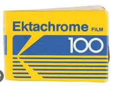
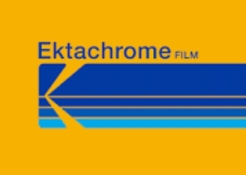
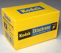
Looks like it should be a box of Ektachrome.
And furthermore...when was the "a" in Kodak changed to a schwa?

And furthermore...when was the "a" in Kodak changed to a schwa?
Oldwino
Subscriber
Looks like a bootleg.
cmacd123
Member
"The minimalist Ted logotype was redrawn in 2006, switching the typeface to a smoother and a more progressive one. Now only two “K”s had their vertical bars straight and angular, all other letters featured rounded and smooth bottom parts. The new typeface was created by the Identity Design agency."Looks like it should be a box of Ektachrome.
And furthermore...when was the "a" in Kodak changed to a schwa?
FROM: https://1000logos.net/kodak-logo/
cmacd123
Member
Yes I would also love to see the fine print, and if that is just for the UK market?
Moose22
Member
Thanks for the link @cmacd123 . I do wonder about what defines a "progressive" font, though. Never cared for the term when studying design because what's old is new and what's new soon enough becomes old, but i digress.
I don't like the schwa lower case a, personally. As far as the whole box, it kind of looks like they paid for printing by the letter and are trying to minimize everything, to me.
Seriously, though, it's fine. Branding works with the colors. That orange/gold is definitively Kodak. Other that not having the ISO larger, I think it's good.
AnselMortensen
Subscriber
cmacd123
Member
yes, although the Ultramax boxes have also featured Blue of quite a while.Blue = Ektachrome, traditionally.
Moose22
Member

AnselMortensen
Subscriber
Fair enough! 
I'm 'out of the loop' regarding 35mm color print film...I use 120 and sheet film.
Along with the schwa, I also don't like the fraction "1 36/400" at the top right. ISO and number of exposures are important information, and should be larger.
That was designed by a graphic designer with little, if any, knowledge of photography.
Last edited:
Yes I would also love to see the fine print, and if that is just for the UK market?
its currently on sale at B&H in the US. They tend to keep their product shots upto date. Q&A states its a different sku but same film.
Agulliver
Member
It's very simple. It may stand out more in the shelves that way? It's certainly simple, almost minimalist. The only thing I'm not so sure about is the card above the box, maybe it's too clean and simple?
Sometimes the card mount packaging - the packaging designed for hanging from a hook on a display - gets updated before the box only packaging.
It tends to be distributed through different channels, although it is accessible by every retailer.
It tends to be distributed through different channels, although it is accessible by every retailer.
Bronson Dugnutt
Member
The color scheme has gone a bit pastel, probably piggybacking on the popularity of Portra which has a similarly pastel but purple branding.
Cardboard is all well and good but what Ultramax could use is a redesigned canister. The 2 color black & gold 'KODAK 400' is as bland as can be. They probably don't want the canisters being too cool though... people might keep them and load them with bulk film!
Cardboard is all well and good but what Ultramax could use is a redesigned canister. The 2 color black & gold 'KODAK 400' is as bland as can be. They probably don't want the canisters being too cool though... people might keep them and load them with bulk film!
Oldwino
Subscriber
I also don't like the fraction "1 36/400" at the top right.
Would you prefer 1.09?
faberryman
Member
Along with the schwa, I also don't like the fraction "1 36/400" at the top right. ISO and number of exposures are important information, and should be larger.
It is not a fraction. Above the line it says "36 exp" and below the line it says "400". I don't know what the large "1" refers to. Maybe 1 roll of film?
Sure the labeling is dumb, but I really don't care what the packaging looks like. It is a Kodak color film for $9.99/roll and in stock at B&H, which is something to cheer about.
If you like the packaging on Ektar or Portra better, you can buy those films instead.
Moose22
Member
It's 1 roll of film, I would assume to separate it from three packs or other multiples that are sometimes sold on cards.
AnselMortensen
Subscriber

AnselMortensen
Subscriber
It's 1 roll of film, I would assume to separate it from three packs or other multiples that are sometimes sold on cards.
Good. I wouldn't be able to tell the difference.

AnselMortensen
Subscriber
Thanks, I do.If you like the packaging on Ektar or Portra better, you can buy those films instead.

albada
Subscriber
And furthermore...when was the "a" in Kodak changed to a schwa?
And the "d" looks like a flipped-sideways sigma. At least it matches the schwa. Whatever...
Moose22
Member
Good. I wouldn't be able to tell the difference.
Don't get snarky with me. Go bitch to the people who designed this. I was just positing at their logic.
foc
Subscriber
View attachment 338549
New packaging - A 'cleaner' less fussy look - What do you think? Even the '400' doesnt state iso.
I like it. Clean looking and simple. (a bit like myself ! )
I am not confused by the fraction notation mentioned earlier. It clearly says to me, a box of 1 film of 36 exposures in 400 speed.
Anything that helps put film in a good light and If it sells more film then I am all for it.
Xylo
Member
I like how simple, clean and elegant the new packaging is. It doesn't make the design messy by adding useless stuff.
It's also a great penny saver for Kodak as they only need to print in 4 colors when compared to the old one which used something like 6.
It's also a great penny saver for Kodak as they only need to print in 4 colors when compared to the old one which used something like 6.
| Photrio.com contains affiliate links to products. We may receive a commission for purchases made through these links. To read our full affiliate disclosure statement please click Here. |
PHOTRIO PARTNERS EQUALLY FUNDING OUR COMMUNITY:  |