MattKrull
Member
I’ve had LF GAS for a while now. Ever since I compared my first 645 enlargements to 35mm enlargements I’ve wanted to try a really big negative. Due to space constraints, I don’t have space for a 4x5 enlarger, so I figured a 5x7 or 8x10 (and sticking to contact printing) was the way for me. Earlier this year I had a string of good fortune that started with finding a Kodak 2D in good condition locally, a friend convincing my wife she should let me buy it because it would make awesome decoration in our living room, and a Apugger selling me 12” Commercial Ektar (I put out a call for a user lens, and Tony D offers me my dream lens).
Since I can’t afford to buy both groceries and 8x10 film, my plan was to use paper negatives. Unfortunately, ISO 6 and speed-light based portrait photography are not a good mix. And so I very quickly landed on X-ray film (as a number of Apuggers suggested I would). I decided to use the slightly more expensive Ektascan B R/A single sided x-ray film to avoid the softness and scratching that come with double sided films. Unfortunately, Ektascan is not currently available in Canada that I can find, and the only place that would ship from the US only does UPS shipping. So I paid half again the cost of the film in UPS brokerage charges.
Alright, my life story finished, what was the result of my first try? Mixed.
First, here’s the photo:

http://mattkrull.tumblr.com/post/133366553337/please-ignore-the-massive-amount-of-dust-on-this
My thoughts: (If you don’t deal with digital at all, skip the first two points)
1 – This scan sucks. My contact (plexi)glass is a magnet for dust (and now scratches, my blower brush scratched it – wtf?), as is the plastic sleeve the negative is in. So, lots and lots of dust. The scan was done at 600DPI (enough to print this at 20”x16” on a good quality inkjet). I did a 1200 DPI scan, and while it did show more detail, it also made the dust more visible, ate up way more disk space, and didn’t really do anything for the way the image looked on the screen.
2 – Resolution: Continuing the thought above, the 600DPI scan translates into a 28MP image, which in the world of 36 and now 50MP DSLRs, doesn’t sound so impressive. But those sensors are bayer-array and so the comparison isn’t really perfect. What I can say is that comparing the fine detail in this 600DPI scans to some RAW files I have from a Nikon D800 (36MP) the fine detail is pretty similar. So, the detail in an 8x10 contact print from a camera built in 1922, using a lens from the 1940s (maybe 50s, I haven’t checked the serial number on it) at the lowest scan resolution is comparable to the best DSLR technology of 2014. That’s pretty darned cool to me.
Digital talk over, True Appugers™ can now begin reading again
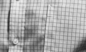
3 – Fine Detail: Okay, so I mentioned the resolution in that image, but what do those meaningless numbers translate to? This:

http://mattkrull.tumblr.com/post/133377744457/heres-a-100-crop-of-the-scan-i-posted-earlier
This is a 100% crop from my scan. If you come from 35mm, remember this is not a macro shot, but an upper body portrait including everything from just above his belly button to the top of his head. You can clearly make out the stitching in his shirt, and if you look closely you can see the weave of the fabric itself. If I increase the scan resolution you can clearly make out the weave.
4 – Depth of field: shot at F8, the depth of field is minuscule. Looking at the above picture you can see that his pocket is in focus but the button behind it (how far does a pocket on a lose shirt stick out? less than 2cm I’d wager) is out of focus. Coming from doing macro work in 35mm I’m impressed with how the focus falls off. With 35mm and a macro lens focus just sort of falls off a cliff, here it melts away smoothly. This is perhaps my favourite aspect of this photo. The down side is that I think I’ll need to shoot portraits at F16 or higher, and that’s right at the ragged edge of what my lighting setup can do.
5 – Grain: Ektascan is a tabular grain film, just like TMax and Delta. Simply put, even at a four times enlargement there is no grain visible what so ever. Anything you see in the images above that you think might be grain is actually dust (dust on the negative, the plexiglas, or the scanner bed – there’s lots of places for dust to get into the process).
6 – Real detail: For all the magnification and such, the fact is, in an 8x10 print, there is no more visible detail here than in an enlargement from my Bronica 645 (using Delta). After my step up from 35mm to 645, I expected to be able to see more detail, but the truth is, the print is now out resolving my eye and all the super duper resolution mentioned in point 2 and 3 are pretty meaningless. That was a big let down.
7 – Tone smoothness: Going along with point 6, yes, when you zoom in the tones are super smooth, but holding the print in your hand, you’d be hard pressed to tell the difference between this and 645 (not counting DoF). I now wonder about everyone who says they can notice a difference in tones between 645 and 6x6.
8 – Skin tones: Ektascan is orthochromatic, which as I understand it, means it is sensitive to both blue and green, but not red light. While the green sensitivity may make it more forgiving to skin tones than blue light only film, it is still harsh on the subject. Bags under the eyes are amplified, blemishes in the skin are exaggerated, and skin is darker over all. I also find that skin (in particular lips) take on a metallic finish that reminds me of a bronze statue. It takes some work in the dark room to get the skin tones looking normal-ish.
As a real apples-to-apples skin tone comparison, look at the second image in this post: (there was a url link here which no longer exists) It was shot moments after the 8x10 camera using RPX 25 135 (also developed in Rodinal). Exact same light setup, same model (same level of tiredness). The skin tones are bright; the bags under his eyes are barely visible.
I will need to be very selective on who I use this film with. Some people will like the look, but people who are sensitive about their looks will not like it at all.
9 – Printing: I made four photos and processed them in two different ways (Rodinal 1:100 and 1:200, details below). The 1:100 negatives are a full grade higher in contrast, and to print them the way I wanted took using Grade 0. That doesn’t leave a lot of room to decrease contrast if I need to. Also, I printed these on Oriental VC RC paper, and I think that is really holding the prints back. Despite all the good things I’ve read about the paper, I find it lifeless and dull. I think these would look noticeably better on different paper. This definitely added disappointment to the final result.
My Process:
I exposed the film at ISO 50 (I treated it as ISO100 and then added bellows factor of 1.7, rounded up to 2, after focusing). I developed two sheets in Rodinal 1:100 (4ml : 400ml) in a 11x14 Unicolor print drum on a reversing unicolor base at 20C for 6 minutes. The other two sheets were done at 1:200 (2ml : 400ml) for 8 minutes. The 1:200 negatives look ever so slightly thinner to me, but I found they took the same amount of time under the enlarger light to reach optimal results, but as mentioned before, I could use a Grade 1 filter. I also found the skin tones to be subtly nicer (it’s hard to tell which is which when the prints are side by side though). Nice thing about the film being orthochromatic, I could load the film holders and print drum under safe-light. I’m sure it gets easier with practice, but that was more difficult than I expected.
Since I can’t afford to buy both groceries and 8x10 film, my plan was to use paper negatives. Unfortunately, ISO 6 and speed-light based portrait photography are not a good mix. And so I very quickly landed on X-ray film (as a number of Apuggers suggested I would). I decided to use the slightly more expensive Ektascan B R/A single sided x-ray film to avoid the softness and scratching that come with double sided films. Unfortunately, Ektascan is not currently available in Canada that I can find, and the only place that would ship from the US only does UPS shipping. So I paid half again the cost of the film in UPS brokerage charges.
Alright, my life story finished, what was the result of my first try? Mixed.
First, here’s the photo:
http://mattkrull.tumblr.com/post/133366553337/please-ignore-the-massive-amount-of-dust-on-this
My thoughts: (If you don’t deal with digital at all, skip the first two points)
1 – This scan sucks. My contact (plexi)glass is a magnet for dust (and now scratches, my blower brush scratched it – wtf?), as is the plastic sleeve the negative is in. So, lots and lots of dust. The scan was done at 600DPI (enough to print this at 20”x16” on a good quality inkjet). I did a 1200 DPI scan, and while it did show more detail, it also made the dust more visible, ate up way more disk space, and didn’t really do anything for the way the image looked on the screen.
2 – Resolution: Continuing the thought above, the 600DPI scan translates into a 28MP image, which in the world of 36 and now 50MP DSLRs, doesn’t sound so impressive. But those sensors are bayer-array and so the comparison isn’t really perfect. What I can say is that comparing the fine detail in this 600DPI scans to some RAW files I have from a Nikon D800 (36MP) the fine detail is pretty similar. So, the detail in an 8x10 contact print from a camera built in 1922, using a lens from the 1940s (maybe 50s, I haven’t checked the serial number on it) at the lowest scan resolution is comparable to the best DSLR technology of 2014. That’s pretty darned cool to me.
Digital talk over, True Appugers™ can now begin reading again
3 – Fine Detail: Okay, so I mentioned the resolution in that image, but what do those meaningless numbers translate to? This:
http://mattkrull.tumblr.com/post/133377744457/heres-a-100-crop-of-the-scan-i-posted-earlier
This is a 100% crop from my scan. If you come from 35mm, remember this is not a macro shot, but an upper body portrait including everything from just above his belly button to the top of his head. You can clearly make out the stitching in his shirt, and if you look closely you can see the weave of the fabric itself. If I increase the scan resolution you can clearly make out the weave.
4 – Depth of field: shot at F8, the depth of field is minuscule. Looking at the above picture you can see that his pocket is in focus but the button behind it (how far does a pocket on a lose shirt stick out? less than 2cm I’d wager) is out of focus. Coming from doing macro work in 35mm I’m impressed with how the focus falls off. With 35mm and a macro lens focus just sort of falls off a cliff, here it melts away smoothly. This is perhaps my favourite aspect of this photo. The down side is that I think I’ll need to shoot portraits at F16 or higher, and that’s right at the ragged edge of what my lighting setup can do.
5 – Grain: Ektascan is a tabular grain film, just like TMax and Delta. Simply put, even at a four times enlargement there is no grain visible what so ever. Anything you see in the images above that you think might be grain is actually dust (dust on the negative, the plexiglas, or the scanner bed – there’s lots of places for dust to get into the process).
6 – Real detail: For all the magnification and such, the fact is, in an 8x10 print, there is no more visible detail here than in an enlargement from my Bronica 645 (using Delta). After my step up from 35mm to 645, I expected to be able to see more detail, but the truth is, the print is now out resolving my eye and all the super duper resolution mentioned in point 2 and 3 are pretty meaningless. That was a big let down.
7 – Tone smoothness: Going along with point 6, yes, when you zoom in the tones are super smooth, but holding the print in your hand, you’d be hard pressed to tell the difference between this and 645 (not counting DoF). I now wonder about everyone who says they can notice a difference in tones between 645 and 6x6.
8 – Skin tones: Ektascan is orthochromatic, which as I understand it, means it is sensitive to both blue and green, but not red light. While the green sensitivity may make it more forgiving to skin tones than blue light only film, it is still harsh on the subject. Bags under the eyes are amplified, blemishes in the skin are exaggerated, and skin is darker over all. I also find that skin (in particular lips) take on a metallic finish that reminds me of a bronze statue. It takes some work in the dark room to get the skin tones looking normal-ish.
As a real apples-to-apples skin tone comparison, look at the second image in this post: (there was a url link here which no longer exists) It was shot moments after the 8x10 camera using RPX 25 135 (also developed in Rodinal). Exact same light setup, same model (same level of tiredness). The skin tones are bright; the bags under his eyes are barely visible.
I will need to be very selective on who I use this film with. Some people will like the look, but people who are sensitive about their looks will not like it at all.
9 – Printing: I made four photos and processed them in two different ways (Rodinal 1:100 and 1:200, details below). The 1:100 negatives are a full grade higher in contrast, and to print them the way I wanted took using Grade 0. That doesn’t leave a lot of room to decrease contrast if I need to. Also, I printed these on Oriental VC RC paper, and I think that is really holding the prints back. Despite all the good things I’ve read about the paper, I find it lifeless and dull. I think these would look noticeably better on different paper. This definitely added disappointment to the final result.
My Process:
I exposed the film at ISO 50 (I treated it as ISO100 and then added bellows factor of 1.7, rounded up to 2, after focusing). I developed two sheets in Rodinal 1:100 (4ml : 400ml) in a 11x14 Unicolor print drum on a reversing unicolor base at 20C for 6 minutes. The other two sheets were done at 1:200 (2ml : 400ml) for 8 minutes. The 1:200 negatives look ever so slightly thinner to me, but I found they took the same amount of time under the enlarger light to reach optimal results, but as mentioned before, I could use a Grade 1 filter. I also found the skin tones to be subtly nicer (it’s hard to tell which is which when the prints are side by side though). Nice thing about the film being orthochromatic, I could load the film holders and print drum under safe-light. I’m sure it gets easier with practice, but that was more difficult than I expected.