My first RA-4 print...

The nights are dark and empty

A
The nights are dark and empty

  • 7
  • 2
  • 47
Nymphaea's, triple exposure

H
Nymphaea's, triple exposure

  • 0
  • 0
  • 28
Nymphaea

H
Nymphaea

  • 1
  • 0
  • 27
Jekyll driftwood

H
Jekyll driftwood

  • 4
  • 0
  • 56

Recent Classifieds

Forum statistics

Threads
198,922
Messages
2,783,151
Members
99,748
Latest member
Autobay
Recent bookmarks
0

Lopaka

Member
Joined
Apr 1, 2006
Messages
757
Location
Michigan
Format
Multi Format
I've been printing Ilfochromes for a few years, bet never RA-4. I have quite a few color negatives on file form the years when I had no darkroom access and I thought at least some would be worth printing so I decided to take some time to play with it.

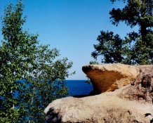
I chose one at random, specifically for average density and colors at about the opposite end of the spectrum to get something to play with. I had no clue as to exposure range or filter range. I started with the first rule of color printing - nail exposure first, then deal the color management. I got something out of the tests in the exposure range, but OMG, it's nothing but different shades of dark red! (no filtration at all used). I started searching the threads here for clues and found some good info to use to go back and play with filtration. A nearly filled trashbin later, I got a print in which the trees look like trees, the sky looks like sky, the water looks like water (for the conditions in which it was shot) and the rock looks pretty much like the actual color of the rock. I'd call that pretty successful for the first try.

Thanks to all who share their experience here - it is most helpful.

Bob
 

Attachments

  • rock001.jpg
    rock001.jpg
    150.8 KB · Views: 212

srs5694

Member
Joined
May 18, 2005
Messages
2,718
Location
Woonsocket,
Format
35mm
I've been doing color printing for close to a year now. I'm far from an expert, but I've found that the most valuable tool for me is a shot of a gray card. It's relatively easy to get good color balance on a gray card because it's gray and because I can compre it directly to the print. If other subjects on the same roll are shot in similar light, their color balance and exposure won't vary by much, so even if they're horrifically difficult to balance (like autumn leaves -- I had a terrible time with such a shot a few days ago!), the task becomes much easier by using the gray card frame to get the color balance.

In theory, if you consistently use the same film, film developer, paper, paper developer, and developing conditions (particularly temperature), color balance shouldn't change much from one roll to another. I've got quite a wide variety of films, though, so my filtration's all over the map. (I'm starting to narrow my film selection to help simplify printing, but there's all the stuff I've already shot.)
 

pentaxuser

Member
Joined
May 9, 2005
Messages
19,976
Location
Daventry, No
Format
35mm
Loooks pretty good. Depending on the paper used there are starting filtrations which would have got you in the ballpark and may have saved some paper.

This may be superfluous advice to someone who has done cibachrome a dn knows a lot about colour but if you intend doing more than just the occasional RA4 ,a colour analyser may be sensible. It needn't be the rolls royce of analysers such as the Colourstar. I had a Paterson one and it was OK. My experience is that unless the negs are all taken under similar conditions etc then relying on the filtration for the first perfect print won't necessarily get you to the ideal filtration for the other negs and it's then back to test strips for each negs which is consuming in terms of time and paper.

pentaxuser
 
OP
OP
Lopaka

Lopaka

Member
Joined
Apr 1, 2006
Messages
757
Location
Michigan
Format
Multi Format
Most contrast control in color work is done at the shooting level - film choice for conditions and subject matter, etc.

FWIW, my box of Fuji Crystal Archive has no 'starting point' for filtration, unlike Ilfochrome. It takes a little work to find the start point for the specific enlarger, chemistry, etc. but seems to get there a lot quicker once that is established.

Bob
 

Stew

Member
Joined
Nov 11, 2005
Messages
88
Location
New Brunswic
Format
Multi Format
The colors in your photo look good!

Something I find useful to get the color balance right is a set of Lee color print viewing filters. They save a bit of wasted paper. You can get them at B&H Photo and Freestyle,or any other well stocked photo store.

Rob.
 

L Gebhardt

Member
Joined
Jun 27, 2003
Messages
2,363
Location
NH
Format
Large Format
Beautiful, but a question, how can you control contrast with color papers?

The two ways I know of to control contrast in RA-4 printing is to use different grade of paper. Kodak makes 3 grades of Endura and Fuji makes at least two (haven't really used much Fuji). If that isn't enough you need to resort to making a contrast reducing mask. Or I guess a contrast increasing mask, but I have never shot a neg in color that would have needed one of these. It looks like the image above could benefit from a bit of contrast reduction, either a mask or a lower grade of paper.

Contrast reducing masks are covered very well in Ctein's book Post Exposure. In fact most things are covered in that book.
 
OP
OP
Lopaka

Lopaka

Member
Joined
Apr 1, 2006
Messages
757
Location
Michigan
Format
Multi Format
That looks pretty good!
Are you using the same equipment that you use for Ciba?
Is this Fuji Crystal Archive?
DT

Dave, I run it on the same JOBO CPP-2. It's Fuji Crystal Archive Super Type C. I used Kodak Ektacolor RT at 35 C. Film is Fuji NPC 160.

Bob
 

Ed Sukach

Member
Joined
Nov 27, 2002
Messages
4,517
Location
Ipswich, Mas
Format
Medium Format
I have had *great* success in reducing color print contrast by "pre-flashing". By that, I mean replacing *some* of the light forming the image with neutral grey-card light: If the exposure for a print "analyzes out" to be 20 seconds, I will modify that to a "pre-flash" of 5 second of a grey-card image "balanced out" and 15 seconds of the original exposure - also balanced out.

This sounds a lot more confusing than it actually is in practice. The idea is that an overly contrasty image is both TOO white and TOO black ... so the grey image will LESSEN the "white" AND the "black".

This is one of those things that I thought about and reasoned out - it made perfect sense THEN - but I'm having trouble duplicating the thought process NOW. I know that it DOES WORK to lessen contrast - I haven't really needed to increase contrast with color film.
 
Photrio.com contains affiliate links to products. We may receive a commission for purchases made through these links.
To read our full affiliate disclosure statement please click Here.

PHOTRIO PARTNERS EQUALLY FUNDING OUR COMMUNITY:


Ilford ADOX Freestyle Photographic Stearman Press Weldon Color Lab Blue Moon Camera & Machine
Top Bottom