Well, based on what I see on my monitor screen (which is a laptop screen, so I cannot be 100 percent certain, though), it looks like the actual print is too light and lacks contrast. So, add more time to your previous exposure time(8 seconds, you said)) first and see how the density and contrast will match the neg-scan version of the image, which is your goal.
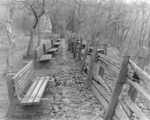
Start from a test strip again and have it placed in the area of an image where you want to see the most and where your eyes see first. I belive in this case, it's the bench and the trees in the foreground, then worry about the rest of the area.
For calcutrating exposure time, think in percentage, like adding (or subtract) extra 10, 20 percent, for instance, everytime you change. That way it's easiler to visualize the final picture. I'm sure you already have, though.
If the contrast is not good and too dull or too mushy, change it to a higher contrast. If it gets too muddy, watch out the exposure time, too.
Keep the developing time (1minute for RC) and agitation consistent if you're doing the basics until you get a better result in a final print. Also, if you're printing longer hours, watch out the exhaustion of the developer and the fix. When changing the old dev to fresh dev, change the stop bath, also.
I personally think Ilford RC paper (in my preference, pearl) is a neutral paper and very easy to use before getting too seduced and in some way distracted by other factors such as color and hue (as well as surface quality) to learn about printing. I wouldn't suggest FB paper to someone at this stage because it's not adequate.
Don't put too much burden on your shoulder, but just try to meet your goal first with what you have. Good luck.