


Photo Engineer
Subscriber
Well, here goes the firestorm I guess. It is a subject tender to a lot of people. I hope you enjoy this. It was a long time in coming, as it took some thinking as to how to present this.
There are two fundamental reasons why people have developed either a love or a hate relationship with Kodachrome film.
The first involves the turnaround time needed to get your slides back, and the cost of processing. It takes anywhere from 3 days to 3 weeks to get a roll of Kodachrome film processed, and with shipping and processing costs it is now more expensive than E6 processing and more time consuming. The cost and convenience were not always a matter of concern, but in about 1990, as the demand for Kodachrome decreased then the number of processing stations began to decrease and costs went up. This decline directly followed the growth of E6 films.
Simple things mean a lot. Cost and convenience were the factors here.
The second one is more complex.
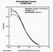
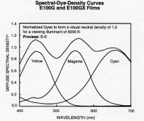
This involves the dyesets of Ektachrome and Kodachrome films. In the leftmost figure below, I have posted the H&D curves of an Ektachrome film. As you can see, the 3 curves are pretty well matched to give a neutral. This is further shown in the second figure below which is the unit neutral of the dye set along with the individual curves of the amounts of the dyes needed to give that neutral. In other words, X, Y and Z amount of each dye (less than D = 1.0) will yield a good neutral with D = 1.0. This will actually translate well into a neutral under almost all illuminants and almost all human eyes. But, as you can see, the neutral is NOT a straight line with equal density across the visible spectrum.
Those last two sentences are critical. Some dyesets will not look the same under all illuminants and will actually not appear the same to all human eyes due to slight differences in our vision. It is not, however, a straight line.
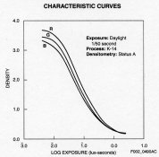
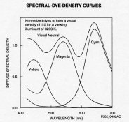
If you compare the first figure to the third figure, you can compare the Ektachrome with Kodachrome. You can immediately see that the curves of the 3 Kodachrome dyes are NOT matched, and that the Cyan is considerably higher than the other two. As a result, a visual neutral may look cyanish. To see why I say may look at the 4th figure which is a unit neutral of the Kodachrome dye set. You can immediately see that the cyan dye requires more density to give a visual neutral of 1.0 due to the fact that the cyan dye is very narrow in absorption. It is also low in unwanted densities and this introduces a big dip or gap in the neutral at about 600 nm. The lower unwanted absorption of the cyan in the green and blue region of the spectrum are responsible in part, for the improved overall color saturation.
The result of all of this though is that Kodachrome K-14 products have slightly more illuminant sensitivity than the E6 product family, but since they are all intended to be projected, who cares. It also means that even under identical illumination, some people may view Kodachrome slides differently than others, due to the slight, but normal differences in the color receptor pigment balance in individual eyes. On the other hand, Kodachrome colors have a vibrant saturation with less impurities for this same reason, but in some cases, that advantage is scene dependant.
In fact, since reversal print materials have a fixed spectral sensitivity, printers will find that the filter packs needed to print E6 vs K14 family products are quite different, but very much the same within the family of products. Ilfochrome recognizes this in their product fact sheets. In fact, this was somewhat true of the older Kodachrome family as well.
On balance, these product family differences lead to a broad variety of opinions on what is better, Kodachrome or Ektachrome. Well, in the final analysis, the Kodachrome products were built to make a garbage dump look pretty, as an EK engineer once said.
And, one of the driving forces to pick this particular cyan dye was that the final products images were considerably more stable than the predecessor Kodachrome family, even given the older products good reputation for image stability.
Apart from the differences of opinion about Kodachrome, I think that last but not least thre is one thing that most everyone agrees about and therefore, I must mention the famous Kodachrome sharpness. This comes from two sources. Since there are no couplers in Kodachrome, the layers are very thin giving better sharpness due to less turbidity and less distortion due to internal reflections. In addition, after processing Kodachrome has that relief image cause by the formation of the color image which swells, or distorts the coating as a function of the color image formation. This relief image is part and parcel of the sharpening effect as it creates a sort of knife edge between colors.
I hope you followed this and that it is of some interest or use to all of you who loved or hated Kodachrome.
PE
There are two fundamental reasons why people have developed either a love or a hate relationship with Kodachrome film.
The first involves the turnaround time needed to get your slides back, and the cost of processing. It takes anywhere from 3 days to 3 weeks to get a roll of Kodachrome film processed, and with shipping and processing costs it is now more expensive than E6 processing and more time consuming. The cost and convenience were not always a matter of concern, but in about 1990, as the demand for Kodachrome decreased then the number of processing stations began to decrease and costs went up. This decline directly followed the growth of E6 films.
Simple things mean a lot. Cost and convenience were the factors here.
The second one is more complex.
This involves the dyesets of Ektachrome and Kodachrome films. In the leftmost figure below, I have posted the H&D curves of an Ektachrome film. As you can see, the 3 curves are pretty well matched to give a neutral. This is further shown in the second figure below which is the unit neutral of the dye set along with the individual curves of the amounts of the dyes needed to give that neutral. In other words, X, Y and Z amount of each dye (less than D = 1.0) will yield a good neutral with D = 1.0. This will actually translate well into a neutral under almost all illuminants and almost all human eyes. But, as you can see, the neutral is NOT a straight line with equal density across the visible spectrum.
Those last two sentences are critical. Some dyesets will not look the same under all illuminants and will actually not appear the same to all human eyes due to slight differences in our vision. It is not, however, a straight line.
If you compare the first figure to the third figure, you can compare the Ektachrome with Kodachrome. You can immediately see that the curves of the 3 Kodachrome dyes are NOT matched, and that the Cyan is considerably higher than the other two. As a result, a visual neutral may look cyanish. To see why I say may look at the 4th figure which is a unit neutral of the Kodachrome dye set. You can immediately see that the cyan dye requires more density to give a visual neutral of 1.0 due to the fact that the cyan dye is very narrow in absorption. It is also low in unwanted densities and this introduces a big dip or gap in the neutral at about 600 nm. The lower unwanted absorption of the cyan in the green and blue region of the spectrum are responsible in part, for the improved overall color saturation.
The result of all of this though is that Kodachrome K-14 products have slightly more illuminant sensitivity than the E6 product family, but since they are all intended to be projected, who cares. It also means that even under identical illumination, some people may view Kodachrome slides differently than others, due to the slight, but normal differences in the color receptor pigment balance in individual eyes. On the other hand, Kodachrome colors have a vibrant saturation with less impurities for this same reason, but in some cases, that advantage is scene dependant.
In fact, since reversal print materials have a fixed spectral sensitivity, printers will find that the filter packs needed to print E6 vs K14 family products are quite different, but very much the same within the family of products. Ilfochrome recognizes this in their product fact sheets. In fact, this was somewhat true of the older Kodachrome family as well.
On balance, these product family differences lead to a broad variety of opinions on what is better, Kodachrome or Ektachrome. Well, in the final analysis, the Kodachrome products were built to make a garbage dump look pretty, as an EK engineer once said.
And, one of the driving forces to pick this particular cyan dye was that the final products images were considerably more stable than the predecessor Kodachrome family, even given the older products good reputation for image stability.
Apart from the differences of opinion about Kodachrome, I think that last but not least thre is one thing that most everyone agrees about and therefore, I must mention the famous Kodachrome sharpness. This comes from two sources. Since there are no couplers in Kodachrome, the layers are very thin giving better sharpness due to less turbidity and less distortion due to internal reflections. In addition, after processing Kodachrome has that relief image cause by the formation of the color image which swells, or distorts the coating as a function of the color image formation. This relief image is part and parcel of the sharpening effect as it creates a sort of knife edge between colors.
I hope you followed this and that it is of some interest or use to all of you who loved or hated Kodachrome.
PE
 to enjoy! Peace
 I meant not quite buried until dec 31st. Never used Ektachrome myself and unfortunately missed many years of Kodachrome while chasing digital.


