
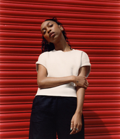
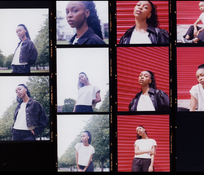
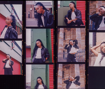
So this was my final print from a day in my darkroom this week. Would love some feedback on my print as I’m still not confident as I’m completely teaching myself, never printed b&w and just went for colour because I mainly shoot colour (only been doing photography a little over a year). Oh and a wee bonus, I made my first ever contact prints.


Latest RA4 printing
-
A
- Thread starter Robbie
- Start date


Recent Classifieds
-
Want to Buy 135mm 5.6 enlarging lens
- Started by ediz7531
-
For Sale New 55 instant film (replacement for polaroid type 55)
- Started by Early Riser
-
Free 16x20 and 20x24 expired Ilford multigrade paper, Portland Oregon pick up
- Started by Early Riser
-
For Sale Helipan 112mm Circular Polarizer
- Started by Early Riser
-
Sold For Sale: 10 rolls of 120 film *SOLD*
- Started by Brad Bireley
Forum statistics


| Photrio.com contains affiliate links to products. We may receive a commission for purchases made through these links. To read our full affiliate disclosure statement please click Here. |
PHOTRIO PARTNERS EQUALLY FUNDING OUR COMMUNITY:  |