I'm afraid I only use NC, so I can't comment on the differences. In fact I haven't used a lot of other emulsions, so please don't mistake me for an expert. I started using Portra because I didn't like the pink cast the old Fuji NPS gave to everything, and I liked the way 400NC shots in 6x6 could be seamlessly matched to 160NC shots in 35mm. I've stuck with it because I have come to love the palette and the subtleties of its rendition.
One caveat: machine prints of scenery can turn out too muted. For me, a hand-corrected print, or one of those d*g*t*l sc*n thingies, has always been able to recover the scene I wanted to photogaph, but if you rely on a distant automated processor you won't get the best out of this film. Or any film for that matter, but Portra shots of wildflowers often seem to need tweaking a bit from the default picked by the algorithms in the package printers.
Another tip: Portra often appears more saturated when scanned than when printed in a conventional enlarger onto RA4 papers, even supposedly vivid ones. This is consistent between my Epson flatbed and Imacons. Since most commercial printers use a scan-and-print engine, you have to interpret such machine proofs in the light of experience if you are going to print yourself later. Not a biggie, but it's a bit like labs that would print B+W at the lowest contrast grade: you have to do some mental interpretation.
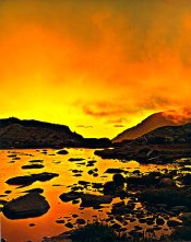
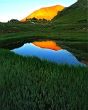
That said, both the above caveats apply to the sorts of high-contrast, subtle colours scenes that are typical of a Scottish moorland on a sunny day. High key seems to need more care in printing than low key. More conventional views, or the diffuse-light dripping wetness of a Scandinavian early spring, reproduce beautifully on auto.