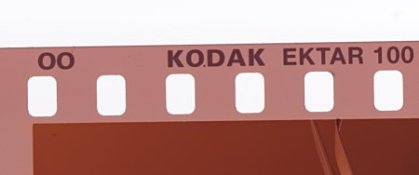
Kodak Ektar 100 - processing question

The Gap

H
The Gap

  • 4
  • 2
  • 43
Ithaki Steps

H
Ithaki Steps

  • 2
  • 0
  • 69
Pitt River Bridge

D
Pitt River Bridge

  • 4
  • 0
  • 77

Forum statistics

Threads
199,002
Messages
2,784,426
Members
99,765
Latest member
NicB
Recent bookmarks
2

sar-photo

Member
Joined
Jan 2, 2006
Messages
68
Location
South West S
Format
Medium Format
I've just processed my first rols of Ektar 100 (in Tetenal C-41 chemicals) and the base colour is pink. Having never processed Kodak colour negs before I just wanted to check that this is ok before I go ahead and process the next 25 films - just got back from a week in Mexico!!

Cheers
Simon
 

steelneck

Member
Joined
Nov 16, 2009
Messages
173
Format
35mm
... and the base colour is pink. Having never processed Kodak colour negs before I just wanted to check that this is ok ...

This is how it should look
 

Attachments

  • 0018.jpg
    0018.jpg
    8.9 KB · Views: 394

nickandre

Member
Joined
Oct 22, 2007
Messages
1,918
Location
Seattle WA
Format
Medium Format
The base color is a different color than other films I've used. Gold is more orange.
 

jbl

Member
Joined
Dec 4, 2009
Messages
93
Location
California,
Format
35mm RF
In all seriousness, I've always had trouble getting the values and richness in Ektar that people seem to get and love it.

There just doesn't seem to be enough punch and contrast in the colors.
 

steelneck

Member
Joined
Nov 16, 2009
Messages
173
Format
35mm
@jbl: I have the same experience, i get more "pop" using Fuji Reala or even more the Pro 160C on Endura Supra paper. Somewhat the same when scanning, i also had much more trouble making a medium definition for Ektar in Xsane (my scanner software). It is hard to describe it, i think "muddy colors" comes close to my experience. It is something about its tonality, not the contrast.
 

frobozz

Subscriber
Joined
Feb 19, 2010
Messages
1,458
Location
Mundelein, IL, USA
Format
35mm
The guy who writes VueScan says Kodak has not yet released the PhotoCD specs for the new Ektar 100 (or whatever it is they do to characterize the film for their own scanning equipment) which might explain why scanning software everywhere has trouble with it. I used a Gold preset and got pretty close. (To bring this back on topic for APUG) the minilab I had process my film, for which I was just planning to use the free 4x6 prints as a proof sheet, did an absolutely WRETCHED job at printing them, possibly in a misguided attempt to give them more "pop" - it looks to me like the colors are fairly subtle and realistic, not vibrant and in your face.

Here's an example:

Scan_100516_0129.jpg


Duncan
 

photomem

Member
Joined
Sep 19, 2009
Messages
624
Format
Medium Format
I have found that if you want higher contrast and more pop from the colors, Ektar really sings when you expose it at ISO64 instead of box speed. I know it sounds counter-intuitive on a C41 Neg film, but it works.

Example:
4116919802_c0b904b449.jpg


This is a stained glass window, backlit by shaded sun, with 120 Ektar 100 @ ISO64. Absolutely no PS hackery. I can pull the actual exposure information off the negative if you guys want.

You can go here: http://www.flickr.com/photos/memphisslacker/4116919802/ if you want to pull up the large size and see the actual gradiations of the glass in the red fields.
 

Photo Engineer

Subscriber
Joined
Apr 19, 2005
Messages
29,018
Location
Rochester, NY
Format
Multi Format
It is absolutely normal to overexpose color negative, and to get more saturated color. I routinely expose ISO 160 Portra VC at ISO 100. It is not counter intuitive. In fact, rating it at 320 will also give quite good results.

PE
 

Ten301

Member
Joined
Apr 11, 2008
Messages
208
Location
Boston, Mass
Format
35mm
Kodak claims on its site that Ektar 100 has "ultra-vivid" color, and I believe it does, but that does not have to mean the unrealistic, cartoon-like colors of Velvia slide film. Somehow this film got labeled early on as the color negative answer to Velvia's saturation, but I don't think that's what Kodak engineers were aiming for. The earlier versions of Ektar were vivid, but by no means garish. When I look at the graduation photo above of the young man, I see very vivid, yet realistic, color. Amazing color, actually. A film such as Velvia certainly has its applications and strengths, but one of them is not accurate skintones. Ektar 100 seems to give the best of both worlds. I'd like to see it in a 400 ISO version, but I think we already have it in the recently improved Portra 400VC. That film and its technology pretty much is "Ektar 400".
 
Last edited by a moderator:

stevebrot

Member
Joined
Apr 19, 2010
Messages
113
Location
Vancouver US
Format
35mm
I have had several rolls of Ektar where most of the photos were "muddy". All three were processed at my local Costco and on examination, the negatives appeared under-developed. I now use the local pro lab instead and have not had a bad roll since. I don't know that it is fair to target Costco processing, except to say that I suspect that they were lax with replenishment at my location.

I shoot Ektar at box speed, but have had good results at ISO 80 as well. My experience has been that contrast and saturation suffer along with significant loss of highlight detail when shooting 1+ over (ISO 50). Underexposure yields unpleasantly high contrast and garish colors along with a magenta color shift. Translation? Ektar 100 is not your father's color negative film. Like slide film, it rewards proper exposure and quality processing.


Steve
 

stevebrot

Member
Joined
Apr 19, 2010
Messages
113
Location
Vancouver US
Format
35mm
...When I look at the graduation photo above of the young man, I see very vivid, yet realistic, color. Amazing color, actually...

That is my opinion as well. The tones in the gown are particularly impressive as are the flesh tones.


Steve
 

thegman

Member
Joined
Feb 8, 2010
Messages
621
Format
Medium Format
I've had Ektar developed by Snappy Snaps in the UK (high street 1-hour developer) and the results were so-so, also had it developed by Genie (A fairly high-end lab in the UK) and the results are so much better. Results are very nice colour, not quite Velvia, a sort of warmed up version of reality.
 

steelneck

Member
Joined
Nov 16, 2009
Messages
173
Format
35mm
@Ten301: I would say that pastel colors is "ultra-vivid" in the Ektar film. I guess that the word "muddy" in my earlier post was a bit strong and more reflects my own prefs. (english is not my native lang.) There is nothing wrong per se with strong pastel colors.

There are quite a lot of Ektar-shots out there with very strong reds and yellows, but i suspect that it has more to do with scanning software issues. I have not seen that in my RA-4 prints. As i wrote, i make my own medium definitions and from that i can see from the numbers that Ektar is a bit different in character from other films.

OT. For those curious about those "medium definitions" i made a post in the Linux desktop users forum:
(there was a url link here which no longer exists)
 

wblynch

Member
Joined
Feb 9, 2009
Messages
1,697
Location
Mission Viejo
Format
127 Format
I'm starting to develop a personal theory that Ektar responds differently to geographical lighting conditions. The postings I've read from those in northern latitudes (or perhaps closer to the global poles) is that the colors are muddy, pastely or weak.

Yet, those from the tropical /equatorial latitudes complain of strong or garish colors.

Personally, being in Southern California USA, Ektar seems to be just about perfect for color representation. Also my experience is based on daylight exposure.

I wonder if anyone else has made these observations?
 

steelneck

Member
Joined
Nov 16, 2009
Messages
173
Format
35mm
I think it was Kodak that once upon a time made a global survey of color preferences, they concluded that people in the north had a preference for a bit colder tones and stronger greens if i recall right (i live above the arctic circle in sweden)

In sunny winter scenes i actually like Ektar. Other films render it a bit too cool without filter, shadows in snow have a tendency to become very blue. Ektar does OK without in those conditions.
 

MikeSeb

Subscriber
Joined
Jun 12, 2005
Messages
1,104
Location
Denver, CO
Format
Medium Format
wblynch, I think you are on to something. I can speak to its geographical variation, but it certainly looks different in different kinds of light locally. It looks awful on overcast days---sickly greenish cast that is repulsive. Portra VC, perhaps its nearest analog in terms of palette, excels in those conditions. Ektar looks great in bright sunlight, even at high noon. Late-day sunlight, it gets very red.

And in just about any light, the color looks better if you shoot it at EI 64 or 80.

Still, it's hard to complain. It's a great film.
 

frobozz

Subscriber
Joined
Feb 19, 2010
Messages
1,458
Location
Mundelein, IL, USA
Format
35mm
Kodak claims on its site that Ektar 100 has "ultra-vivid" color, and I believe it does, but that does not have to mean the unrealistic, cartoon-like colors of Velvia slide film. Somehow this film got labeled early on as the color negative answer to Velvia's saturation, but I don't think that's what Kodak engineers were aiming for. The earlier versions of Ektar were vivid, but by no means garish. When I look at the graduation photo above of the young man, I see very vivid, yet realistic, color. Amazing color, actually.

Precisely. I am ecstatic with the color from that roll of film, from the properly exposed outdoor shots. The indoors, slightly underexposed ones? Not quite as much. I can see where people used to color pictures in ads, or in most digital cameras, would think that looks flat, but to me it looks like a dead-on representation of reality that day.

Interestingly, the wretched prints from the minilab (with completely blown out skies and ultra contrasty, but more vivid colors) very nearly match the pictures we took that day with the Canon Powershot Pro 1 - a relatively decent little digicam. Which makes me think that the whole world is getting used to seeing pictures that way, which is a shame because the Ektar results are just stunningly more realistic.

Thanks to the tips in this thread though, I'm going to have to play with overexposure and Ektar. That stained glass pic strikes me as the perfect use of slightly more vividness - because in bright sunlight when stained glass takes on that surreal glow, more vivid colors are exactly realistic, and not always easy to capture on film. Definitely a handy trick to have in my back pocket.

Oh, and next time I think to myself "C-41 is C-41" I'm going to remember this roll of film and send my rolls of Ektar off to the good pro lab I use and not succumb to the temptation to get the negs back in an hour.

Duncan
 

osprey48

Member
Joined
Apr 5, 2007
Messages
136
Location
Norfolk
Format
Multi Format
Talking about scanning issues with colour film, when I got my scanner, an Epson V700 which is a pretty high end hybrid model, I started to scan all my old colour negs, and a couple of old rolls from the 80s came out blue or red, I can't remember which. It was a freaky colour anyway.I didn't know that a scanner had to be programmed to cope with a particular film.This old film was probably an ultra cheap Boots one which the guys at Epson didn't know existed. So, would my scanner cope with Ektar 100 today?
 

polyglot

Member
Joined
Jun 12, 2009
Messages
3,467
Location
South Australia
Format
Medium Format
Scanning Ektar is a little difficult but once you nail it, it is a beautiful film. As good as any chrome, IMHO, with the bonus that you can actually wet print it. The only bad photos I got from it were when the air is all yellow and smoggy or when I screwed up the scan (there are a few obvious examples in the above sets).

Have a read of my VueScan C41 howto for some guidance. I apologise that all the images are missing from it due to a website hack any my crappy backup scheme, but the instructions are still there.

As to the graduation photo posted above, I would say that you've made it too orange. The skin should not look carroty like that, and you should change the gamma (reduce the "brightness" slider in VueScan), which will give it more pop and take away some of the muddiness of that photo.
 

nbagno

Subscriber
Joined
Oct 19, 2012
Messages
748
Location
SF Bay Area
Format
4x5 Format
2010 thread in case some replys are a bit tardy.

Sent from my SM-N900V using Tapatalk
 
Photrio.com contains affiliate links to products. We may receive a commission for purchases made through these links.
To read our full affiliate disclosure statement please click Here.

PHOTRIO PARTNERS EQUALLY FUNDING OUR COMMUNITY:


Ilford ADOX Freestyle Photographic Stearman Press Weldon Color Lab Blue Moon Camera & Machine
Top Bottom