- Joined
- Jul 5, 2010
- Messages
- 212
- Format
- 35mm
Looking at the photos I've recently shot on a family trip, most of them straight up suck. Actually there's only one I like, and to rub salt into wund, it was shot by my wife who's no photographer at all!
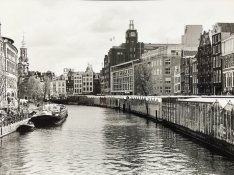
Colors are very important for our perception, they attract us to details. They provide contrast even when the levels of luminosity are the same. In essence, they provide 3 independent dimensions/vectors compared to BW single one. On top of that, most man made objects exploit that fact, that's why objects/cityscape will be attractive in color, but when shot with panchromatic BW film, they will turn into mushy blob of greys with no interesting points. Similar goes for landscape, the contrast between green/blue is well perceived in color, but is lost in BW.
In my experience, digital BW is more forgiving: "filters" can be in some degree applied in post processing, while RGB information is still there. Shooting BW film, you need to make it right right there and then, as you can only work with the information you stored on the film in the time of shooting. For portraits, I don't know why, but to me it seems like digital BW just works better "out of the box". Maybe I just suck and need to make and develop many many more portrait shots to learn.
Anyway, some general mistakes I noticed in my photos:
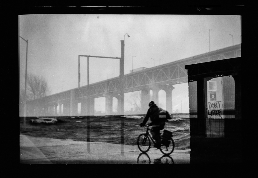
Lack of contrast / central point. Black and white cityscape with no filter results in mostly white/grey blob in place of sky, and the building are just shades of grey put on that white background. It makes no impression, no "wow" effect.
Possible improvements:
- use red filter to darken the blue sky and bring in some drama, however, that would not work with overcast sky.
- night shots could create more drama, but would also lose most interesting details in the buildings
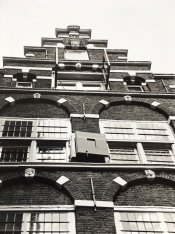
Perspective. Shooting buildings from below without a TS lens/folding camera just doesn't work.
Possible improvements:focus on interesting details, or really make extra effort to find a point of view which works.
Portraits. I always seem to have problems with BW portraits. Either too much or too little contrast, skin tones seem off, and adding contrast to the photo only makes them worse. No clue what the improvements could be here.
General notes: bring another body with color slide film, probably it's easier to shoot at least average color photos compared to BW.
Colors are very important for our perception, they attract us to details. They provide contrast even when the levels of luminosity are the same. In essence, they provide 3 independent dimensions/vectors compared to BW single one. On top of that, most man made objects exploit that fact, that's why objects/cityscape will be attractive in color, but when shot with panchromatic BW film, they will turn into mushy blob of greys with no interesting points. Similar goes for landscape, the contrast between green/blue is well perceived in color, but is lost in BW.
In my experience, digital BW is more forgiving: "filters" can be in some degree applied in post processing, while RGB information is still there. Shooting BW film, you need to make it right right there and then, as you can only work with the information you stored on the film in the time of shooting. For portraits, I don't know why, but to me it seems like digital BW just works better "out of the box". Maybe I just suck and need to make and develop many many more portrait shots to learn.
Anyway, some general mistakes I noticed in my photos:
Lack of contrast / central point. Black and white cityscape with no filter results in mostly white/grey blob in place of sky, and the building are just shades of grey put on that white background. It makes no impression, no "wow" effect.
Possible improvements:
- use red filter to darken the blue sky and bring in some drama, however, that would not work with overcast sky.
- night shots could create more drama, but would also lose most interesting details in the buildings
Perspective. Shooting buildings from below without a TS lens/folding camera just doesn't work.
Possible improvements:focus on interesting details, or really make extra effort to find a point of view which works.
Portraits. I always seem to have problems with BW portraits. Either too much or too little contrast, skin tones seem off, and adding contrast to the photo only makes them worse. No clue what the improvements could be here.
General notes: bring another body with color slide film, probably it's easier to shoot at least average color photos compared to BW.